OVERVIEW
The perceptual and material domains agree closely here. The eye lands on the face, drops to the pale mass, and the paint handling confirms that path: tight brushwork on the features, loose dry-dragged strokes on the fabric. Value structure and edge detection do the same work at the level of pigment that gaze direction and face detection do at the level of attention. That's a rare alignment. The picture is built to be read the way it's built.
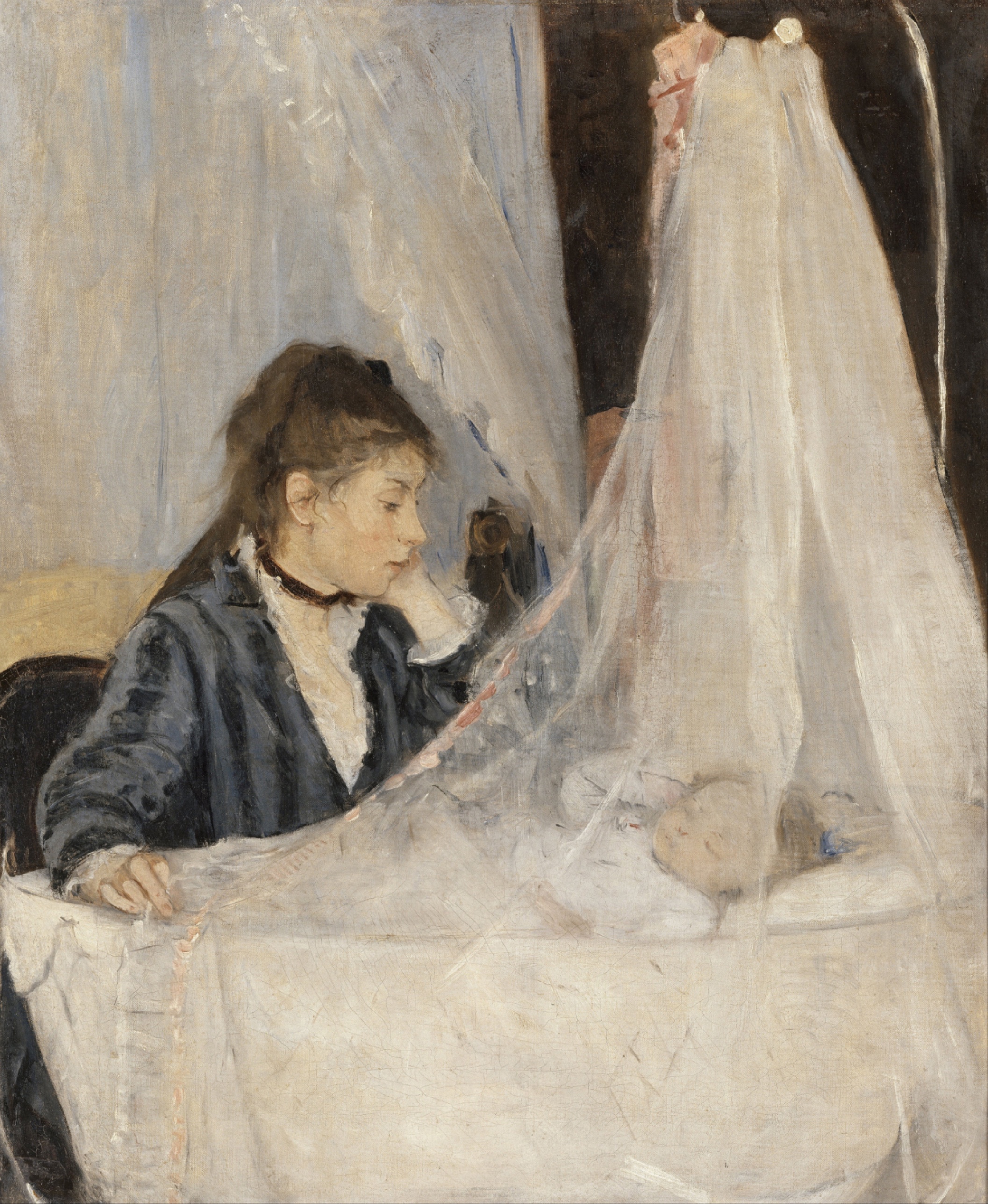
The cultural and conceptual domains pull against each other. Culturally, this is a woman painting domestic labor in a moment when domestic labor was not a subject worthy of a Salon submission by a woman with Morisot's social position. Conceptually, the argument the brushwork makes (dissolution, atmosphere, the dissolving of established form) sits inside Impressionism's larger argument about optical truth over academic finish. But the contradicted Pass-1 readings matter: one reading sees a mother watching an infant sleep; another reading sees a woman handling fabric near a hanging garment, no infant confirmed. That's not a minor disagreement. It changes whether the painting is a maternal narrative or a study in surface and drapery with an ambiguous human anchor. The perceptual record can't settle it. The paint itself refuses to over-specify the lower-right form, and that formal indeterminacy is exactly where the cultural and iconographic reading breaks down.
The material evidence (matte surface throughout, no specular highlights, dry scumbling on the sleeve) supports a reading of restraint and privacy rather than performance. That stabilizes the domestic-scene reading even as the identity of the lower-right form stays unresolved.
The live question the work is sitting inside: whether the picture is organized around a confirmed narrative subject (mother, cradle, infant) or around a passage of pure paint handling that only resembles that narrative under a certain kind of looking.
CULTURAL
Morisot paints this in 1872, inside the circle that becomes the Impressionist exhibiting group, and she paints it as a woman recording a domestic interior with her own sister and niece as models. That fact sits underneath everything the culture does with this picture, whether or not it's visible in the paint. One reading: this is a work entering the conversation about what counts as a legitimate Salon or exhibition subject, and it enters that conversation through a genre (mother and child, cradle-side devotion) that has deep precedent in religious and domestic painting but reduces its finish to something the Salon jury would find underworked. The dry-dragged fabric and unresolved lower-right form are not academic failures. They read as a deliberate refusal of the smooth, licked surface that Salon juries rewarded.
A different reading, available from the openai-family observations, sees less domestic sentiment and more a study in cloth, hooks, and enclosed space, something closer to a studio exercise in value and transparency than a maternal icon. If that reading holds, the work signals membership in the emerging Impressionist project (surface over subject) more than in the sentimental genre-painting tradition that a 19th-century bourgeois audience would recognize instantly.
Institutions that recognize this work now, the Musée d'Orsay foremost, canonize it inside the story of women in Impressionism and inside Morisot's biography specifically. That canonization depends on the cradle/infant reading holding. If the alternate reading (ambiguous fabric-handling scene, no confirmed infant) is taken seriously, the institutional narrative built around this painting gets less stable than the wall label suggests.
CONCEPTUAL
The work is in dialogue with the academic finish tradition it's abandoning; the tight, resolved handling on the face against the dissolved handling on the drapery is the clearest visual argument for that. This is the Impressionist position stated in miniature: perceptual attention is uneven, so paint handling should be uneven too. A face gets resolved because a face is where a human viewer looks first (face detection, edge detection both measure at strength 3, stable across readings). The fabric doesn't need that resolution because peripheral vision doesn't resolve it that way either. That's a strong, supportable position: optical honesty over uniform academic finish.
Where the argument gets less certain is the lower-right form. If that shape is meant to be legible as a sleeping infant, the painting is making a claim about maternal watching, an inherited subject going back through genre painting to devotional images of the Madonna and Child, secularized into an ordinary interior. If the shape is meant to stay ambiguous, the painting is making a more radical claim: that legibility itself is optional, that a picture can hold a viewer's attention through massing and value alone without confirming what is being looked at. The contradicted Pass 1 readings mean both positions have support in the paint. Hypothesis (insufficient visual evidence): the ambiguity is deliberate, used to keep the maternal reading available without insisting on it. That can't be confirmed from the image alone; it depends on knowing the sitters were Morisot's sister Edma and her infant daughter, which is external biographical information, not something the canvas states.
PERCEPTUAL
Standing in front of this, the face finds you first, tucked into the left side of the canvas, resolved and calm against everything else that isn't. Attention drops immediately along her sightline into a pale tangle at lower right that takes a second look to parse. The right two-thirds of the canvas stay loose and unfinished-looking no matter how long you look, so the eye keeps returning to the one place where the paint actually commits.
WHAT HITS YOU FIRST
- Edge Detection [A]: strength 3
- The crisp boundary at the woman's nose, brow, and mouth is the only firm contour in the picture, and it holds against a canvas otherwise built from dissolving edges.
- Face Detection [A]: strength 3
- Her profile is resolved enough to trigger recognition instantly, well before the rest of the composition sorts itself out.
- Figure-Ground Relationships [A]: strength 3
- The dark wedge in the upper background sits behind the pale curtain mass and behind her head, giving the two light shapes something to separate against.
- Gaze Direction / Social Attention [A]: strength 3
- Her head angles down and to the right, and that angle drags the viewer's eye off her face toward the smaller pale form before any other feature competes for it.
- Light Source Logic [A]: strength 3
- Diffuse light from the upper left with no cast shadow anywhere keeps every value shift soft, so nothing but the face and the dark wedge reads as a hard event.
- Overlap/Occlusion [A]: strength 3
- Her arm crossing the rail, the curtain crossing the dark recess: these overlaps are the only depth cues in the painting, and they're doing all the spatial work alone.
- Color Temperature [B]: strength 3
- The near-black recess reads cool and recedes; the pink-rust accent reads warm and sits forward, and that single warm note anchors the whole cool-to-neutral field.
- Contour Quality [B]: strength 3
- Firm on the face, broken and dry-dragged on the drapery: the contour itself tells you where finish stops.
- Value Structure/Massing [B]: strength 3
- Two large pale masses (the curtain, the woman's face and collar) flank a dark wedge, and that three-part massing is the skeleton the whole composition hangs from.
- Texture [B]: strength 2.5
- The dry, broken brushwork on the sheer fabric reads as textured against the smoother paint handling on the skin, even though both are matte.
WHAT HOLDS YOU THERE
- Postural Affect [A]: strength 2
- The downward lean of her head and shoulder reads as watchfulness to some viewers and as active handling to others; the posture itself is doing the work, but what it's watching stays contested.
- Visual Pop-out / Pre-attentive Features [A]: strength 2
- The pink-rust ribbon is the only saturated note in a desaturated field, so it pulls the eye almost involuntarily even though it's small.
- Anchoring and Reference Points [B]: strength 2
- The dark wedge functions as a fixed value reference that every other passage in the picture gets measured against.
- Cropping/Framing [B]: strength 2
- The canvas edges cut close around the scene, compressing the woman, the curtain, and the smaller form into one shallow band with no room to spare.
- Detail Density Gradient [B]: strength 2
- Detail is dense at the face and thins rapidly moving right and down, so the eye reads the painting as a gradient of attention rather than a uniform surface.
- Directional Force/Implied Movement [B]: strength 2
- The diagonal line from her head down to the lower-right form pulls the eye along it like a drawn line, even though nothing in the picture actually moves.
- Emergence [B]: strength 2
- The lower-right shape only resolves into a coherent form after the eye has already processed the face and the curtain, so it arrives late, as a kind of afterthought made solid.
- Saturation [B]: strength 2
- Nearly everything sits at low saturation, which makes the one warm accent operate almost like a separate register of color entirely.
- Scale Relationships [B]: strength 2
- The face is the largest resolved form; the lower-right shape is the smallest, and that size gap reinforces the reading of one figure as primary and the other as secondary.
- Transparency/Opacity [B]: strength 2
- The curtain is built to read as sheer, its dry-brushed strokes let the dark ground show through in patches, while the woman's clothing stays opaque.
- Visual Weight/Balance [B]: strength 2
- The dense, resolved face on the left balances against the larger but lighter, airier fabric mass on the right; the composition holds because the fabric's size compensates for its lack of density.
- Color Harmony Systems [C]: strength 2
- The palette stays inside a narrow neutral range (grays, tans, near-blacks) with the pink accent as the sole departure, giving the picture a held-together, restrained harmony.
- Economy of Means [C]: strength 2
- A handful of value masses and one color accent carry the entire composition; there's no incidental detail anywhere.
- Empathic Resonance [C]: strength 2
- The downward gaze and lowered posture invite a viewer to project tenderness onto the scene, though what's being watched stays open to more than one reading.
WHAT SURFACES ON A LONGER LOOK
- Agency Attribution [A]: strength 1.5
- Whether her hands rest passively on a rail or actively grip and lift fabric changes whether she reads as watching or as working; the paint doesn't resolve this, so it surfaces slowly.
- Color Opponent Channels [A]: strength 1.5
- The warm pink note against the cool gray-black field runs on a basic red-green, warm-cool opposition that the eye keeps returning to.
- Grouping [A]: strength 1.5
- The pale curtain, her collar, and her face group loosely as one light family across the canvas, separated only by the dark wedge between them.
- Binocular vs. Monocular Depth Cues [A]: strength 1
- Only overlap supplies depth; there's no perspective grid or converging line to reinforce it, so the space stays shallow no matter how long you look.
- Biological Motion Detection [A]: strength 1
- The faint suggestion of a body's weight in her posture registers, but there's no actual motion or gesture unfolding.
- Closure/Negative Space [A]: strength 1
- The unresolved lower-right form asks the eye to complete a shape the paint only half-supplies.
- Simultaneous Contrast [A]: strength 1
- The dark wedge makes the adjacent pale curtain look even paler by contrast, an effect that only registers after the initial read.
- Specularity/Surface Reflection [A]: strength 1
- There is none, and the total absence of any shine, even on the white fabric, becomes noticeable only once you look for it.
- Color Weight and Advancement [B]: strength 1
- The warm accent advances slightly against the receding cool ground, a small effect easy to miss on first pass.
- Complexity and Visual Density [B]: strength 1
- The picture is sparse rather than dense; noticing how little incident there is takes a second look.
- Embodied Perspective / Eye-Level Effects [B]: strength 1
- The implied vantage sits close and slightly above the smaller form, consistent with someone standing over it.
- Embodied Simulation [B]: strength 1
- The lean of the woman's body invites a felt sense of leaning in oneself, a mild effect that builds with continued looking.
- Focal Blur/Depth of Field [B]: strength 1
- The dissolving edges on the fabric behave like an optical blur even though the medium is paint, not lens.
- Interval Relationships [B]: strength 1
- The spacing between the face, the dark wedge, and the pale form sets up a rhythm of near-far-near that becomes apparent on repeated viewing.
- Local vs. Atmospheric Color [B]: strength 1
- Colors stay close to local hue rather than shifting with implied atmosphere, a restraint that surfaces once you compare passages directly.
- Optical vs. Physical Color Mixing [B]: strength 1
- The broken strokes on the drapery suggest optical mixing at a distance, though up close the strokes stay physically distinct.
- Pattern Completion/Closure [B]: strength 1
- The lower-right form requires the viewer to supply its identity from minimal cues.
- Rhythm and Repetition [B]: strength 1
- The repeated diagonal strokes on the sleeve and drapery set up a quiet rhythm that only becomes conscious with sustained attention.
- Symmetry/Asymmetry [B]: strength 1
- The composition is heavily asymmetrical, weighted left by the face and right by the fabric mass, and the imbalance becomes apparent once you try to find a center.
- Unity vs. Variety Tension [B]: strength 1
- Tight facial handling against loose fabric handling creates a tension between cohesion and variety that a longer look brings forward.
- Visual Tension [B]: strength 1
- The unresolved identity of the lower-right form keeps a low-grade tension active throughout the viewing.
- Implied Time/Narrative Sequence [C]: strength 1
- A viewer may construct a before/after story, watching becoming waking, though the canvas supplies no explicit sequence.
- Elevation in Picture Plane [A]: strength 0.5
- The woman's head sits slightly higher in the frame than the lower-right form, a minor cue reinforcing her primacy.
The picture asks the eye to do two different jobs and doesn't fully reconcile them: resolve a face fast, then slow down and puzzle out a fogged, half-finished passage on the other side of the canvas. Visual weight sits mostly left, but the sheer size of the curtain mass keeps the right side from feeling empty. The eye keeps cycling between the two because neither passage lets it settle for long: the face is finished but small, the fabric is large but never resolves.
MATERIAL AND FORMAL
Up close the paint sits thin and dry in most passages, dragged across the canvas weave rather than built up, and the surface stays matte from corner to corner. The face is the one place where the brush has slowed down and blended; everywhere else you can see individual strokes lying side by side, unblended, some barely covering the ground beneath.
WHAT HITS YOU FIRST
- Edge Detection [A]: strength 3
- The sharp brush-edge at the mouth and nose is the only place in the paint layer where the artist has fully closed a contour; everywhere else the stroke stops short.
- Light Source Logic [A]: strength 3
- No cast shadow appears anywhere on the physical surface; the paint records a diffuse light condition consistently across every passage.
- Color Temperature [B]: strength 3
- The cool near-black pigment in the recess and the single warm pink stroke are the two temperature poles the rest of the palette sits between.
- Contour Quality [B]: strength 3
- Firm, controlled line on the face; broken, dry-dragged line on the drapery. The difference in handling is a physical fact of stroke pressure and loading, not just an optical effect.
- Value Structure/Massing [B]: strength 3
- The dark wedge is laid in as a single dense passage of near-black pigment, thicker and more opaque than the surrounding paint, physically anchoring the value structure.
- Texture [B]: strength 2.5
- Dry-brushed, broken strokes on the curtain leave visible canvas tooth showing through; the face is worked smoother, with less visible weave.
WHAT HOLDS YOU THERE
- Transparency/Opacity [B]: strength 2
- The curtain strokes are thin enough that underlying ground color shows through in patches, an actual physical transparency, not just a painted illusion of it.
- Detail Density Gradient [B]: strength 2
- Paint application itself thins and loosens moving away from the face, so the density gradient is visible in the handling, not only in the image it describes.
- Economy of Means [C]: strength 2
- Very few pigments carry the whole canvas: a near-black, a range of grays and tans, one warm accent. The economy is material, not just compositional.
WHAT SURFACES ON A LONGER LOOK
- Specularity/Surface Reflection [A]: strength 1
- The total absence of gloss, even in the whites, means the paint was likely worked without heavy medium or varnish buildup in those passages, a choice that becomes noticeable only up close.
- Focal Blur/Depth of Field [B]: strength 1
- The soft edges on the drapery are a product of dry, broken strokes rather than glazing or blending, visible as a handling choice once you look at stroke level.
- Optical vs. Physical Color Mixing [B]: strength 1
- Individual strokes on the fabric stay distinct up close and only merge into a unified sheer surface at viewing distance.
The support is a modestly sized canvas, smaller than a door panel, meant to be seen at close range in a domestic room rather than across a gallery hall, and the handling matches that scale: the loose fabric strokes would read as unfinished at a distance greater than the work was likely intended for. The physical thinness of the paint on the curtain is not a shortcut. It is the same gesture, at the level of the hand, that produces the optical dissolve the eye registers. Where the work asks something different up close versus at a distance is the drapery: from across a room it reads as sheer cloth; from a foot away it reads as scattered, dry strokes of gray-white pigment that never resolve into cloth at all. The face never does this. It holds its identity at both distances, which is itself a material decision, not just a compositional one.
NOISE: CONSOLIDATED
PERCEPTUAL: The clean read (face draws the eye, gaze leads down to a resolved subordinate form) is interfered with by the fact that the subordinate form never fully resolves. Pattern completion has to do work the picture doesn't fully supply, and the contradicted Pass 1 readings (cradle versus garment, watching versus gripping) show that different viewers complete that shape differently. The single perceptual mechanism most responsible for the interference is Emergence: the late-arriving, under-specified shape at lower right.
MATERIAL: The dry-dragged, thin paint on the curtain fights against any reading of the work as fully "finished" in the academic sense, and this friction is likely intentional rather than accidental, given how tightly controlled the face is by contrast. The material choice that produces ambiguity (thin, broken strokes with visible ground) is the same choice that produces the sheer-fabric illusion, so the "fighting" here also does necessary work elsewhere.
CULTURAL: The unresolved identity of the lower-right form prevents the work from being cleanly legible as a maternal-devotion scene to an audience expecting the genre payoff, cradle, infant, sentiment, fully confirmed. If that audience is a 19th-century bourgeois viewer trained on genre painting, the picture underdelivers on legibility. If the audience is a 21st-century museum viewer trained on Impressionist optical fragmentation, the same ambiguity reads as sophistication rather than failure.
CONCEPTUAL: The argument that paint handling should mirror uneven human attention (sharp where a viewer looks, loose where a viewer doesn't) is undercut by the fact that the loose passage is also the compositionally load-bearing one. If the sleeping-infant reading is the entire point, leaving that area the least resolved element in the picture works against the argument's own claim to have organized the whole canvas around watching and care.
The single most consequential noise finding, the unresolved identity of the lower-right form, is very likely intentional: it produces the sheer-fabric optical effect the perceptual and material domains both need, even as it destabilizes the cultural and conceptual readings that depend on a confirmed infant.