OVERVIEW
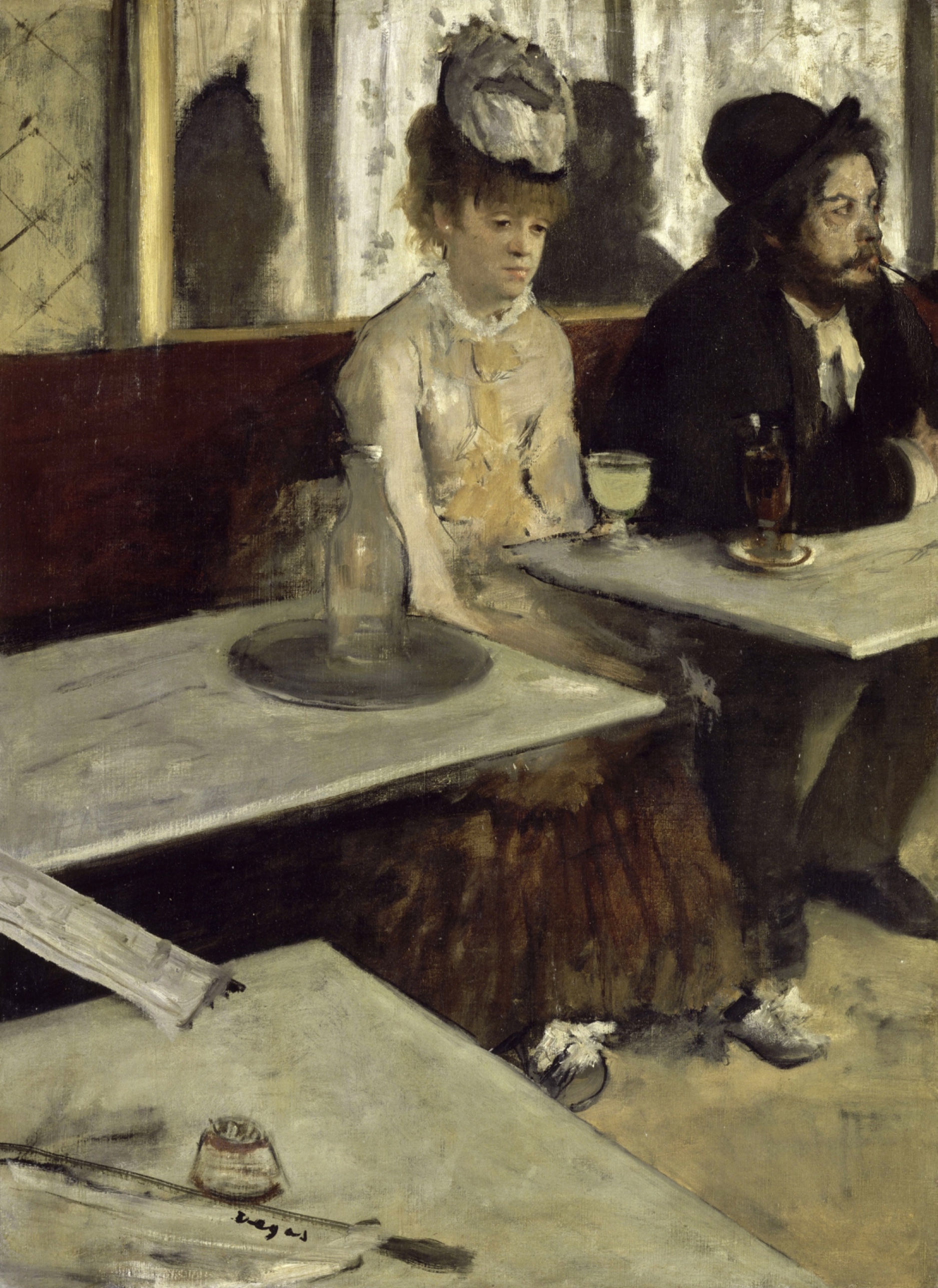
The perceptual pull and the compositional logic agree with each other. The eye goes to the woman's face, gets held by her posture, and the tables keep it at a distance. Face detection, postural affect, and cropping all point the same way: isolation, no exchange, a body that has stopped participating in its own scene.
The material handling backs this up rather than complicating it. The hard ruled edges of the tables against the dissolving edges of the figures aren't decorative. They match the psychological split the composition already sets up: furniture is solid and permanent, people are provisional.
Where the domains start to pull apart is cultural and conceptual reception versus what the picture actually shows. The cultural conversation this work entered in 1876 was not settled at the time of making. What the image depicts, a woman and a man not speaking to each other in a café, doesn't itself declare "absinthe," "moral ruin," or "modern alienation." Those are readings brought to the image by later viewers and institutions. The conceptual domain has to flag this: the picture supports a reading of disconnection and inattention, but the specific vice-narrative the title invites is an add-on, not a visible fact.
There's also a live disagreement inside the perceptual/material evidence itself: whether linear perspective or stacked overlapping planes is doing the spatial work, and where light is actually coming from. This isn't resolved in the Pass 1 record, and it shouldn't be smoothed over here.
The unresolved question the work sits inside: does the picture's famous reputation as a document of urban vice and alienation rest on what is visible in the paint, or on the title and the decade of criticism that followed it?
CULTURAL
This work enters the conversation around Impressionist exhibition practice in the mid-1870s, when painters were showing scenes of ordinary, often marginal Parisian life outside academic subject hierarchies. A café interior with two unremarkable people and no narrative climax was not a subject the Salon rewarded. Choosing it, and cropping the man at the edge of the canvas rather than composing a full scene, reads as a position against academic completeness.
One reading of where this work sits institutionally: it belongs to the small group of Impressionist works later reframed by critics and audiences as social commentary on urban isolation and drink culture, a reading that solidified more in England than in France, where its title and reception provoked debate about French moral decline. That reception is itself a historical event separate from the painting. The image supports a reading of disengagement (the averted gaze, the slumped posture, the pale unfocused face) but the "absinthe as vice" narrative is a layer added by title, caption, and later moralizing criticism, not something the paint alone announces.
The audience this work needs to reach, viewers fluent in Impressionist informality and comfortable reading psychological absence rather than narrative event, would recognize this as legible, even quietly radical: no story, no moral gesture, just two people occupying the same table without occupying the same attention. Viewers expecting a legible genre-scene narrative (temperance-tract or otherwise) get less than they expect, and that withholding is plausibly the point rather than a failure of the picture. A museum context like the Musée d'Orsay, built around this exact moment of French painting, recognizes and rewards this kind of scene; a viewer looking for melodrama or moral clarity will find the picture flat and inconclusive by comparison.
CONCEPTUAL
The picture is in dialogue with genre painting's traditional promise: that a scene of ordinary people implies a legible social or moral situation. Here that promise is only partly kept. The composition gives two figures, physical proximity, and a shared table, but withholds the connective tissue, no eye contact, no shared gesture, no clear narrative cue beyond the drink glass. That gap between "this looks like a genre scene" and "this refuses to resolve into one" is arguably the argument the work is making: modern urban intimacy can be spatial without being social.
The economy of means, minimal brushwork on the bottle, quick pale highlights standing in for glass, supports this argument rather than working against it. A fully rendered, fully described scene would supply the narrative detail the composition withholds elsewhere; the sparseness of touch keeps every element, including the drink, at the same low pitch of incompleteness. Nothing in the picture is allowed to become more finished than the human connection is.
Hypothesis (insufficient visual evidence): that the work is making a deliberate argument about absinthe specifically as a social pathology. The Pass 1 record supports isolation and disengagement as readable content; it does not supply enough independent visual anchors, beyond one glass of pale liquid, to support a claim about substance abuse as the picture's thesis. That reading depends on title and later reception, not on two independent observations from the image itself.
The relevant precedent is the café-concert and genre tradition of Manet and the illustrated broadsheet culture of the period, both of which used incidental settings to carry social meaning without staged moralizing. This picture pushes further than Manet's café scenes toward withheld narrative: the cropping at the right edge cuts the man's story off mid-sentence, literally.
PERCEPTUAL
Standing in front of this, the eye finds the woman's face almost immediately and then has nowhere obvious to go next. The man's head turns away at the far edge like he's already left the conversation. The tables in front of both figures sit closer to the viewer than either person, so the first visual experience is of furniture, then faces, then a slow realization that nobody here is looking at anybody.
WHAT HITS YOU FIRST
- Face Detection [A]: strength 3
- The woman's pale, isolated face against the mirror wall is the first shape the eye resolves before anything else in the canvas registers.
- Figure-Ground Relationships [A]: strength 3
- The woman's face and torso separate cleanly from the flat mirror/wall behind her, while the man's dark coat nearly fuses with the dark background mass at the upper right.
- Gaze Direction / Social Attention [A]: strength 3
- Her downward, unfocused gaze and his sharp turn toward the right edge point in two different directions, and the eye keeps checking both without finding a meeting point.
- Light Source Logic [A]: strength 3
- The diffuse, soft-edged illumination with no crisp cast shadow reads as ambient interior light, flattening drama rather than staging it.
- Linear Perspective [A]: strength 3
- The tabletop edges recede diagonally toward the right, giving the lower canvas a strong directional pull that competes with the vertical stillness of the figures.
- Overlap/Occlusion [A]: strength 3
- The near table overlaps the middle table, the tables overlap the figures' lower bodies, and the bottle/tray overlaps the woman, stacking the space in layers rather than through depth cues alone.
- Postural Affect [A]: strength 3
- The woman's rounded shoulders, tucked head, and hidden hands read as collapse before any narrative detail is considered.
- Contour Quality [B]: strength 3
- Hard ruled edges define the tables while the figures' hairlines, sleeves, and skirts dissolve into the background, splitting the picture into two different kinds of drawing.
- Cropping/Framing [B]: strength 3
- The man's arm, shoulder, and pipe are cut by the right edge, making his presence feel incidental and already departing.
- Value Structure/Massing [B]: strength 3
- Dark coat mass upper right, pale tabletop mass lower canvas, and mid-value banquette behind sort the composition into three legible bands before any single object is identified.
- Economy of Means [C]: strength 3
- The bottle is rendered with only a few pale strokes, and this sparseness keeps the object from competing with the figures for attention.
WHAT HOLDS YOU THERE
- Edge Detection [A]: strength 2
- The ruled diagonal edges of the tabletops give the eye a fast, unambiguous line to trace across the lower third of the canvas.
- Specularity/Surface Reflection [A]: strength 2
- The minimal highlights on the bottle read as glass without describing it fully, holding the eye briefly on a single glinting note.
- Visual Pop-out / Pre-attentive Features [A]: strength 2
- The pale yellow-green drink glass is the one saturated color in an otherwise muted scene, so it grabs attention out of sequence with everything around it.
- Anchoring and Reference Points [B]: strength 2
- The woman's face functions as the point every other element gets measured against, near or far, light or dark.
- Color Temperature [B]: strength 2
- The cool grays and blacks of the setting make the warm drink and skin tones read as isolated pockets of temperature.
- Detail Density Gradient [B]: strength 2
- Detail concentrates in the small foreground objects (newspaper, match holder) while the figures thin out toward soft, underdescribed edges.
- Directional Force/Implied Movement [B]: strength 2
- The man's turned head and the diagonal table edges both push the eye rightward, away from the woman, creating a pull against her static isolation.
- Embodied Perspective / Eye-Level Effects [B]: strength 2
- The viewpoint sits at table height, close to the marble surfaces, placing the viewer as a seated patron rather than an observer looking down.
- Embodied Simulation [B]: strength 2
- The woman's collapsed posture invites a bodily echo of fatigue or resignation in the viewer before any story is assigned to it.
- Saturation [B]: strength 2
- The drink's saturation against the desaturated room does double duty: pre-attentive pop and a quiet marker of otherwise absent color.
- Texture [B]: strength 2
- The marble tabletops read as smooth and hard against the more broken, atmospheric handling of the figures' clothing.
- Visual Tension [B]: strength 2
- The unmatched gazes and the diagonal tables create a low, sustained tension that never resolves into a single focal event.
- Visual Weight/Balance [B]: strength 2
- The dark mass of the man's coat at upper right counterbalances the pale tabletop mass at lower left, keeping the composition stable despite its psychological imbalance.
- Color Harmony Systems [C]: strength 2
- The browns, grays, and dull creams form a tight, low-key harmony that makes any warm accent read as an event.
- Empathic Resonance [C]: strength 2
- The slumped posture and averted gaze together invite a reading of shared fatigue or disconnection, though this reading rests on posture and gaze, not on narrative content.
WHAT SURFACES ON A LONGER LOOK
- Agency Attribution [A]: strength 1
- The man's cropped, turned-away figure eventually reads as having somewhere else to be, a minor narrative inference beyond pure form.
- Binocular vs. Monocular Depth Cues [A]: strength 1
- Overlap and occlusion carry almost all the depth information; stereoscopic cues are effectively absent given the flattened planes.
- Closure/Negative Space [A]: strength 1
- The gaps between tabletop edges and figures ask the eye to complete the room's geometry rather than seeing it fully stated.
- Color Opponent Channels [A]: strength 1
- The muted reds and greens sit close in value, so opponent contrast stays quiet rather than assertive.
- Elevation in Picture Plane [A]: strength 1
- The figures sit higher in the canvas than the dominant tabletops, a compositional choice that only registers after the tables have been scanned.
- Grouping [A]: strength 1
- The small foreground objects (newspaper, folded paper, match holder) cluster as a unit distinct from both tables and figures.
- Simultaneous Contrast [A]: strength 1
- The pale drink glass looks even more vivid set against the darker table edge beside it.
- Color Weight and Advancement [B]: strength 1
- The drink's pale warmth advances slightly against the receding cool grays of the room.
- Complexity and Visual Density [B]: strength 1
- The scene is sparse rather than dense; only a handful of objects carry any narrative or textural interest.
- Emergence [B]: strength 1
- The overall mood of disconnection only fully emerges after the individual cues (gaze, posture, cropping) are each separately noticed.
- Focal Blur/Depth of Field [B]: strength 1
- The soft dissolving edges on the figures function like blur, even though the paint is not literally out of focus.
- Interval Relationships [B]: strength 1
- The spacing between the two figures across the canvas width feels wider than their physical proximity at a shared table would suggest.
- Local vs. Atmospheric Color [B]: strength 1
- Local color dominates; there is little atmospheric shift across the shallow depth of the room.
- Optical vs. Physical Color Mixing [B]: strength 1
- Some of the glass and highlight passages suggest optical mixing at close range, though this reading is contradicted across observation runs.
- Pattern Completion/Closure [B]: strength 1
- The partially cropped bottle and cup shapes get completed by inference rather than full description.
- Rhythm and Repetition [B]: strength 1
- The repeated diagonal edges of the two tabletops set up a minor rhythmic echo across the lower canvas.
- Scale Relationships [B]: strength 1
- The figures read as smaller relative to the tables than the room's real proportions would suggest, pushing the human presence into the upper half.
- Symmetry/Asymmetry [B]: strength 1
- The composition is asymmetrical, weighted right by the man's mass and left by the tabletop's foreground bulk.
- Transparency/Opacity [B]: strength 1
- The bottle's near-transparency is one of the only passages built on the idea of seeing through rather than at a surface.
- Unity vs. Variety Tension [B]: strength 1
- The unified low palette holds the varied handling (hard tables, soft figures) together as one visual event.
- Implied Time/Narrative Sequence [C]: strength 1
- The man's already-turned head suggests a moment already passing rather than a moment being lived, a narrative inference riding on very little direct evidence.
The face reads first because nothing else in the canvas competes with it for that kind of recognition, but almost immediately the eye gets rerouted by the diagonal tabletops, which physically block the shortest path toward the figures and hold a third of the canvas hostage in flat, undramatic marble. That's the central visual request the picture makes and the central conflict: look at the woman, but first get past the furniture. The drink glass offers a brief, bright detour, popping out of the muted field before letting go. Nothing in the picture asks to be looked at for very long; the eye keeps sliding off the dissolving edges of the figures and landing back on the hard-edged, indifferent geometry of the tables.
MATERIAL AND FORMAL
Up close the canvas alternates between passages built with real description, the woman's face, the ruled edges of the marble, and passages built from almost nothing, a few strokes standing in for a bottle, a blurred smear standing in for a sleeve. From across the room those differences collapse into one overall low-key surface: browns, blacks, dull creams, with the single warm note of the drink glass holding its position regardless of viewing distance.
WHAT HITS YOU FIRST
- Contour Quality [B]: strength 3
- Ruled, hard-edged lines define the tabletops while the figures' outlines, hair, sleeve, skirt, are allowed to merge into the background, a deliberate handling split rather than a uniform touch across the canvas.
- Cropping/Framing [B]: strength 3
- The right edge of the canvas physically cuts through the man's arm and pipe, a compositional decision made at the framing stage, not an accident of the scene.
- Value Structure/Massing [B]: strength 3
- The paint is built in broad value masses, dark coat, pale table, mid-value wall, rather than through even, continuous modeling across the surface.
- Economy of Means [C]: strength 3
- The bottle is painted with a handful of pale strokes and no more, a visible decision to withhold finish rather than a failure to render it.
WHAT HOLDS YOU THERE
- Edge Detection [A]: strength 2
- The ruled diagonal edges of the marble tables are laid down with a straighter, more controlled hand than any other passage in the picture.
- Specularity/Surface Reflection [A]: strength 2
- The bottle's highlights are a few loaded, pale touches of paint sitting on top of a thin ground, doing the work of glass with minimal material.
- Texture [B]: strength 2
- The marble surfaces are painted smooth and flat while the clothing and hair carry visibly broken, textured brushwork, a material contrast doing the same work as the contour split above but through touch rather than line.
WHAT SURFACES ON A LONGER LOOK
- Transparency/Opacity [B]: strength 1
- The near-transparent handling of the bottle sits against the fully opaque, built-up passages of the tabletops, a material distinction visible mainly on close inspection.
The physical construction of the picture is honest about its own hierarchy of attention: Degas spends visible labor on the tabletop edges and the woman's face, and visibly withholds labor from the bottle, the man's cropped arm, and the background wall. That unevenness in handling is not incidental; it matches, stroke for stroke, the psychological unevenness the composition sets up between what gets looked at and what gets ignored. Up close, the ruled precision of the table edges feels almost drafted, done with a straightedge logic against the loose, atmospheric touch elsewhere. At a distance, that precision reads simply as solidity, the one thing in the room that doesn't waver. The surface asks the viewer to notice this discrepancy only slowly: from six feet away it looks like one consistent low-key painting; from eighteen inches it splits into two different kinds of mark-making occupying the same canvas.
NOISE: CONSOLIDATED
PERCEPTUAL: The Pass 1 record itself disagrees about basic spatial logic, whether the depth here is built from linear perspective toward a vanishing point or from flat stacked overlapping planes with no perspective diminishment. It also disagrees on light direction, front-left versus upper-front-right. Both are live conflicts in how the eye is supposed to parse the room, not settled readings, and they compete with the figure-to-figure gaze conflict for primary attention.
MATERIAL: The economy of means on the bottle and the cropped man's arm sits against the fully resolved, carefully ruled tabletop edges. This is not a contradiction so much as an uneven distribution of finish that could read, to a viewer expecting consistent handling across a canvas, as unevenness rather than intention.
CULTURAL: The title, "L'Absinthe," and a century of moralizing reception sit on top of an image that shows disconnection and fatigue but does not visually specify vice, addiction, or moral judgment. A viewer encountering the picture without that title-driven framing might read isolation and inattention without ever landing on "absinthe" as the operative subject. The gap between title-driven expectation and image-supported content is the main obstacle to a clean cultural read.
CONCEPTUAL: The argument that the picture makes about withheld social connection is undercut slightly by the drink glass functioning as a Visual Pop-out, the one moment of bright, legible incident in an otherwise deliberately underspecified scene. That single vivid object risks anchoring the whole conceptual reading to "the drink" rather than to the broader condition of mutual inattention the composition otherwise builds through gaze, posture, and cropping alone.
The uneven finish and the withheld narrative both look like deliberate decisions serving the conceptual argument of incomplete human connection; the disagreement over perspective type and light direction across observation runs looks like genuine interpretive noise, not intention, and it remains unresolved.