OVERVIEW
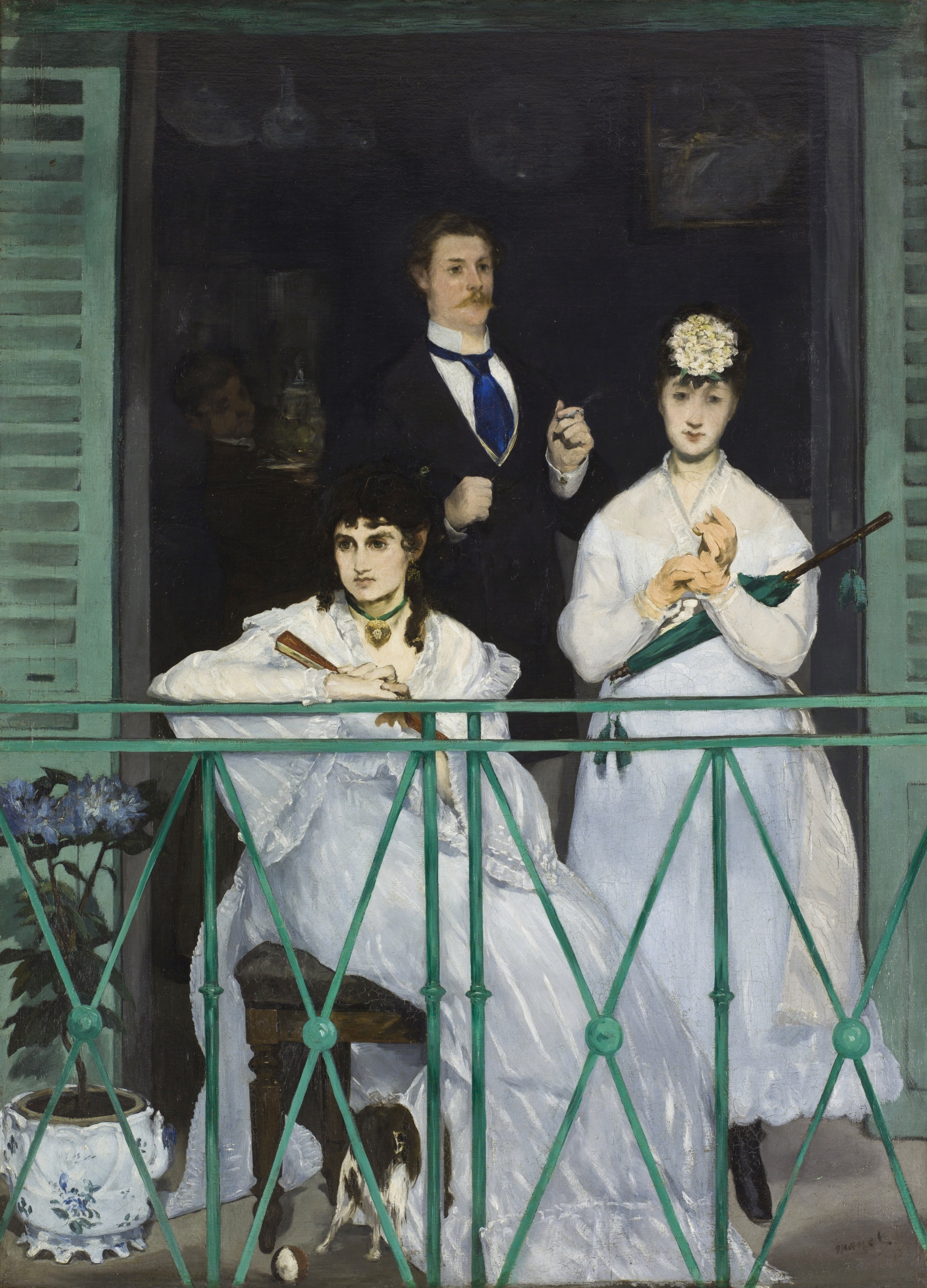
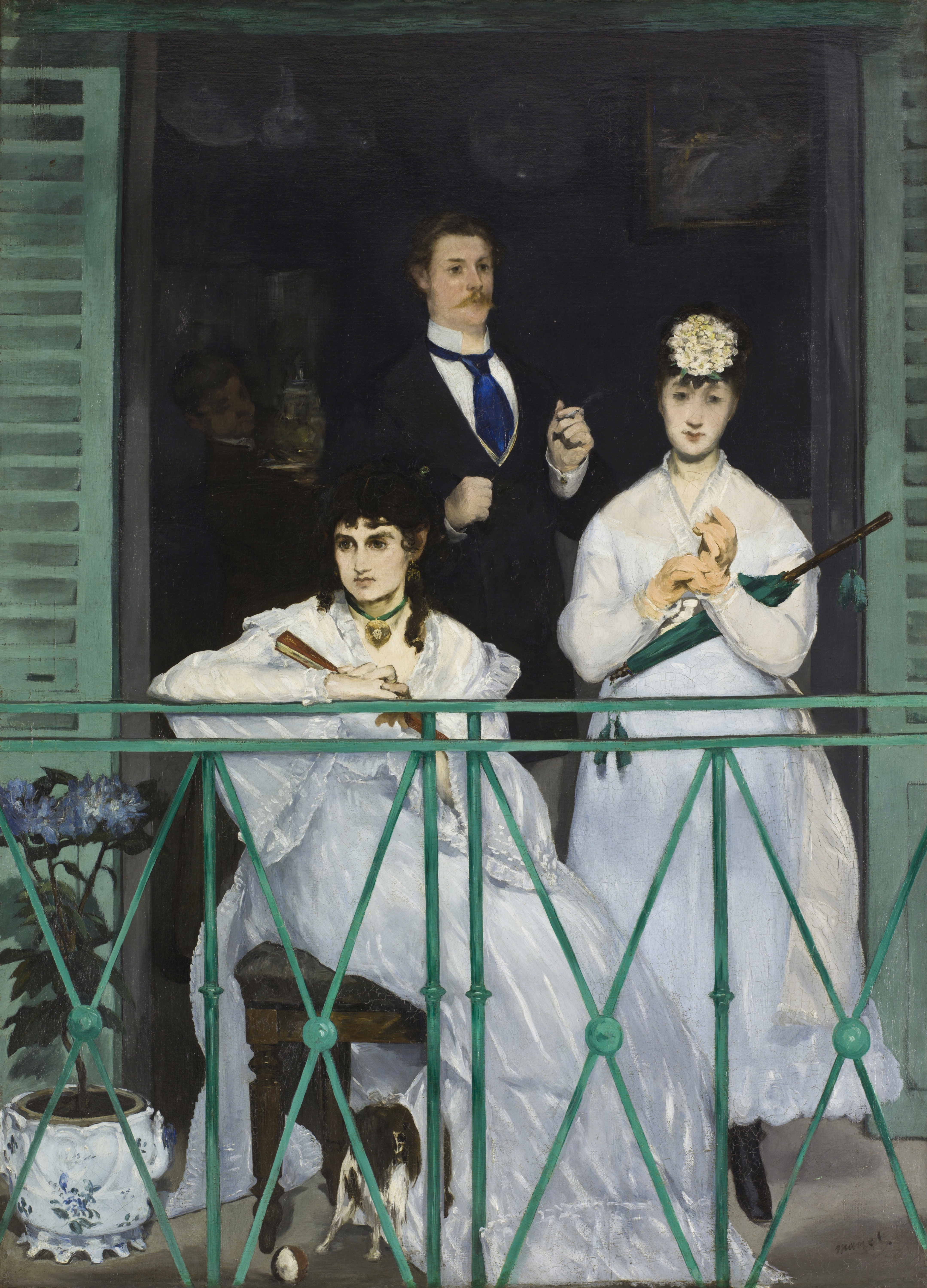
Four figures share a balcony. Nobody looks at anybody. That single fact drives every domain here in the same direction: perceptual (gaze direction registers as strength 3 but converges nowhere), cultural (a genre scene refusing genre-scene sociability), and conceptual (a group portrait that argues against the idea of the group). The material domain adds a second force pointing the same way: the paint itself is loaded and visible, especially in the white dresses, so the surface keeps announcing its own facture at the same moment the subject withholds psychological connection. Both refusals happen at once. That's convergence, not conflict.
The conflict sits between the ironwork and the human figures. The railing is the highest-saturation, most legible passage in the picture. Pass 1 places it "first" in most descriptions. It is also inert: a lattice, a barrier, a non-agent. The eye's first stop is the least alive thing in the composition. The picture asks the viewer's early-vision system to attend to a fence before it attends to three faces. That's a real tension between what pulls attention (color pop-out, edge clarity) and what the subject matter would seem to require (social reading of the figures). The dark interior compounds this: it swallows a fourth figure whose identity the Pass 1 record cannot even agree on. Material description (near-black undifferentiated mass) and iconographic uncertainty (boy? adult? smear?) are the same problem seen from two domains. The painting is not stingy with information behind the railing; it is structurally opaque there, and no domain resolves what's in the dark.
The live question the work sits inside: is the railing a boundary that separates the viewer from a room full of unconnected people, or is the failure of the figures to connect the actual subject, with the railing just staging it?
CULTURAL
This work enters the conversation around the Salon group portrait and the balcony/window scene as a social genre, and then withholds the sociability that genre promises. Spanish balcony scenes (Goya is the obvious reference point for costume and setting) and the tradition of the outdoor family or leisure-class portrait give a viewer a expectation: figures arranged to imply relation, address, or narrative. This composition uses the setting, the dress, the props, without supplying the relational payoff. One reading is that this is a deliberate rebuff aimed at Salon audiences trained to read arrangement as narrative. A Salon viewer in 1868 would recognize the type of subject and be denied its customary legibility.
The color discipline (green, white, black, with the blue tie and gold accents as the only warm notes) signals a painter working against academic finish toward something closer to structural color relationships, a position that would be legible to the community forming around Manet at the time and later claimed by Impressionist and Post-Impressionist historiography as ancestral. Institutions that prize this work today (the Musée d'Orsay's own installation logic, survey courses on the birth of modern painting) read it as a hinge picture: Salon subject matter, anti-Salon handling. Whether that hinge status is legible to a general museum audience without the historical framing is a separate question. The paint handling in the dress fabric (loaded, visibly brushed rather than fine linear drawing) would have read to conservative 1868 critics as unfinished, which is a charge actually leveled at Manet's public reception in his period; that reading is not settled by the image, it requires knowing the reception history, so it's offered here as a plausible cultural position rather than a fact drawn from the canvas.
CONCEPTUAL
The work is in dialogue with the group portrait as a genre premised on implied relation, and it withholds relation while keeping every trapping that would normally supply it. Three figures, one shared architectural space, matching sightlines expected and none delivered (per Pass 1, "none of their gazes meet each other's or converge on a single point"). That's the anchor for the strongest conceptual claim available here: this is an argument about modern proximity without connection, made through composition rather than subject matter.
A useful precedent is not narrative painting but photographic portraiture's growing convention of the unposed glance, and the broader nineteenth-century anxiety about urban strangers occupying shared space without forming community. The picture does not moralize about this; it stages it flatly, without gesture toward pathos. The near-black interior, holding a figure whose age and action three independent viewing passes could not agree on, supports a secondary position: the painting treats offscreen/interior space as genuinely unknowable rather than merely underpainted. That's consistent with an argument that says legibility itself, not just sociability, is being withheld.
Hypothesis (insufficient visual evidence): the closed fan and closed umbrella, both held rather than used, might be read as a statement about performed leisure withholding its own function. This has only the two props as anchors and no supporting gesture or gaze evidence tying them to a shared idea, so it stays a hypothesis.
PERCEPTUAL
Standing in front of this, the eye hits a band of hard green metalwork before it finds a face. The two white dresses glow against a hole of black behind them, so bright and dark trade places almost like a photographic negative. Only after that first jolt does the viewer notice that none of the three visible people are looking at each other, or at anything in particular that the picture identifies.
WHAT HITS YOU FIRST
- Edge Detection [A]: strength 3
- The white dresses cut against the near-black interior with almost no transitional value, so the boundary reads before any figure does.
- Face Detection [A]: strength 3
- Three faces sit at roughly the same height across the canvas, pulling the eye into a triangle scan even though nothing else links them.
- Figure-Ground Relationships [A]: strength 3
- The dark interior functions as a single collapsed ground plane, forcing every foreground element, dresses, railing, dog, plant, forward as figure.
- Gaze Direction / Social Attention [A]: strength 3
- Each pair of eyes points somewhere different, so the automatic urge to trace sightlines to a shared target keeps failing.
- Light Source Logic [A]: strength 3
- Frontal, slightly left light hits faces and fabric with soft-edged shadow, consistent enough that the eye reads it as one coherent daylight source.
- Overlap/Occlusion [A]: strength 3
- The railing crosses in front of skirts, dog, and potted plant, establishing a single clear depth order in an otherwise flattened space.
- Visual Pop-out / Pre-attentive Features [A]: strength 3
- The saturated blue-green of the railing, shutters, and parasol reads instantly against the muted rest of the palette, arriving before any object identification does.
- Value Structure/Massing [B]: strength 3
- The composition reduces to three value masses, pale dresses, dark suit, black interior, and the eye organizes the whole scene through those masses before details register.
WHAT HOLDS YOU THERE
- Color Opponent Channels [A]: strength 2
- The green railing against the warm accents (blue tie, gold jewelry) keeps triggering small adjustments in the eye's color balance as it moves across the canvas.
- Grouping [A]: strength 2
- The three foreground figures cluster by proximity and shared framing even though their gazes refuse to group them psychologically.
- Postural Affect [A]: strength 2
- The seated woman's closed fan and the standing woman's closed parasol both read as held-still, non-active postures, giving the group a suspended, waiting quality.
- Simultaneous Contrast [A]: strength 2
- The white dresses look even whiter, and the black interior even blacker, because each sits directly against the other.
- Anchoring and Reference Points [B]: strength 2
- The railing functions as a fixed horizontal that the eye returns to after each detour into the darker upper zone.
- Color Temperature [B]: strength 2
- The cool green-black-white scheme makes the man's warm skin, the blue tie, and the gold jewelry read as temperature spikes rather than mere color notes.
- Contour Quality [B]: strength 2
- The dresses are built from loaded, visible brushwork rather than drawn contour, so their edges look assembled rather than outlined.
- Cropping/Framing [B]: strength 2
- Shutters at both edges and bodies cut at waist or thigh height compress the scene into a shallow strip, denying any deep recession.
- Detail Density Gradient [B]: strength 2
- Detail falls off sharply from the crisp railing and faces to the barely blocked interior, guiding the eye toward the front plane and stalling it in the back.
- Emergence [B]: strength 2
- The fourth figure only partially resolves out of the dark mass, so the eye keeps almost-finding a person without confirming one.
- Optical vs. Physical Color Mixing [B]: strength 2
- The green of railing, shutters, and parasol reads as one mixed hue across separate physical objects, unifying disparate elements by repetition of color rather than by any painted blending.
- Rhythm and Repetition [B]: strength 2
- The green recurs at railing, shutters, and parasol at roughly even intervals, creating a beat the eye tracks across the width of the canvas.
- Saturation [B]: strength 2
- The railing's saturation is turned up well past everything around it, so it keeps pulling the eye back even after the faces have been found.
- Scale Relationships [B]: strength 2
- The dog and ball sit small against the figures, giving the eye a size cue that stabilizes how large the human figures read.
- Visual Weight/Balance [B]: strength 2
- The two women's pale mass on the left/center balances against the dark, denser mass of the man and the black interior on the right, keeping the composition from tipping.
- Color Harmony Systems [C]: strength 2
- The limited green/white/black scheme with small warm accents reads as a controlled system rather than a naturalistic transcription of an actual balcony's colors.
WHAT SURFACES ON A LONGER LOOK
- Agency Attribution [A]: strength 1
- The half-resolved fourth figure raises the question of whether something back there is acting, without ever confirming it.
- Biological Motion Detection [A]: strength 1
- The dog's posture near the seated woman's feet is the only cue in the picture suggesting a body capable of movement.
- Closure/Negative Space [A]: strength 1
- The dark interior asks the eye to complete a room it can't actually see, filling in walls and furniture that are only implied.
- Elevation in Picture Plane [A]: strength 1
- The man's position, set slightly back and higher, gives him marginally more visual authority without changing the group's lack of interaction.
- Canonical Views [B]: strength 1
- The frontal, waist-up balcony arrangement matches a familiar portrait convention, which is part of why its lack of connective gaze feels pointed rather than accidental.
- Color Weight and Advancement [B]: strength 1
- The green railing, despite sitting nearest the viewer, is cool enough that it doesn't advance as aggressively as its saturation alone would predict.
- Complexity and Visual Density [B]: strength 1
- The scene is visually sparse relative to a typical Salon interior, concentrating all incident on four figures, a railing, a plant, and a dog.
- Directional Force/Implied Movement [B]: strength 1
- The man's cigarette gesture is the only limb activity in the group, giving the composition its one small vector of implied motion.
- Embodied Perspective / Eye-Level Effects [B]: strength 1
- The viewer's eye level sits roughly level with the seated woman's face, placing the viewer as a third party standing at the railing rather than looking up or down at the scene.
- Embodied Simulation [B]: strength 1
- The closed fan and closed parasol invite an unconscious sense of stalled or withheld gesture, as if the viewer's own hand mirrors the non-use.
- Focal Blur/Depth of Field [B]: strength 1
- The interior's lack of edge definition functions like an optical blur even though it is a value effect, softening recession into the dark.
- Interval Relationships [B]: strength 1
- The spacing between the two women and the man is uneven enough that the trio never reads as a symmetrical grouping.
- Local vs. Atmospheric Color [B]: strength 1
- Colors stay locally true (green stays green, white stays white) rather than shifting with implied atmosphere, flattening the sense of real outdoor air.
- Pattern Completion/Closure [B]: strength 1
- The diamond lattice of the railing is legible as a repeating pattern even where paint handling loosens toward the edges.
- Pattern vs. Figure [B]: strength 1
- The railing's geometric pattern competes with the figures for status as the main "subject" of the lower third.
- Symmetry/Asymmetry [B]: strength 1
- The composition sets up a rough bilateral frame (shutter, shutter) but places figures asymmetrically within it, creating a mild, sustained visual tension.
- Transparency/Opacity [B]: strength 1
- The dark interior reads as opaque rather than as a transparent window into deeper space, which is part of why the fourth figure never fully resolves.
- Unity vs. Variety Tension [B]: strength 1
- The tight color scheme unifies the picture while the three unconnected gazes introduce psychological variety that the color scheme doesn't resolve.
- Visual Tension [B]: strength 1
- The mismatch between physical proximity and psychological distance among the figures sits unresolved the longer one looks.
- Economy of Means [C]: strength 1
- A handful of props, fan, parasol, cigarette, dog, ball, carry the entire sense of incident in an otherwise sparse scene.
- Empathic Resonance [C]: strength 1
- The withheld eye contact makes it hard to settle into feeling with any one figure, so empathy stays diffuse rather than anchored.
- Implied Time/Narrative Sequence [C]: strength 1
- The closed props and static poses suggest a pause before or after an action rather than an action itself.
Attention lands on the railing because it is the loudest color pop-out in the frame, then jumps to the faces because faces always win the second round of looking, and only then notices that the third round, the round that expects the faces to look at each other or at the viewer, comes up empty. The picture keeps the eye busy with color and value work in the first seconds and only lets the social failure surface once the initial scan is done. That's a real sequencing effect: the formal fireworks (saturated green, extreme value contrast) buy the picture cover before its colder subject, unconnected people sharing a space, registers.
MATERIAL AND FORMAL
Up close the dresses are not drawn, they're built: thick, loaded strokes stand up off the canvas where the fabric catches light, and the darks behind the figures thin out into something closer to a stained wash. From across the room those same loaded whites read as clean, almost photographic value shapes; the handling only declares itself as handling once you're near enough to see the ridges of paint.
WHAT HITS YOU FIRST
- Value Structure/Massing [B]: strength 3
- The three-mass structure (pale dresses, dark suit, black room) is built entirely through paint density and opacity, not line, so the masses read as physical accumulations of pigment rather than drawn shapes.
WHAT HOLDS YOU THERE
- Texture [B]: strength 2
- The visibly brushed, loaded paint of the dresses sits in contrast to the thinner, smoother handling implied in the dark interior, giving the surface two distinct physical registers.
WHAT SURFACES ON A LONGER LOOK
- Specularity/Surface Reflection [A]: strength 1, agreement contradicted
- A glimmer on a glass vessel in the interior is reported by only part of the record, so any reading of a reflective highlight back there has to stay tentative.
- Transparency/Opacity [B]: strength 1, agreement contradicted
- Accounts disagree on whether the dark interior reads as a transparent view into shadowed depth or as an opaque painted mass, and that disagreement is itself a material fact about how illegible the paint layer is in that zone.
Manet is not hiding the difference between a passage he cared about and a passage he didn't. The dresses get the full weight of loaded, dragged paint; the interior gets scrubbed-in dark with barely a figure indicated. That imbalance in labor is visible without a magnifying glass and it is doing compositional work, it pushes the eye to the front plane and keeps the room behind the railing genuinely uncertain. The support is a large, human-scale canvas, taller than most viewers' shoulders and roughly as wide as a person is tall, so the figures approach life size, which matters for how directly the withheld eye contact registers: this is built at a scale meant to meet the viewer's own body, not to be read as a small distant scene.
NOISE: CONSOLIDATED
PERCEPTUAL: The railing's saturation competing with the faces for first-attention is a real interference. A viewer trained to expect a portrait's social content to lead is met instead by a decorative ironwork pattern winning the first few hundred milliseconds of looking.
MATERIAL: The uneven finish, dense, worked paint in the dresses against a near-blank dark interior, creates a picture that is only half-resolved as a physical object. That unevenness is also exactly what produces the perceptual effect above, so it's not pure noise; it's doing double duty.
CULTURAL: The Salon-genre setup (balcony scene, respectable dress, a family-adjacent grouping) primes an audience to expect legible sociability, and the picture's refusal of that expectation risks reading as failure rather than argument to any viewer unfamiliar with Manet's broader project of withholding narrative resolution.
CONCEPTUAL: If the argument is about modern disconnection, the picture still spends its most persuasive visual energy on decorative color harmony (the green scheme) rather than on the psychological distance itself, which is carried by the comparatively quiet cue of mismatched gaze direction. The showier device and the actual argument aren't pointed the same way.
The material unevenness and the perceptual pop-out of the railing are almost certainly the same intentional decision seen twice; the cultural illegibility and the conceptual imbalance look more like real friction the work hasn't resolved, not a strategy.