OVERVIEW
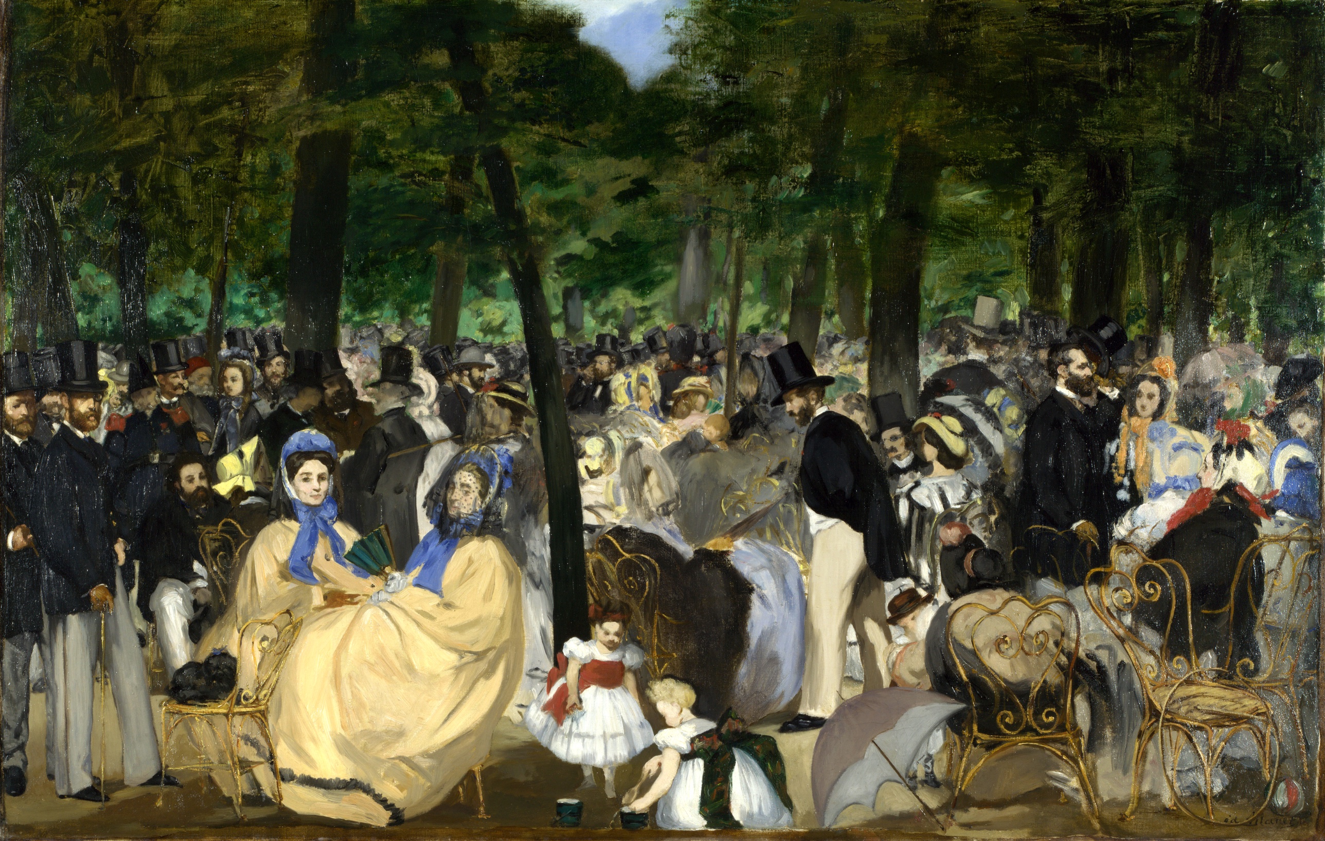
The perceptual and material domains agree with each other almost completely. The eye jumps to the yellow dresses, and the paint confirms that jump: those dresses get the tightest contours in the picture, while the crowd around them goes to smudge. Detail Density Gradient is not just something the eye notices, it's something Manet built with the brush. Contour Quality tracks Focal Blur tracks Complexity and Visual Density. The formal decisions and the perceptual experience are the same decision seen twice.
The cultural and conceptual domains pull against that agreement. Perceptually, this painting behaves like an image organized around one bright social cluster in a sea of undifferentiated men. Culturally, that cluster (women, children, fashion, leisure) sits inside a scene coded as a record of specific, named Parisian men (Baudelaire, Gautier, Manet himself among the top hats). The eye's entry point and the painting's social subject don't match. What the eye finds first is not what the picture is reportedly "about" in the art-historical account. That's a live tension, not a resolved one.
The conceptual argument, read as flat frontal recording without academic finish, is supported by the material evidence: no blending, no varnish-smooth transitions, visible loaded strokes in the foliage. But the same refusal to resolve deep-crowd faces that reads as "anti-narrative honesty" conceptually also reads, perceptually, as a simple attentional cost-saving: Manet painted what the eye actually resolves in a crowd and skipped what it doesn't. Whether that's an epistemological argument about vision or an economical shortcut is not something the image settles.
The unresolved question the work sits inside: is the blurred, undifferentiated crowd a deliberate statement about how modern urban attention actually works, or is it just where Manet stopped rendering.
CULTURAL
This painting enters the conversation about Parisian public leisure at exactly the moment that subject becomes fashionable for painting rather than illustration. The Tuileries Gardens concert crowd is a real social space, not an invented pastoral, and Manet's decision to paint identifiable contemporary figures in contemporary dress (rather than myth, history, or genre-type peasants) puts the work in dialogue with a documentary ambition that Salon painting of the 1860s mostly avoided. One reading: this is an early bid to make the standing crowd of black coats and top hats a fit subject for serious oil painting, on a scale usually reserved for history painting's ambitions if not its size.
The work's legibility splits by audience. To a Salon jury trained on finish, modeling, and narrative clarity, the loose, unresolved faces in the crowd and the scumbled foliage would read as unfinished, even careless. That audience would not recognize this as ambitious; the visual evidence (soft contours dissolving with distance, no resolved leaf shapes anywhere in the canopy) is exactly what got Manet's generation accused of laziness. To the audience that would later be called Impressionist and its supporters, the same evidence reads as a claim about optical truth: crowds really do dissolve at the edges of attention, and painting them sharp everywhere would be a lie.
The picture also signals belonging to a specific social circle rather than the anonymous public. If the black-coated crowd includes recognizable cultural figures, as it's often said to, the work functions partly as a group portrait of Manet's own milieu, staged as an anonymous public gathering. That double function (public genre scene, private social register) would be legible to a small circle in 1862 and largely invisible to anyone without knowledge of who's in the crowd. That's not failure. It's a work aimed at two audiences with different keys, one visual and public, one social and private.
CONCEPTUAL
The most defensible argument the painting makes: finish is not owed equally to every part of a visual field, because human attention doesn't distribute itself equally either. The Detail Density Gradient (crisp women in front, dissolving figures behind) and the refusal to individuate foliage into leaves are not failures of technique. They function as a claim about where visual information actually lives when a person looks at a crowd: only foreground, only where you land.
That claim sits against the tradition of academic finish, where every square inch of canvas earns the same degree of resolution regardless of narrative importance, because completeness itself signals mastery. Manet's picture argues the opposite: uniform finish is a fiction, and a painting that insists on it is lying about how sight works. This is a precedent for what later gets called "impressionistic" handling, but here it isn't yet about color-as-light. It's about attention as a filter, rendered as brushwork.
The composition's refusal of linear perspective, building depth instead through overlap and diminishing scale (stable across all readings), supports the same position from a different angle. A crowd doesn't organize itself into converging orthogonals. It organizes itself into blocking and overlapping bodies. Choosing occlusion over perspective is a choice to represent social space as it's actually encountered, body against body, not as an geometric abstraction imposed from outside.
Hypothesis (insufficient visual evidence): that the painting is a specific argument about modernity's fragmentation of the self, in the sense theorized by later urban sociology. The image supports a claim about attention and crowds. It does not, on its own visual evidence, support a claim about alienation or psychological fracture; that would require reading intention into blur that the formal record only shows as a distance effect.
PERCEPTUAL
Standing in front of this, the eye doesn't wander, it snaps. Two pale yellow dresses grab it first, low and left, before any single face or object gets read. Then the whole picture reveals itself as a wall of black coats and hats, more texture than population, with the eye scanning across rows of hats the way it would scan a fence. The only place the eye can exhale up top is a narrow gap of blue sky pushing through the leaves.
WHAT HITS YOU FIRST
- Overlap/Occlusion [A]: strength 3
- Bodies block bodies, trunks block crowd; there isn't a single sightline in the picture that isn't interrupted by something nearer.
- Visual Pop-out / Pre-attentive Features [A]: strength 3
- The yellow dresses fire before anything else registers, purely on color and value contrast with the black mass around them.
- Complexity and Visual Density [B]: strength 3
- The packed rows of top hats read as a single dense field before any individual figure separates out.
- Contour Quality [B]: strength 3
- Foreground women get hard, continuous edges; the crowd behind them has no continuous edge left by the time it recedes.
- Detail Density Gradient [B]: strength 3
- Resolution collapses with distance from the yellow-dressed women, so the painting itself enacts where attention actually goes.
- Rhythm and Repetition [B]: strength 3
- The repeating black hats set up a visual beat that the eye taps through almost involuntarily.
- Value Structure/Massing [B]: strength 3
- Dark coats and trunks form one continuous mass, against which the yellow, white, and sky-blue pockets read as isolated events.
WHAT HOLDS YOU THERE
- Color Opponent Channels [A]: strength 2
- Yellow against the surrounding black-green sets up a contrast that keeps pulling the eye back to the two seated women even after it has moved on.
- Edge Detection [A]: strength 2
- The crisp boundary around the foreground figures versus the smudged boundary of background heads gives the eye a place to rest its focus.
- Elevation in Picture Plane [A]: strength 2
- Figures placed higher in the canvas read as farther back, letting the eye use vertical position as a depth cue once it starts scanning up.
- Face Detection [A]: strength 2
- The eye keeps trying to resolve faces in the crowd and mostly fails, which is why the foreground faces get so much of the looking time.
- Figure-Ground Relationships [A]: strength 2
- The seated women separate cleanly from the crowd behind them, functioning as figure against a dark, undifferentiated ground.
- Grouping [A]: strength 2
- Hats and heads cluster into rows that the eye treats as units rather than individuals.
- Light Source Logic [A]: strength 2
- Soft, diffuse shadow edges throughout tell the eye this is filtered outdoor light, not studio light, without a single hard cast shadow anywhere to contradict it.
- Simultaneous Contrast [A]: strength 2
- The yellow dresses look more saturated for sitting against the surrounding black and dark green.
- Anchoring and Reference Points [B]: strength 2
- The two women function as the fixed point the eye returns to after every excursion into the crowd.
- Color Temperature [B]: strength 2
- Warm yellow and red notes sit against cool black and green, and the eye treats the warm notes as the places to stop.
- Color Weight and Advancement [B]: strength 2
- The yellow dresses feel closer and heavier in the composition than their actual size would predict.
- Cropping/Framing [B]: strength 2
- Figures and objects cut at the frame's edge (the parasol, chair legs) signal that the scene continues past what's shown.
- Emergence [B]: strength 2
- The crowd only resolves into individual hats and heads after a beat; at first glance it's a single textured field.
- Optical vs. Physical Color Mixing [B]: strength 2
- Foliage color reads as unified green from a distance despite being built from separate unblended dabs up close.
- Pattern Completion/Closure [B]: strength 2
- The eye fills in faces and figures in the crowd that the paint never actually completes.
- Pattern vs. Figure [B]: strength 2
- The hat-rows read first as pattern, and only the foreground breaks out as individuated figure.
- Saturation [B]: strength 2
- The dresses' saturation stands so far above the muted crowd that it functions almost like a spotlight.
- Scale Relationships [B]: strength 2
- Head size shrinking toward the back of the crowd tells the eye how deep the space goes without any perspective lines to confirm it.
- Texture [B]: strength 2
- The broken, scumbled foliage reads as textured mass rather than as individual leaves, and the eye accepts that substitution instantly.
- Unity vs. Variety Tension [B]: strength 2
- The dark uniform crowd (unity) and the isolated color notes (variety) trade off for attention throughout the picture.
- Visual Weight/Balance [B]: strength 2
- The bright lower-left cluster balances against the darker, denser upper-right crowd mass.
WHAT SURFACES ON A LONGER LOOK
- Agency Attribution [A]: strength 1
- The bending child near the bucket reads as performing a small, specific action rather than just occupying space.
- Atmospheric Perspective [A]: strength 1
- The deepest crowd figures lose contrast along with detail, consistent with distance rather than just occlusion.
- Biological Motion Detection [A]: strength 1
- The child's bending posture and the crowd's implied movement register as living gesture rather than static arrangement.
- Closure/Negative Space [A]: strength 1
- The sky gap functions as a rare negative shape the eye can rest in in.
- Gaze Direction / Social Attention [A]: strength 1
- Where individual figures seem to look is inconsistent enough across accounts that it doesn't organize the reading strongly.
- Linear Perspective [A]: strength 1
- There's a slight sense of recession from the carriage wheel and trunks, but it's minor next to the overlap-driven depth.
- Postural Affect [A]: strength 1
- The seated women's relaxed posture reads as social ease against the more rigid standing crowd.
- Specularity/Surface Reflection [A]: strength 1
- Small glints in the dark trunks and foliage surface only after sustained looking, given how matte the rest of the paint is.
- Directional Force/Implied Movement [B]: strength 1
- The crowd's density suggests a mass that could shift or press, though nothing in the picture actually moves.
- Embodied Perspective / Eye-Level Effects [B]: strength 1
- The viewpoint sits at roughly the crowd's own eye level, putting the viewer inside the gathering rather than above it.
- Embodied Simulation [B]: strength 1
- The bending child's posture invites a felt sense of reaching down toward the ground.
- Focal Blur/Depth of Field [B]: strength 1
- Background heads blur the way an out-of-focus lens would, even though the mechanism here is paint handling, not optics.
- Interval Relationships [B]: strength 1
- The spacing between hats sets up a rhythm the eye tracks almost like counting.
- Local vs. Atmospheric Color [B]: strength 1
- Local black of the coats stays fairly constant even as detail dissolves with distance.
- Progressive Rhythm [B]: strength 1
- Hat sizes step down gradually toward the back, reinforcing depth through a rhythm of diminishing units.
- Symmetry/Asymmetry [B]: strength 1
- The bright cluster's left position against the darker right mass keeps the composition asymmetrical and active.
- Visual Tension [B]: strength 1
- The gap between the resolved foreground and the dissolving crowd creates a mild, sustained visual pull.
- Color Harmony Systems [C]: strength 1
- Warm yellow, red, and gold notes recur just often enough to feel coordinated rather than accidental.
- Empathic Resonance [C]: strength 1
- The seated women's ease invites a mirrored sense of relaxation in the viewer.
- Implied Time/Narrative Sequence [C]: strength 1
- The child reaching for the bucket suggests an action with a before and after, a small narrative beat inside the larger static crowd.
Attention in this picture is asked to do two incompatible things at once: settle on the two women as a stable resting point, and scan the crowd as an undifferentiated field with no individual worth stopping on. Visual weight sits almost entirely in the lower-left quadrant, which pulls against the crowd's sheer physical bulk occupying most of the canvas. The eye keeps getting sent back and forth between a small zone of legibility and a large zone that refuses to resolve, and neither zone lets you stay.
MATERIAL AND FORMAL
Up close this is a rough, unblended surface: loaded, visible strokes in the foliage that never cohere into leaves, thin curling lines standing in for chair ironwork, patches of nearly featureless paint standing in for distant faces. From across the room, all of that roughness collapses into a legible, even convincing crowd scene. The picture is built to work at exactly one distance and to fall apart if you get too close looking for information that isn't there.
WHAT HITS YOU FIRST
- Complexity and Visual Density [B]: strength 3
- The sheer number of separate small strokes needed to build the hat-rows and foliage gives the surface a busy, worked-over density even before any single stroke is read individually.
- Contour Quality [B]: strength 3
- The line quality itself shifts across the canvas, hard and continuous on the foreground dresses, broken and interrupted everywhere else, and that shift is the material fact behind the Detail Density Gradient.
- Detail Density Gradient [B]: strength 3
- This is a brushwork decision as much as a perceptual effect: paint is loaded and worked in the foreground, thinned and abbreviated in the depth of the crowd.
- Value Structure/Massing [B]: strength 3
- Blacks are built as flat, near-uniform masses of pigment rather than modeled forms, which is what lets the coats read as one connected shape.
WHAT HOLDS YOU THERE
- Edge Detection [A]: strength 2
- Some edges are drawn with a loaded brush pulled in one continuous motion; others are just where one dab of paint stops touching another.
- Texture [B]: strength 2
- The foliage is scumbled paint dragged over paint, leaving a broken surface that never resolves into individual leaf shapes even at close range.
- Optical vs. Physical Color Mixing [B]: strength 2
- The green canopy is physically made of separate unmixed touches of pigment that only blend in the eye at a normal viewing distance.
- Economy of Means [C]: strength 2
- A few curled ochre lines stand in for an entire chair frame; the reduction is severe enough that some viewers read it as unfinished and others read it as sufficient.
WHAT SURFACES ON A LONGER LOOK
- Specularity/Surface Reflection [A]: strength 1
- Isolated glossy streaks turn up in the darkest passages of trunk and foliage, small departures from the otherwise matte handling everywhere else.
- Focal Blur/Depth of Field [B]: strength 1
- The paint itself gets thinner and less differentiated with distance into the crowd, an actual material correlate of an out-of-focus effect.
The canvas is oil on a support just under two and a half feet tall and under four feet wide, a scale that puts the crowd close to life-size at the front edge and lets the far crowd shrink convincingly toward the top. Nothing about the surface hides its own construction: brushstrokes stay visible everywhere, there's no glaze evening things out, no smoothing at the transitions between resolved and unresolved passages. That honesty is the material argument matching the conceptual one: the painting doesn't pretend uniform effort produced this image, it shows you exactly where the effort went and where it stopped. Up close, the unresolved zones look like abandonment. At viewing distance, they look like decision.
NOISE: CONSOLIDATED
PERCEPTUAL: The two strongest attentional pulls in the picture, the yellow dresses and the crowd's hat-rhythm, don't cooperate. One asks the eye to settle, the other asks it to scan indefinitely with no individual stopping point. Where the eye "finally" rests has no agreement across viewers, landing variously on the women, the sky gap, or lower-right foreground clutter. That's a genuine perceptual conflict, not just a reporting discrepancy: the picture doesn't build a single terminal resting point.
MATERIAL: The surface's matte, unglazed handling is contradicted at the margins by small glossy passages in the dark foliage and trunks. If the material logic is "everywhere flat, everywhere matte, direct paint with no polish," those glints are a small internal exception that fights the surface's own stated rule.
CULTURAL: The picture's legibility depends on knowing who's in the crowd. Without that social key, viewers can only access the genre-scene reading (leisure, fashion, public space); with it, they access a private group-portrait reading. Nothing in the visible image signals which reading is intended, so the audience without the social key and the audience with it see two different paintings.
CONCEPTUAL: The argument that finish should track attention (sharp where the eye lands, loose where it doesn't) is undercut by the fact that the foreground clarity is not obviously more "important" than the background dissolution in any narrative sense; the women aren't doing anything more central to the concert than the men are. The formal logic and the semantic logic of the scene don't fully align.
Most of this noise looks intentional in one domain and accidental in another: the unresolved crowd serves the conceptual argument about attention but creates real perceptual uncertainty about where the picture wants the eye to end up, while the stray glints in the foliage look like plain handling accidents with no domain claiming them on purpose.