OVERVIEW
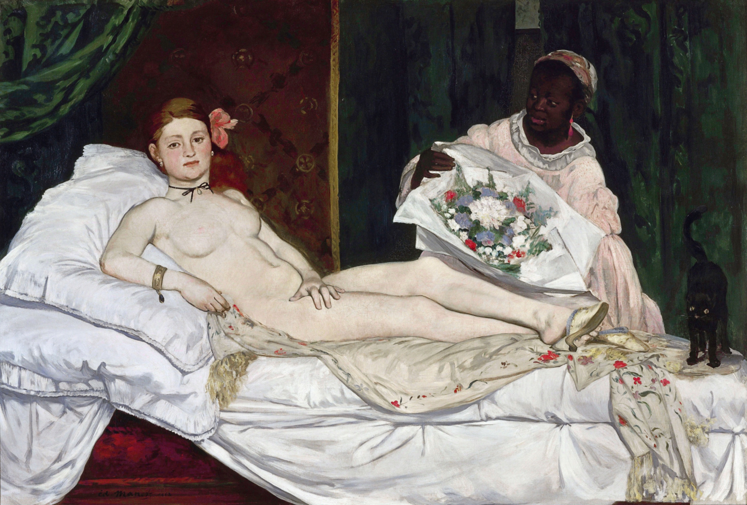
The perceptual and material domains agree with each other almost completely here. The eye snaps to the face, then the flat hard body-edge, then the bouquet, then loses time in the cat. The brush confirms every stop on that route: tight description at the face, quick unblended color at the flowers, thin scrubbed shorthand at the cat. Attention and paint handling are the same map.
The cultural and conceptual domains pull against that agreement, not against each other exactly, but against what the surface wants to be read as. The pose is a known reference — a reclining nude with a servant and a gesture toward luxury goods sits inside a lineage of Venus paintings. But the flat light, the direct stare, and the black ribbon strip the pose of its usual softening devices. Culturally the work asks to be read inside the nude tradition and simultaneously refuses that tradition's terms. Conceptually the argument seems to be built from exactly this refusal: use the format, cancel the alibi.
The tension worth naming: the perceptual system reads this as a coherent, confidently staged picture (strong edges, decisive massing, unambiguous focal sequence), while the cultural-conceptual reading depends on the picture being read as deliberately unresolved, even hostile to its own genre. The eye finds order. The argument depends on disorder. The work does not resolve which one wins, and it does not have to.
The unresolved question the work sits inside: is the stare an address to a viewer, or a refusal of one, and can a single flat unmodulated face carry both at once.
CULTURAL
Olympia enters a conversation that already has rules. The reclining female nude, seen frontally, accompanied by an attendant, is a format inherited from Titian and reworked constantly through the nineteenth-century Salon system. A painter submitting to the Paris Salon in 1865 was expected to use that format to produce distance: mythological name, softened light, downcast or unfocused gaze, skin rendered as continuous tonal gradation. Those are the signals that made a nude legible as art rather than as a picture of a specific woman.
This canvas withholds nearly every one of those signals. Face Detection observations show a direct outward stare rather than an averted gaze. Light Source Logic and Contour Quality show flat frontal lighting and a hard sharp outline against the dark ground rather than gradual modeling. The black ribbon at the throat, the flowers held out by a second figure, the cat at the foot of the bed: these read less as mythological attributes and more as the furnishings of a contemporary transaction. One reading available from these observations is that Manet is using the vocabulary of the academic nude while stripping its distancing apparatus, and that a Salon audience trained to recognize Venus would have recognized instead a specific, undisguised, present-tense woman looking back.
Institutions that would recognize this move are exactly the ones the painting provoked: the Salon jury and press of 1865, and later the modernist canon-builders (starting with Manet's own defenders, then reaching into twentieth-century museum culture) who reread the refusal of idealization as the founding gesture of a new relationship between painter, painting, and viewer. The Musée d'Orsay's current framing of the work as a rupture point in French painting is one such institutional position, not a neutral fact about the image. Whether the work's directness was legible as a formal argument or only as an affront, at the time of its making, is itself a live historical question rather than something the image settles on its own.
CONCEPTUAL
The visible argument concerns address. A painting in the reclining-nude tradition typically manages the viewer's relationship to the body by keeping the figure absorbed, unaware, available to look at without being looked back at. Face Detection and Gaze Direction observations here show the opposite: the face is the first thing the eye meets, and the stare meets the viewer outward. Combined with the flat frontal light that refuses to model the body into soft sculptural continuity (Light Source Logic, Contour Quality), the painting removes the two main devices that let a viewer look at a nude while pretending not to be implicated in the looking.
Read this way, the work is not illustrating a myth. It is proposing that looking at a nude is a transaction with a specific, aware party, and it stages that transaction rather than hiding it. The bouquet held by the second woman (Agency Attribution, Overlap/Occlusion) supports this reading as a second anchor: an offering entering the frame from outside, addressed to the reclining figure, doubling the sense that this is a scene of exchange rather than a scene of passive display.
The relevant precedent is Titian's Venus of Urbino, which supplies the pose Manet is reworking. The departure is not in composition but in the refusal to translate presence into allegory. Manet's flatness of paint handling (Value Structure/Massing, Edge Detection) does the same work at the level of surface: no atmospheric haze, no gradual transition softens the body into distant myth. The picture argues, through its stare and through its flatness together, that idealization was always a choice, and that withholding it is also a choice, one with consequences for who is comfortable in front of the canvas.
PERCEPTUAL
Standing in front of this canvas, the face finds you before you decide to look at it. The body reads as a pale flat shape cut hard against dark cloth, almost like a shape stamped rather than modeled. Attention then drifts sideways to a small dense cluster of bright paint before dropping down into a dark corner where a pair of yellow eye-highlights sit, easy to miss, hard to un-see once found.
WHAT HITS YOU FIRST
- Edge Detection [A]: strength 3
- The line where the pale body meets the dark curtain and wall stays hard and unbroken the whole length of the figure, giving the body a cut-out quality rather than a sculpted one.
- Face Detection [A]: strength 3
- The face, pale and frontal, is the first shape the eye organizes, ahead of the body mass it sits on top of.
- Figure-Ground Relationships [A]: strength 3
- The pale body-and-bedding mass reads instantly as figure against the dark green curtain and burgundy wall, with almost no ambiguity about which is which.
- Gaze Direction / Social Attention [A]: strength 3
- The stare is aimed outward at the viewer, not at anything within the painting, so the eye is met rather than allowed to wander past the face freely.
- Light Source Logic [A]: strength 3
- Flat frontal light collapses the body into broad pale planes instead of rounded volumes, so shading gives almost no information about form.
- Overlap/Occlusion [A]: strength 3
- The bouquet's wrapping crosses the standing woman's torso, the legs cross each other, and the cat overlaps the sheet edge, stacking the space through covering rather than through perspective.
- Visual Pop-out / Pre-attentive Features [A]: strength 3
- The saturated red-and-blue bouquet, painted in visible unblended strokes, jumps out against the otherwise flat, subdued color field around it.
- Contour Quality [B]: strength 3
- The outer edge of the body against the dark ground is crisp and continuous, while the boundary between pale skin and pale sheet dissolves almost entirely, so the same figure has two completely different edge qualities.
- Value Structure/Massing [B]: strength 3
- The composition resolves into two large value blocks, pale body-and-bed against dark curtain-and-wall, before any smaller detail registers.
WHAT HOLDS YOU THERE
- Agency Attribution [A]: strength 2
- The standing woman's held-out bouquet reads as an action directed at the reclining figure, giving the picture a sense of something happening rather than something merely displayed.
- Color Opponent Channels [A]: strength 2
- The red-and-green pairing between the bouquet and the curtain keeps pulling the eye back toward the flowers even after it has moved on.
- Grouping [A]: strength 2
- The pale bedding, pillow, and body fuse into one connected mass, while the standing figure and curtain form a separate dark grouping beside it.
- Postural Affect [A]: strength 2
- The reclining figure's flat, un-yielding pose combined with the direct stare reads as composed and unapologetic rather than relaxed or vulnerable.
- Simultaneous Contrast [A]: strength 2
- The pale skin looks even paler set against the saturated dark green and burgundy fields around it.
- Specularity/Surface Reflection [A]: strength 2
- Small tight highlights on jewelry, eyes, and the slipper catch the eye briefly as points of hardness in an otherwise matte field.
- Anchoring and Reference Points [B]: strength 2
- The black ribbon at the throat acts as a small dark fixed point the eye returns to between the face and the body.
- Color Temperature [B]: strength 2
- The warm pink of the standing woman's dress stands out as a temperature break inside the cooler dark-green and black surroundings.
- Detail Density Gradient [B]: strength 2
- Detail concentrates at the face and bouquet and thins out toward the sheets and background, guiding how long the eye stays in each zone.
- Emergence [B]: strength 2
- The black cat only resolves as a cat once the eye catches the two yellow highlights; before that it reads as part of the shadow mass.
- Saturation [B]: strength 2
- The bouquet's saturation level is far above anything else in the picture, which is why it keeps interrupting the eye's path between face and cat.
- Scale Relationships [B]: strength 2
- The reclining figure's scale dominates the canvas relative to the standing woman and cat, establishing her as the primary mass before any other reading happens.
- Texture [B]: strength 2
- The visible, separate brushstrokes in the bouquet contrast with the smoother, more blended handling of the skin, making the flowers feel physically different in substance.
- Visual Tension [B]: strength 2
- The stare and the flat lighting work against each other: one invites a psychological read, the other refuses to give the body any soft, inviting modeling.
- Visual Weight/Balance [B]: strength 2
- The pale body-mass on the left/center and the dark standing figure with curtain on the right balance each other, keeping the composition from tipping toward either side.
WHAT SURFACES ON A LONGER LOOK
- Binocular vs. Monocular Depth Cues [A]: strength 1
- Overlap does the work of suggesting depth; there is little else supporting a sense of a receding room.
- Biological Motion Detection [A]: strength 1
- The standing woman's forward lean toward the bed reads faintly as motion, though the pose is otherwise held and static.
- Closure/Negative Space [A]: strength 1
- The dark curtain area functions partly as negative space the eye fills in as continuous cloth rather than examining in detail.
- Linear Perspective [A]: strength 1
- There is almost no perspectival scaffolding; the bed edge offers the only faint suggestion of a receding line.
- Canonical Views [B]: strength 1
- The frontal reclining pose matches a familiar viewing angle for this subject type, which is part of why it reads instantly as a figure rather than a puzzle.
- Color Weight and Advancement [B]: strength 1
- The red in the bouquet feels like it sits slightly forward of the picture plane compared to the flatter greens and browns around it.
- Complexity and Visual Density [B]: strength 1
- The picture is mostly plain and un-crowded, with visual density concentrated in only two small zones, the bouquet and the face.
- Cropping/Framing [B]: strength 1
- The cat and the far edge of the bed run close to the canvas boundary, giving a faint sense of a space that continues past the frame.
- Directional Force/Implied Movement [B]: strength 1
- The bouquet's presentation gesture creates a weak diagonal pull from the standing figure toward the reclining one.
- Embodied Perspective / Eye-Level Effects [B]: strength 1
- The viewpoint sits roughly level with the bed, avoiding a strong looking-down or looking-up sensation.
- Embodied Simulation [B]: strength 1
- The flat, unyielding pose does not invite much bodily mirroring in the viewer, unlike a more relaxed or twisting figure would.
- Interval Relationships [B]: strength 1
- The spacing between the three figures (reclining woman, standing woman, cat) reads as roughly even across the lower half of the canvas.
- Local vs. Atmospheric Color [B]: strength 1
- Colors stay locally true and flat rather than shifting with implied distance or atmosphere.
- Optical vs. Physical Color Mixing [B]: strength 1
- The bouquet's dabs of red, white, and blue sit unblended on the surface rather than optically fusing at normal viewing distance.
- Pattern Completion/Closure [B]: strength 1
- The faint circular motif on the background wall is only partly legible, and the eye completes it as decorative pattern rather than reading each element.
- Pattern vs. Figure [B]: strength 1
- The faint wallpaper pattern stays subordinate to the figures, never competing for primary attention.
- Rhythm and Repetition [B]: strength 1
- The small dark accents (ribbon, cat, hair) create a loose repeating rhythm of dark notes across the pale field.
- Symmetry/Asymmetry [B]: strength 1
- The composition is asymmetrical, weighted left by the reclining body and balanced right by the darker cluster of curtain and standing figure.
- Unity vs. Variety Tension [B]: strength 1
- The picture holds together as one flat scene despite the sharp handling difference between the loosely painted bouquet and the smoother body.
- Color Harmony Systems [C]: strength 1
- The palette of green, burgundy, pink, and pale flesh reads as a deliberately limited, coordinated set rather than a broad range.
- Economy of Means [C]: strength 1
- Very few elements carry the whole picture: one face, one bouquet, one cat, one ribbon.
- Empathic Resonance [C]: strength 1
- The outward stare produces a faint sense of being addressed personally, though the flat affect limits how much emotional pull it generates.
- Implied Time/Narrative Sequence [C]: strength 1
- The gesture of the offered bouquet implies a "just now" moment, a delivery in progress, without building a full narrative sequence.
What no single principle name fully covers is the sequence itself: face, then hard edge, then bouquet, then cat, in that order, on a loop. Nothing in the picture tells the eye to stop at any one of these; the flat lighting removes the usual cue (a brightest highlight, a modeled peak) that would normally settle attention on one center. The picture keeps you circulating between an address you can't look away from and a shadow you almost miss.
MATERIAL AND FORMAL
Up close the canvas shows two entirely different kinds of paint handling living beside each other. The body and bedding are laid in with smoother, more controlled strokes, the pigment thin enough in places that the weave shows through. The bouquet is built from loaded, separate dabs of red, white, and blue that sit up off the surface, wet-looking even now. From across the room those dabs fuse into a bright compact mass; up close they break back apart into individual marks of the brush.
WHAT HITS YOU FIRST
- Edge Detection [A]: strength 3
- The dark-to-light boundary along the body is painted with a single confident pass rather than built up through gradual transitional strokes, which is why it stays so hard at any viewing distance.
- Light Source Logic [A]: strength 3
- The choice to light the body flatly, with no consistent single-source falloff, is a construction decision, not an observed lighting condition, and it flattens the paint's job of describing volume.
- Contour Quality [B]: strength 3
- The painter draws the outer silhouette firmly and lets the internal skin-to-sheet boundary go soft or vanish, a deliberate difference in how much work each edge is asked to do.
- Value Structure/Massing [B]: strength 3
- The picture is built as broad value shapes first, laid in as flat masses, with detail added afterward only in a couple of concentrated zones.
WHAT HOLDS YOU THERE
- Specularity/Surface Reflection [A]: strength 2
- Small opaque highlights on jewelry and the slipper sit as thick, distinct dabs of lighter paint over the otherwise flat, matte surrounding passages.
- Texture [B]: strength 2
- The bouquet's built-up, visible brushwork sits in open contrast to the thinner, more rubbed-in paint of the skin, so the canvas itself carries two different physical surfaces.
- Detail Density Gradient [B]: strength 2
- Paint handling gets looser and more summary moving away from the face and bouquet, an active thinning of the hand's attention rather than a passive falloff.
WHAT SURFACES ON A LONGER LOOK
- Optical vs. Physical Color Mixing [B]: strength 1
- The bouquet's unblended dabs of pigment rely on the eye doing the mixing at a distance, a method the smoother body passages don't use.
- Cropping/Framing [B]: strength 1
- The bed and cat run close to the canvas edge, indicating the composition was framed tight to its subject rather than given room to breathe.
The physical construction of the painting backs up its perceptual argument almost exactly. A canvas this size, over four feet tall and more than six feet wide, is built at close to life scale for the reclining figure, so the confrontation the face sets up isn't happening at miniature remove. The paint doesn't hide its own economy: thin scumbled darks for the cat and curtain, thick wet strokes for the flowers, careful but not labored modeling at the face. Nothing here pretends to Old Master finish. The surface tells you plainly where the hand slowed down and where it moved fast, and that unevenness is legible at both viewing distances rather than resolving into a uniform "finished" look up close.
NOISE: CONSOLIDATED
PERCEPTUAL: The main interference is the contradiction in how the shadow edges read. Some observation runs describe hard, sharp cast shadows on the body; others describe soft transitions with no strong cast shadow at all. Since Light Source Logic and Contour Quality are both scored at maximum strength, this disagreement matters: it's not a minor detail, it's a live uncertainty about whether the lighting logic is rendered as a hard flattening device or a soft one. A second, smaller interference is the unresolved question of where the eye finally settles, bouquet, cat, hand, or signature strip; the picture clearly cycles between them, but no single terminal point is agreed on.
MATERIAL: No strong internal fight here. The uneven finish (tight face, loose cat, dense bouquet) is consistent with the value-massing approach across the whole canvas rather than working against it. The one soft friction point is the noted "fine cracking in dark areas," raised in only one observation family; if real, it affects legibility of the darkest passages (curtain, cat) but isn't corroborated broadly enough to treat as established.
CULTURAL: The work's illegibility risk sits in its refusal of the Venus alibi. A Salon audience expecting a mythological name and a softened gaze would have had trouble placing this painting inside the category it visually resembles. That illegibility is plausibly deliberate rather than accidental, given how consistently the flat light, hard edge, and direct stare work together to strip the pose of its usual cover.
CONCEPTUAL: The argument about direct address depends on the stare reading as confrontation rather than passivity, but Postural Affect is only scored at strength 2, not dominant, and gaze target for the standing woman is explicitly contradicted across observation families. If the standing woman's gaze is not clearly directed at the reclining figure, the "staged transaction" reading loses one of its two anchors and leans more heavily on the stare alone.
Most of this noise looks intentional in the cultural and conceptual domains, the withheld softness, the ambiguous gaze exchange between the two women, serves the argument about refusing easy legibility. The shadow-edge disagreement in the perceptual domain reads more as observer inconsistency than a deliberate ambiguity built into the paint.