There's no Front Door read for this one yet.
Go deeper
OVERVIEW
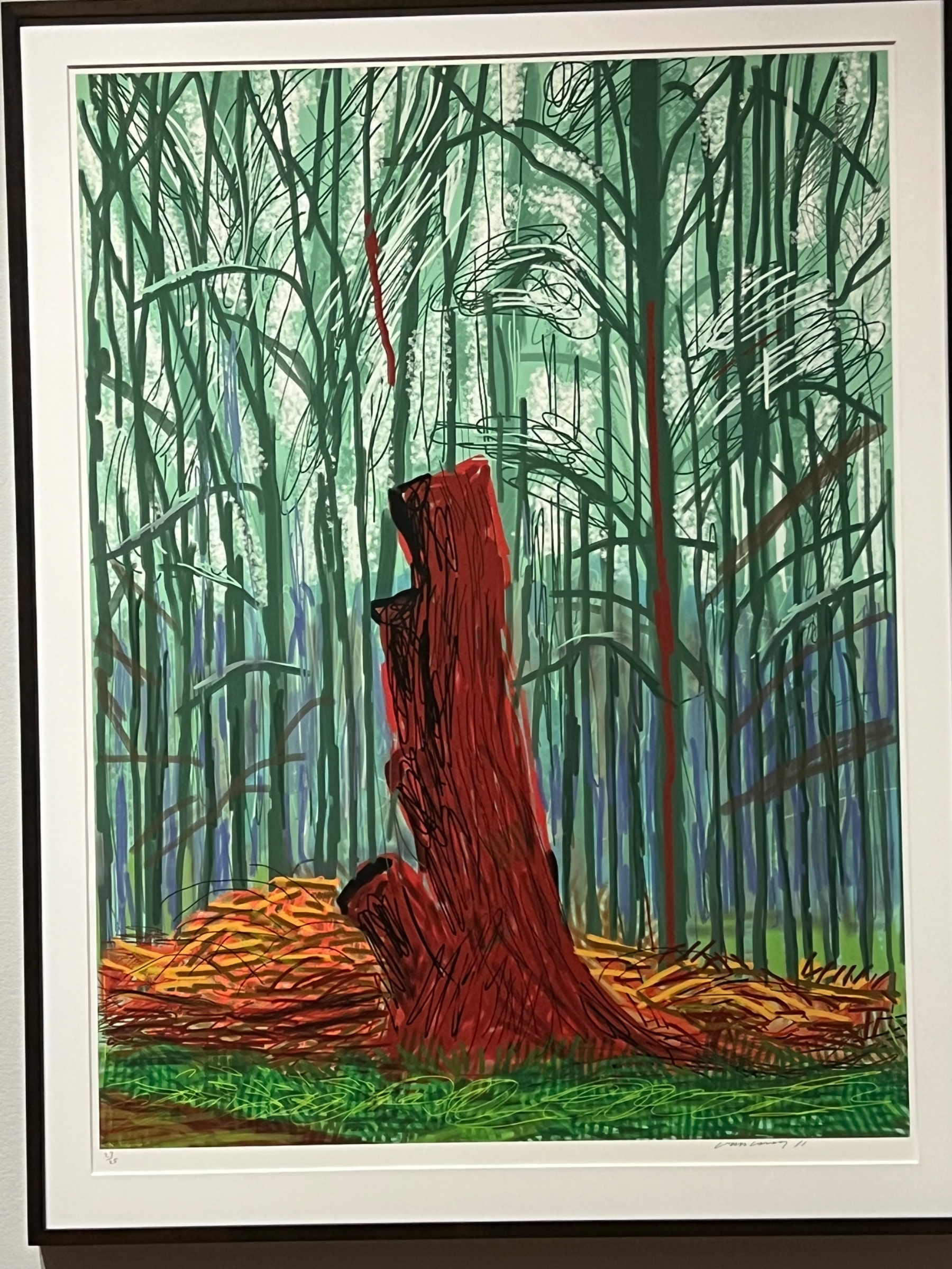
The perceptual pull and the material fact of this piece work against each other from the start. The eye wants heat and depth: red trunk forward, cool forest back, light breaking through somewhere above. That's a body responding to color as space, the oldest trick in landscape painting. But the surface refuses to confirm any of it. No brushstroke, no build-up, no physical evidence of a hand pushing pigment around. Everything is flat, even, printed. The perceptual domain says "forest, depth, weather." The material domain says "surface, edition, mechanism." Those two readings don't fight loudly. They just sit next to each other unresolved.
Cultural and conceptual domains split the same way. Culturally, this belongs in a specific late-Hockney conversation about landscape, technology, and printmaking as a legitimate final medium, not a lesser copy of painting. Conceptually, the same tension surfaces: is this a picture of light in a forest, or a picture of how images of forests get made now? The formal record can't settle that. It can only show that both readings are supported by the same marks.
The most significant unresolved tension: the work asks the eye to believe in a physical woodpile lit by real sun, while the hand of the artist is nowhere in the surface that delivers that belief.
PERCEPTUAL
The eye lands on the red trunk first. Nothing else competes. It's warm against a cold field, and warm colors advance regardless of where they sit in the composition. That's Color Weight and Advancement and Color Opponent Channels working together: red against green is the strongest opponent pair the visual system has, and Hockney (or the image) puts it at full saturation. Simultaneous Contrast pushes the red further than it would go on its own. The eye doesn't have to search. It's told where to look before it has decided to look anywhere.
From there the eye tries to travel up, into the field of thin vertical green and teal lines behind the trunk. This is Rhythm and Repetition, and it functions as a kind of visual rest after the shock of the red: many small, similar, low-contrast events instead of one big one. The repetition also reads as Pattern vs. Figure, background pattern against foreground figure, which is what lets Figure-Ground Relationships stay stable even though there's no atmospheric blur to help.
The heavy black scribbled outline around the trunk does two contradictory things at once. It's an Edge, so it should stabilize the figure. But its quality, described as rough and porous, especially where it breaks at the top, keeps the edge from settling. The eye checks that boundary more than once. That's a small stutter, a place where Contour Quality undercuts Closure instead of completing it.
At the base, the orange-yellow-ochre scribbles read as a different texture register entirely, rougher, more crowded, more separated. This is the Interval Relationships and Detail Density Gradient doing quiet work: mark density increases toward the bottom, which keeps the eye anchored there before it climbs. The pale/white marks clustered in the upper third act as a secondary pop-out, lower contrast than the red, but still a stopping point, and they get read as "light" partly because they're pale and partly because of where they sit, an Elevation in Picture Plane cue standing in for actual atmospheric recession.
The whole image asks the eye to do two jobs that don't fully cooperate: settle on the trunk as a discrete object (Overlap/Occlusion, clean figure), and also read the background as continuous, extending past the frame (Cropping/Framing, elements severed at edges). Both readings are supported. Neither cancels the other. The eye keeps oscillating between "this is a solid thing" and "this is a fragment of something larger."
MATERIAL AND FORMAL
The surface is flat, uniform, without paint texture. Line weight doesn't vary the way a loaded brush or a pressed pencil would vary it. Color sits in even fields without visible layering or build. This is consistent across every account of the work: no impasto, no visible ground, no drag marks, nothing that indicates physical resistance between tool and surface. The signature and edition number in the lower margin confirm what the surface already tells you: this is a print, not a unique painted object.
That changes what "the hand" means here. The looping, scribbled black contour around the trunk looks like drawing, gestural and loose. But it's reproduced with total mechanical evenness. Every scribble is printed with the same flatness as every other mark. The gesture is preserved as image, not as residue. This is the print medium doing something specific: it keeps the vocabulary of the drawn line (the scribble, the loop, the rough edge) while stripping out the physical evidence a drawn line usually carries (pressure change, ink pooling, paper tooth).
Up close, this means the marks won't reward inspection the way a painting's surface does. There's no new information at six inches that wasn't visible at six feet. That's unusual for a landscape image built from what looks like expressive linework. At a distance, the composition reads as woods, light, a fallen or standing red form. Up close, it reads as printed information, evenly deposited.
The physical choices support one thing clearly: economy. Economy of Means as a formal principle, one type of mark per zone (vertical lines for forest, loops for trunk, scattered strokes for brush pile, cross-hatch for grass), each doing one job, none competing with texture for attention. What the material choices don't support is any claim to touch. If the work is asking to be read as an intimate, physical encounter with a place, the surface withholds that. If it's asking to be read as an image of a place, mediated, repeatable, designed rather than felt into being, the surface delivers exactly that.
CULTURAL
One reading of where this sits: late-career Hockney's sustained interest in landscape as a subject that survives translation across media, from oil to Polaroid grids to iPad drawing to print. The forest-with-red-accent structure, the woodpile, the cut trunk, these motifs recur across his output in different technical forms. A viewer familiar with that trajectory would recognize this immediately as part of a body of work about seeing land itself, not about a single unrepeatable mark.
The print format and edition number signal a specific market position: multiple, collectible, priced and distributed differently than a unique painting. That's a legible signal to a print-collecting audience and to institutions that build survey shows around an artist's late output across all media. It is less legible, or actively resistant, to a market logic that still privileges the unique gestural object as the site of authenticity. If a viewer expects "painting equals sincerity, print equals reproduction," this image sits in the more skeptical camp: reproducibility, not scarcity, as a site of value.
The saturated, almost cartoonish red against green, and the loose scribbled contour, could read within a Fauvist-descended color tradition, color used for intensity rather than description. That's a lineage (Matisse forward) that values color as sensation over color as fact. Institutions that valorize that lineage would find this legible immediately.
Hypothesis (insufficient visual evidence): any claim about this specific work's critical reception, market price, or exhibition history would require information outside the formal record. The formal record only supports positioning within stylistic lineage, not institutional outcome.
CONCEPTUAL
The argument in view: an image can carry the full emotional charge of observed landscape (color intensity, spatial recession, natural light) while being made through a completely mechanical, evenly reproduced process. That's a direct challenge to the old assumption that expressive mark-making requires unrepeatable physical contact between hand and surface. Two observations anchor this: the gestural, scribbled contour quality of the trunk edge, and the flat, mechanically even printed surface that reproduces that gesture without variance. The tension between those two facts is the argument, not a flaw in it.
This puts the work in conversation with a long twentieth-century question: can reproduction carry the same conceptual weight as an original mark? Warhol answered that question by making the mechanical repetition itself the subject. This work answers differently: it keeps expressive vocabulary (loose contour, scribbled ground, warm/cool contrast) and asks whether that vocabulary still functions once its physical guarantee (the artist's actual hand pressure) is removed. The Color Opponent Channels and Simultaneous Contrast still work on the eye exactly as they would in paint. Perceptually nothing is lost. Materially everything about authorship-through-touch is absent.
Historical precedent that matters here: Hockney's own well-documented move from oil painting into technological drawing tools, and the broader postwar question (Benjamin's aura argument, restated a hundred times since) about what happens to an image's authority when it can exist in multiples. This piece doesn't resolve that argument. It sits inside it by demonstrating that the perceptual mechanisms of landscape painting (advancing color, contrast-driven focal point, implied light) survive the move into a medium with no unique object at all.
NOISE — CONSOLIDATED
PERCEPTUAL: The contour of the trunk is drawn with such looseness that the eye can't decide if it's looking at a solid, occluding object or a fragment cut by the frame. Sources directly contradict each other on whether the trunk is cropped top and bottom or fully contained. That's not a resolvable question from the image; it's a genuine perceptual ambiguity, worsened by the porous, broken quality of the top edge specifically.
MATERIAL: The gestural vocabulary (scribble, loop, rough edge) implies spontaneous mark-making. The mechanically even printed surface contradicts that implication directly. The marks look drawn but behave like data. This isn't a subtle tension, it's the central material fact of the piece.
CULTURAL: Without direct knowledge of this specific work's exhibition or market history, any claim about how it has actually been received stays speculative. The formal record supports stylistic lineage-placement (Hockney's late landscape/print period, Fauvist-descended color use) but not institutional verdict. That gap is a limit of the available evidence, not necessarily a limit of the work's clarity.
CONCEPTUAL: If the argument depends on the gap between expressive-looking mark and mechanically reproduced surface, the work risks being read simply as "a nice landscape print" by a viewer who doesn't register that gap at all. The conceptual position is legible only to a viewer already primed to ask questions about medium and authorship. Otherwise the surface just looks like a picture of woods.
Intentional versus accidental: the perceptual ambiguity around cropping and the material gap between gestural line and mechanical surface both look like they're serving the conceptual argument, evidence used deliberately across domains. The cultural illegibility (uncertain institutional reception) is more likely an accident of missing information than a designed effect.
Admin
Original: 1800×2400px · 2.5× zoom ceiling — carries the camera