OVERVIEW
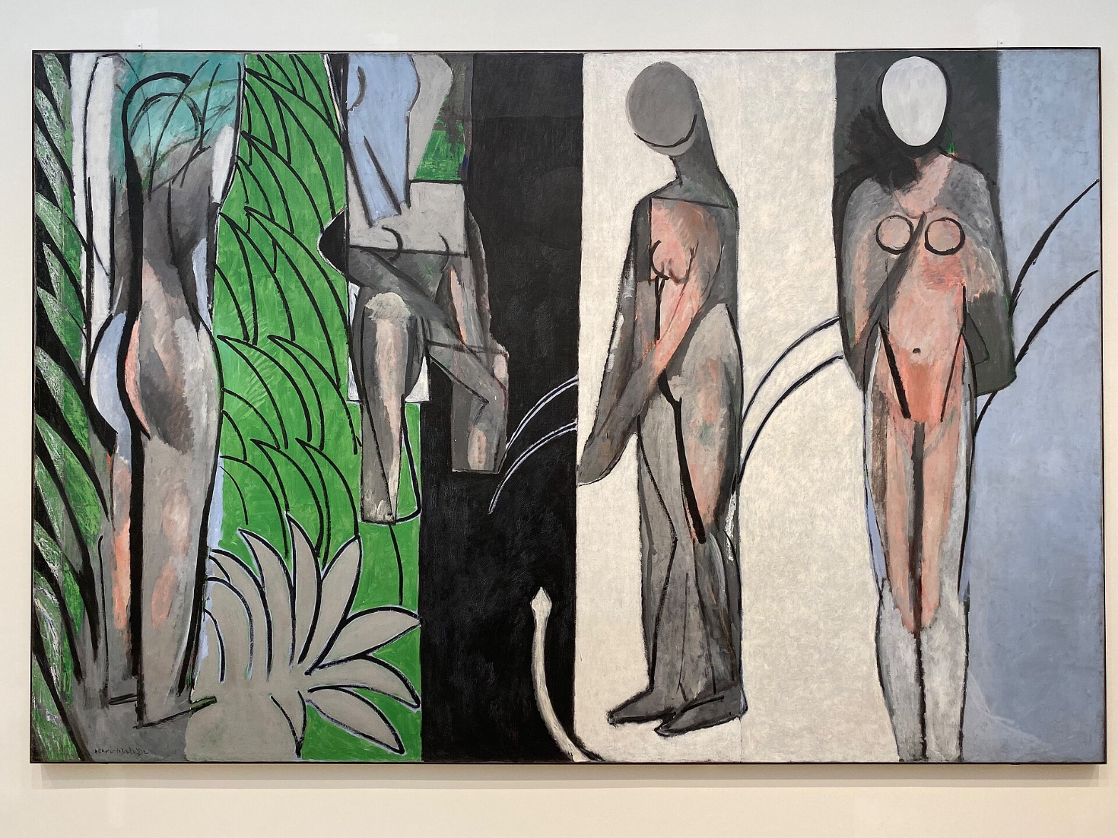
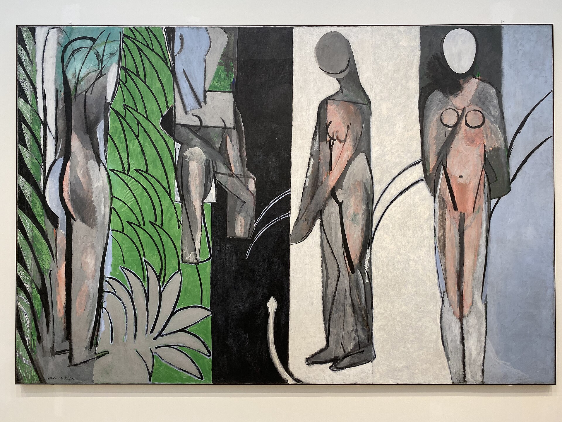
Four vertical panels. Four bodies. A black band anchoring the middle. That much every domain agrees on.
The perceptual and material domains move together. The eye stops at the black band because it is the densest value mass on the canvas; the paint handling confirms this is a deliberate field, not an accident of drying, because the scumbled, chalky surface treats every panel differently, thinning where the ground shows through, thickening at panel edges. The formal structure (Interval Relationships, Value Structure/Massing) is doing the same work the material is doing: both organize the canvas into zones rather than a single continuous space.
The cultural and conceptual domains pull against this stability. A 1917 canvas this large, this blank in the faces, this indifferent to anatomy, is entering a conversation about whether painting still needs to describe a body at all. That argument requires the perceptual thinness (the featureless ovoid heads, the inconsistent contours) to be legible as a position, not a failure of drawing. But the documentation shows contradictions between viewers on basic facts: how many figures stand, how many sit, whether scale is uniform or graduated. If trained observers can't agree on the literal count of standing versus seated figures, the conceptual claim that this ambiguity is intentional becomes harder to hold with confidence.
The tension is this: the perceptual system reads decisively (band, mass, anchor, advancing flesh tone) while the compositional facts underneath that reading are unstable across viewers. The work's confidence at the level of visual weight sits on top of real disagreement at the level of figure count and pose. That gap is the live question.
PERCEPTUAL
The eye lands on the black vertical band first. It is the largest unbroken dark mass on the canvas, and Value Structure/Massing pulls attention there before any figure registers. From that anchor, the eye moves outward along the panel divisions, because the hard, decisive edges between color bands (green, black, white, blue-grey) give it a route to travel. Cropping/Framing turns the canvas into a set of doors the eye walks through one at a time rather than a single field it takes in at once.
Once inside a panel, the eye finds a face. Or what reads as one. The blank ovoid heads have no eyes, no mouth, nothing rendered, yet Face Detection fires anyway. This is a pre-attentive response (Visual Pop-out/Pre-attentive Features): the oval shape and its position atop a vertical body are enough. The mind supplies a face where none exists (Pattern Completion/Closure). This happens fast, before the viewer registers that nothing is there.
The flesh tones do real work. Warm pink and salmon read as advancing against the cooler grey, blue-grey, black, and white fields around them (Simultaneous Contrast, Color Temperature, Color Weight and Advancement). The bodies pop forward optically even though the picture has no modeling, no cast shadow, no perspective to physically push them forward. Depth here is entirely a color effect, not a spatial one.
Contour behaves inconsistently, and the eye feels this as friction. Some edges are hard and confident, panel boundaries, certain limb outlines. Others dissolve into the ground, a leg against a similarly-valued field, a foliage edge that scumbles into nothing. The eye keeps switching strategies: sharp-edge scanning in some zones, soft-edge searching in others. This is Edge Detection working against itself across a single canvas.
Late in the scan, a small curving line near the bottom center or inside the black band gets noticed. It is quiet, easy to miss, and its lateness in the viewing sequence suggests the composition is not built to lead the eye there. It sits outside the main circuit of attention.
The overall request the painting makes is split. The panel structure asks for sequential, compartmentalized looking, one zone at a time. The color advancement of the flesh tones asks for a single sustained read of push-pull across the whole surface at once. Those two requests don't fully align. The eye keeps getting pulled into segments and then asked to hold a whole-field color relationship in mind simultaneously.
MATERIAL AND FORMAL
Oil on canvas, close to nine feet tall and over thirteen feet wide, wider than a city bus, taller than most doorways twice over. At this scale, the physical act of painting required distance and return: no single passage could be seen and adjusted from arm's length while working close.
The surface is dry and chalky in large areas. Paint sits thin in passages, letting the canvas ground or an underlayer show through, which produces a scumbled, matte quality rather than the wet, blended surface associated with Matisse's earlier Fauve handling. This is visible up close as patchy, uneven coverage: some strokes barely tint the canvas, others are laid on more densely at panel edges and around the black band.
The hard edges at panel divisions look deliberate, painted with a steadier hand or masked line. The soft edges, where a limb dissolves into the ground or foliage edges scumble away, look like they were built through repeated overpainting and correction rather than a single confident pass. This unevenness is the surface being honest about a working process that revised itself. Whether these are literal pentimenti (only weakly supported in the observation record) or simply an economy-of-means choice to leave some contours unresolved, the physical evidence supports the idea that different parts of the canvas received different degrees of attention and revisit.
At a distance, the painting reads as four flat color fields with figures. Up close, the surface is inconsistent in density and finish, panel to panel, and even within a single panel. This distance-dependent legibility means the picture asks two different kinds of looking of the viewer: the big read from across a room, the material read of a scumbled, reworked surface from a few feet away. Nothing here contradicts the flatness of the image; the thin, chalky paint reinforces it, since a heavily built, glossy surface would compete with the flat, shallow space the composition already establishes.
CULTURAL
A reading: this canvas belongs to the period when Matisse was pulling away from the saturated, decorative color of his Fauve and odalisque work and testing a colder, more architectonic language, closer in spirit to what Cubism had been doing to the figure though without adopting fracture or facet. The vertical panel structure and flattened, geometric breast markings on the rightmost figure could support a reading that Matisse is answering Cézanne's bathers compositions and, at a remove, the challenge Picasso's Demoiselles posed to the whole bather-in-landscape tradition.
An institution encountering this work, a major museum with a strong modernist holding, would likely recognize it as evidence of Matisse's less decorative, more experimental register, useful for complicating the popular image of Matisse as a painter of pure color pleasure. That's a specific institutional value: the painting is legible as a corrective to reductive Matisse narratives, not as a crowd-pleasing object in the way his cutouts or interiors are.
Where legibility breaks down: a viewer expecting a Matisse of joyous, high-color, and decoratively pleasing surfaces may find this canvas's grey-black austerity and blank faces uninviting, even punishing. Hypothesis (insufficient visual evidence): this refusal of pleasure may be read as a deliberate rejection of the market appetite that had formed around his prewar work, though the documentation gives no direct evidence of market or reception context to confirm intent.
CONCEPTUAL
A reading: the painting argues that the figure can be reduced to a set of flat, colored intervals and still trigger the recognition systems attached to bodies and faces. The blank ovoid heads that nonetheless read as faces (Face Detection, Pattern Completion/Closure) support this argument directly: the work is testing how little information a face requires before the mind fills in the rest. That's a specific claim about representation, not a general modernist gesture.
This puts the painting in dialogue with the broader early-twentieth-century question of how much illusionistic apparatus, modeling, perspective, cast shadow, a figure painting actually needs. The flat, shallow space, the reliance on overlap and color advancement rather than depth cues, and the panel-based Cropping/Framing all support a position that composition through color interval can replace composition through spatial description. Cézanne's late bather compositions are the direct precedent for organizing bodies within a landscape as color masses rather than modeled forms; this canvas pushes that logic further toward abstraction while keeping the body recognizable.
The inconsistent contour quality, hard at panel seams, dissolving at limb edges, may support a further claim: that finish itself is being treated as optional, applied only where the composition needs a hard stop and withheld where the eye is expected to complete the form itself. Hypothesis (insufficient visual evidence): the pentimenti-like passages may be intended as visible argument for painting-as-process rather than painting-as-finished-object, but this reading rests on a single weakly corroborated observation and should be held loosely.
Where the argument strains: if the four figures' scale and pose are genuinely inconsistent across careful viewings (contradicted in the documentation itself), then the claim that this is a controlled, reasoned system of intervals is harder to sustain. A conceptual argument about rigorous flatness and interval logic wants internal consistency; the recorded disagreement about seated versus standing figures suggests the picture may not fully deliver that consistency, or at least doesn't make it unambiguous to every viewer.
NOISE: CONSOLIDATED
PERCEPTUAL: The panel structure asks for sequential, zone-by-zone looking; the color advancement of the flesh tones asks for a simultaneous whole-canvas read. These two attentional modes conflict, and the eye has to switch between them rather than settle into one.
MATERIAL: The hard, decisive panel-edge painting sits against the soft, dissolved, reworked-looking limb and foliage contours. One passage of the canvas argues for control and finish; another argues for revision and unfinishedness. The surface doesn't resolve which mode governs the whole.
CULTURAL: The painting's austerity and blank faces make it hard to read within the popular image of Matisse as a colorist of pleasure, which may block it from being read clearly by an audience expecting that Matisse. Whether this is a deliberate departure from market expectation or simply the result of the period's aesthetic experiments is not something the visual evidence alone can settle.
CONCEPTUAL: The argument for a rigorous, interval-based reconstruction of the figure depends on internal consistency of scale and pose that the documentation itself shows disagreement about. If viewers can't agree on how many figures stand versus sit, the claim that the picture is a controlled system rather than an ambiguous one is weakened by the same evidence meant to support it.
The panel-edge versus dissolving-contour conflict in material handling likely serves the conceptual argument about optional finish; the cultural illegibility to a pleasure-seeking audience may be a genuine byproduct of the period's experimental turn rather than a calculated position, and the scale/pose disagreement across viewers looks like accidental interference the painting itself hasn't resolved.