OVERVIEW
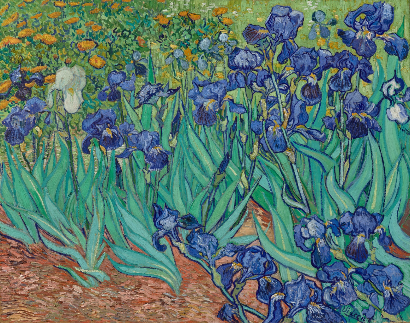
The perceptual system and the material system agree with each other almost completely. The eye goes to the blue-violet cluster because the paint handling builds it that way: tight contour lines, high saturation, complementary push against the orange dabs above. Whatever the brush did, the eye follows.
The cultural and conceptual domains introduce friction the paint surface doesn't resolve. A painting made inside an asylum garden, cropped like a fragment of a larger field, sits oddly against the market and institutional afterlife this specific canvas has had. The conceptual question of what "finish" means in 1889 is not answered by the image. It's raised by it.
The one real cross-domain tension: the white iris. Perceptually it's a pop-out point, plain and simple, a break in a mostly-blue field. Read culturally or conceptually, that same white flower invites a biographical projection (isolation, singularity) that the visual evidence alone can't carry. The eye finds it instantly. What it means is a separate, weaker claim.
The unresolved question the work sits inside: is the cropping and fragmentation a formal decision about the picture plane, or a trace of something outside the frame the painting doesn't show. The canvas doesn't say.
PERCEPTUAL
The eye lands on the blue-violet cluster first. Three independent formal facts explain why: the cluster occupies the right two-thirds of the canvas, it carries the highest saturation in the picture, and it sits against the orange dabs above it in direct complementary opposition. That's Color Opponent Channels doing basic work, intensified by Simultaneous Contrast at the edges where blue touches orange directly.
From there the eye doesn't stay put. The white iris left-of-center breaks the pattern. It's a clean case of Visual Pop-out: everything around it is saturated blue-violet, this one thing isn't, and the eye jumps to it involuntarily before any reading of "meaning" happens. This is a pre-attentive grab, not a narrative one.
Edges do a lot of the directing. Petal and stem contours are dark, crisp, closed. Background leaves and orange flowers dissolve into softer, broken marks. That's a Detail Density Gradient paired with Focal Blur logic: the eye reads the crisp zone as near and important, the loose zone as far and secondary, even though there's no actual atmospheric haze in the paint. It's Elevation in Picture Plane substituting for linear perspective. Lower in the frame reads as close. Upper reads as far. No vanishing point does this work. Position does.
The bottom rust-colored strip acts as an anchor, a stable horizontal band the eye can return to after wandering the busier upper register. The cropped edges (blooms cut by the frame on the right and elsewhere) push against that stability. They imply the field of irises continues past what's shown, which keeps the eye slightly unsettled at the boundaries even while the center holds firm.
The directional brushwork adds movement without adding narrative. Long sweeping strokes in the leaves create Directional Force running diagonally through the lower half. Curved, twisting strokes in the petals create small local rotations. Neither stroke pattern points anywhere in particular. They keep the eye moving inside the cluster rather than sending it out of the frame.
Net effect: the eye is pulled hard to one region, held there by contour and saturation, given one escape valve (the white flower), and let go loosely at the framing edges. It's a tight perceptual circuit, not a wandering one.
MATERIAL AND FORMAL
Oil on canvas, worked with visibly directional strokes that differ by botanical part. Long strokes for the sword-shaped leaves, following the actual growth direction of iris foliage. Curved, twisting strokes for the petals, echoing how iris petals fold and ruffle. Short choppy strokes for the earth. The brush is doing descriptive work, not just texture work. Each stroke type maps to a different physical structure in the subject.
The dark contour lines around petals and stems are a separate pass from the color fill, laid on to hold the shape together, most likely applied after or alongside the color strokes to keep the graphic edge crisp. That's a deliberate hierarchy: outline for near/important forms, no outline (or dissolving outline) for background forms. The paint is honest about this decision. You can see where control was applied and where it was relaxed.
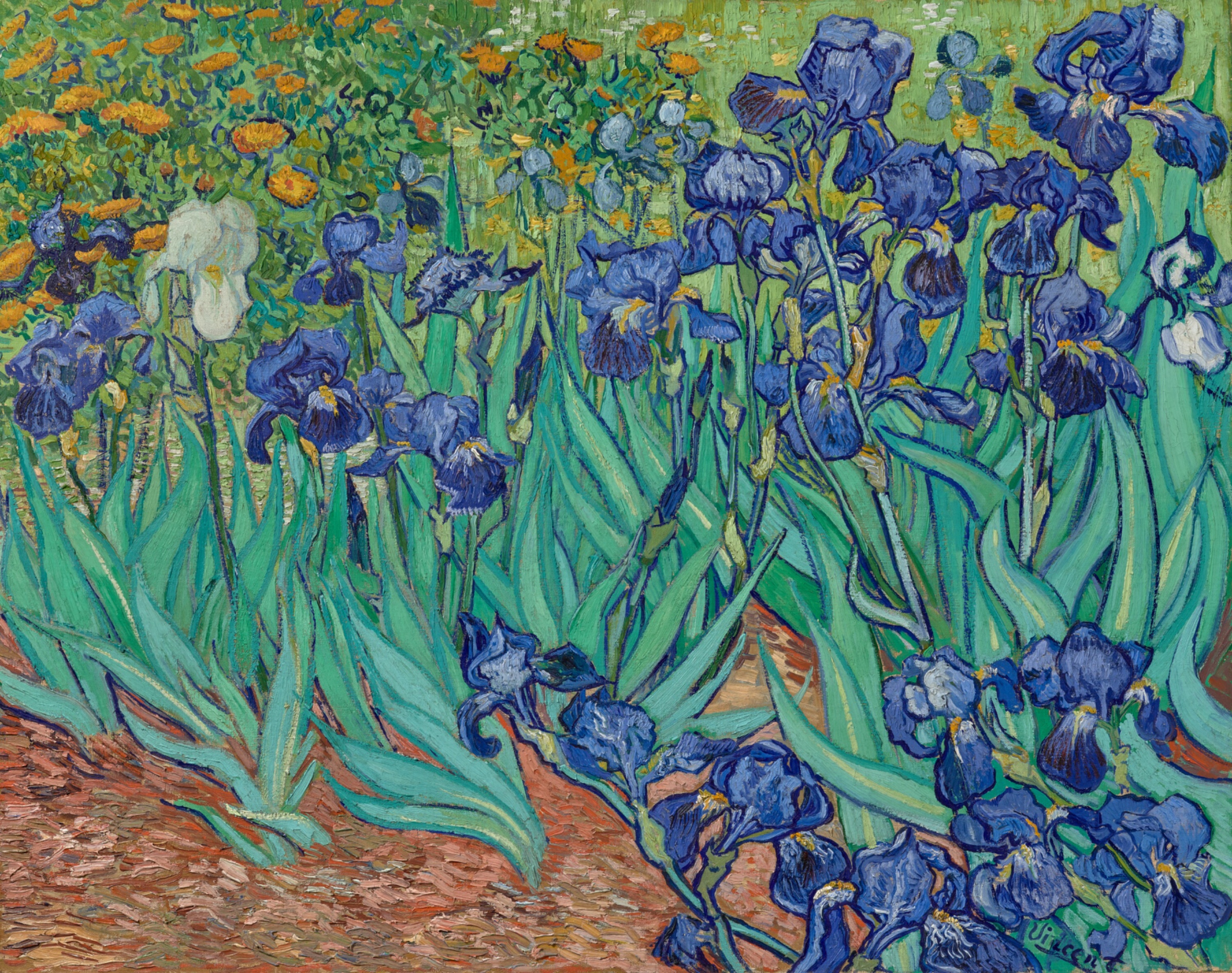
Up close, the surface would show impasto ridges, especially in the thicker petal strokes, catching real light rather than painted light. That's a physical, not illusionistic, source of highlight in the darkest petal interiors and the white iris. At a distance those ridges disappear into color relationships. The work asks two different things of the viewer depending on distance: up close, read the ridge and the stroke; at a distance, read the color mass and the contour shape.
Nothing in the material handling contradicts what the eye is doing. The tight control on the irises and the looser handling in the background aren't fighting each other. They're reinforcing the same hierarchy the perceptual system already found. The signature, dark paint in the lower right against foliage, is a small anchor point but a minor one. It doesn't compete with the main visual event.
CULTURAL
One reading of this work's cultural position: it belongs to a moment when garden and flower subjects carried lower institutional prestige than history painting or portraiture, and van Gogh's late-career choice of this subject can be read as a deliberate move into a modest genre rather than a compromise. The cropped, field-like composition, flowers cut by the frame edges, breaks with the centered, contained bouquet tradition of still-life painting that came before it. That cropping could read as an engagement with photographic framing conventions circulating in the 1880s, or with Japanese woodblock composition, both of which van Gogh is known to have engaged with elsewhere. That connection isn't visible in this image alone; it's a position drawn from the wider context of his practice, not from this canvas.
The Getty's ownership of this specific painting places it inside one of the most visible collecting institutions in the world, a context that trades heavily on van Gogh's market value and biographical mythology. That institutional frame is legible to a general museum audience immediately: this is presented and received as a major single-owner trophy work. It's also a frame that can flatten the painting's specific formal decisions (the cropping, the color logic) into generic "van Gogh" branding recognition, where the name does more work than the picture.
Whether the white iris carries any coded personal meaning (solitude, difference) is a common popular reading. There isn't enough in the visual record here to support that as more than a hypothesis. Hypothesis (insufficient visual evidence): the white iris stands for personal isolation. The formal evidence supports pop-out, not biography.
CONCEPTUAL
One position the painting can be read as taking: color relationship carries more structural weight than drawing or perspective. The complementary blue-violet/orange pairing, intensified through Simultaneous Contrast, does the job that a vanishing point or modeled volume would do in an academic painting. This lines up with Post-Impressionist and specifically van Gogh's own stated interest (from his letters, outside this image) in color as an expressive and structural tool rather than a purely descriptive one. The picture's own logic, contour plus flat color mass rather than tonal modeling, supports that reading directly.
The cropping argument is a second live position. Cutting blooms at the frame edges refuses the closed, self-contained bouquet composition inherited from Dutch still-life painting. Whether that's a conceptual argument about the world extending past the frame, or simply a compositional device to fill the canvas with maximum density, the image doesn't decide for us. Both are plausible; the formal evidence (dense packing, cropped edges, no visible container or table for the flowers as a "cut bouquet") tilts slightly toward "field fragment" over "arranged bouquet," but not conclusively.
A weaker, harder-to-support position: that the loosening of edges toward the background enacts a philosophical claim about attention and hierarchy, that some things matter and some don't, formally encoded. This is plausible given the Detail Density Gradient observed, but it requires only one type of evidence (the edge behavior itself) to support a fairly large claim about intention. Hypothesis (insufficient visual evidence): the edge dissolution is a stated argument about perceptual hierarchy rather than a practical/economical way of handling secondary elements quickly.
NOISE: CONSOLIDATED
PERCEPTUAL: The three source passes disagree on where the eye "finally rests," some say the signature, some say back to the white flower, some say scattered final details. This isn't a conflict in the image; it's a conflict in tracking eye movement after the first fixation, which is inherently less stable than first-glance data. The first-second read (blue cluster, then white pop-out) is solid. What happens after second three is genuinely ambiguous.
MATERIAL: No real fighting here. The only friction is interpretive, not physical: is the edge dissolution in the upper register "optical blur" (an implied depth-of-field effect) or just faster, less resolved brushwork with no optical claim attached. The paint doesn't resolve this distinction; it's a naming problem for the analyst, not a defect in the canvas.
CULTURAL: The Getty's institutional weight and the painting's own modest, unglamorous subject (a garden bed, cropped and cut) pull against each other. A viewer arriving expecting "masterpiece" branding may not register the specific formal argument (color-over-drawing, cropped field) the picture is actually making. The name of the artist and the size of the institution can outrun the specific visual argument on the canvas.
CONCEPTUAL: The strongest argument the painting supports, color structuring the composition instead of linear perspective, is well anchored. The weaker argument, that background looseness carries a stated philosophical position rather than being practical economy of means, is thin. Presenting both at equal weight would be the actual error here, not a fact about the painting.
Most of this noise is accidental, a byproduct of separating first-glance perception from later interpretation, and of an institution's reputation outweighing a specific canvas's specific choices. The one piece that may be intentional, in the sense of belonging to the artist's own working logic rather than to later reception: the tight contour control on the irises against the loose handling of the background, which serves the perceptual hierarchy on purpose, whatever else gets projected onto it later.