OVERVIEW
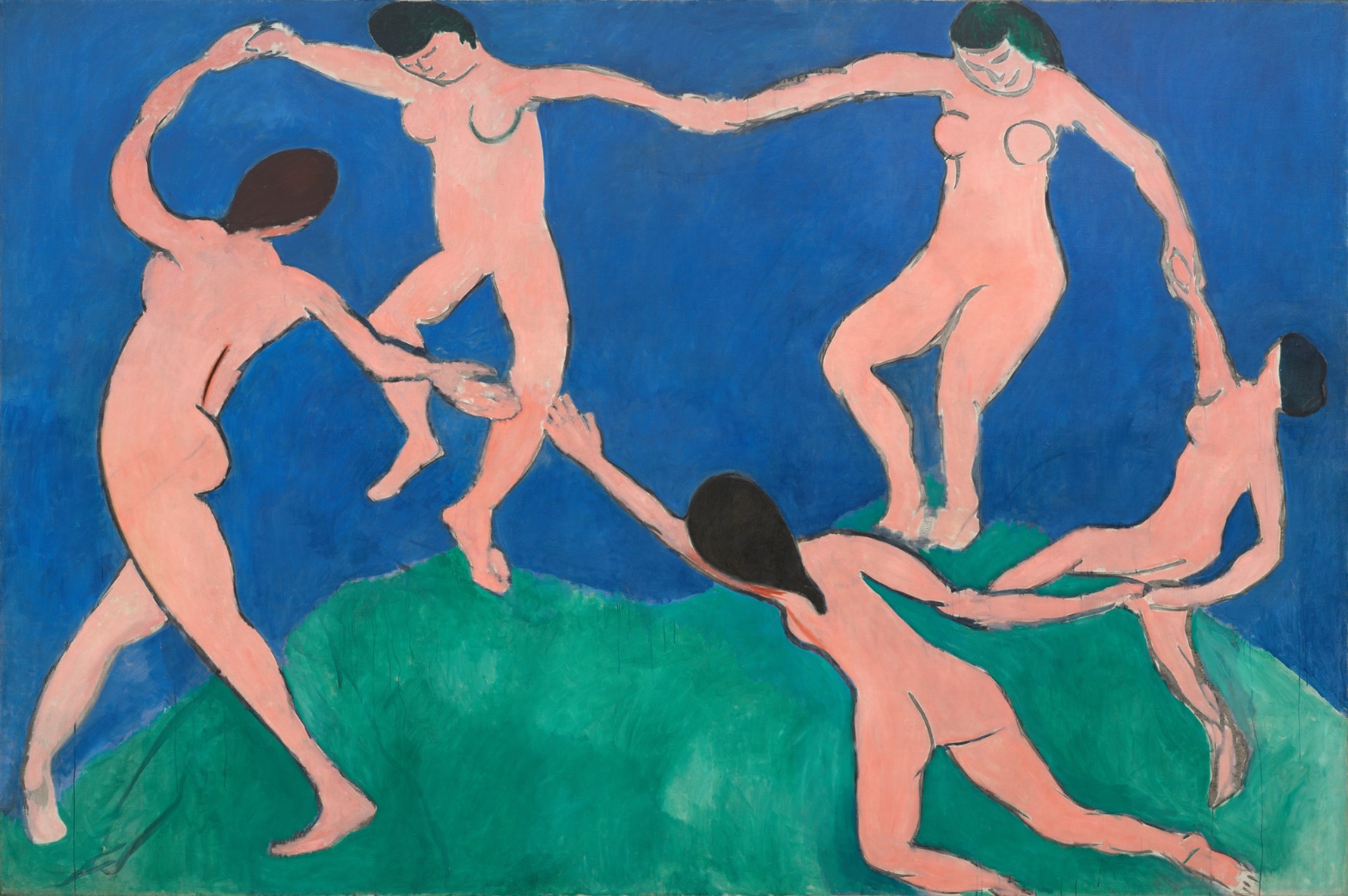
Five bodies, two color fields, one canvas over eight feet tall. The perceptual system reads motion instantly: bent knees, arched backs, a ring of linked hands. The material system complicates that read: brushwork is visible, contours double back on themselves, drips run down the surface. The eye wants continuous rotation. The hand shows correction and hesitation. That's the first friction.
Cultural and conceptual domains pull toward each other more than they pull toward the perceptual. A reading of this work as a rejection of Salon finish, a rejection of narrative subject matter, and an assertion of color as structural rather than descriptive, is consistent with what the surface shows: flat unmodulated fields, economy of means in the faces and hands, a circle that doesn't close. But the conceptual argument (color and rhythm replace illusionism) depends on the viewer accepting the visible seams as intentional rather than as unfinished labor. The material record doesn't resolve that. It just shows the seams.
The unresolved tension: the picture asks to be read as instant, total, and continuous, an unbroken ring of dancers, while everything the hand actually did (the gap between two hands, the corrected contours, the soft green-blue boundary) insists on sequence, revision, and incompletion.
PERCEPTUAL
The eye lands on the warm pink figures first. Pink against saturated blue is a straightforward case of Color Opponent Channels and Visual Pop-out: the flesh tone advances, the blue recedes, and there's no gradation in either field to slow the read. That advancement is immediate, before any figure is individually identified.
Once the figures register, Biological Motion Detection takes over. Bent knees, one arched back, arms reaching past the frame edge: the body recognizes dance before the mind names a single pose. This is fast and automatic. The eye doesn't linger on anatomy because there's almost nothing to linger on. Economy of Means keeps faces and hands reduced to a few strokes, so attention doesn't stall there. It moves along the chain of bodies instead, following Directional Force implied by each limb's angle.
The ring almost closes. It doesn't. Two hands don't quite meet, and that Interval Relationship becomes the one place the eye stops and holds. Pattern Completion pulls toward closure; the actual gap resists it. That's the single strongest point of Visual Tension in the piece, stronger than any color contrast.
Cropping at the canvas edges (a foot, a hand cut by the frame) extends the implied action past the picture boundary, so the circle reads as larger than what's shown. That reinforces continuous rotation even as the hand-gap denies full closure. The two effects don't cancel each other. They coexist: the eye is asked to see an endless ring and a broken one at the same time.
The bottom edge, where green meets blue, is soft and irregular against the hard contour lines everywhere else. That edge doesn't compete for attention. It sits below the action, a loose horizon that stabilizes the ring without pulling focus from it.
MATERIAL AND FORMAL
Oil on canvas, over twelve feet wide, taller than a doorway. At that scale the work is built to be seen from across a room and to be seen up close, and those two viewing distances show different things.
From a distance, the surface reads as flat, poster-like color: two skies of blue and green, five uniform pink bodies. Up close, the flatness breaks down. Brush texture is visible in the blue and green fields. The blue-green boundary at the bottom is handled wet-into-wet, not drawn, a passage where paint was worked rather than bounded. Contour lines around the figures show doubling and correction: a line drawn, reconsidered, redrawn slightly off from the first mark. Drips are present and left visible.
This is a surface that doesn't hide its own making. The correction marks around limbs and joints show a hand testing position directly on the canvas rather than transferring a resolved drawing. The flatness of the color fields is a deliberate flatness, applied broadly and evenly, but the edges of that flatness are handled loosely, especially where colors meet each other rather than where color meets figure.
There's a real disagreement here between two kinds of edge: the figure-to-ground boundary is crisp and drawn, almost graphic; the ground-to-ground boundary (blue to green) is soft and painted. That's not an oversight distributed evenly across the canvas. It's localized. The body outlines carry the weight of definition. The landscape doesn't.
CULTURAL
A reading of this work as a rejection of academic finish is supported by the flat unmodulated color and the visible correction marks; a Salon jury of 1909 would have read the surface as unresolved, not as considered abstraction. That rejection places the work inside an early-twentieth-century argument (shared with Fauvism and with Matisse's own prior canvases) that color intensity and flat design can replace tonal modeling as the primary carrier of a picture.
One reading of where this work sits institutionally: it belongs to the small set of paintings that get treated as arguments for modernism itself inside museum collections, hung as evidence that decorative flatness and bodily rhythm can carry the full weight a history painting once carried. That's a possible position, not a settled fact about this canvas alone; it depends on how MoMA and prior owners have actually used the object, which is knowledge beyond the image.
The nudity, the circular dance, and the absence of any narrative attribute (no costume, no setting detail, no mythological marker) would have been legible in 1909 as a move away from subject-based painting and toward a painting whose subject is bodily rhythm and color relationship. To an audience trained on academic figure painting, that illegibility is likely a deliberate transgression rather than a failure: the economy of means in the faces removes the possibility of reading individual character, which pushes attention toward the group shape instead.
CONCEPTUAL
The flattened color fields, the Economy of Means in facial and hand rendering, and the unbroken ring of figures together support a reading that this work argues for decorative and rhythmic structure over illusionistic depth. That argument sits inside a broader early-modernist position: painting doesn't need to describe a believable room in order to carry weight; it can organize the eye through color advancement and repeated bodily rhythm instead.
The unclosed hand-gap complicates that argument rather than weakening it. If the ring closed perfectly, the picture would argue for pure formal unity, a closed pattern with no friction. The gap keeps a trace of individual bodies and individual will inside the pattern. One reading: the painting argues that group rhythm and individual separateness coexist, that unity is asserted through motion and repetition even while full physical connection is withheld.
Historical precedent worth naming: this canvas is often discussed alongside Matisse's own preparatory studies and alongside the broader turn away from Cézanne's structural, volumetric bodies toward a linear, flattened figure. The visible pentimenti support a reading that the artist was working out the ring's geometry directly on this canvas rather than importing a fixed design, which matters for how the "argument" of unbroken rhythm gets read: the rhythm was arrived at, not given in advance.
NOISE: CONSOLIDATED
PERCEPTUAL: The cropped limbs suggest continuous, larger motion beyond the frame; the unclosed hand-gap suggests interrupted, incomplete motion within the frame. Both readings are active in the same image and the eye doesn't get to settle on one.
MATERIAL: The crisp, decisive contour around each figure sits against the loose, corrected, drippy handling of the same contour lines under close inspection. Distance flattens the picture into clean graphic design; proximity shows a worked, revised surface. Those two views of the same object don't agree.
CULTURAL: The absence of any narrative marker (setting, costume, identifiable myth) strips the audience of the usual entry point for figure painting. For a viewer expecting subject matter, that absence reads as withholding rather than as invitation, which limits legibility outside a modernist-trained audience.
CONCEPTUAL: The argument for total rhythmic unity is undercut by the deliberate incompleteness of the ring. The picture can't simultaneously claim perfect formal closure and visible individual separateness without leaving that claim unresolved on the canvas itself.
The cropping and the hand-gap are very likely intentional, serving the perceptual tension the piece is built on. The disagreement between distance-view flatness and close-view revision reads more like the residue of the work's actual making than a calculated device.