There's no Front Door read for this one yet.
Go deeper
OVERVIEW
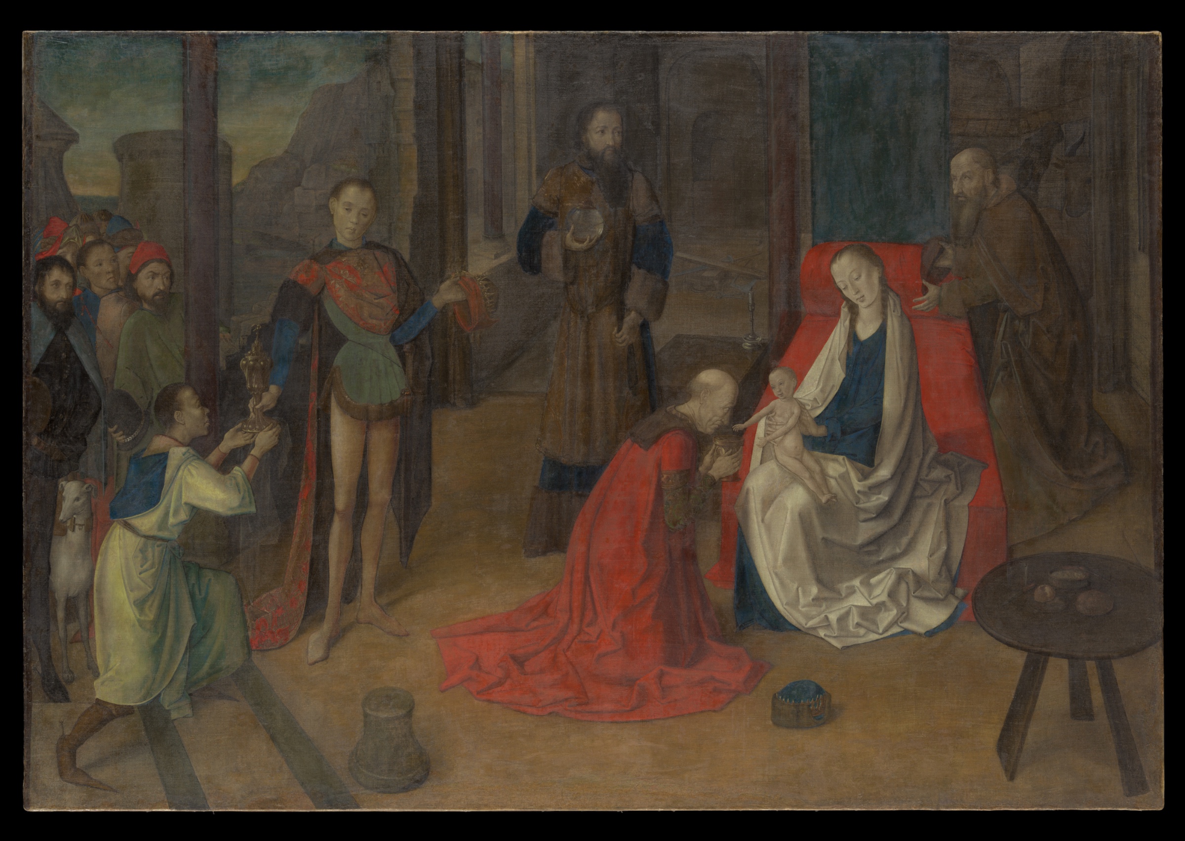
The eye moves fast in this picture. Red robe, pale child, white mantle — the circuit closes in under a second. The paint handling doesn't slow that circuit down. It's smooth, thin, built for legibility, not for resistance. Perceptual pop and material technique agree with each other. Both point at the child.
The cultural and conceptual domains complicate that agreement without breaking it. This is a devotional object first. Its job is to organize attention around a theological event, not to reward optical dwelling. Read that way, the perceptual clarity isn't decoration — it's function. The eye goes where the doctrine needs it to go.
The tension shows up at the edges of the record, not the center. Contradicted light-source readings and disputed proportions (gemini's elongation claims vs. anthropic/openai's naturalism) suggest the image doesn't fully commit to one internal logic — hard raking light in one passage, softer front-lighting in another. That's a real formal seam, not just observer disagreement. It sits underneath the confident central read without disturbing it.
The live question: whether this is a single unified pictorial system aimed at one convergence point, or several locally-resolved passages (a lit face here, a raking edge there, a naturalistic figure next to a slightly stretched one) stitched into a compositional whole that reads as unified only because the subject demands it to.
PERCEPTUAL
The red robe hits first. It's the largest saturated shape in the field, and saturation wins before anything else gets processed — pure Visual Pop-out / Pre-attentive Features. The eye doesn't reason its way there. It just lands.
From the red, the eye is handed off. The kneeling figure's head and offered vessel point toward the child — Directional Force/Implied Movement, reinforced by Gaze Direction / Social Attention from the seated woman and the standing onlookers. The child is the palest value in the composition, so Value Structure/Massing pulls the eye there independently of the directional cues. Two separate mechanisms — color pop and value contrast — both terminate at the same point. That's why the convergence feels inevitable rather than staged.
Once there, the eye doesn't stay locked. Crisp edges on the foreground faces and hands (Edge Detection / Contour Quality) give the eye a place to rest and then release, moving along the receding floor bands and columns (Linear Perspective) into the crowd at left, where edges soften and dissolve (Detail Density Gradient, Atmospheric Perspective). The cropped white dog at the frame edge is a stopping point that isn't a resolution — Cropping/Framing cuts the narrative off rather than closing it, which keeps the eye circling back toward center rather than exiting.
The one friction point: reported light direction isn't stable across the image. If raking light hits some passages and soft frontal light governs others, the eye gets inconsistent cues about where the "true" source sits — a small but real disruption in Light Source Logic under an otherwise clean compositional read.
MATERIAL AND FORMAL
Distemper on canvas. That's a fast, thin, water-based medium — no build, no impasto, no drag. The paint sits in the weave rather than on top of it; canvas texture shows through in thin passages. That's consistent with distemper's physical behavior: it doesn't allow heavy reworking, so the surface stays close to the support.
This flatness is honest about process. Nothing here fakes volume through thick paint. Volume is built entirely through tonal gradation — the "smooth, thinly built" surface noted across all runs is the direct result of the medium, not a stylistic overlay on top of a different material logic. The hand worked fast, in washes, committing early.
This creates a real material-perceptual alignment: because there's no surface incident (no visible brushwork, no impasto ridges) to catch light or attention, the eye isn't distracted by texture at any viewing distance. Up close, you get thin, matte, weave-revealing paint. At distance, you get the same tonal massing that organizes the composition. The material doesn't perform differently depending on how close you stand — which is unusual, and which supports the perceptual clarity rather than fighting it.
Where the material logic gets tested: distemper doesn't sustain contradictory light logics well, because it can't hide reworking. If two passages carry different implied light sources, that's not concealed by surface — it's sitting right there in the thin paint, visible as an actual construction inconsistency, not just an interpretive disagreement between viewers.
CULTURAL
This is a 1470s devotional narrative panel-turned-canvas, working inside the workshop-and-altarpiece economy of Northern/Netherlandish-adjacent production. One reading: the Metropolitan's institutional framing places it as an example of Netherlandish naturalism moving into Italian or transitional visual territory — distemper on canvas is itself an unusual, somewhat provincial choice relative to panel painting, which was the higher-status support at this date.
The audience this work needs to reach isn't primarily an optical audience — it's a devotional and liturgical one. Legibility of narrative (who kneels, who watches, where the vessel goes, where the child's attention pulls the room) matters more than painterly virtuosity for that audience. The composition's clarity — red robe, pale child, converging gazes — is legible to exactly that community: clergy, patrons, congregants trained to read Adoration iconography quickly.
For a modern museum-going public, the cultural signal is different. It reads as "early Renaissance devotional object," valued now for historical position and material rarity (distemper on canvas survives poorly; this is part of why the object has institutional weight) rather than for painterly innovation per se. One possible reading: its market and scholarly value rests more on rarity of support and technique than on the pictorial ambition itself. That's a position, not a settled fact — it would require reception history the image alone can't supply.
CONCEPTUAL
The work sits inside the Northern devotional tradition of organizing a sacred narrative through legible spatial and gestural logic — this is the same conceptual project as most quattrocento Adorations: make the theological event readable as physical event. Kneeling, offering, gazing, holding — these are all Postural Affect and Gaze Direction doing doctrinal work, not just compositional work.
The argument the picture makes: sacred significance is legible through ordinary perceptual mechanisms — color, gaze, gesture — without needing symbolic distortion of scale or space to signal holiness. That's a specific position relative to earlier medieval conventions, where hierarchy of scale (bigger = holier) was a live device. If this picture largely avoids that (as anthropic/openai suggest, against gemini's elongation reading), it's taking the naturalizing position: sanctity shown through composition and attention, not through size distortion.
The unresolved proportion dispute matters conceptually. If the child really is subtly elongated, that's a residue of older symbolic-scale thinking surviving inside an otherwise naturalistic system — the picture arguing two things at once without fully choosing. If it's naturalistic throughout, the picture is more conceptually unified: full commitment to attention-based sacred signaling.
Hypothesis (insufficient visual evidence): the picture is using naturalistic register precisely to make the miraculous event feel historically real rather than symbolically remote — this would require textual/doctrinal context the image alone doesn't supply.
NOISE — CONSOLIDATED
PERCEPTUAL: Light source direction is reported inconsistently — raking hard light in some accounts, soft frontal light in others. This is a real conflict in Light Source Logic, not just an observer disagreement, since it affects how edges and volumes are read across the same figures.
MATERIAL: Distemper's thinness means any inconsistency in the underlying drawing or light logic is visible, not buried. The surface can't cover a construction seam. If two lighting logics exist, the material has no capacity to reconcile them.
CULTURAL: Distemper-on-canvas is a lower-status/lower-durability material choice relative to panel painting at this date. This may make the work harder to place confidently within the "major altarpiece" category that its subject and scale suggest — a mismatch between ambition of subject and modesty of support.
CONCEPTUAL: The proportion dispute (naturalistic vs. elongated child/figures) means the work may be arguing for full perceptual naturalism while still carrying a residual symbolic-scale device. That would undercut the very naturalizing argument the composition otherwise seems to make.
Most of this noise looks accidental — a function of condition, attribution uncertainty, and viewer disagreement — rather than a deliberate device serving a second domain; the one possible exception is the cropped dog and compressed left-edge crowd, where Cropping/Framing may be a genuine compositional choice to keep the eye from exiting the scene.
Admin
Original: 2400×1703px · 2.0× zoom ceiling — carries the camera