There's no Front Door read for this one yet.
Go deeper
OVERVIEW
The four domains mostly agree here. The perceptual pull toward the column, the material logic of small-panel oil painting, the cultural slot of Dutch church-interior painting, and the conceptual argument about looking all point the same direction. This is not a work built on internal contradiction. The tension that exists is quieter: between the painting's claim to record a specific, particular place and the actual instability of its own spatial logic — the vanishing point, the light source, and the column's position all shift depending on which observer you trust. The eye is told to trust the architecture as fact. The architecture doesn't fully cooperate. That's the live seam.
PERCEPTUAL
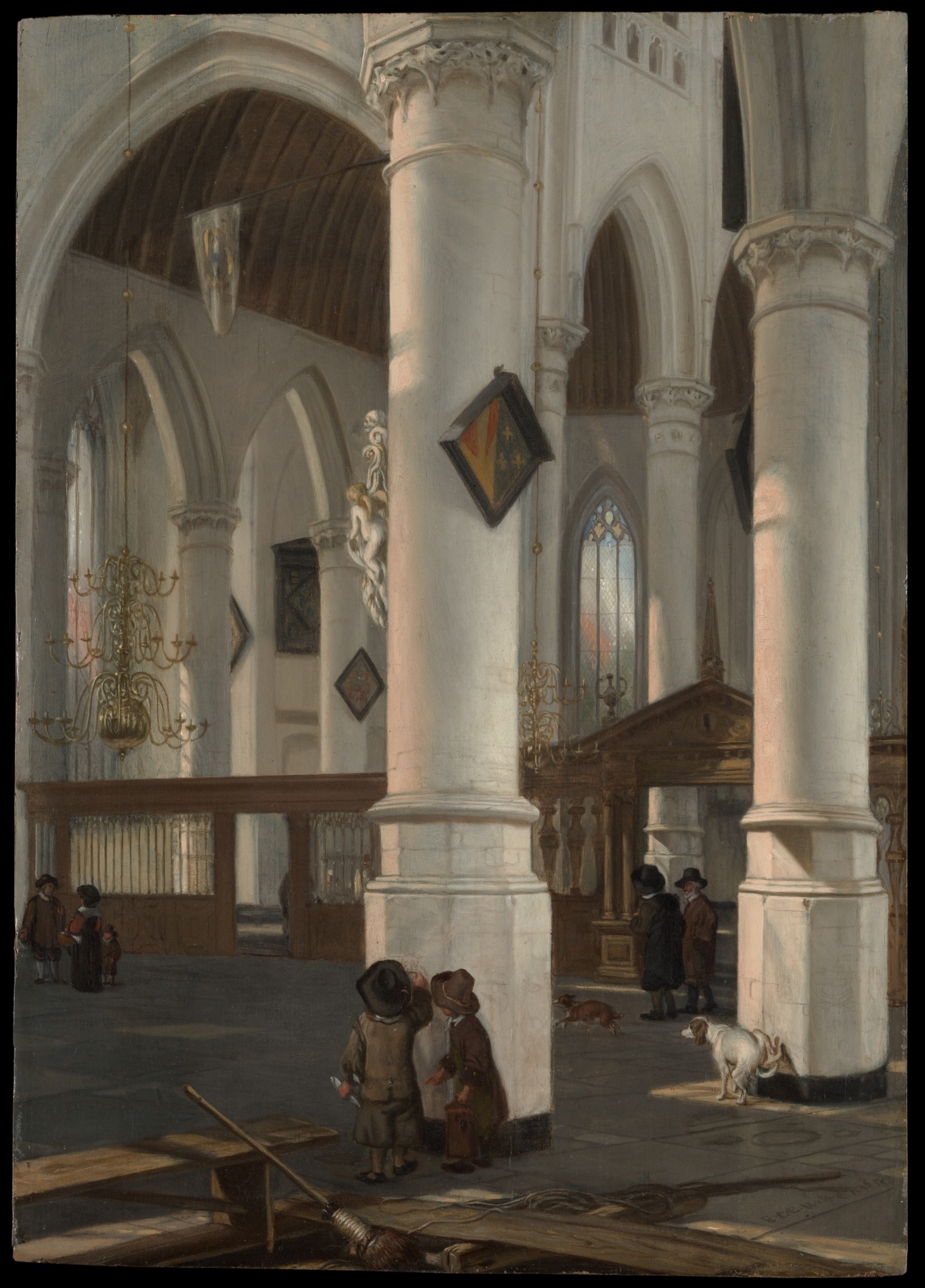
The eye lands on the pale column first. It's the largest mass, the lightest value, closest to the viewer, and it's cropped at the top — Cropping/Framing pulls it into the viewer's own space rather than letting it sit as a distant object. Anchoring and Reference Points does real work here: everything else in the composition gets measured against that cylinder.
From the column, the heraldic shield acts as a Visual Pop-out. Small, saturated, dark-bordered against pale stone — the eye catches it fast, almost against its will, before returning to the larger architectural read. That's a deliberate-feeling interruption in an otherwise cool, low-saturation field.
Then the eye follows the Linear Perspective lines — arcades, ribs, floor joints — back into the nave. This is the slow, steady pull of the painting: a Directional Force running from foreground column to background vanishing point. The Value Structure/Massing (pale stone against dark timber ceiling) reinforces that recession — light architecture up close, shadow and depth further back.
Along the floor, the eye picks up small dark notes — figures, dogs — read through Figure-Ground Relationships against the stone. These don't compete with the column for primacy. They're incidental punctuation, Scale Relationships doing the work of making the architecture feel vast by comparison.
The foreground plank, broom, and possible rope sit at the very bottom edge, tight and detailed — Detail Density Gradient makes clear this is nearest to the viewer, everything past it progressively softening. This produces Atmospheric Perspective without needing color shift — just loss of edge sharpness.
What the eye is asked to do: anchor on mass, get pulled by line into depth, get briefly hijacked by a color accent, and register scale through small dark figures. These requests don't conflict. They're sequenced. The one instability — where exactly the light is coming from, where the vanishing point actually sits — doesn't register as confusion in first-second viewing. It only becomes visible under sustained comparison across viewings.
MATERIAL AND FORMAL
Oil on wood panel, modest scale — 48.3 x 34.6 cm. This is a cabinet picture, made for close, private looking, not a wall-scale public statement. The wood support matters practically: panels hold fine detail and smooth transitions better than canvas at this period, which supports the tight rendering of the foreground plank and broom against the softer, thinner paint handling in the deep nave.
The Detail Density Gradient observed perceptually has a material cause: thicker, more worked paint up front, thinner glazes and looser touch as forms recede. The brass chandelier's "thin wiry metal forms" and small bright highlight touches are Economy of Means in practice — a few flicks of lighter paint standing in for reflective metal, not laboriously rendered.
The surface is not honest about brushwork in a demonstrative way — this isn't a painting foregrounding its own facture. It's built to disappear into illusion at close range, panel smoothness aiding that. Up close, the viewer would see the thin, quick handling that reads as chandelier or shield from a slight distance — Optical vs. Physical Color Mixing in the sense that small discrete strokes cohere into form only at viewing distance, not through blended paint.
The physical choices support the perceptual program entirely. Nothing in the material handling fights the illusionistic ask. A small panel painting of a church interior wants to be held, examined, walked toward and away from — the paint handling anticipates exactly that movement.
CULTURAL
This work sits inside the Dutch church-interior genre, a mid-17th-century Delft/Haarlem specialty associated with painters like Pieter Saenredam, Gerard Houckgeest, and de Witte himself. One reading: this genre serves a Protestant Dutch market's appetite for architectural specificity divorced from Catholic devotional function — the church as a rendered space, not a site of image-veneration. The picture doesn't ask to be prayed to. It asks to be looked into.
A possible institutional reading: this genre earns art-historical value for its perspectival ambition — church interiors as a proving ground for optical/geometric skill, adjacent to but distinct from the vanitas or genre-scene markets. The Met's acquisition and framing of the work as an "Interior of the Oude Kerk, Delft" signals documentary specificity — a named, real building — which matters to a collecting culture that prizes topographical accuracy alongside painterly skill.
The genre would be legible to viewers versed in Dutch Golden Age painting broadly, and specifically to those who know the Oude Kerk itself, or the sub-genre of architectural perspective painting. It would be less legible, or read as merely "old church painting," to audiences without that specific frame. The small human dramas — a boy possibly marking the column, dogs, family groups — signal genre-painting's interest in ordinary life folded into monumental space, a move Saenredam mostly avoided and de Witte leaned into more. This is a possible point of departure within the tradition, not outside it.
CONCEPTUAL
The work argues, if it argues anything, for the interior of a building as a subject sufficient in itself — worthy of the same optical rigor applied to portraiture or history painting. That's the argument the Dutch church-interior tradition makes collectively, and this painting reads as participating in it rather than contesting it.
There's a secondary argument embedded in the human/animal figures at the base of the column: sacred architecture as a lived-in, workaday space. Dogs on the floor, a broom left mid-task, children possibly scratching graffiti into stone — Hypothesis (insufficient visual evidence): this could be read as a quiet secularizing gesture, monumental space made casual and inhabited rather than solely awe-inducing. Two anchors support this partially — the presence of dogs and children as Grouping against the church's scale, plus the domestic props (broom, plank) at the very foreground. But without more certainty on the boy's action (marking vs. conversing — the record itself is split), the graffiti-reading specifically stays a hypothesis, not a stated position.
The historical precedent that matters most: Saenredam's more austere, mathematically pure interiors versus de Witte's warmer, more populated, more atmospheric ones. If Saenredam's work argues for architecture as geometry, this work — if the genre attribution holds — argues for architecture as inhabited experience. The perceptual program (mass, then depth, then human scale) supports that argument formally. The eye is made to feel small before the column, then reminded that ordinary life continues underneath the vastness regardless.
NOISE — CONSOLIDATED
PERCEPTUAL: The observational record itself disagrees on light direction and vanishing point location. This doesn't register as visible confusion in the image — the eye resolves it locally, run by run — but it means no single confident claim about "where the light comes from" can be made cleanly. That's a real interference with a fully clean formal read, even if it doesn't disrupt first-second viewing.
MATERIAL: No material choice fights the work's own logic. Panel support, tight foreground handling, loose distant handling — all consistent with a small cabinet picture meant for close inspection. Nothing to report here.
CULTURAL: The genre's legibility depends heavily on the viewer already knowing Dutch church-interior painting as a category. Outside that frame, the work risks being flattened into generic "old master architecture painting," losing the specific conversation it's in with Saenredam and Houckgeest. That's a legibility gap, not a transgression — the painting isn't trying to be illegible.
CONCEPTUAL: The strongest conceptual claim available — architecture made inhabited and casual rather than purely monumental — rests partly on a disputed detail (is the boy marking the column or just standing there?). The argument is only as strong as a detail the record itself can't confirm.
The light-direction and vanishing-point instabilities in the perceptual domain are most likely accidental — artifacts of observation, not of the painting's design. The unresolved boy's-action detail is the one place where perceptual uncertainty directly weakens a conceptual reading, and that connection is the most consequential noise in the whole set.
Admin
Original: 1725×2400px · 2.5× zoom ceiling — carries the camera