There's no Front Door read for this one yet.
Go deeper
OVERVIEW
Four domains, four different speeds. The perceptual pass moves fast — top left to bottom right, stopping hard at the red mass. The material pass moves slow — it wants you to stand close, read impasto ridges, then step back and lose them. These two domains already disagree about how long the painting wants to be looked at. The cultural domain reads the painting's vocabulary — stenciled text, schematic mountain, figures dissolving into gesture — as familiar moves within a known lineage of American painting that mixes text, landscape shorthand, and expressive figuration. The conceptual domain asks whether that vocabulary adds up to an argument or just assembles a inventory of gestures. That's the central friction: perceptual momentum says the work is organized and intentional, cultural context says the vocabulary is legible, but conceptual analysis can't confirm a position beyond citation. The material evidence stabilizes the lower third — the red zone earns its visual dominance through actual paint behavior, not just placement — but the upper two-thirds stay thin, stained, textual. That's a real structural asymmetry, not a reading. Whether that asymmetry is the argument or an unresolved seam is the question the work doesn't answer for itself.
The unresolved tension: the painting's visual logic is tighter than its conceptual logic — the eye finds coherence the argument hasn't yet earned.
PERCEPTUAL
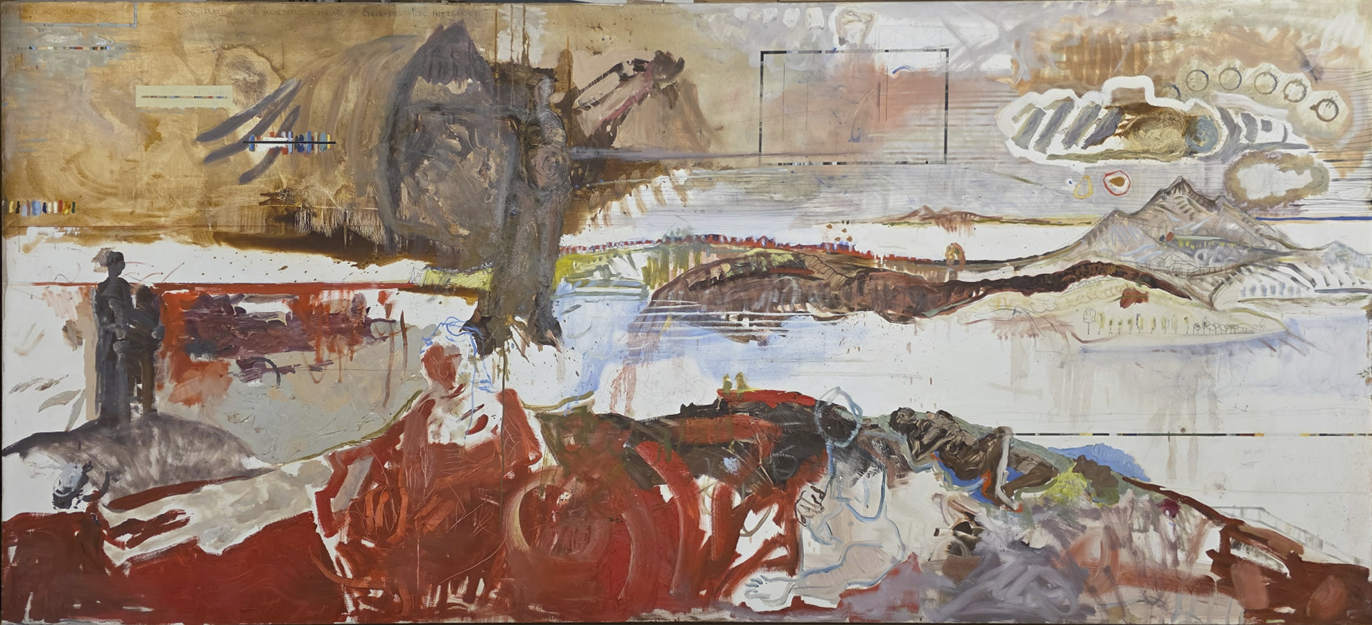
Attention enters at the upper left because that's where the only crisp textual information sits — stenciled lettering against flat tan-ochre. Economy of means keeps that zone quiet; there's little to resolve there, so the eye doesn't stay. It slides down into the grayish-brown mass where two figures press together, but contour quality is loose at the shoulders and heads — closure is incomplete, so the eye doesn't settle there either, it keeps moving.
The black-bordered square near center-top acts as an anchoring point. It's the first hard edge in the painting, and it functions exactly like one: a fixed reference against the softness around it, arresting the left-to-right drift before it exits the frame.
The cloud-shaped white contour with its diminishing circles creates a progressive rhythm — implied recession without real spatial depth, since the picture stays otherwise flat. This is a directional cue, but a gentle one. It doesn't stop the eye, it redirects it rightward, toward the schematic mountain line. That mountain is a canonical view — a single clean contour doing the entire job of "distance" through economy alone, an atmospheric perspective effect achieved with almost no marks.
The strongest visual pop-out in the picture is the dark elongated horizontal form in the middle register. High value contrast against near-white ground, irregular mottled edges — pre-attentive, involuntary, it interrupts lateral movement before the eye can drift off the right edge.
Then the eye drops into the red zone. This is where visual weight concentrates hardest — saturated color, thick paint, high complexity and visual density all combine into a mass that reads as heavier than anything above it. Color advancement is doing real work here: red pushes forward regardless of its position low in the frame. The two dark standing figures at lower left provide visual weight/balance against this horizontal red sprawl — vertical against horizontal, solid against churning.
The final resting point, lower right, is a release rather than a stop — marks loosen, canvas shows through, the eye is let go rather than held. The composition asks the viewer to enter quietly, accelerate through a sequence of anchors and pop-outs, peak in density and saturation at the bottom, then exit through dissipation. That's a coherent perceptual arc. Whether it's a coherent meaning is a separate question.
MATERIAL AND FORMAL
The medium is oil on canvas, and the two registers of paint handling are physically distinct enough to read as two different working sessions or two different intentions. Upper two-thirds: thin, stained application, soft bleeding edges, matte surface — this is paint behaving like wash, soaking rather than sitting on the canvas. The stenciled lettering and striped rectangle in the upper left are the driest, flattest marks in the picture — no visible brush drag, which suggests a more mechanical or controlled application, possibly masking or a rigid brush.
The lower third is a different material event. Real impasto — ridges of pigment that catch light, visible scumbling, overlapping arcs built through physical paint deposit rather than stain. This is where the hand becomes visible as gesture, as pressure, as drag. The transition between these two zones is the painting's most honest material fact: it does not disguise the shift. The canvas is thin and bare at both the top edges and the lower right corner, which means the artist let raw support show at both ends of the picture — a framing device that's consistent, not incidental.
At a distance, the composition reads through value structure and massing — the eye organizes light top, dark bottom, single interruptions in between. Up close, the story changes entirely: the top is atmosphere and residue, the bottom is texture and body. This bifurcation is real and visible on the surface. Whether it supports a single intention or exposes two different paintings stitched into one format is not something the material evidence can settle by itself — it can only confirm the difference is real, not smoothed over.
CULTURAL
The vocabulary here is legible to anyone who has spent time with postwar American painting that mixes text fragments, schematic landscape, and gestural abstraction in a single field — a lineage running through Rauschenberg's combines, Twombly's scrawled economy, and the churning figure-ground instability of late Guston. The stenciled lettering and striped mark in the upper left read, in one possible reading, as a citation of that stencil-text tradition — Johns, Rauschenberg, the whole vocabulary of the painting-as-surface-with-residue.
The shift into thick red impasto in the lower third, with its bodily, churning arcs, could be read as entering a different lineage — expressionist figuration, maybe a nod toward Guston's late cartoon-body paintings, maybe toward a more contemporary vocabulary of gestural rawness that circulates in galleries invested in "returns to painting." A viewer versed in that history would recognize both halves of the painting as belonging to real, separate conversations. Whether the painting successfully bridges them into one conversation is a live question, not a given.
One reading of where this work sits institutionally: large scale (144 x 72 in.), oil on canvas, ambitious formal range — this signals gallery or museum-scale contemporary painting, aimed at an audience fluent in art historical citation. The title, "49B," offers no interpretive handle — no narrative anchor, no place name, no figure identification. That withholding could read as deliberate anti-narrative positioning, consistent with a lineage of numbered, indexical titling (Rothko, Twombly's untitled series) that resists biographical or literary reading. Or it could simply reflect a studio inventory system. Both readings are available; the image alone can't decide between them.
CONCEPTUAL
The painting appears to be in dialogue with the tension between abstraction and figuration as an unresolved argument rather than a settled position. The upper register stays in the territory of sign and residue — text, geometric anchor, schematic mountain — objects that function as symbols more than as observed things. The lower register moves into embodied, bodily gesture — impasto, churning arcs, a figure emerging through closure rather than contour. This structure argues, in one possible reading, that meaning migrates downward from sign to body, from cool notation to hot gesture, over the course of the canvas.
A historical precedent worth naming: Rauschenberg's combines argue that image and text and gesture can share a surface without resolving into a single register — that unresolved coexistence is the point. If this painting is working in that lineage, the compositional split isn't a flaw, it's the argument: meaning doesn't cohere, it accumulates.
But there's a competing precedent — Guston's late work, where the shift from abstraction to cartoon-figuration was a deliberate rejection of pure formalism in favor of moral, bodily content. If this painting is invoking that lineage, then the upper register's abstraction should read as something being left behind, and the red zone as where "real" content lives. These two precedents pull the painting toward different conclusions about what the geometric anchor and the schematic mountain are for — signs to be superseded, or signs held in permanent unresolved tension with the body below them.
Hypothesis (insufficient visual evidence): the reclining brownish figure embedded in the red zone represents a specific narrative or historical subject. The formal description gives only silhouette and value shift — closure, not iconographic content. Nothing in the observed evidence supports a specific reading of who or what that figure is. Any claim beyond "a figure emerges through closure" outruns the evidence.
NOISE — CONSOLIDATED
PERCEPTUAL: The main conflict is between the black-bordered square's function as anchoring point and the picture's overall drift toward the red mass. The square wants the eye to stabilize center-top; the value structure and saturation of the lower third pull with more total force. The eye gets two competing centers of gravity, and the painting doesn't fully resolve which one is primary.
MATERIAL: The stained, thin upper two-thirds and the thick impasto lower third are handled with such different physical logic that they read almost as two different paintings joined at a horizontal seam. Nothing in the surface bridges them — no passage of paint migrates from one handling to the other. This is a real formal fight between the top and bottom of the canvas.
CULTURAL: The title "49B" gives the audience no entry point, which risks illegibility for viewers outside a narrow art-historical fluency. Without that fluency, the citational range — stencil text, schematic landscape, gestural body — reads as inventory rather than argument. Whether that withholding is transgressive economy or simply underexplained is not resolvable from the image.
CONCEPTUAL: The painting cites two competing precedents — Rauschenberg's unresolved coexistence and Guston's move toward bodily content — without visual evidence indicating which the painting intends to be read through. This undercuts the strength of any single conceptual claim; the argument stays plural where it might need to commit.
Closing: The perceptual/material split between upper thinness and lower impasto looks like it could be intentional — it drives the composition's climax and matches the conceptual reading of migration from sign to body. The title's illegibility and the unresolved choice between competing historical precedents look more accidental, or at least unresolved by the work itself, rather than serving a deliberate purpose in another domain.
Admin
Original: 1978×902px · 1.7× zoom ceiling — stills only, needs about 2400px of width