There's no Front Door read for this one yet.
Go deeper
OVERVIEW
Four domains here mostly agree on one thing: this image resists settling. The perceptual record shows an eye that cannot find one entry point and cannot find one exit. The material record shows a hand building density through accumulation, line by line, with no shortcuts. The cultural record shows a print that was never meant to sit quietly in a print cabinet as a record of a real place. The conceptual record shows an argument about reason's limits made using the era's most rational tool — engraved perspective.
The domains pull together on instability. Multiple vanishing points (perceptual/material) match a period skeptical of single rational systems (cultural/conceptual). Where they diverge: the perceptual pass shows real disagreement about where attention lands first and where it rests — three observers, three different entry points. That instability is not noise to be explained away. It may be the actual mechanism of the work. The conceptual reading needs that instability to make its argument; the perceptual domain is simply reporting that the instability is real and measurable in behavior, not just inferred from theme.
The tension worth naming: does the multiplicity of vanishing points serve a legible 18th-century argument about the limits of Enlightenment reason, or is it simply the residue of a printmaker improvising across multiple plate states over years? The work does not resolve which. Neither does this analysis.
PERCEPTUAL
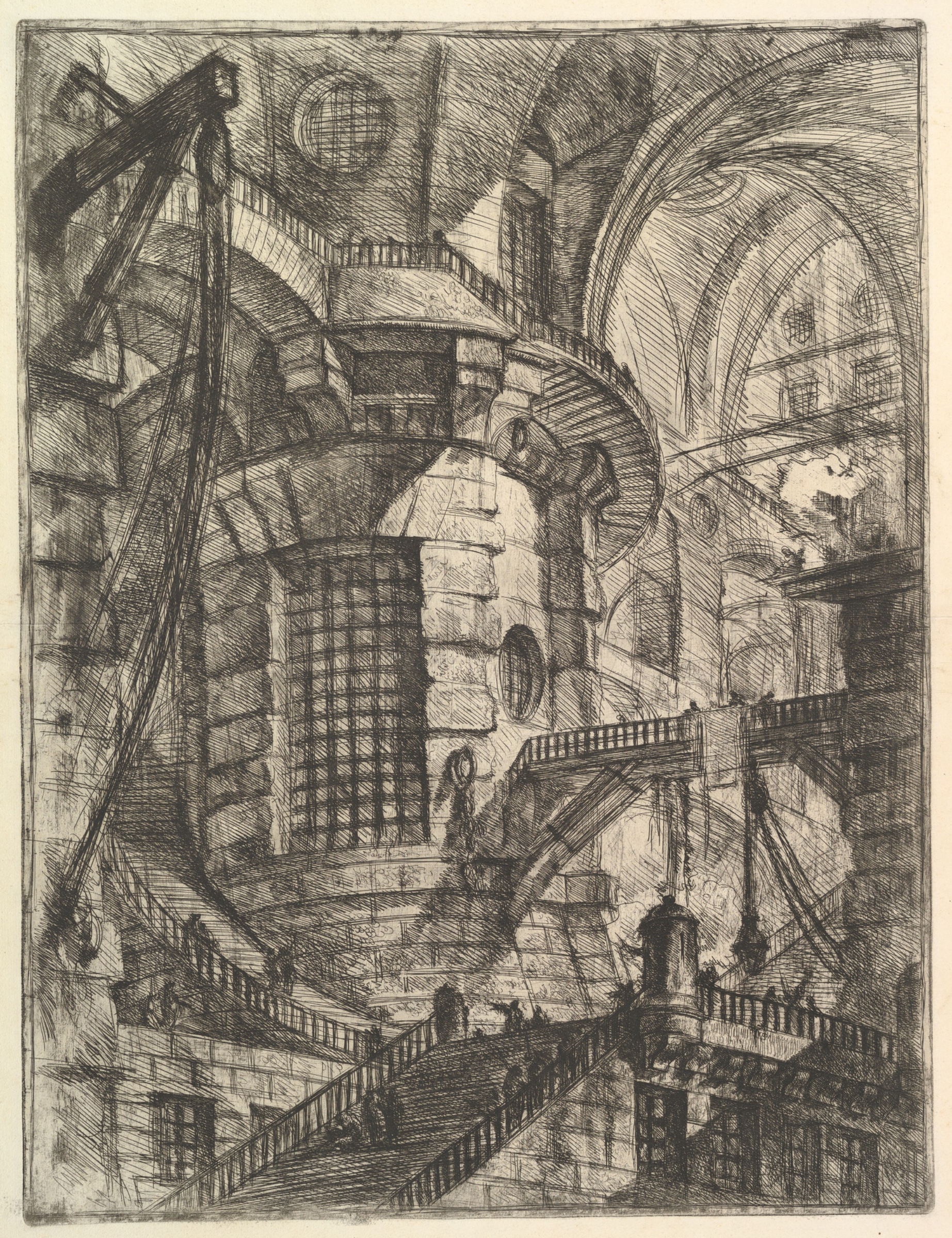
The eye does not have one door in. Observers logged three different first stops: the upper-left diagonal rigging, the central cylindrical tower with its gridded window, the pale curved stair. That disagreement is itself a finding. No single high-contrast focal point dominates the way it would in a work built for one glance.
What does hold attention, once caught, is the density gradient. Dark, tight crosshatching packs the lower and central zones. The upper right thins out into a pale, sparsely worked vault. The eye drifts from dense to sparse, from occluded to open. That gradient acts as a release valve — after working through the tangle of staircases, bridges, and railings crossing each other at odd diagonals, the eye finds relief in the one area asking less of it.
Occlusion drives most of the spatial reading. Bridges cross towers, staircases cross arches, near railings block far walls. This stacking of overlaps, rather than converging perspective lines, tells the eye what is near and what is far. Meanwhile the actual linear perspective refuses to cooperate — verticals and diagonals imply multiple vanishing points, not one. The eye is asked to build depth from occlusion while perspective itself argues against a single coherent space. That's a real conflict, not a subtle one: two depth systems running at once, disagreeing.
Tiny human figures on the stairs are almost afterthoughts, but they anchor scale. Once spotted, they recalibrate the entire tower as monstrously large. Before that, the architecture reads as abstract mass.
MATERIAL AND FORMAL
This is etching and engraving on paper, worked further with sulphur tint or open bite and burnishing. No color anywhere — value is built entirely from the density and direction of hatched line. That's a laborious, additive process. Every dark passage is many individual incised or bitten lines layered and crossed. Every pale passage is the plate left comparatively untouched. The tonal range comes from accumulation, not mixture.
The hand's decisions are visible at the edge level. Architecture and railings get crisp, ruled, controlled lines — straightedge work, confident, made once. Shadowed recesses and distant passages dissolve into softer, looser hatching — less controlled, or controlled toward ambiguity rather than clarity. That distinction is a formal choice: certainty at the structural skeleton, uncertainty in the depth.
The physical process is honest about itself. Nothing hides that this is built line by line on a metal plate. Up close the surface is all texture — bundles of parallel and crossing strokes, burnished passages where tone has been softened or lifted. At a distance those strokes resolve into stone, shadow, void. The material doesn't pretend to be anything other than an accumulation of marks; the illusion of massive architecture is entirely a distance effect. That gap between close-looking and far-looking is the material core of the print's power: proximity reveals the labor, distance delivers the fiction.
CULTURAL
Piranesi's Carceri sits in an odd position for its period: prints trading in the same market as Grand Tour souvenir views of Roman ruins, but doing something antagonistic to that market's expectations. Grand Tour buyers wanted legible antiquity — recognizable arches, identifiable ruins, a comfortable relationship between viewer and grandeur. This print offers no identifiable site. One reading is that Piranesi is using the visual vocabulary of the veduta (the topographical view) against its own purpose — the etching technique, the architectural fluency, all trained on real Roman monuments, redirected toward invented, irrational space.
Institutionally, this places the work in a lineage that later Romantic and Surrealist audiences would claim more comfortably than Piranesi's own contemporaries could. A reading available here: eighteenth-century viewers may have received these as virtuosic architectural fantasies, a genre with its own market (capriccio). Twentieth-century readers reclaimed them as proto-Surrealist, even proto-existentialist, images of confinement and irrational bureaucracy. Both readings are legible depending on which institution is doing the looking — the print room curator cataloguing technique, or the modern museum framing this as a precursor to psychological horror.
Whether the work's illegibility (no coherent single space, no narrative closure) was a problem for its original audience or the point is a genuinely open question. Given the multiple print states Piranesi returned to over years, deepening the darkness and complicating the perspective with each revision, one reading is that the destabilization was a deliberate escalation, not an accident of a young printmaker's inexperience.
CONCEPTUAL
The Carceri series arrives inside the same century that produces linear perspective's most rigorous late flowering and the mathematized stagecraft of Baroque theater design — Piranesi trained in stage design, and that matters here. One position the work can be read as taking: perspective, the Renaissance's proof that space could be rationally mastered on a flat surface, is used here to demonstrate the opposite. Multiple vanishing points, staircases that don't resolve, bridges that lead nowhere legible — these use the language of rational architectural drafting to stage a space reason cannot actually hold together.
That argument, if it's there, is supported by the perceptual finding that the eye cannot fix one coherent spatial reading and by the observation that linear perspective is present but inconsistent. The tool of Enlightenment measurement is turned against Enlightenment closure. This puts the work in dialogue with a long tradition of architectural fantasy (Piranesi's own Vedute, but also the capriccio tradition of Panini and others) while pushing past that tradition's usual reassurance — capricci still resolve into pleasant impossible collages of real monuments; the Carceri resolve into nothing, only scale and dread.
A further position: the work's thinness of narrative — no clear prisoners, no explicit torture, just tiny indifferent figures dwarfed by machinery-like architecture — could itself be the argument. The horror isn't depicted, it's structural. The space itself is the argument. Hypothesis (insufficient visual evidence): that Piranesi intends the tower specifically as a metaphor for judicial or state power is plausible given the "prison" title but not something the image alone confirms; the architecture could as easily be read as generic monumental ruin.
NOISE — CONSOLIDATED
PERCEPTUAL: The three-way disagreement on first-glance entry point is the clearest interference. No dominant pop-out feature anchors a single reading path. Additionally, occlusion-based depth and multi-point perspective are giving contradictory spatial instructions simultaneously, which is disorienting by design or by accident — the perceptual record alone can't say which.
MATERIAL: No real fight here. The additive, linear, monochrome technique is fully consistent with the tonal and spatial ambitions of the image. Crosshatching density maps directly onto the depth and mass the composition needs. Material and formal logic are aligned.
CULTURAL: The work's refusal of a single identifiable site or narrative event makes it hard to slot cleanly into either the veduta market it emerged from or a strict didactic-prison-critique reading. That illegibility could alienate an audience wanting topographical pleasure, or attract an audience wanting exactly this ambiguity. Which audience it "belongs" to is unresolved by the image itself.
CONCEPTUAL: If the argument is "reason fails to master this space," the image still uses extremely disciplined, controlled linework to make that claim — crisp ruled architectural edges throughout. The execution is highly rational even where the content argues against rational coherence. That's a real self-undercutting, or it's the entire point: control depicting the failure of control.
Most of this noise looks intentional, serving the conceptual argument, rather than accidental: the perceptual disorientation and the conceptual claim about reason's limits are the same phenomenon seen from two domains.
The live question the work sits inside: is the spatial incoherence a calculated argument about reason's limits, or the accumulated residue of a printmaker reworking plates over years without a master plan — and does the difference actually matter to how the image works on a viewer.
Admin
Original: 1845×2400px · 2.5× zoom ceiling — carries the camera