There's no Front Door read for this one yet.
Go deeper
OVERVIEW
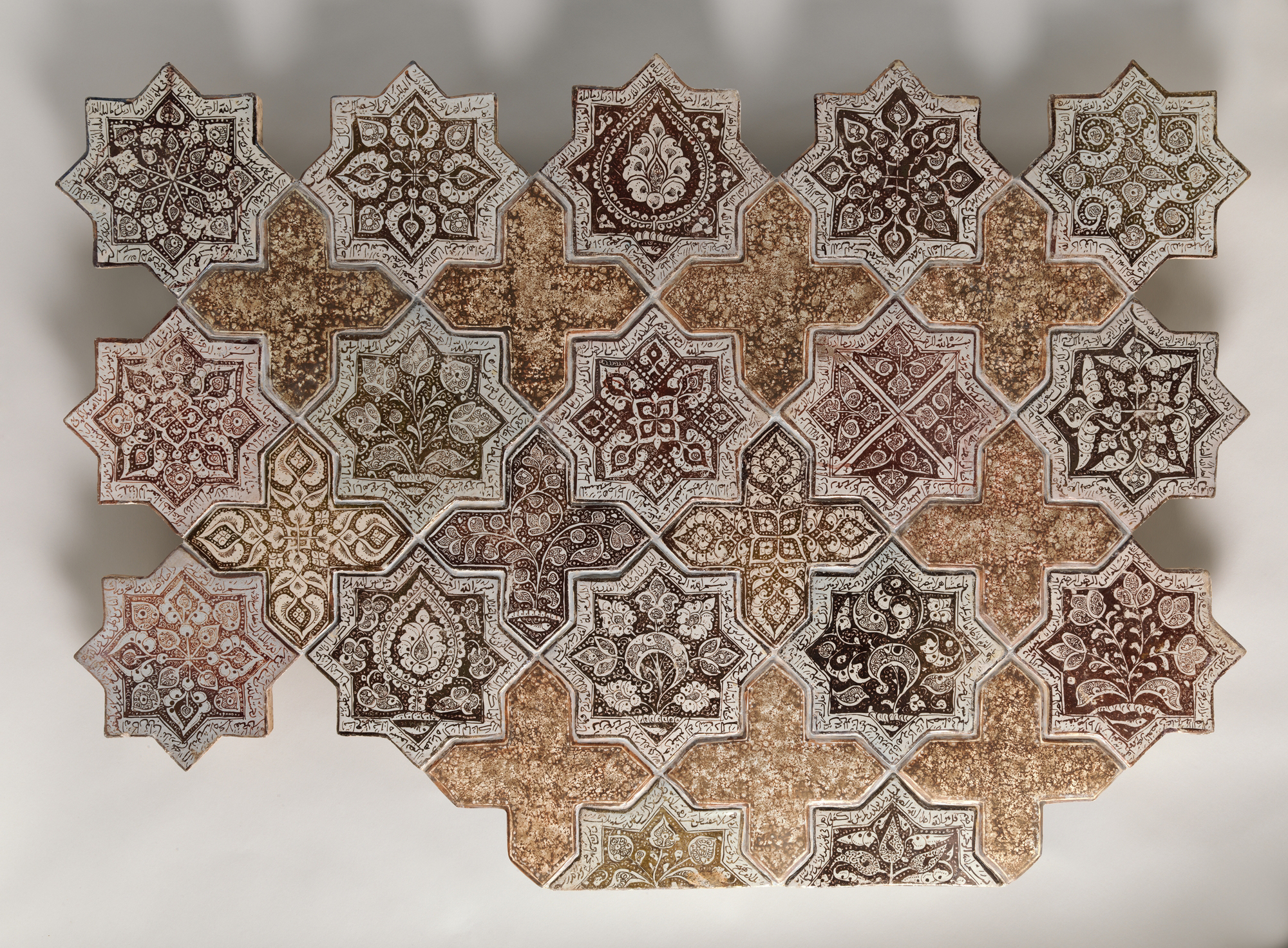
Perceptual and material findings agree closely here. The eye's rhythm follows the physical grid. Grout lines are physical facts; they also set the pace of scanning. Cultural and conceptual readings extend outward from that same grid, into questions about where this fragment sits institutionally and what argument a repeating, crop-truncated pattern makes about wholeness. The tension isn't between domains contradicting each other. It's between what's visible (a fragment) and what's implied (a total pattern that exceeds the frame). Perceptual closure wants to complete the star-and-cross field beyond the edges. Material fact stops at 32 tiles, 28 by 40 inches, no more. Cultural and conceptual domains both have to work with that gap: a full architectural scheme reduced to a museum panel. The live question the work sits inside: does this panel ask to be read as a complete aesthetic object, or as a deliberately partial witness to something larger it can no longer be part of.
PERCEPTUAL
The eye lands on the star tiles first. Reason: Detail Density Gradient. Dark brown and black ornament against pale cream ground creates high local contrast, and contrast wins the first look. The cross tiles function as rest stops, their mottled tan surface offering the eye a place to release tension before the next star pulls it back in. This alternation sets up Rhythm and Repetition: scan, rest, scan, rest, moving through the grid at a steady pace.
At a middle viewing distance, Figure-Ground Relationships flip. Seen close, each star is a figure against the cross ground. Pull back, and the crosses start to read as a figure of their own, a secondary lattice sitting on top of the star field. This is Figure-Ground Reversal doing real work: the same tiles support two different readings depending on scanning distance, and the eye doesn't settle on one.
The cropped edges interrupt Pattern Completion/Closure. Tiles cut off at top, bottom, and sides tell the eye this pattern continues past what's shown. The mind fills in more grid than is physically present. That's Cropping/Framing forcing an active viewer response rather than a passive one.
Depth stays flat throughout. No occlusion, no atmospheric recession, nothing pulling the eye into illusionary space. All visual movement happens in the picture plane itself, through contrast and repetition, not through depth cues.
MATERIAL AND FORMAL
The medium is stonepaste with luster-painted decoration under a transparent glaze. That's a specific ceramic technology: a fritware body, an opaque white glaze layer, metallic luster pigment painted on top, then fired again at lower temperature to fuse the luster. The result is visible in the surface: crisp tile boundaries where individual fired units meet the grout, and softer, sometimes-blurred internal linework where the luster pigment migrated or fired unevenly during the second firing. That contrast between hard physical edge and soft painted edge is a direct record of two separate manufacturing stages: shaping/glazing the tile, then luster-painting it.
The cross tiles' granular, speckled texture reads as under-decoration, or as a plainer glaze recipe used deliberately to contrast with the ornamented stars. The tan/ochre mottling is consistent with variable firing or a different glaze mixture on those units.
Surface reflectivity is a genuinely contested read across observers: some see active glassy specular highlights consistent with a fired luster glaze; others see a mostly matte surface. Given the medium record (opaque white glaze under transparent glaze, luster-painted), a glossy, light-catching surface is the more materially consistent expectation. A flatter photographic reproduction could suppress that.
Up close, the viewer confronts brushwork: individual calligraphic and arabesque strokes, pooling of luster pigment, pitting in the glaze. At distance, those individual marks disappear into the grid's overall rhythm. The object asks for both kinds of looking and rewards each differently, which is consistent with tilework meant for architectural installation, viewed at multiple distances by people moving through a space.
CULTURAL
One reading: this panel sits within the Persian/Ilkhanid ceramic tradition of luster-painted tilework, made for architectural revetment. Institutions like the Met display such panels as reassembled or excerpted fragments of larger schemes, originally set into a wall, mihrab, or dado. If that reading holds, the object now functions doubly: as an art-historical witness to 13th-century Kashan production technique, and as a museum object valued for its formal pattern and craftsmanship independent of its lost architectural context.
The audience most equipped to recognize this work is one fluent in Islamic art history: scholars, collectors, and museum-goers who read luster ware as a marker of technical sophistication (a difficult, resource-intensive glazing/firing process) and who understand tile panels as fragments of dismantled buildings, common in the market history of Islamic architectural ceramics from the 19th and 20th centuries onward.
To a general museum audience unfamiliar with that history, the panel may read primarily as ornamental pattern, its calligraphic and arabesque content illegible as content rather than decoration. That illegibility isn't transgression here; it's a consequence of the object's removal from its original reading context. Hypothesis (insufficient visual evidence): the star tiles' script bands carry specific devotional or poetic text, which would be legible to a period viewer and is largely inaccessible to a modern general viewer without translation.
CONCEPTUAL
This object sits inside a design tradition that treats geometric modularity, unity through repeated form, and variety through individualized ornament as compatible rather than opposed. The star's outer form stays constant tile to tile; the internal motifs vary (Unity vs. Variety Tension, observed directly in the star/cross alternation and internal motif variation). This is consistent with an argument common in Islamic geometric ornament: infinite, non-hierarchical pattern as a formal analog to a non-representational, non-narrative visual order. No single tile is a focal point in a Western compositional sense; Rhythm and Repetition replaces a singular climax with distributed emphasis.
The cropping supports that argument rather than working against it. A pattern that implies continuation beyond its physical edges argues, visually, for a field that exceeds any single frame. That's consistent with a tiling logic built to cover a wall of any size, not a bounded picture built to be complete in itself. Hypothesis (insufficient visual evidence): the specific selection of eight-pointed stars and crosses references cosmological or mathematical symbolism beyond decorative function; the visible tile record alone doesn't establish that reading with two independent anchors.
Read this way, the panel is less an "artwork" in the Western individual-authorship sense and more a fragment of an ongoing design system. The conceptual position: pattern itself, not any single tile, carries the meaning.
NOISE — CONSOLIDATED
PERCEPTUAL: Figure-ground reads competitively. Star-as-figure and cross-as-figure alternate depending on viewing distance, and the eye doesn't get a stable resolution. Cropped edges also work against closure by forcing an active, unresolved sense of "more pattern exists," which can read as either an open invitation or an incompleteness depending on viewer expectation.
MATERIAL: The record itself is split on whether the glaze is glossy or matte. That's not a fight within the object; it's a fight in how the object has been photographed or lit across different documentation passes. It matters because Specularity/Surface Reflection changes how "finished" or "precious" the object appears at first glance.
CULTURAL: The panel's script and iconographic content are likely illegible to most viewers without specialist knowledge, and the object's fragmentary, reassembled museum status (32 elements reconstituted into a "panel") can obscure its original architectural function, making it easy to misread as a self-contained decorative composition rather than a rescued piece of a larger structure.
CONCEPTUAL: The argument for infinite, non-hierarchical pattern sits in tension with the museum's framing of the object as a bounded, titled, dimensioned "panel." Presenting a fragment of an endless system as a discrete work with fixed dimensions works against the pattern's own logic of continuation.
The cropping and figure-ground instability look intentional, in service of the conceptual argument for pattern without a fixed center. The glaze-reflectivity discrepancy and the panel's institutional framing as a bounded, titled object look more like accidents of display and documentation, cutting against the same argument the tilework itself makes.
Admin
Original: 2000×1472px · 1.7× zoom ceiling — stills only, needs about 2400px of width