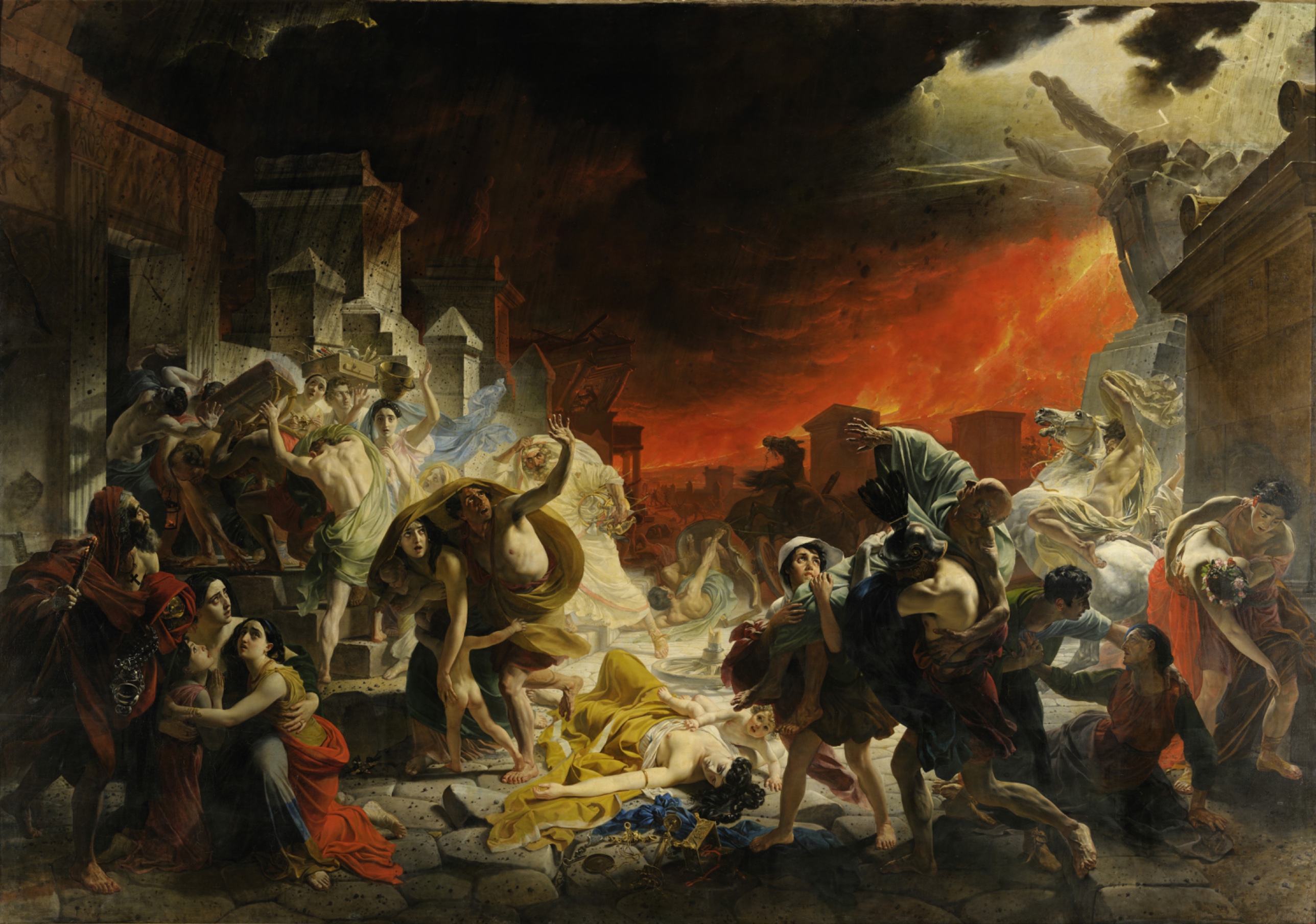
Karl Brullov — The Last Day of Pompeii
November 2, 2026 at 10:53 AM
Model: claude-sonnet-5
These 58 principles are perceptual mechanisms that influence what gets noticed, how forms organize, and how space is inferred - all before conscious interpretation. They do not determine meaning.
the world it entered
Brullov painted this in Italy, in Rome, after walking the excavated streets of Pompeii himself. He showed it first in Milan, then Paris, then brought it home to Russia, where it arrived as a kind of national argument: a Russian painter could make a history painting on the scale and ambition of the French and Italian academies. The work entered a room still dominated by Neoclassical history painting and by the early stirrings of Romanticism, and it tried to claim both rooms at once. Walter Scott reportedly called it an epic in paint. Gogol wrote about it as a turning point for Russian art.
One reading of where this sits institutionally: it is the picture that Russia pointed to, for decades, as proof that its academy could compete with Paris and Rome on their own terms, using their own subject matter (antiquity, catastrophe, the sublime) rather than homegrown ones. That made it legible immediately to the European academic establishment and to the Russian court that funded Brullov's training. It is less legible, maybe deliberately so, to anyone looking for a native visual language rather than a brilliant imitation of an imported one. The debt to Poussin's compositional clarity and to Géricault's theatrical bodies is not hidden. It is the engine.
the point it's making
The composition argues that catastrophe is a social event, not a private one. Every figure is caught in relation to another: carrying, shielding, reaching, failing to save. The fallen woman with the child reaching across her body is the clearest statement of this — death does not clear the stage, it just stops one figure while the others keep moving around it. The man carrying his father on his back repeats the idea from a different angle: duty continuing past the point where it can still succeed.
The argument being tested is whether a neoclassical arrangement, borrowed from history painting about gods and generals, can hold ordinary bodies in extremity without becoming sentimental or inert. Brullov's answer is to keep every contour taut and every muscle legible even as the sky dissolves into smoke. The precision of the bodies is the position: that dignity survives in the handling even when the city does not survive in the narrative. Whether that position fully earns itself, given how posed and operatic some of the figures are, is a live question rather than a settled one.
what stops you
The eye lands on the yellow robe and the white skin of the fallen woman first, a bright shape low in a crowded, dark field. Then it's pulled sideways, almost against its will, by the rearing white horse and the lightning-pale light catching the foreground bodies. The picture doesn't let you settle; it keeps routing you between a body that has stopped moving and a sky that is actively collapsing.
what hits you first
- Light Source Logic splits the picture between the warm red glow of the fire at back and a cold pale light on the foreground bodies, so the eye keeps flipping between two different explanations for what it's seeing.
- Value Structure/Massing stacks the black smoke against the orange fire-glow at the top of the canvas, a dark weight pressing down on the only warmth in the scene.
- Overlap/Occlusion locks the foreground figures into an interlocking chain of limbs, so no single body can be read in isolation.
- Postural Affect reads instantly in the twisted reach of the child toward the fallen woman and in the strain of the son carrying his father.
- Visual Pop-out picks out the hard glints on the scattered jewelry and gold bowl against the matte skin and drapery around them.
- Color Temperature sets the cool blue veils against the surrounding ochre and terracotta, so they register before you've consciously looked for them.
- Complexity and Visual Density crowds the middle ground with bodies and architecture, so the eye has to work to find any open ground to rest on.
- Directional Force carries the rearing horse's diagonal straight into the collapsing statues above it, linking animal panic to architectural collapse.
The eye wants to rest on the fallen woman, because she is pale, horizontal, and still in a picture built from diagonals and strain. It can't rest there long. The smoke above keeps pulling attention up and sideways, toward the falling stone and the horse, and the picture seems to want you oscillating between the one figure who has already lost everything and the dozens still trying not to.
how it was made
Up close the flesh and drapery are smooth, almost polished, built from tight, blended layers with no visible brush incident. The smoke and fire are the opposite: looser, scumbled, worked with a freer hand, as if two different painters took turns. From across the room those two surfaces resolve into a single atmosphere, the precision of the bodies never dissolving even as the sky does.
what hits you first
- Edge Detection keeps the contours of muscle and drapery razor-sharp on every foreground figure, a deliberate contrast with the smoke's blurred edges.
what holds you there
- Atmospheric Perspective and Detail Density Gradient work together, dissolving the distant architecture and the smoke into soft transitions while every foreground jewel stays crisp.
- Specularity/Surface Reflection puts small, hard highlights on the metal and gems, the only truly reflective passages in an otherwise matte paint surface.
- Texture shifts from tight, invisible brushwork in the flesh to loose, visible strokes in the smoke, a change you can feel more than name from ten feet away.
The canvas itself (nearly fifteen feet wide, taller than a door) is built to be walked toward and discovered twice: once as a unified disaster from across the room, once as a set of individually finished bodies up close. The smooth handling of flesh asks the viewer to believe in these people as physically real; the looser handling of the smoke asks the viewer to accept the sky as something closer to weather than to fact. The two kinds of paint are doing two different jobs, and the canvas never apologizes for the difference.
where it fights itself
The two light sources are the clearest fight. A viewer trying to work out where the fire ends and the lightning begins will not fully succeed, because the picture uses both logics without reconciling them: warm glow justifies the color scheme, cool pale light justifies the modeling on the foreground skin. That inconsistency could be read as an accident of ambition, Brullov wanting the drama of fire and the clarity of a cooler light on his heroine at once. It could also be read as useful: the collision of warm and cool is what makes the blue veils and the fallen woman's skin pop against the surrounding ochre. The mechanism causing the confusion is the same mechanism producing the picture's most striking color contrast.
The depth of the space is harder to defend. The architecture recedes with real linear perspective on the left, promising a deep street, while the crowd of bodies in the middle distance reads as a flattened, frieze-like wall of figures. The picture wants both a believable receding city and a theatrical, stage-like arrangement of actors, and it does not fully choose. That looks less like intention and more like the strain of fitting a classical staging device around a subject that is, by nature, chaotic.
what stays unresolved
The eye finds a single stilled body in a field of strain, and the making backs that reading: her skin is the smoothest paint in the picture, finished as if nothing could touch it further. The sharpest conflict is the sky. Two light logics, warm fire and cool lightning, never resolve into one coherent source, so what illuminates the bodies never quite matches what destroys the city around them. Brullov seems to have wanted catastrophe to be legible and orderly at the same time, a crowd of individually readable griefs arranged like a frieze. The live question the painting sits inside: can a disaster be staged with this much compositional control and still feel like a disaster.
WAYS OF LOOKING
Notice how the analysis doesn't just say "there's a light problem," it traces two separate light sources, warm fire from the back and a cool pale glow on the foreground bodies, and then asks where each one comes from and what it's doing. That's the habit: when something in a picture doesn't add up, don't smooth it over. Follow the inconsistency to see what work it's secretly doing. Here, the mismatched light is also what makes the blue veils pop against the ochre. The "flaw" and the payoff turn out to be the same mechanism.
Look also at how the analysis treats the canvas's two painting styles, tight and polished in the flesh, loose and smeared in the smoke, as a decision rather than a stylistic default. It asks what each surface is asking the viewer to believe (these bodies are real; this sky is weather, not fact). That's a transferable move: read brushwork as argument, not just texture. Ask what each kind of mark is trying to convince you of.
Notice too how the writing keeps returning to the fallen woman, not because she's the obvious focal point, but because she's the stillest shape in a composition built entirely from strain and diagonal. The analysis uses her as an anchor to test every other claim against: does the depth read as one deep street or one flat wall of bodies? Does the picture's control feel like clarity or like evasion? Picking one fixed point and checking everything else's relationship to it is how you keep a complex picture from sprawling into a list of observations.
WHAT THIS WORK MAKES VISIBLE
Look at the smoke pressing against the fire at the top of the canvas, and you can watch, almost like a lesson, how value (the lightness or darkness of a color) does spatial work independent of color temperature. Most paintings hide this trade-off. Here it's loud: black on top of orange, doing the job of weight and threat before you've registered either color as "fire" or "smoke."
Look at the hard little glints on the scattered jewelry and gold bowl near the dead woman. In a matte, blended painting like this one, those few genuinely reflective passages tell you exactly where the painter wanted a flicker of attention to land, apart from the main bodies. Next time you're in front of a crowded painting, scan for the two or three spots of actual shine. They're rarely random.
And look at how differently the flesh and the sky are painted, smooth bodies, smeared atmosphere, side by side on one canvas. Most paintings commit to one handling throughout. This one lets you see, in a single frame, the difference between painting something as fact and painting something as impression. Once you've seen it here, you'll start checking other paintings for where the brush tightens up and where it lets go.
Looking vs. Knowing
These are the analysis's own words, nothing added.
What the Work Shows Us
These are the claims that hold up when you look: each one is rooted in something the image actually puts in front of you, not from what we already knew—or thought we knew—about it.
Readings That Came From Outside
Not wrong, necessarily—but these readings didn't come from looking: they came from biography, cultural context, critical tradition, to complete what the image left open.
Writing guardrail
The house style rules this writing was asked to follow, and where it didn't. Flagged after the fact. Nothing was rewritten.
Pass 2
- Used a banned construction: em dash
Alternative Interpretation
Pulled directly from this analysis's own language — nothing added.
The primary reading treats the clash between the fire's warm glow and the cool pale light on the foreground bodies as an unresolved flaw, evidence that Brullov wanted drama and clarity at once without fully reconciling them. The competing reading holds that this same inconsistency is functionally productive: it's the very mechanism that makes the blue veils and the fallen woman's skin pop against the ochre, so the "error" and the picture's strongest color effect share a single cause.
Questions Raised
Whether the double light source (fire versus lightning) is an accident of ambition or a deliberate device, the analysis explicitly leaves this open rather than choosing.
Whether the collision between the receding linear-perspective street and the flattened, frieze-like crowd reflects intention or simply the strain of forcing a classical staging device onto a chaotic subject, the analysis says this "looks less like intention" but doesn't resolve it further.
Whether the painting's compositional control ultimately undercuts or earns its claim to depict disaster, the analysis poses this as "a live question rather than a settled one" and does not answer it.
Pass 1 — blind observation used
The first thing the eye hits is the split sky: black smoke pressing down from the upper left, a wall of orange-red fire filling the upper right. Light Source Logic puts the only illumination in the scene as fire-glow from that right side and from a jagged white lightning-bolt cut into the dark cloud above, so skin and drapery on the right-hand figures pick up warm orange rim-light along their raised arms and shoulders, while the left side of the canvas sits in cooler, ash-colored shadow lit by a thin strip of pale sky visible at the far upper left.
The woman lying dead in the center, sprawled on the paving stones in a yellow robe with her dark hair spread out and a small child reaching toward her still body, is the anchor. Anchoring and Reference Points: every other figure's posture and running direction seems to organize around this one static, fallen form. Scale Relationships confirm her centrality too, she's one of the largest figures in the painting and the only one lying flat against the horizontal paving, a stark contrast to every vertical, straining body around her.
Figures radiate outward from her in diagonal clusters. On the left, a pyramidal group climbs a flight of steps, carrying bundles, a jeweled box, a woman balancing a chest on her head. Overlap/Occlusion stacks these bodies three and four deep, arms and torsos cutting across each other, establishing that cluster as a dense near-ground mass. On the right, a bearded man carries an old man piggyback, echoing a common motif of flight-with-elderly-father; behind them a rearing white horse and collapsing stone figure (a statue losing its head and arm) occupy the middle distance.
Atmospheric Perspective is used only faintly, the background riders and burning architecture in the far middle distance are rendered with slightly less edge-sharpness and a flatter, more uniform orange than the crisply outlined foreground bodies, which carries the eye back into depth. Linear Perspective shows in the receding temple steps and colonnade on the left, orthogonal lines pulling toward a vanishing area obscured by smoke.
Edges: contours on the foreground nude and draped figures are hard and continuous, outlined with a near-sculptural clarity, muscles and collarbones rendered in crisp light-to-shadow transitions. Edges dissolve where smoke meets rooftops and where the fire's glow bleeds into the black cloud above, that transition is the softest passage in the whole canvas, almost airbrushed compared to the figures' drawn precision.
Value Structure/Massing divides the canvas roughly into three bands, a near-black upper register, a brilliant orange-red horizontal band at the horizon, and a lighter, grayish-white foreground pavement that holds the brightest flesh tones and the white drapery of the central background figure with raised arms. That single white-robed woman midground, arms thrown up, flanked by falling debris, functions as a secondary bright note, Visual Pop-out against the darker clustered figures on either side of her.
Color temperature runs almost entirely warm, ochre, terracotta, gold, and blood-orange, broken only by cooler blue-gray drapery on a few figures (the woman in blue-white at left, the pale blue cloth over the man in yellow in the center-left group) and by the grayish stone architecture. Those cool notes sit forward optically despite their desaturation, because Simultaneous Contrast makes them read as pockets of relief against the saturated red backdrop.
Texture: the paint surface is smooth, blended, almost without visible brushwork in the flesh and drapery, built up in thin glazes that would catch a soft sheen under raking light rather than a hard specular shine, consistent with traditional academic oil technique. Jewelry, a scattered gold bowl, bracelets, and a chain near the dead woman's hand, these objects carry small hard highlights, the only passages suggesting Specularity/Surface Reflection in an otherwise matte, fabric-and-skin-dominated surface.
The eye's final stop is the far right edge, where a second group of fleeing figures and another white horse are partly cropped by the frame, Cropping/Framing implying the chaos and exodus continue beyond the canvas boundary rather than resolving within it.