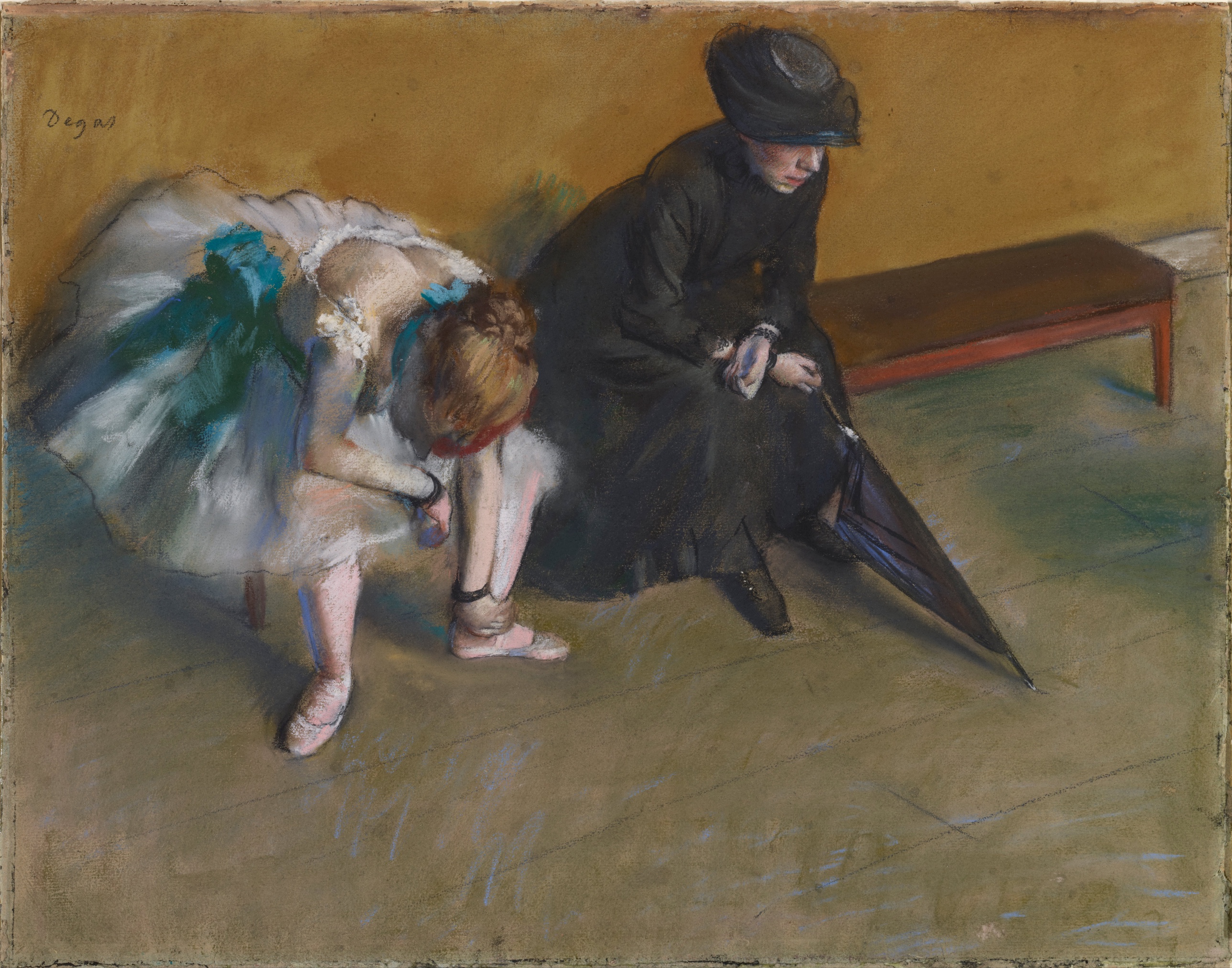
Edgar Degas — Waiting
October 14, 2026 at 10:09 AM
Model: claude-sonnet-5
These 58 principles are perceptual mechanisms that influence what gets noticed, how forms organize, and how space is inferred - all before conscious interpretation. They do not determine meaning.
OVERVIEW
The perceptual and material findings line up almost completely. What the eye grabs first, the black mass of the seated woman, the bent dancer's hidden head, the turquoise flash against mustard ochre, is built by the same hand-decisions that show up under close looking: unblended strokes of color sitting side by side, charcoal laid hard at the ankle and umbrella point, pastel thinned to show paper grain on the wall. The attentional logic and the material logic are not fighting each other. The picture works the way it was made to work.
The cultural and conceptual domains introduce real friction. Culturally, this is a Degas ballet pastel, a genre audiences and the market know how to want. Conceptually, the image withholds almost everything that genre promises: no stage, no music, no visible face, no spectacle. The dancer is doubled over in what reads as private physical strain, and the largest, most legible passage in the whole sheet belongs to a bystander in black, not to dance at all. The work trades on the cultural currency of "Degas dancer" while refusing the pleasures that currency usually buys.
That refusal is legible as argument, not as failure. The perceptual record shows a composition organized around occlusion, awkward posture, and withheld faces (both figures' faces are either hidden or the only lit patch in a dark mass). That supports a conceptual reading: the painting treats dance as labor and waiting as its own kind of labor, rather than as romance. But this reading needs the cultural frame to land, because without knowing what ballet imagery usually does, the formal refusal reads as simply odd, not pointed.
The unresolved tension: the work asks to be read both as a desirable, collectible object in a known genre and as a quiet argument against that genre's usual payoff, and it never tells the viewer which claim to believe first.
CULTURAL
This pastel enters the ballet-dancer genre that Degas built almost single-handedly into a market category. By 1880, dancers in motion, at the barre, in rehearsal, were already his signature subject, and collectors and dealers (Durand-Ruel chief among them) had learned to want them. A picture like this one, with its loose pastel strokes and visible paper tooth, signals "late Degas pastel" to anyone who has looked at the holdings of the Musée d'Orsay or the Metropolitan's Degas rooms. That is a legible signal to the audience that collects and studies French painting from this period.
What is less legible, or at least less comfortable, is the content choice inside that signal. The genre trains viewers to expect a dancer's face, a line of tutus, a glimpse of stage light. Here the dancer's head is dropped out of sight entirely, and the only resolved face in the whole sheet belongs to a seated chaperone in black holding a furled umbrella, an unglamorous, almost bureaucratic presence. One reading of where this sits institutionally: it belongs less to the romantic ballet-print tradition that preceded Degas (the Chalon-style theater illustration) and more to his own backstage project, the pictures that treat the Opéra as a workplace with attendants, parents, and dance masters cluttering the wings. Museums that build Degas's reputation around that "backstage" argument, the Norton Simon among them, would recognize this immediately as core material, not an outlier.
Whether this is departure or transgression depends on which audience is asked. For a viewer expecting ballet-as-spectacle, the absence of face and stage reads as withholding, even frustrating. For a viewer versed in Degas's broader practice, it reads as consistent, maybe even typical, evidence of his interest in dancers as laboring bodies observed from odd angles rather than as idealized performers. The painting does not resolve which audience it is addressing. It simply assumes the second one.
CONCEPTUAL
The work is in dialogue with the nineteenth-century argument, carried by Courbet, Manet, and then Degas, that modern painting's subject should be ordinary present-tense labor and waiting rather than myth or allegory. The title itself names a state of suspended time rather than an event. Two bodies occupy the sheet: one bent into visible physical effort (the dancer reaching toward her ankle), one collapsed into inert stillness (the seated woman, umbrella planted on the floor like a weight). Both are forms of waiting. Neither face is available to the viewer in the ordinary way; the dancer's is dropped out of sight, the chaperone's is the single lit patch inside a block of black. That double withholding, across two independent figures, supports a reading that the picture is arguing against portraiture as its organizing logic. It substitutes posture and mass for likeness.
This is also an argument built on cropped, elevated, off-center viewing, a vantage point with no resolved center and a floor that eats a large share of the sheet without locking into a clean perspective grid. That device has a clear precedent: Japanese prints and snapshot photography, both of which Degas was absorbing in this period, and both of which treat the frame as a cut through a scene already in progress rather than a staged tableau. The picture's refusal to center either figure, and its willingness to let the bench and part of the dancer's body sit outside clean resolution, reads as a position: dance, looked at honestly, is not composed for an audience. It is caught sideways, mid-exertion, next to someone bored enough to be clutching an umbrella she does not need indoors.
The conceptual risk is that perceptual thinness, an unresolved vanishing point, a loosely gridded floor, a background reduced to flat ochre, is doing real work here rather than standing in for unfinished technique. The flatness of the wall and the indeterminacy of the floor refuse to build a stage, and that refusal is the point: there is no theater in this room, only a corridor of waiting.
PERCEPTUAL
Walking up to this sheet, the eye does not find a center. It drops into the heavy black shape on the right before it finds anything else, then gets pulled left and down toward a figure bent so far over that her head has disappeared. The picture feels lopsided and a little uncomfortable to stand in front of, like catching two people mid-moment rather than being shown a scene.
WHAT HITS YOU FIRST
- Overlap/Occlusion [A]: strength 3
- The dancer in front, the seated woman beside and behind her, the bench behind the woman, the wall behind everything: the stacking order is immediate and unambiguous.
- Postural Affect [A]: strength 3
- The dancer's bent-double reach toward her own ankle reads as strain in the body before any story is attached to it.
- Visual Pop-out / Pre-attentive Features [A]: strength 3
- The small turquoise/blue-green passages in the tutu jump out against the ochre-and-black field and pull the eye there almost involuntarily.
- Contour Quality [B]: strength 3
- Hard charcoal lines at the umbrella shaft and ankle sit against soft, dissolved edges at the tutu and skirt hem, so the eye reads some forms as fixed and others as still forming.
- Value Structure/Massing [B]: strength 3
- The seated woman's black coat and skirt form the single largest, darkest shape in the composition, anchoring the whole right side before any detail inside it is read.
WHAT HOLDS YOU THERE
- Biological Motion Detection [A]: strength 2
- The dancer's reaching arm and dropped torso register as a live body mid-action, not a static pose.
- Edge Detection [A]: strength 2
- The hard line of the umbrella's point meeting the floor gives the eye one crisp anchor to return to after wandering through softer passages.
- Elevation in Picture Plane [A]: strength 2
- The dancer's bent, lowered position against the seated woman's upright mass sets up a push-pull in vertical placement across the sheet.
- Face Detection [A]: strength 2
- The seated woman's lit, rose-pink face is the one legible face in the picture, so it draws repeated return visits even though it occupies a small area.
- Figure-Ground Relationships [A]: strength 2
- The flat mustard wall sits far enough back, tonally and texturally, that both figures separate cleanly from it despite the shallow space.
- Gaze Direction / Social Attention [A]: strength 2
- With the dancer's face hidden, the seated woman's visible face becomes the only place the eye can look for a returned gaze, and it does not meet one.
- Grouping [A]: strength 2
- The dancer and the seated woman read as a pair sharing one shallow pocket of space, separate from the bench and wall behind them.
- Light Source Logic [A]: strength 2
- Light from the upper left catches the dancer's back and the seated woman's face and hands, giving the eye a consistent, if soft, path across the two figures.
- Linear Perspective [A]: strength 2
- The floor's diagonal strokes suggest recession without resolving into a hard vanishing point, so the eye senses depth without fully confirming it.
- Anchoring and Reference Points [B]: strength 2
- The umbrella's point touching the floor functions as a fixed stake the eye keeps coming back to after scanning the looser passages.
- Cropping/Framing [B]: strength 2
- The bench is only partly visible behind the seated woman, which makes the frame feel like a slice of a larger room rather than a staged composition.
- Detail Density Gradient [B]: strength 2
- Resolution concentrates at the ankle, umbrella, and face, while the floor and wall stay loose and undifferentiated.
- Directional Force/Implied Movement [B]: strength 2
- The dancer's downward-reaching arm carries a visible line of force toward her shoe, pulling the eye down and to the left.
- Embodied Simulation [B]: strength 2
- The bent-over posture is uncomfortable enough that a viewer's own body registers a flicker of that strain just from looking.
- Scale Relationships [B]: strength 2
- The two figures' relative sizes shift depending on where the eye enters, which keeps the spatial read slightly unsettled.
- Unity vs Variety Tension [B]: strength 2
- The warm ochre-brown-black palette holds the sheet together while the one cool turquoise accent keeps breaking that unity on purpose.
- Visual Tension [B]: strength 2
- The bent dancer and the rigid, upright chaperone create two opposite body states in the same shallow space, and neither releases the other.
- Visual Weight/Balance [B]: strength 2
- The dense black mass on the right is balanced only by the compressed, active shape of the dancer on the left, an uneven trade that keeps the composition from settling.
WHAT SURFACES ON A LONGER LOOK
- Agency Attribution [A]: strength 1
- The seated woman's stillness next to the dancer's motion raises the question of whether she is watching, waiting, or indifferent, without settling it.
- Binocular vs Monocular Depth Cues [A]: strength 1
- Occlusion carries almost all the depth information here; there is little else (no converging texture, no size diminution) to reinforce it.
- Closure/Negative Space [A]: strength 1
- The gap between the two figures reads as charged, empty space rather than neutral background once attention slows down.
- Canonical Views [B]: strength 1
- Neither figure is shown in a standard, expected pose for her role (dancer performing, bystander attentive), which only becomes noticeable on a second look.
- Embodied Perspective / Eye-Level Effects [B]: strength 1
- A steep, elevated vantage down onto the floor only registers once the viewer notices how much of the sheet the floor itself occupies.
- Emergence [B]: strength 1
- The floorboards and bench legs resolve into a coherent room only after the eye has spent time with the figures first.
- Interval Relationships [B]: strength 1
- The spacing between the dancer, the seated woman, and the bench sets up an uneven rhythm across the width of the sheet.
- Pattern Completion/Closure [B]: strength 1
- The bench, partly hidden behind the seated woman, gets mentally completed into a full piece of furniture even though half of it is missing.
- Rhythm and Repetition [B]: strength 1
- The diagonal strokes of the floor echo the diagonal of the umbrella shaft, a quiet repeated angle that only becomes apparent after sustained looking.
- Symmetry/Asymmetry [B]: strength 1
- The composition's clear asymmetry, heavy right, active left, becomes a deliberate-feeling imbalance rather than an accident only on return visits.
- Empathic Resonance [C]: strength 1
- The dancer's strained posture invites a felt concern for her that the picture never confirms or denies with any facial expression.
- Implied Time/Narrative Sequence [C]: strength 1
- The title and the seated figure's held stillness suggest a "before" and "after" to this moment that the image itself refuses to show.
What no principle name quite covers is how much the picture asks the eye to keep moving without ever rewarding it with a face-to-face encounter. Every path the attention takes, toward the dancer's head, toward the seated woman's eyes, toward some resolved vanishing point in the floor, gets redirected or cut off. The eye is given one lit face, one hard edge, one flash of cool color, and has to build the rest of the room out of suggestion. That constant redirection is what makes the picture feel unsettled rather than composed, and it is also what keeps a viewer looking longer than the modest size of the sheet would predict.
MATERIAL AND FORMAL
Up close this is dry, chalky pastel sitting directly on the grain of the paper, with whole passages (the wall especially) so thinly worked that the sheet's own tooth shows through the color. From across the room the surface reads as matte and absorbent everywhere, no shine anywhere, which flattens the light into something soft and even rather than theatrical.
WHAT HITS YOU FIRST
- Texture [B]: strength 3
- The visible grain of the paper through the thin mustard wall pastel tells the eye this is a dry, built-up surface, not a smooth painted one.
- Contour Quality [B]: strength 3
- Charcoal is pressed hard at the umbrella and ankle while pastel is dragged loose at the tutu and hem, so the drawing hand's pressure is visible as a record, not just a shape.
- Value Structure/Massing [B]: strength 3
- The black of the coat and skirt is built from layered, heavy strokes that stay matte and absorbent, giving that mass real physical weight on the sheet rather than just a dark outline.
WHAT HOLDS YOU THERE
- Edge Detection [A]: strength 2
- The sharpest line in the whole work, the umbrella's point hitting the floor, is made with a single confident charcoal stroke, distinct from the built-up, reworked pastel everywhere else.
- Color Temperature [B]: strength 2
- The warm ochre-brown field is interrupted only by the cool turquoise of the tutu, a temperature contrast made entirely with unmixed pastel sticks laid side by side.
- Optical vs Physical Color Mixing [B]: strength 2
- The tutu's color comes from distinct white and turquoise strokes placed next to each other, not blended on the paper, so the eye does the mixing the hand refused to do.
- Saturation [B]: strength 2
- The turquoise is kept at a higher saturation than anything else on the sheet, which is what lets it carry so much visual weight in such a small area.
- Color Harmony Systems [C]: strength 2
- Ochre, brown, and black dominate as a tight, almost monochrome family, which makes the small saturated accents feel like deliberate exceptions rather than part of a broader palette.
- Economy of Means [C]: strength 2
- A handful of hues and a limited set of mark types (hard charcoal line, loose diagonal hatch, flat scumble) do all the work of describing bodies, furniture, and room.
WHAT SURFACES ON A LONGER LOOK
- Color Opponent Channels [A]: strength 1
- The orange-brown ground and the blue-green tutu sit in direct opponent relation, which is part of why the small cool passage reads as the loudest color in the work.
- Simultaneous Contrast [A]: strength 1
- The seated woman's pink face looks warmer and more alive than it would in isolation because it is surrounded entirely by black.
- Specularity/Surface Reflection [A]: strength 1
- There is no shine anywhere on this sheet; every surface, umbrella, skirt, skin, stays matte, which keeps the picture feeling dry and unglamorous rather than polished.
- Color Weight and Advancement [B]: strength 1
- The warm ochre wall should recede by convention, but its flatness and lack of depth cues let it sit closer to the picture plane than warm colors usually do.
- Complexity and Visual Density [B]: strength 1
- Most of the sheet (wall, floor) is handled with very few marks, which makes the dense, reworked passages at the figures stand out by contrast.
- Local vs Atmospheric Color [B]: strength 1
- Color stays locally true to each object, black coat, ochre wall, turquoise tutu, with no haze or distance-based shift softening any of it.
- Transparency/Opacity [B]: strength 1
- Thin pastel over visible paper at the wall sits against thick, opaque black at the coat, a direct contrast in how much the hand chose to load the stick.
What the material choices are doing beyond any single principle is refusing to disguise the process. Nothing here is blended into illusion. The charcoal line stays a line, the pastel stroke stays a stroke, and the paper grain stays visible wherever the color is thin. That honesty about the drawing's own construction matches the picture's refusal to resolve space cleanly. A medium this exposed cannot fake a seamless room, and it does not try to.
NOISE: CONSOLIDATED
PERCEPTUAL: The clearest interference is the contradiction over vantage point. Some readings find a steep, elevated viewpoint with the floor eating two-thirds of the sheet; others find perspective only "gestured at," with no locatable vanishing point at all. That disagreement matters because it changes whether the viewer is meant to feel positioned above the scene, looking down with some detachment, or simply dropped into a shallow, ambiguous pocket of space. The picture does not resolve this itself; the floor strokes suggest recession without committing to geometry.
MATERIAL: The friction is between the confident, resolved charcoal line (umbrella, ankle, shoe) and the deliberately unresolved pastel handling everywhere else (wall, floor, skirt hem). The surface is honest about this unevenness rather than hiding it, but it does mean the drawing reads as part finished study, part fully worked passage, and that inconsistency is visible at close range in a way flatter reproduction would not show.
CULTURAL: What keeps this from reading cleanly within its own genre is the mismatch between subject label and subject treatment. It will be filed, correctly, as a Degas ballet pastel, which carries strong market and institutional legibility. But the actual content, a faceless dancer bent in discomfort next to a bored chaperone, withholds the performance imagery that label usually promises, so a viewer approaching it expecting ballet glamour meets something closer to a waiting room.
CONCEPTUAL: The argument that dance is unglamorous labor is made partly through withheld information (no face, no stage), but the picture still relies on the dancer's tutu, a recognizable costume, to cue "ballet" in the first place. The argument against spectacle borrows the one prop spectacle depends on. That is the work's own contradiction, not a flaw introduced by reading it.
The perceptual ambiguity about vantage point and the conceptual reliance on the tutu as a readable costume both look like decisions in service of the work's larger refusal of a finished, legible ballet scene; the unevenness between resolved charcoal passages and loose pastel elsewhere looks closer to an accident of the drawing's working process rather than a deliberate argument in any domain.
WAYS OF LOOKING
The analysis notices that the seated woman's black coat is the single largest, darkest shape on the sheet, and clocks that before it says anything about who she is or why she's there. That's a habit worth stealing: read value and mass first, identity second. A shape pulls the eye before a story does, and naming the shape before naming the subject keeps you honest about what's actually doing the work.
It also catches something that could easily slide past: the dancer's tutu is the one prop that lets the whole picture get filed as "ballet painting," even while everything else in the image (no face, no stage, no music) argues against spectacle. The analysis holds both facts at once instead of picking a side. That's the move: when a work seems to argue against its own genre, check whether it's still borrowing the genre's one recognizable costume to make the argument legible at all. Contradiction inside the work is often the argument, not a flaw in your reading of it.
Notice, too, how often the write-up says what it can't settle, whether there's a real vanishing point, whether the vantage is steep or shallow, rather than forcing a clean answer. Naming the unresolved thing is itself a finding. A description that papers over ambiguity to sound confident is less useful than one that says: here's where the picture itself won't commit.
WHAT THIS WORK MAKES VISIBLE
Look at the hard charcoal line where the umbrella's point meets the floor, then look at the soft, dissolved edge of the tutu's hem a few inches away. Both are by the same hand, on the same sheet, done around the same time. Most paintings hide this kind of unevenness under varnish or a unified finish. Pastel can't hide it: the stick either presses hard or drags loose, and the paper shows through or it doesn't. Next time you're in front of a chalk, charcoal, or pastel work, look for where the hand committed and where it stayed provisional. That gap tells you what the artist considered finished.
Look also at the small turquoise strokes sitting right next to white ones in the tutu, unblended. Your eye does the mixing that the hand refused to do. That's easiest to see in dry media where strokes stay separate strokes; it gets much harder to spot once paint is layered wet into wet.
And look at how the one lit face in the whole work, the seated woman's, sits inside a field of flat black. It reads as more alive than it would sitting on a plain background, because surrounding darkness pushes rose and pink toward warmth. Watch for that trick wherever a painter isolates a single pale patch inside a dense dark mass: it's rarely accidental.
Looking vs. Knowing
These are the analysis's own words, nothing added.
What the Work Shows Us
These are the claims that hold up when you look: each one is rooted in something the image actually puts in front of you, not from what we already knew—or thought we knew—about it.
Readings That Came From Outside
Not wrong, necessarily—but these readings didn't come from looking: they came from biography, cultural context, critical tradition, to complete what the image left open.
Writing guardrail
The house style rules this writing was asked to follow, and where it didn't. Flagged after the fact. Nothing was rewritten.
Pass 2
- Used banned word: resonance
Alternative Interpretation
Pulled directly from this analysis's own language — nothing added.
The primary reading treats the picture's refusals, hidden faces, no stage, a chaperone given more visual weight than the dancer, as a deliberate argument that dance is labor and waiting rather than spectacle. The competing reading, which the analysis never rules out, is that this is simply typical Degas backstage material consistent with his broader practice, meaning the "withholding" is not pointed critique at all but business as usual for an artist already known to treat dancers this way.
Questions Raised
Whether the steep, elevated vantage point is real or only "gestured at" is left unsettled; the floor strokes suggest recession without a locatable vanishing point, so it's unclear if the viewer is meant to feel positioned above the scene or simply dropped into ambiguous shallow space.
Whether the gap between the confident charcoal lines (umbrella, ankle) and the loosely worked pastel elsewhere (wall, floor, hem) is a deliberate formal choice echoing the work's refusal to resolve space, or just an artifact of an unevenly finished drawing, is explicitly flagged as undecided.
The seated woman's stillness is read as possibly watching, waiting, or indifferent, and the analysis admits it cannot settle which, leaving her relationship to the dancer (chaperone, bystander, something else) genuinely open.
Pass 1 — blind observation used
The first thing that catches is the mustard-gold wall, flat and unbroken across the top two-thirds of the sheet, against which the two figures read as dark and light cutouts. The bent dancer's tutu pulls the eye first by Visual Pop-out: the white and blue-green pastel strokes are the lightest, most saturated marks in the composition, sitting against the warm ground.
From there the eye drops to her bent form. Her back and arms are rendered in loose, overlapping pastel hatching, the flesh tone built from pink, ochre, and pale green strokes side by side rather than blended, an instance of Optical vs. Physical Color Mixing. The contour of her spine and shoulder blade is a firm charcoal line, but it dissolves where it meets the tutu, the skirt's edges fraying into chalky smudges rather than resolving into cloth. Her hair is a tighter mass of russet marks, bound by a red ribbon that is the only pure warm accent against all the cooler pinks nearby.
The seated woman in black holds the eye next by sheer Value Structure/Massing: she is the single largest dark shape in the picture, her coat and hat rendered in near-featureless charcoal and black pastel with almost no internal modeling. Her face is the only passage of close value control on her figure, pale and softly shaded, turned downward, which pulls my attention along her sightline to her hands and the umbrella. This is Gaze Direction / Social Attention doing real work: she looks at the umbrella tip, and so do I.
Her hands, pale against the black sleeves, form a small bright node of contrast, wrists lightly scribbled with white highlight strokes. The umbrella itself is a hard diagonal, its point driven into the floor and its fabric a flat near-black triangle, one of the few crisp geometric edges in the whole sheet, functioning as an Anchoring and Reference Point against the loose organic contours of the two bodies.
The floor is built from loose diagonal pastel lines in olive, blue-gray, and brown, crossing each other to suggest floorboards or tile without ever resolving into a consistent grid; this is Linear Perspective gestured at rather than constructed, enough to place the figures on a receding plane without a vanishing point I can actually locate. The bench at the right, rust-red legs under a dark seat, overlaps the wall behind it and is itself partly overlapped by the woman's shoulder, giving a clear Overlap/Occlusion sequence: wall behind bench, bench behind figure.
Edges throughout alternate between hard charcoal underdrawing (the dancer's shoe strap, the umbrella's rib, the woman's hat brim) and passages where pastel has been rubbed into soft bloom (the tutu, the wall, the shadow beneath the dancer's foot). No surface here would reflect light; the pastel sits matte and chalky, grain of the paper visible through thin patches, especially in the gold background where strokes don't fully cover tooth.
Scale-wise the dancer is noticeably smaller and lower in the frame than the seated woman, though they occupy roughly the same ground plane; the woman's bulk and the dancer's compressed, bent posture create an asymmetrical balance, the dark mass on the right weighted against the pale, more fragmented shape on the left.
The last thing I find is the artist's signature, "Degas," in loose cursive at the upper left, sitting directly on the flat gold wall, isolated from everything else in the image.