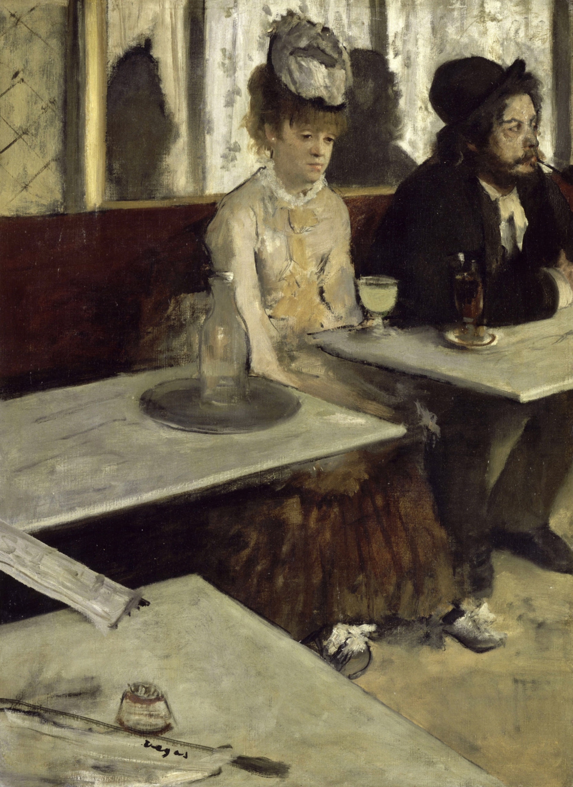
Edgar Degas — Dans un café (also known as L’Absinthe)
August 30, 2026 at 5:55 PM
Model: claude-sonnet-5
These 58 principles are perceptual mechanisms that influence what gets noticed, how forms organize, and how space is inferred - all before conscious interpretation. They do not determine meaning.
the world it entered
Paris in 1876 knew café paintings. It did not know this one. The Impressionist exhibitions were selling light and leisure: boating parties, dancers, sunlit boulevards. Renoir and Monet were making modern life look like a pleasure to witness. Degas submits two people who cannot look at each other, in a room the color of old coffee.
The title changed more than once. Contemporary critics saw it as a temperance illustration, a warning about absinthe and the woman's presumed profession, and reviled it on that basis when it showed in London in 1893 as "L'Absinthe." That reading treats the picture as reportage. It probably isn't. The composition is too engineered, the cropping too calculated, for a simple morality tale. One position: this is Degas working out a problem in painting, isolation rendered through geometry, and the absinthe glass is bait for a certain kind of viewer, a saturated yellow-green hook that pulls in a reading the picture doesn't actually make. Whether that argument was legible to the museum-going public of the 1870s and 1890s is doubtful. Whether it's legible now, inside an institution that hangs the painting next to Manet and calls it early Impressionism, is a separate question, and the Musée d'Orsay's own visitors mostly still call it a picture about drink.
the point it's making
The tradition being answered here is genre painting's promise of legible sentiment. A Dutch tavern scene, a Hogarth print, tells you what's happening and how to feel about it. Degas removes the instructions. The man's head is turned out of frame. The woman's eyes are down and unfocused. Nobody is reacting to anybody. The picture argues that a room can hold two people and produce no meeting between them, and that this can be shown formally, without narrative machinery, just by directing where a gaze lands and where a body is cut.
That argument depends on cropping doing real work, and it does: the man sliced by the right edge, the tables sliced at the bottom, both refusing the canvas the courtesy of containing its subjects. The photographic snapshot look is the point, not a mistake corrected by a fuller composition. Degas is taking a position against the finished, balanced picture-plane of academic painting, closer to what Japanese prints and photography were teaching painters about asymmetric framing. The absence of eye contact between the two figures is the whole argument in miniature: proximity without connection, rendered as a compositional fact rather than a story.
what stops you
The woman's face is the first thing that resolves, pale against a blurred backdrop, and it takes a second look to notice she isn't looking at anything. The man beside her is already leaving the frame. Between the two of them and the viewer sits a slab of empty white tabletop, closer to us than either person.
what hits you first
- Face Detection pulls the eye straight to the woman's pale, isolated head before any other shape in the canvas competes for attention.
- Figure-Ground Relationships set her face against a soft, undifferentiated mirror-wall so it reads as a single lit object in a dim field.
- Gaze Direction / Social Attention registers, almost immediately, that neither figure is looking at the other, or at anything shared.
- Cropping/Framing cuts the man off at the shoulder, so the canvas edge does something a picture frame doesn't usually do: interrupt a person mid-thought.
- Value Structure/Massing stacks the dark coat and hat against the pale tables, splitting the canvas into two unequal weights before you've named a single object.
- Postural Affect reads the woman's collapsed shoulders and tucked head as exhaustion before you've reasoned your way to that word.
what holds you there
- Visual Pop-out / Pre-attentive Features makes the yellow-green drink the one saturated color in a brown and gray room, so it keeps pulling the eye back no matter where else it travels.
- Visual Tension holds the empty foreground tabletop against the crowded human incident behind it, so the eye keeps being sent to a space with nothing in it.
The eye starts at the face, gets pulled sideways by the drink's color, and then has to cross a wide, empty foreground to get back. That foreground does real work: it puts distance between the viewer and the two people, so that even looking at them feels like looking across a table you're not sitting at. The man's pipe and turned head give the composition somewhere to run out of energy, off the right edge, unresolved.
how it was made
Up close the tabletops are laid down in flat, ruled passages, almost architectural. The figures are handled differently: the woman's hair and sleeve blur into the background rather than stopping at a hard line. From across the room the whole thing reads as browns and grays with one green-yellow spark.
what hits you first
- Contour Quality separates the hard-edged tables from the softly dissolving edges of the figures, so the furniture feels more solid than the people.
- Light Source Logic gives a diffuse, front-left illumination with no crisp cast shadow, flattening the mood rather than dramatizing it.
- Economy of Means lets a few pale strokes stand in for the glass bottle on the table, doing the job of describing glass without describing it fully.
what holds you there
- Specularity/Surface Reflection shows up only in those few highlight strokes on the bottle, the single passage in the painting that behaves like reflective material.
what surfaces on a longer look
- Detail Density Gradient thins out toward the lower left, where the newspaper, matchbox, and signature sit half-resolved, the last things worth finding.
The paint doesn't hide its shortcuts. The bottle is a suggestion, not a rendering. The tabletops are built with a ruler's confidence and the figures with a much looser hand, and that difference in handling is doing the same job the cropping does: telling you where the picture's certainty lives and where it doesn't. Nothing about the surface is polished for its own sake. It asks to be read at a normal viewing distance, not inspected for finish.
where it fights itself
The linear perspective of the tabletops runs one way, hard and diagonal, toward a vanishing point somewhere off the right edge, while the overlap of the tables and figures makes the actual spatial arrangement hard to parse; the two depth cues don't fully agree on how far back the man's table sits, or how it relates to the woman's. That's a real ambiguity in the record, not a settled reading. The saturated drink glass fights the picture's own restraint: it's the one thing in the frame built to grab a nineteenth-century viewer's moral attention, in a painting that otherwise refuses to hand out moral cues. That conflict looks intentional, since the temperance reading was clearly available and clearly wrong, or at least insufficient, and Degas seems to have baited it on purpose. The disagreement about where the eye actually settles at the end, on the signature, on a match holder, on floor debris, is less a fight in the painting than a fact about how thin the lower-left corner is: there's no strong claim on attention there, which may be exactly why nothing agrees.
what stays unresolved
The face and the framing agree completely: everything built to catch the eye first, the pale head, the dark mass beside it, points to two people who share a table and nothing else. That much the painting settles. What it won't settle is whether the drink glass is evidence or bait, whether it means what nineteenth-century viewers took it to mean or is a formal accent dressed up to provoke that misreading. The hard-edged tables and the dissolving figures never resolve into one consistent way of being in that room, either. The picture keeps two people close enough to touch and gives them no way to reach each other, and it never tells you if that's what it saw or what it built.
WAYS OF LOOKING
Notice how the analysis handles the empty foreground tabletop. It doesn't skip past it as dead space. It clocks it as distance, a slab of nothing the eye has to cross to get back to the two people. That's a habit worth stealing: treat empty space in a composition as doing work, not as absence. Ask what it separates you from, not just what it's missing.
Watch what happens with the amber glass and the vanishing point: three sources disagree about where they sit, and the write-up doesn't force a resolution. It says plainly that the record is ambiguous and moves on. That's a discipline, not a shrug. When the evidence splits, naming the split is more honest than picking a winner to sound certain.
Look at how the temperance reading gets handled. Instead of dismissing it outright, the analysis takes it seriously enough to explain why nineteenth-century viewers reached for it, then argues the picture built that reading on purpose, as bait, while doing something cooler and more formal underneath. That's how you make a case for a work's intent: show what a plausible wrong reading looks like, then show why the actual construction exceeds it.
And notice the move from handling to meaning: hard-ruled tables, softly dissolving figures, and the piece treats that difference in brushwork as an argument about where the painting's certainty lives. Reading technique as claim, not just as style, is the whole method here.
WHAT THIS WORK MAKES VISIBLE
The gap between where your eye lands first and what the painting is actually about is unusually wide here. Your eye goes to the woman's face, then gets yanked sideways by that one green-yellow drink, the only saturated color in a room of browns and grays. That's a clean example of pre-attentive pop-out, color grabbing attention before meaning catches up, and it's worth watching for in any painting with one loud note in an otherwise quiet palette: ask whether the color is pointing at the subject or away from it.
The cropping does something you can name precisely: the man is cut by the canvas edge mid-gesture, like a photograph taken a second too early. Painters before photography rarely did this on purpose. Once you've seen it here, you'll notice it everywhere painters were absorbing snapshot logic, Degas especially, and you'll start reading an edge that cuts a figure off as a decision about where attention is allowed to stop.
The mismatch between two people's gazes, hers down, his turned away, gives you a template for reading absence of eye contact as composition, not accident. Next time two figures share a frame, check where each one is actually looking. It's often the fastest way in.
Looking vs. Knowing
These are the analysis's own words, nothing added.
What the Work Shows Us
These are the claims that hold up when you look: each one is rooted in something the image actually puts in front of you, not from what we already knew—or thought we knew—about it.
Readings That Came From Outside
Not wrong, necessarily—but these readings didn't come from looking: they came from biography, cultural context, critical tradition, to complete what the image left open.
Writing guardrail
The house style rules this writing was asked to follow, and where it didn't. Flagged after the fact. Nothing was rewritten.
Pass 3
- Used a banned construction: not just X, but Y
Alternative Interpretation
Pulled directly from this analysis's own language — nothing added.
The analysis reads the painting primarily as a formal problem in isolation, geometry and cropping producing disconnection rather than moral illustration, with the absinthe glass functioning as bait for a misreading. But it also grants that this formalist account may itself be unprovable: the temperance reading was "clearly available" to period viewers and remains the one most museum visitors still hold, leaving open whether the painting's meaning is determined by Degas's compositional intent or by the reception it has actually produced.
Questions Raised
Whether the saturated drink glass is evidence supporting a moral/narrative reading or a deliberate formal accent meant to provoke and then refute that reading — the analysis calls this "doubtful" to resolve.
Whether the conflicting perspective cues in the tabletops (linear perspective vs. overlap) represent an intentional ambiguity about spatial arrangement or simply an unresolved inconsistency in the record.
Whether the formalist argument about isolation-through-geometry was legible to 1870s–1890s viewers at all, or is a reading only available from within a later institutional framing (the Musée d'Orsay's own hang and labeling).
Pass 1 — blind observation used
The eye lands first on the woman's face, isolated against the pale mirror-wall behind her, then drops to the pale yellow-green drink in front of her.
The composition is cut into wedges by two marble tabletops meeting at sharp diagonals in the foreground, empty of figures, cutting across the lower third of the canvas before either person is fully reached. This is Cropping/Framing: the tables and a folded newspaper edge intrude from the left margin as if the viewer's own table is included in the scene, pushing the two seated figures back and to the right.
The woman's face and hands are the most finished passages, modeled with warm flesh tones against the loose, streaky white-and-grey brushwork of the wall behind her. Her hat is a soft grey-white shape, its ribbon rendered in a few broad strokes with almost no internal detail; the closure of "hat" happens more from silhouette than from description. Below her face, her bodice dissolves into scumbled yellow-white paint where the brushwork stops describing fabric structure and just sits as texture. Detail Density Gradient runs from her face (sharpest) down through her dress (loosest) to her skirt, which is a near-flat dark brown mass.
The man beside her is cropped by the right edge of the canvas and by his own hat, which is pushed high and forward so that only the lower half of his face is visible, his pipe caught mid-profile. Overlap/Occlusion is doing the spatial work: his black coat sits in front of the pale curtain-wall, her shoulder overlaps the edge of his table, the bottle on her table overlaps the tray beneath it. There's no perspective diminishment of figures, just stacked overlapping planes.
Value Structure/Massing: the picture reads in three bands. A near-white/grey mass across the bottom (foreground tables), a dark horizontal band of brown banquette behind the figures, and a pale streaked band above that (the mirror or window with vertical folds). The woman's cream dress and pale hat sit at the value center between the dark bench and the light wall, which is what pulls the eye to her first: Figure-Ground Relationships, where the mid-value cream shape reads clearly against both the dark band behind and the lighter table in front.
Color Temperature: the whole palette is muted, greyed browns, dull creams, blacks, with two small chromatic accents that pop by contrast, Visual Pop-out — the pale yellow-green liqueur in her glass and the amber liquid in the man's glass on the far table. These are the only saturated notes in the picture.
Light source is diffuse, no cast shadows sharpen anywhere; the only shadow is a soft dark silhouette on the wall behind the woman's hat, blurred at its edges, more like a stain than a shape with a defined light-source origin.
Surface: the paint is matte throughout, thinned in places (the wall) and dragged dry in others (her skirt, the tabletop edges), no passage suggests it would catch specular reflection. Brushwork is visible as directional strokes, vertical on the wall, diagonal on the table edges, giving the surface a worked, unglazed look.
The signature "Degas" sits lower left on the tabletop in dark script, small and easy to miss against the pale marble, the last thing the eye picks up after circling from face to glass to man to tables and back.