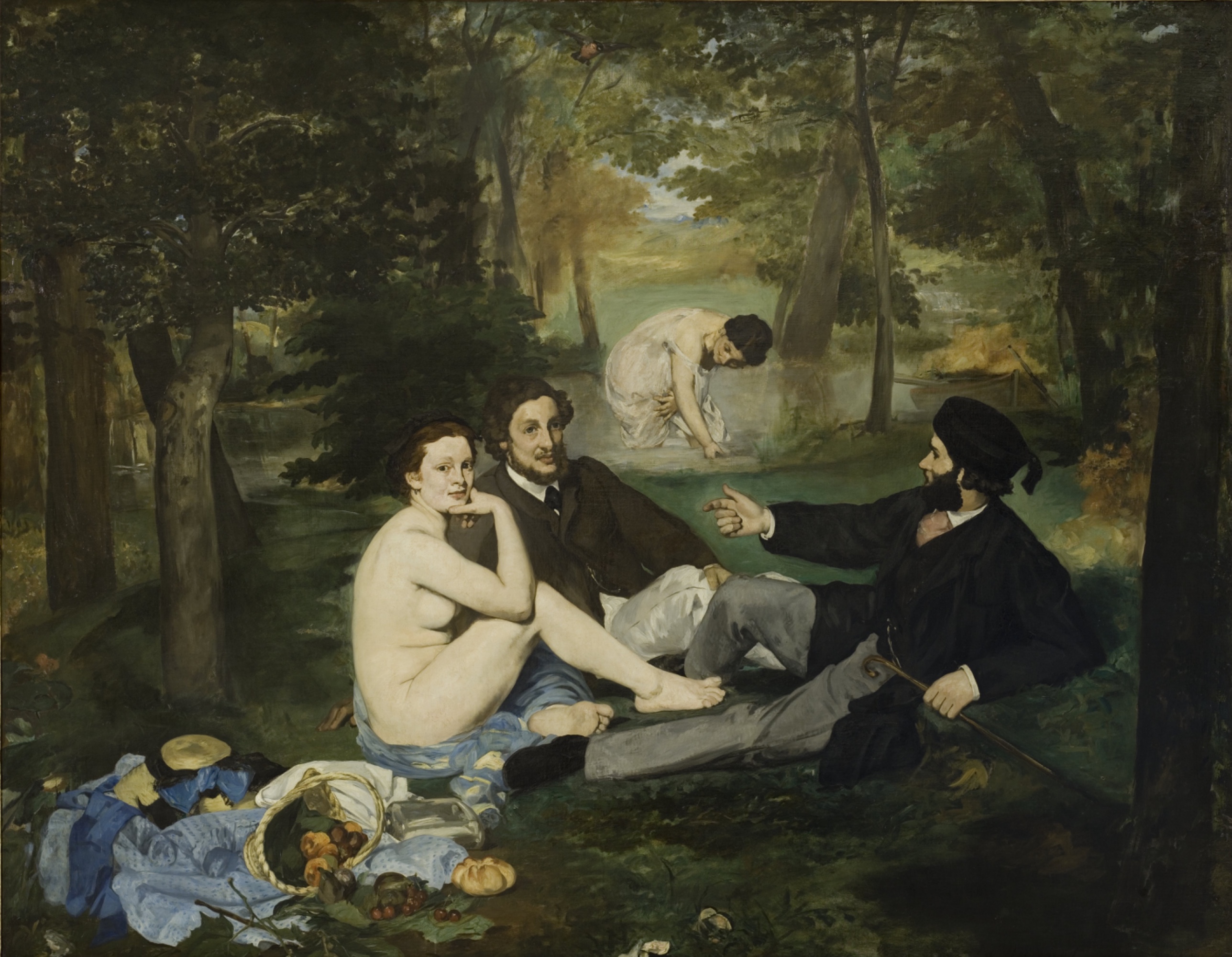
Édouard Manet — The Luncheon on the Grass
August 27, 2026 at 9:00 AM
Model: claude-sonnet-5
These 58 principles are perceptual mechanisms that influence what gets noticed, how forms organize, and how space is inferred - all before conscious interpretation. They do not determine meaning.
the world it entered
Manet submitted this canvas to the Paris Salon of 1863. The jury rejected it, along with thousands of others that year, and Napoleon III authorized a separate show for the rejects, the Salon des Refusés. That is where this painting was first seen in public, hung among the works the official Salon had decided were not good enough, and the crowds came mostly to laugh.
The nude herself was not the scandal. Nude women were a Salon staple, so long as they were called Venus or a nymph and set inside a myth. One reading of what provoked the outrage is the company she keeps: two clothed men in the flat black suits of contemporary Paris, having what looks like an ordinary picnic conversation, next to a naked woman who is looking back at whoever is looking at her. The costume gives it away. This is not Arcadia. It is the Bois de Boulogne, or somewhere like it, on a Sunday.
The composition itself was not new. The grouping of the three foreground figures echoes a river-god group in a Marcantonio Raimondi engraving after a lost Raphael design, and the picnic-with-nude arrangement recalls Giorgione's Pastoral Concert, a painting Manet could have studied in the Louvre. One reading of this borrowing is homage; another is provocation, using a respected lineage to smuggle a modern, undisguised body past the institution that had trained everyone to read nudity as allegory. The Salon jury and its academic constituency were the audience equipped to notice the quotation. Whether they were equipped to accept what he'd done with it is the whole argument of the rejection.
the point it's making
The tradition Manet is answering says a nude is permissible when she is fictional. Wrap her in myth, in classical drapery for everyone else in the scene, and the body becomes an idea instead of a person. This painting keeps the myth's cast, a nude and two clothed companions in a landscape, and strips the myth away. The men are dressed for 1863. The woman is not dressed for anything. One reading of the argument here is that Manet is testing whether the nude needs mythology to be looked at, or whether mythology was always a way of not looking at what was actually being looked at.
The picture supports that position with choices that are visible before any of this history is known. Her body is lit with almost no shadow, flattened rather than modeled, which keeps her from reading as a sculptural, timeless form and closer to a flat cutout pasted onto a woodland backdrop. She meets the viewer's eye directly while the men look elsewhere, an asymmetry that turns her from an object being discussed into a person aware she is being looked at. The hard edge where her skin meets the man's black coat refuses to let her dissolve into the scene the way an academic nude would soften into her setting. Each of these is a formal decision, and together they argue that this is a constructed arrangement of paint and people, not a window onto Arcadia.
what stops you
The white of her body is the first thing the eye finds, set against a wall of near-black coats and green undergrowth. Her stare comes right back at you a half-second later, while the men beside her are looking at each other or nothing at all. Off to the right a man's arm juts out mid-gesture, as if you've walked in mid-sentence.
what hits you first
- Visual Pop-out / Pre-attentive Features: the nude's flesh reads as the brightest note in the entire canvas before anything else in the picture resolves.
- Figure-Ground Relationships: her body sits pressed forward of the picnic group and the woods behind it, like a cutout laid onto the grove rather than seated inside it.
- Value Structure/Massing: the canvas splits into two broad masses, dark coats and undergrowth against pale skin and linen, with almost nothing between them.
- Gaze Direction / Social Attention: she looks straight out at the viewer while the men look elsewhere, and that mismatch keeps pulling the eye back to her face.
what holds you there
- Edge Detection: the line where her hip meets the black coat beside her is drawn hard, almost cut, while the foliage behind softens into blur.
- Agency Attribution: the man on the right extends his arm and points, a gesture that reads as speech and sends the eye toward the man he's addressing.
- Detail Density Gradient: the overturned basket, bread, and cherries at lower left are painted tighter and sharper than the trees around them, so the eye keeps returning to that patch of things.
what surfaces on a longer look
- Simultaneous Contrast: the dark green surrounding her skin is doing real work here, her pallor is partly the woods talking, not the flesh tone alone.
The bird near the top of the canvas is the last thing the eye settles on, a small dark mark against a gap of lighter sky, easy to miss on a first pass and hard to un-see afterward. Attention moves in a loop rather than a line: nude, her stare, the pointing hand, the still life, back to the nude. Nothing in the background asks for much time, which is presumably the idea, the eye is meant to stay in the foreground triangle and treat everything past it as scenery.
how it was made
Up close the paint is mostly dry-looking and matte, laid on without much glazing or built-up layering. From across the room the brushwork disappears into broad flat shapes; step closer and the foreground breaks into visible, separate strokes while the trees stay a loose smear.
what hits you first
- Light Source Logic: the paint on her torso sits in nearly one flat value, with almost no built shadow, as if the light came from everywhere in the grove at once rather than from one direction.
what holds you there
- Texture: the still life is worked in small, distinct strokes, tighter than anything else on the canvas, while the canopy around it is brushed in loose smears.
- Contour Quality: the edge of her body against the dark coat is a hard stopped line, not blended, a choice in how the brush was handled rather than an accident of drawing.
- Color Weight and Advancement: the warm flesh tones sit forward of the cool dark greens simply because warm pigment reads as nearer, doing spatial work the drawing itself doesn't.
what surfaces on a longer look
- Specularity/Surface Reflection: the only real shine on the whole canvas sits on a small glass or metal vessel in the still life, an isolated point of reflected light in an otherwise matte painting.
The canvas is a little over three feet by nearly four, oil paint applied with what looks like speed rather than patience, closer to a sketch pushed to finished scale than a picture built up in the usual academic stages of underpainting and glaze. The still life alone gets the kind of attention a Dutch painter would give an entire canvas; the woods get almost none. That imbalance is visible as brushwork before it means anything else, and it tells you where the hand spent its time and where it didn't bother.
where it fights itself
The background bather creates a problem the rest of the picture doesn't share. She's meant to read as distant, smaller, set back in the water behind the picnic group, but her size against the foreground figures doesn't hold up under scrutiny; she reads closer to half or a third the scale a true recession would produce, and in some readings closer still, nearly matching the foreground figures. Overlap and occlusion do the real work of establishing depth everywhere else in the composition, bodies crossing bodies, the basket crossing the cloth, and that system is legible. Then the bather sits on top of it as a second, weaker spatial claim that the picture never reconciles with the first.
The light is a second point of friction. The nude's body is lit frontally and flatly, almost without shadow, while the grass beneath the reclining man throws a harder, more particular shadow, and the bather in the distance seems to catch light a dense canopy shouldn't let through. These aren't three readings of one coherent light source. They're three different logics of light living in one picture.
Both look intentional in service of something other than spatial accuracy. The flattened light on her body keeps her from reading as a modeled, three-dimensional form the eye can settle into and stop questioning; it keeps her assertive and frontal, closer to a painted fact than a body in a room. The bather's wrong scale can be read the same way, less an error than a refusal to let the background behave. What looks accidental is the still life's shadow logic, which behaves like a genuine cast shadow while nothing around it does; that one reads less like an argument and more like Manet solving one passage on its own terms without checking it against the rest.
what stays unresolved
The eye and the argument agree on one thing: her body is meant to be looked at as paint, not entered as illusion. The flattened light, the hard edge against the coat, the direct stare, all of it keeps the surface in front of you rather than letting you fall through it into a woods, which lines up with the position that this is a constructed scene, not a window.
The sharpest conflict is behind her. The bather's scale breaks the depth the foreground so carefully builds through overlap and occlusion, and no amount of looking resolves whether that's a mistake or a second argument the painting hasn't finished making.
She looks back at you. What is she asking you to notice?
WAYS OF LOOKING
The nude's body carries almost no shadow, painted in one flat value while the grass a few feet away throws a hard, particular shadow under the reclining man's leg. Rather than treating that as a slip, the analysis follows it: two different light logics, sitting in one picture, doing different jobs. The habit here is refusing to average out inconsistencies. When a work contradicts itself, the contradiction is often the argument, not a flaw to smooth over on the way to a tidy reading.
The background bather gets checked against the foreground nude for actual scale, not just impression, and comes up wrong by a wide margin, sometimes nearly matching a figure that should read as half her size. That's a habit of measuring rather than accepting a picture's own claims about itself. Depth, light, proportion, all of it can be tested against what the picture would need for a stated effect to hold up, and where it doesn't hold up is worth stopping on.
The hard edge where her hip meets the man's black coat gets named specifically, "hard," "stopped," "not blended," against the soft dissolve of the trees behind her. That precision matters because it turns a feeling ("she stands out") into a locatable cause. The habit is chasing a reaction back to the exact formal decision that produced it, so "this grabs me" becomes "this edge is doing that."
The essay also builds its case in layers, first what hits you immediately, then what holds you, then what only shows up on a longer look, like the shine on the glass vessel or the color-contrast trick propping up her pallor. That's a habit of sequencing an argument the way attention actually moves, so the reader's eye and the reader's understanding arrive together instead of the second lagging behind the first.
WHAT THIS WORK MAKES VISIBLE
This canvas lights its main figure with almost no shadow and its side detail, the grass under a leg, with a real cast shadow, and the two never argue with each other because they're never asked to occupy the same logic. In a painting less interested in disrupting convention, you'd expect one light source throughout; look for that split next in any picture where a figure feels oddly "cut out" from its setting.
The still life at lower left is worked in tight, separate strokes while the canopy around it dissolves into smear. That gap in how much attention different parts of a canvas get is often invisible until you stand close enough to see the brush change speed. Next time, check where a painter clearly slowed down.
The distant bather's wrong scale is rare in how checkable it is, most paintings hide their proportion errors better. Here the discrepancy sits in plain sight, teaching you to test depth against measurement, not mood.
Looking vs. Knowing
These are the analysis's own words, nothing added.
What the Work Shows Us
These are the claims that hold up when you look: each one is rooted in something the image actually puts in front of you, not from what we already knew—or thought we knew—about it.
Readings That Came From Outside
Not wrong, necessarily—but these readings didn't come from looking: they came from biography, cultural context, critical tradition, to complete what the image left open.
Writing guardrail
The house style rules this writing was asked to follow, and where it didn't. Flagged after the fact. Nothing was rewritten.
Pass 2
- Used a banned construction: that's not X, it's Y (bare)
- Used banned word: timeless
Alternative Interpretation
Pulled directly from this analysis's own language — nothing added.
The analysis reads the borrowed composition (the Raimondi/Raphael figure group, the Giorgione arrangement) as either homage to a respected lineage or as a deliberate provocation that uses that lineage to smuggle a modern, undisguised body past an institution trained to read nudity only as allegory. It explicitly declines to settle which: the same quotation could signal reverence for tradition or exploitation of it, and the piece leaves both readings standing.
Questions Raised
Whether the mismatched scale of the background bather is a spatial error or a deliberate second argument the painting "hasn't finished making" is left explicitly unresolved.
Whether the borrowing from Raimondi/Raphael and Giorgione functions as homage or as provocation is stated as an open choice, not decided.
The analysis notes the Salon jury and academic viewers were "equipped to notice the quotation" but says whether they were "equipped to accept what he'd done with it... is the whole argument of the rejection" — leaving open exactly what in the painting they objected to versus what they merely recognized.
Pass 1 — blind observation used
The nude woman's body is the brightest passage in the picture, and my eye lands there first: pale flesh against the dark greens behind her. Value Structure/Massing organizes the whole canvas this way, three dark-clothed or dark-toned masses (the two men's clothing, the deep woodland behind) bracketing pockets of light flesh and white linen.
Her flesh is painted with almost no gradation, a flat expanse of cream and pink with minimal transition into shadow along the torso and thigh. The modeling that would normally turn a form away from the light is mostly absent; the body reads as a cut-out shape laid onto the grass rather than a volume the light wraps around. Edge Detection: her outline against the dark man's coat is hard and continuous, unbroken by the kind of soft transitional edge you'd expect where a rounded form meets a lit background.
Light Source Logic is inconsistent. The woman's body is lit as though by a strong frontal source, evenly bright with little cast shadow beneath her raised knee or along her side. Meanwhile the bathing woman in the background stands in mottled dappled light broken by foliage shadow, and the men's dark clothing absorbs light almost entirely, showing only a few catchlights on the white shirt cuffs and collar. The clothed man's black coat on the right is nearly a flat void, no fabric folds indicated by value shift, just a silhouette.
Color: the palette splits into cool dark greens and browns in the woods, warm flesh tones in the nude, and a scatter of blues (the crumpled dress under her) and small hits of red-orange in the overturned fruit basket. The fruit and bread at lower left are the most saturated color notes in the painting, small and low but pulling the eye back down after it travels through the figures.
Overlap/Occlusion establishes the spatial order: the reclining man's leg and foot cross in front of the picnic cloth and basket, the seated men overlap each other's shoulders, and the nude's own bent leg crosses over her other leg and blocks part of the blue drapery beneath her. The background woman is set behind a screen of tree trunks that cross in front of her hem, placing her in a middle distance distinct from the foreground group. Scale Relationships reinforce this: she's rendered smaller and less resolved than the foreground figures, though the drop in size is not as steep as true distance would produce, so the middle ground feels compressed, almost pulled toward the foreground plane.
Brushwork changes across the canvas. In the trees and water the paint is loose, strokes visible as short dashes and smears building up foliage without individual leaf description. On the flesh the strokes flatten out, smoother, blended just enough to model the collarbone and the crease at the hip but leaving the transition from lit to shadow side abrupt rather than graduated. The still life basket at the bottom is built with thicker, more broken touches, individual dabs standing for cherries and a split fig.
Figure-Ground Relationships keep shifting: the nude sits forward of the men yet her pale mass and their dark mass press onto the same shallow band near the bottom edge of the canvas, so the illusion of deep space competes with a flatter reading where all three foreground bodies sit on one plane parallel to the picture surface.
The eye finally settles on the small bird in flight at the top of the canvas, dark against the lit gap in the canopy, an isolated mark set apart from the mass of foliage by empty pale sky around it.