David Hockney — A Year in Normandie
August 4, 2026 at 5:37 PM
Model: claude-sonnet-5
These 58 principles are perceptual mechanisms that influence what gets noticed, how forms organize, and how space is inferred - all before conscious interpretation. They do not determine meaning.
OVERVIEW
Four domains agree on one fact: this painting is built from discrete marks that fuse at a distance. That single material truth drives the perceptual read, gets literalized in the medium, and becomes the raw material for both the cultural and conceptual arguments. Where they diverge is on the seam.
Perceptually, the seam reads as a stop, a place where the eye hesitates between two lighting conditions. Materially, it reads as the visible trace of iPad-based, session-by-session construction, an honest record of how digital painting accumulates. Culturally, the seam is legible mainly to viewers who already know Hockney's iPad practice and the Normandy scroll project; without that context it can look like an error. Conceptually, the seam is the argument: it stages simultaneity against sequence, refusing to resolve which moment the painting depicts.
The tension: the perceptual domain treats the seam as a disruption to be crossed, something the eye works around via the hay bales and roofline. The conceptual domain treats that same disruption as the entire point. So the eye's discomfort and the work's argument are aligned rather than opposed, but a viewer without the conceptual frame experiences only the discomfort, not the payoff. The material evidence (visible stippling, mark-based color) supports both readings equally, which is why it doesn't resolve anything on its own.
The unresolved tension the work sits inside: does the seam function as a perceptual flaw the painting asks you to forgive, or as the conceptual proposition the whole piece exists to test?
PERCEPTUAL
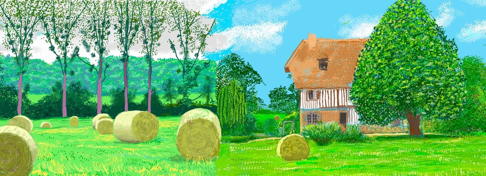
The eye enters through whichever high-contrast anchor sits closest to habitual scanning patterns: the orange-brown roofline against pale sky, or the cluster of hay bales at lower left. Both are strong Anchoring and Reference Points. The roofline is one of the crispest edges in the image, a clean Edge Detection event that contrasts with the soft, porous boundary where the dense green tree canopy dissolves into sky. That contrast, hard edge against soft edge, creates two different qualities of Contour Quality within one frame, and the eye toggles between them rather than settling.
The vertical seam interrupts lateral scanning. Sky value flips from pale gray-white with scribbled clouds to saturated cyan-blue at the same horizon height, so the eye registers a Simultaneous Contrast event it can't fully explain by shadow or weather logic. This produces Visual Tension right at the composition's spine. The eye does not stop at the seam so much as skip over it, carried by the continuous field of hay bales and grass hatching that run underneath, unbroken, on both sides. That continuity beneath a broken sky is the main perceptual conflict: ground reads as one place, sky reads as two.
Depth is built through Overlap/Occlusion and Elevation in Picture Plane rather than atmospheric fade. Bales get smaller and rise higher in the frame; the house and tree sit on a middle band; the far tree-line closes the back. There's no softening of color or edge with distance, so recession is legible but shallow, more a stack of planes than a deep pull. The pink-violet tree trunks function as Visual Pop-out: bark color that has no naturalistic basis grabs attention through Color Opponent Channels before the brain assigns it meaning. That non-naturalistic color note keeps returning the eye to the left edge even after it has traveled right toward the house.
The isolated hay bale, set apart from the main cluster, works as a closing point, a place the eye can rest once it has crossed the seam and toured the house and tree. The overall visual instruction is: scan continuously across a broken sky, using the ground plane as the stable through-line. That instruction is coherent, but it asks the eye to hold two different atmospheric conditions as one continuous afternoon, which is the perceptual work the painting keeps generating.
MATERIAL AND FORMAL
The support is a composite iPad painting, a work made from multiple digital passes and instrument marks rather than a single continuous surface. The medium's construction shows: stippling, scumbling, and dot-based color built up in visible increments, no blending, no wet-into-wet transitions of the kind a brush would leave. This is Optical vs. Physical Color Mixing done at the level of individual marks. Foliage color is not premixed green; it's built from multiple greens layered as separate dots that the eye fuses at viewing distance. Up close, the canopy is a field of discrete touches. At a few feet back, it reads as a single dense tree.
The seam between the two sky zones is the most material fact in the piece. Whatever the digital equivalent of a brushstroke boundary is here, it's visible: two treatments of sky sit side by side with no transitional blend, no gradient bridging pale gray-white into saturated cyan-blue. This is consistent with a painting assembled from separate working sessions or separate iPad "pages" that got joined into one composite file at 96 by 42 inches, taller than most doorframes and roughly as wide as a small car is long. The composite dimension itself is a material decision: this is not a single canvas painted at once, but panels or passes stitched at production stage.
The surface is honest about its own making. Nothing here pretends to be oil paint or gouache. The dot-based grass hatching, the stipple-built canopy, the crisp vector-like edge of the roofline against a flat sky field: all of these read as digital marks doing digital things, not simulating traditional media. That honesty is a strength at close range and a liability at a glance, because from a normal viewing distance the piece can be mistaken for a loosely brushed landscape until the eye catches the too-clean roof edge or the too-uniform stipple pattern, at which point the digital origin becomes obvious and doesn't go away.
CULTURAL
Hockney's iPad landscapes since 2010 have already established a critical frame: digital drawing as a legitimate extension of plein air observation, not a break from it. This painting enters that conversation directly. The Normandy series as a whole references the Bayeux Tapestry's horizontal, processional format (a connection the artist has stated publicly), and a 96-inch-wide composite panel fits that ambition toward a long, scroll-like viewing experience even at this comparatively modest width.
One reading of where this sits institutionally: the Serpentine Gallery context signals contemporary art infrastructure engaging with an artist whose reputation was built in painting and photography, now working in a medium (iPad app painting) that had to earn legitimacy against skepticism from both digital-art and traditional-painting communities. The half-timbered house and hay bales are conventional French rural landscape subject matter, legible to anyone who knows Impressionist and Post-Impressionist landscape painting, Pissarro, Monet's haystacks specifically. Placing saturated, non-naturalistic pink-violet trunks and a split sky inside that inherited subject matter reads as a deliberate friction between inherited genre and new tool.
The seam itself carries different legibility depending on audience. To a viewer versed in Hockney's practice and the iPad medium's working method, panel-seam or session-seam construction reads as procedural honesty consistent with the artist's stated interest in multiple perspectives and moments within one image. To a general gallery audience unfamiliar with that lineage, the seam risks reading as an uncorrected flaw in the file, a compositing error rather than a compositional choice. This is a case where illegibility could be read as cost of the digital medium's unfamiliarity rather than intended transgression, though it's also consistent with Hockney's long-stated interest (from the joiner photographs onward) in multiple viewpoints refusing to cohere into one.
CONCEPTUAL
The painting engages the argument, running through Hockney's work since the 1980s photo joiners, that single-point perspective and a unified moment of time are not how human vision actually works. The seam, read this way, is not an accident to be smoothed over; it's the argument made visible. Two sky treatments occupying one continuous ground plane stage Simultaneity vs. Sequence directly: the painting proposes that a landscape observed over time, in different light, different sessions, different states of attention, can be truthfully rendered as one image without reconciling those states into a single coherent moment.
This connects to Hockney's long-standing position against photographic and Renaissance perspective as truth-telling devices. The uniform depth of field (no focal blur, no atmospheric softening with distance) is consistent with that position: everything stays equally sharp because the painting isn't claiming the fixed vantage point of a camera lens. Instead it's claiming the roaming, accumulating vantage point of a body that walked the field over days or weeks. Overlap and elevation-in-plane substitute for atmospheric perspective because the argument is compositional truth, not optical simulation.
Where the visual choices support the position: the mark-built, stippled color across grass and canopy performs the same argument at the level of paint handling that the seam performs at the level of composition. Both say a scene is an accumulation of discrete observations, not a single continuous act of seeing. Where the position gets tested: the non-naturalistic pink-violet trunks introduce a different kind of claim, closer to color-as-feeling than color-as-observed-time-shift, and that claim runs alongside the temporal argument without being fully folded into it. Hypothesis (insufficient visual evidence): the trunk color specifically references stained glass or medieval manuscript color logic as part of the Bayeux Tapestry lineage; the formal observations alone don't establish that connection, only that the color is non-naturalistic and functions as Visual Pop-out.
NOISE: CONSOLIDATED
PERCEPTUAL: The seam creates a genuine scanning conflict. The eye must treat one continuous ground plane as sitting under two incompatible sky conditions, and no perceptual cue (haze, gradient, shadow direction) explains the split in observational terms. This is real friction, not resolved by the composition itself.
MATERIAL: None of the material choices fight each other. Stipple-built color, visible mark construction, and the panel-seam device are all consistent expressions of the same digital process. The one friction point is scale-dependent legibility: from a distance the piece can pass as conventionally handled paint, and only close viewing reveals its digital construction, which briefly misdirects the viewer's expectations before correcting them.
CULTURAL: The seam and the non-naturalistic trunk color both risk reading as errors or unresolved passages to an audience unfamiliar with Hockney's decades-long argument against single-viewpoint perspective. Without that context, the work's most conceptually loaded features look like the least resolved parts of the painting.
CONCEPTUAL: The temporal-simultaneity argument (carried by the seam) and the color-as-feeling move (carried by the pink-violet trunks) run on parallel tracks without being explicitly unified. The painting doesn't fully clarify whether non-naturalistic color is doing the same argumentative work as the sky split, or a separate one.
The seam's apparent flaw is very likely intentional, serving the conceptual argument about simultaneity; the risk of misreading it as error is a genuine cultural-legibility cost the work accepts rather than solves.
WAYS OF LOOKING
The analysis notices that hay bales and grass hatching run continuously underneath a sky that splits into two different treatments, one pale and scribbled, one saturated blue. That's the move worth stealing: check whether a disruption at one level of the image (the sky) is contradicted or smoothed by continuity at another level (the ground). A composition rarely breaks uniformly across its whole surface. Find the layer that stays stable and the layer that doesn't, and you've found where the real argument is happening.
Notice, too, how the write-up refuses to settle what the seam means. It lays out three live readings, accident, procedural honesty, deliberate staging, and holds them side by side instead of picking a winner early. That's a habit: when a feature could be read multiple ways, name the readings explicitly and ask what evidence would actually distinguish them, rather than defaulting to the most flattering interpretation. It's slower, but it's the difference between describing a painting and arguing for a reading of it.
The piece also keeps asking who can actually see what. It points out that the seam reads as intentional to someone who knows Hockney's iPad practice and as a compositing error to someone who doesn't. That's a habit worth carrying into any argument about a work's significance: separate what's visible in the object from what's visible only with outside context, and say so plainly instead of assuming your audience already has the frame you have.
WHAT THIS WORK MAKES VISIBLE
Stand close to the tree on the right and the color is a scatter of separate green dots. Step back and it becomes one solid canopy. That's optical color mixing, the eye fusing distinct marks into a mass tone, and it's rarely this easy to catch in the act because most paintings blend at the surface before you get the chance. Here the digital stipple stays discrete at any distance up close, so you can watch the fusion happen instead of just trusting that it happened. Look for this in any pointillist or mark-built surface: find the viewing distance where the dots become a color, and you've located the exact threshold where perception does the mixing the artist didn't.
The vertical seam does something rarer still: it lets you watch a painting refuse to commit to one moment in time. Most landscapes hide their multiple sessions under blended light. This one shows the stitch, pale sky butting straight against saturated sky with no gradient between them. Next time you're in front of a landscape that feels slightly wrong without an obvious reason, check the sky first. Inconsistent light across one continuous ground is usually the tell that you're looking at accumulated time, not a single glance.
Looking vs. Knowing
These are the analysis's own words, nothing added.
What the Work Shows Us
These are the claims that hold up when you look: each one is rooted in something the image actually puts in front of you, not from what we already knew—or thought we knew—about it.
Readings That Came From Outside
Not wrong, necessarily—but these readings didn't come from looking: they came from biography, cultural context, critical tradition, to complete what the image left open.
Writing guardrail
The house style rules this writing was asked to follow, and where it didn't. Flagged after the fact. Nothing was rewritten.
Pass 2
- Used banned word: tapestry
Alternative Interpretation
Pulled directly from this analysis's own language — nothing added.
The analysis's primary reading treats the vertical seam between the two sky treatments as an intentional conceptual device, the visible staging of simultaneity against sequence consistent with Hockney's decades-long argument against single-viewpoint perspective. The competing reading, which the analysis raises but doesn't dismiss, is that to a viewer unfamiliar with Hockney's iPad practice and the joiner-photograph lineage, the same seam reads simply as an uncorrected compositing error, meaning the work's legibility as argument depends entirely on the viewer already possessing outside context the image itself doesn't supply.
Questions Raised
Does the seam function as a perceptual flaw the painting asks viewers to forgive, or as the conceptual proposition the whole piece exists to test? The analysis states both are true for different audiences without resolving which one the painting is "supposed" to do for a general viewer.
Are the non-naturalistic pink-violet trunks doing the same argumentative work as the sky split (staging temporal accumulation), or a separate, unrelated move toward color-as-feeling? The analysis flags these as running on parallel, unreconciled tracks.
The hypothesis that the trunk color references stained glass or medieval manuscript color logic tied to the Bayeux Tapestry lineage is explicitly marked as insufficient visual evidence. It remains an open question whether that connection exists at all or whether the color is non-naturalistic for other reasons.
Pass 1 — blind observation used
The eye lands first on the row of hay bales cutting across the lower left, their circular forms repeating in a diagonal line toward the foreground. This is Rhythm and Repetition: five, six, seven cylindrical shapes stamped across the grass at irregular but related intervals, each rendered with the same concentric striations suggesting the coiled straw.
The picture splits into two distinct halves that don't quite match. On the left, a stand of thin poplar trunks, painted with pink-violet undersides, rises against a sky rendered in loose gray scribbles. On the right, the sky turns a flat saturated blue, and the trees become rounder, denser masses of green stippling. This is Unity vs. Variety Tension: the same field, the same light, but two different handling systems abutting at a visible seam near the center, as if two sessions of looking were stitched together without reconciling.
The half-timbered house anchors the right side: an orange tiled roof, a chimney stack, black timber framing crossing a white-and-brick lower story. Its dark window squares are Visual Pop-out, small high-contrast notes against the pale wall that the eye keeps returning to.
Color Temperature runs cool to warm left to right: the gray-green poplar section reads cooler, while the house's orange roof and the yellow-green bales advance visually, sitting forward of the receding blue.
Marks throughout are dabbed and stippled rather than blended, dense pointillist clusters standing in for foliage. This is Optical vs. Physical Color Mixing: the tree canopies are built from separate green, yellow, and dark strokes that the eye fuses into a single leafy mass only at viewing distance.
Depth is established by Overlap/Occlusion rather than atmospheric fading, bales in front block the grass behind them, the house partially hides the large tree to its right, and the tree trunks overlap the darker green tree line behind. No haze softens the distance; far and near are equally sharp, flattening the space.
The eye finally settles on the single bale sitting alone in the right-hand meadow, isolated from the cluster on the left, a quiet echo that ties the two halves of the composition back together.