David Hockney
July 29, 2026 at 3:52 PM
Model: claude-sonnet-5
These 58 principles are perceptual mechanisms that influence what gets noticed, how forms organize, and how space is inferred - all before conscious interpretation. They do not determine meaning.
what the eye does
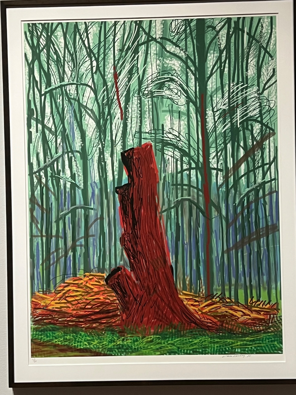
The red trunk grabs you before you've decided to look at anything. It's not the biggest shape in the picture, but it's the only warm thing surrounded by cold, and your eye treats that like an alarm going off. You settle there first, then the black looping outline around it starts to bother you a little, because it never quite closes, never gives you a clean edge to rest on. From the trunk your eye drifts up into a thicket of thin vertical lines, green and teal and pale mint, stacked so evenly they stop reading as individual trees and start reading as a pattern, almost like static. Then it catches on the pale gaps near the top, the places where the color drops out and you read that as light getting through. Down at the bottom, the orange and ochre scribbles of cut brush interrupt the vertical rhythm entirely, and your eye has to shift gears again, from reading trunks to reading debris. Nothing here is soft. Nothing blurs. The eye keeps getting handed a hard edge to deal with.
how it's made
The lines are heavy, looping, almost hand-scribbled, but the color underneath them sits completely flat, no brush drag, no thinning at the edges, no place where you can see a hand slow down or press harder. That combination is the tell. This is a print, worked out on a screen or through a digital drawing process, then output at a scale and surface that gives it the evenness of ink or laser rather than paint. The signature and edition number penciled into the lower margin confirm what the surface already tells you: this exists as one of a run, not as a single unrepeatable object. The mark-making still performs looseness, the scribble, the restless contour, the interrupted line, but the performance sits on top of a mechanically consistent field. You get the gesture of drawing without the residue of drawing. That gap between what the line looks like it's doing and what the surface proves it did is worth sitting with.
where it lives
Hockney spent a long stretch of his later career going back to the same patch of Yorkshire woodland and landscape repeatedly, working across paint, watercolor, charcoal, and eventually digital tools including the iPad, treating each medium as a different way of asking the same question about how a place looks when you actually stand in it and look hard rather than photograph it. This piece sits inside that project. It arrives after decades in which Hockney had become openly skeptical of photographic vision, arguing in his writing and in exhibitions like the Royal Academy's "A Bigger Picture" that the camera flattens experience in ways the eye and hand don't. A forest built from repeated vertical strokes, with one warm trunk singled out by color rather than by size, reads like an argument against the camera's version of a tree line, which would give you focus falloff and atmospheric haze. Here there's none of that. Every trunk, near or far, gets the same clarity. That refusal is the point, not an oversight.
what it's arguing
The picture is making a case that attention, not distance, is what organizes a landscape. A camera would blur the background trees to tell you they're far away. This image keeps them just as sharp as the foreground trunk and lets color temperature do the work of separation instead, warm against cool, saturated against muted. That's a claim about how looking actually works: you don't experience distant trees as fuzzy, you experience them as less demanding of your attention, and this picture translates that difference into hue rather than focus. It's also making a smaller, funnier argument about scribbling itself, that a rough, unfinished-looking line can carry as much structure as a clean one, maybe more, because the roughness keeps your eye moving instead of letting it settle too soon.
what it holds open
The trunk's cropped top, whether it's cut by the frame or breaks apart on its own, never resolves into one clear reading, and Hockney doesn't seem interested in settling it. Is this a portrait of one tree, or a stand-in for the whole idea of a forest compressed onto a flat sheet? The picture keeps both options live and won't choose, which is probably the most honest way to draw something you've walked past for years and still don't feel finished looking at.
WAYS OF LOOKING
The analysis notices that heavy, looping black outlines sit on top of color that's completely flat, no drag, no thinning, no pressure change. That mismatch between what a line performs and what the surface proves becomes the key to identifying the medium. The habit here is reading materials against gesture: don't just describe what a mark looks like, ask whether the surface backs up the story the mark is telling. A brushstroke that behaves like ink, a scribble that behaves like a machine pass, those contradictions are where the real information about how a thing was made hides.
The analysis also catches that background trees keep the same clarity as the foreground trunk, no blur, no softening, and reads that as a refusal rather than a mistake. That's a habit worth naming: when a work withholds a convention you expect (atmospheric perspective, in this case), treat the absence as a choice, then ask what's doing the job that convention usually does. Here, color temperature replaces distance. Somewhere else it might be scale, or line weight, or nothing at all, which would be its own kind of statement.
Notice, too, how the piece won't settle whether the trunk's top is cropped by the frame or broken on its own terms, and the analysis simply says so instead of forcing a resolution. That's a discipline: naming what a work leaves genuinely undecided, rather than smoothing it into a tidy reading, because the ambiguity is often where the work is most alive.
WHAT THIS WORK MAKES VISIBLE
The red trunk against the green field makes color opponency, the way red and green intensify each other just by sitting side by side, almost impossible to miss. Most paintings bury this effect inside more complicated color relationships. Here it's isolated enough that you can watch your own eye jump to the red before you've consciously decided to look at anything. Next time you're in front of a busy composition, find the one saturated note surrounded by its opposite, and notice how much earlier your eye finds it than everything else.
The repeated vertical strokes of the background trees also make repetition-as-texture unusually easy to see: enough trunks, drawn with just enough consistency, that they stop reading as individual objects and start reading as a field, almost like static. Wallpaper does this. So does a hillside of similar trees, or a crowd in a photograph. Once you've seen it named here, you'll start noticing the threshold where "many things" becomes "one texture," and in whose work that threshold gets crossed on purpose.
Alternative Interpretation
Pulled directly from this analysis's own language — nothing added.
The analysis reads the singled-out red trunk as a specimen study, one tree isolated by color against a uniform stand of others. But it also floats the competing possibility that the trunk stands in for the whole forest compressed onto the sheet, a symbolic condensation rather than a portrait of one tree, and it explicitly declines to choose between these two readings.
Questions Raised
Whether the trunk's cropped top is a deliberate compositional cut or an unresolved break in the drawing itself, since the analysis states this "never resolves into one clear reading."
Whether the piece is a portrait of a single tree or a stand-in for the idea of a forest, a question the analysis raises and then says Hockney "doesn't seem interested in settling."
The analysis infers the digital/print production method from surface evidence (flat color under scribbled line, penciled edition number) rather than from confirmed documentation of the specific tool or process used, so the exact technical process remains inferred rather than established.
Pass 1 — blind observation used
The red trunk claims the center first, Visual Pop-out driven by saturation: nothing else in the composition reaches that intensity of red against the greens surrounding it.
The trunk's edges are drawn in heavy black scribbled outline, dense and looping, especially at the top where the wood has broken or splintered. That contour quality is rough, repeated pen strokes rather than a single clean line, giving the break at the crown a torn, fibrous look. Lower down the outline relaxes into looser, more open marks where the trunk meets the log pile.
Behind the trunk, the vertical lines of the forest are drawn as thin repeated strokes in dark green, teal, and blue-green, creating a Rhythm and Repetition of trunks that reads as a screen rather than individual trees. Interval Relationships between these verticals are fairly even, reinforcing the sense of a planted or managed stand rather than wild growth. A few of the background lines are rendered in the same red as the main trunk, thin vertical streaks that echo the central color and create Color Opponent Channels against the green field.
Between the trunks, patches of white and pale green suggest light breaking through, with scribbled cloud-like white marks clustered at the upper middle and right, denser and more circular than the straight trunk lines, breaking the vertical rhythm.
At the base, the ground is built from overlapping orange, yellow, and brown scribbles representing cut brush or wood debris, piled unevenly to either side of the trunk. This is the densest area of mark-making in the image, small tight loops layered over each other, contrasting with the longer, sparser strokes used for the background trees. Below that, green cross-hatching indicates grass, flatter and more evenly spaced than the debris above it.
Value Structure is built from the dark trunk and black outlines at one extreme against the near-white gaps in the tree screen at the other, with the mid-range greens and blues carrying most of the picture's area.
Occlusion is minimal: the trunk sits in front of the brush pile, and the brush pile in front of the grass, but the background trees are drawn as a flat overlapping lattice without clear front-to-back layering, keeping the forest compressed rather than deep.
The piece is signed and numbered in pencil at the lower corners, consistent with a limited edition print, and the flat unmodulated color fields point to a printed or digitally generated medium rather than painted layering.
The eye finally settles on the black cavity near the top of the trunk, the darkest and most enclosed shape in the image, where the scribbled contour lines converge and stop.