David Hockney
July 29, 2026 at 3:50 PM
Model: claude-sonnet-5
These 58 principles are perceptual mechanisms that influence what gets noticed, how forms organize, and how space is inferred - all before conscious interpretation. They do not determine meaning.
what stops you
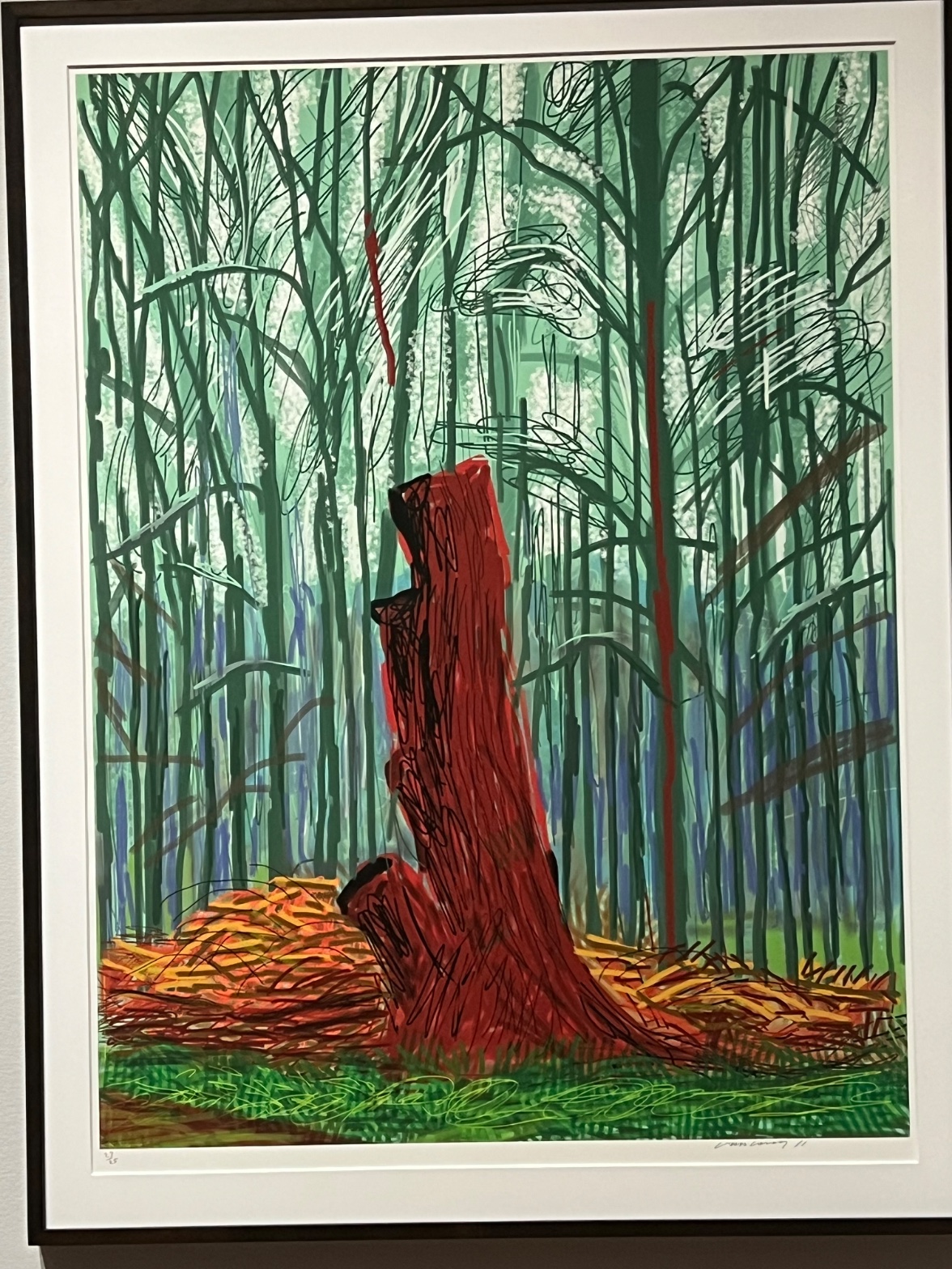
The red trunk hits before anything else registers. You haven't parsed the forest, haven't clocked the ground, haven't read the print signature in the margin. The red is already there, doing its work against the green field around it, and the green field makes the red hotter than it would be on its own. That's the whole opening move: color built to fight itself.
Then the eye starts doing what the trunk's outline demands. That outline isn't a line, it's a scribble pretending to be a line, dense and looping and torn open at the top where the form breaks apart instead of closing. A clean contour would let you settle. This one keeps working. Your eye traces the loops, loses the edge, finds it again lower down. Behind the trunk, the vertical strokes of the background trees repeat in cooler tones, and that repetition sets a rhythm the eye can rest in, which makes the trunk's ragged edge feel even more like a disruption. You keep bouncing between the two textures. The picture won't let you pick one mode of looking and stay there.
how it was made
The surface is flat and even in a way that hand-laid paint rarely is. No visible ridge of pigment, no place where a brush dragged and left a shadow, no variation in the thickness of a stroke as pressure changed. The line weight holds steady across the whole sheet. That evenness is the tell. This is a printed image, worked out through mark-making that was then reproduced with mechanical consistency, a pencil signature and edition number in the lower margin confirming it as a limited print rather than a one-off surface.
But the marks themselves still read as drawn, not printed cold. The scribbled loops that make the trunk's edge look like they came from a hand moving fast, doubling back, refusing to resolve into a single confident stroke. Same with the orange and ochre tangle at the base, the cut brush and woodpile debris rendered in short looping strokes that sit differently on the page than the longer verticals above them, and the cross-hatched green at the very bottom, looser and more horizontal, standing in for grass underfoot. Three distinct stroke vocabularies, one per zone, and none of them softened into each other. Depth here isn't built by blur or by fading color into the distance. It's built by covering: the trunk sits in front of the background verticals and blocks them, the brush pile sits in front of the tree bases and blocks them. Layering by overlap, not by atmosphere. Nothing recedes. Things just get covered up.
what it was entering
Landscape had spent a century being told it was either observation or invention, plein air fidelity on one side, expressive distortion on the other, and most artists picked a camp. This picture refuses the choice by making the print process itself part of the argument: a landscape built from repeatable marks, editioned and signed like a photograph's cousin, but drawn with the loose hand of a sketchbook study. It sits at the crossing point between the fidelity of observed color and the freedom of a mark that doesn't pretend to be naturalistic. The red trunk isn't the color of any tree. It's the color a tree becomes once you've decided that intensity matters more than accuracy.
That's a position, not an accident: color pushed past local truth into something closer to sensation, forest space compressed rather than opened into recession, cropping that lets the top of the trunk get cut off by the frame so the forest clearly continues past what you're allowed to see. The picture isn't claiming to document a clearing. It's claiming that a clearing, looked at hard enough, produces this much heat.
what demonstrates
Watch what happens if you cover the red trunk with your hand. The green field goes flat, uniform, almost sleepy. Uncover the trunk and the whole field changes temperature, the greens read cooler and sharper than they did a second ago. Nothing in the green paint changed. Only the context did. That's the picture's central demonstration: color has no fixed value, only relative value, and this single form, sitting where it sits, proves it by force rather than by explanation.
The second thing to carry out of the room is what the ragged edge is doing. A clean silhouette would let the trunk sit as a shape, something you recognize and move past. The scribbled, broken contour keeps the eye working the boundary instead of accepting it, so the trunk never fully separates from the field around it, even though it's the most dominant form in the composition. Figure and ground stay in an argument the whole time you look. Once you've registered that, you start noticing it everywhere: in Cézanne's tree trunks refusing to hold still, in any drawing where the edge is left loose enough that the boundary between one thing and another has to be negotiated instead of granted. This picture makes that negotiation visible because it exaggerates it. The trunk is unmissable, and its edge still refuses to resolve.
why it holds
The picture stays alive because it never lets the eye finish its job. Simultaneous contrast means the red keeps intensifying every time you glance back at it, no fatigue, no settling. The broken contour means the boundary between trunk and forest never locks into place. And the flat, printed evenness of the whole surface means there's no brush texture to fall back into as a resting point, no place where you can stop reading structure and just admire craft. Every part of the surface asks you to keep comparing it to every other part.
That's the standing question the work sits inside: whether a landscape has to earn its intensity through observed truth, or whether intensity itself, laid down hot enough against its opposite, is truth enough. This picture bets on the second answer and builds a mechanism, color against color, edge against edge, that keeps making the bet good every time someone looks.
WAYS OF LOOKING
The analysis starts with the covered-hand test: put your hand over the red trunk, and the green field goes flat and sleepy; take it away, and the greens sharpen. Nothing in the paint changed, only the context did. That's a habit worth stealing — when a color or shape feels intense, don't just describe the intensity, test what's making it intense. Isolate the element and see if the effect survives on its own. Usually it doesn't. The intensity was a relationship, not a property.
Notice how the analysis treats the trunk's outline: not as a boundary but as an unresolved argument, a scribble that never lets figure fully separate from ground. That's a habit of reading edges as decisions rather than facts. Every contour in a picture is a choice about how much the artist wants a shape to hold still. A clean edge settles the eye. A ragged one keeps it working. Ask, every time: is this edge letting me rest, or is it still negotiating?
The analysis also catches something easy to miss — the surface is flat and mechanically even, no ridge of paint, no pressure variation, and reads that evenness as evidence about how the thing was made, arriving at "this is a print" before ever citing the signature. That's a habit of letting the surface itself testify. Texture, or its absence, is information about process, and process is often the argument.
WHAT THIS WORK MAKES VISIBLE
Because the red trunk sits in a nearly monochrome green field, you can watch simultaneous contrast happen in real time, the way red and green sit as opposites on the color wheel and each makes the other more intense just by proximity. In a busier, multicolor painting this effect gets buried under other information. Here it's isolated enough to catch yourself doing it. Next time you're in front of any painting with one saturated color against a dominant field, try the hand-over-the-shape test. You'll feel the color pulse when you uncover it.
The other thing visible here almost by exaggeration: depth built entirely through overlap, with no atmospheric softening at all. The background trees hold the same line weight and clarity as the foreground; only the fact that the trunk covers them tells you it's in front. Most landscapes fake distance by blurring or cooling far objects. This one refuses that trick, so you can see overlap doing the whole job of depth by itself, stripped of every other depth cue that usually rides along with it.
Looking vs. Knowing
These are the analysis's own words, nothing added.
What the Work Shows Us
These are the claims that hold up when you look: each one is rooted in something the image actually puts in front of you, not from what we already knew—or thought we knew—about it.
Readings That Came From Outside
Not wrong, necessarily—but these readings didn't come from looking: they came from biography, cultural context, critical tradition, to complete what the image left open.
Writing guardrail
The house style rules this writing was asked to follow, and where it didn't. Flagged after the fact. Nothing was rewritten.
Pass 3
- Used a banned construction: em dash
Alternative Interpretation
Pulled directly from this analysis's own language — nothing added.
The analysis treats the print as a settled hybrid: a mechanically reproduced sheet that nonetheless carries "drawn, not printed cold" marks. But it doesn't fully resolve whether the loose, sketchbook-like handling is the trace of a genuine spontaneous drawing hand later editioned, or a calculated imitation of spontaneity designed to read as loose within a medium built on repeatable evenness. The essay calls this tension "a position, not an accident," yet it never settles which came first, the gesture or the decision to make the gesture look unrehearsed.
Questions Raised
Is the ragged, "torn open" contour of the trunk a spontaneous mark preserved through the printing process, or a deliberate simulation of spontaneity built into the plate/stone before editioning?
The analysis asserts the picture "refuses the choice" between plein air fidelity and expressive distortion by making the print process part of the argument, but it doesn't establish whether this refusal was the artist's conscious intent or a reading imposed after the fact.
The comparison to Cézonne's trunks is offered as a way of generalizing the edge's function, but the analysis doesn't clarify whether this is a claim of direct influence or simply a shared visual habit noticed in hindsight.
Pass 1 — blind observation used
The red trunk claims the center first, Visual Pop-out driven by saturation: nothing else in the composition reaches that intensity of red against the greens surrounding it.
The trunk's edges are drawn in heavy black scribbled outline, dense and looping, especially at the top where the wood has broken or splintered. That contour quality is rough, repeated pen strokes rather than a single clean line, giving the break at the crown a torn, fibrous look. Lower down the outline relaxes into looser, more open marks where the trunk meets the log pile.
Behind the trunk, the vertical lines of the forest are drawn as thin repeated strokes in dark green, teal, and blue-green, creating a Rhythm and Repetition of trunks that reads as a screen rather than individual trees. Interval Relationships between these verticals are fairly even, reinforcing the sense of a planted or managed stand rather than wild growth. A few of the background lines are rendered in the same red as the main trunk, thin vertical streaks that echo the central color and create Color Opponent Channels against the green field.
Between the trunks, patches of white and pale green suggest light breaking through, with scribbled cloud-like white marks clustered at the upper middle and right, denser and more circular than the straight trunk lines, breaking the vertical rhythm.
At the base, the ground is built from overlapping orange, yellow, and brown scribbles representing cut brush or wood debris, piled unevenly to either side of the trunk. This is the densest area of mark-making in the image, small tight loops layered over each other, contrasting with the longer, sparser strokes used for the background trees. Below that, green cross-hatching indicates grass, flatter and more evenly spaced than the debris above it.
Value Structure is built from the dark trunk and black outlines at one extreme against the near-white gaps in the tree screen at the other, with the mid-range greens and blues carrying most of the picture's area.
Occlusion is minimal: the trunk sits in front of the brush pile, and the brush pile in front of the grass, but the background trees are drawn as a flat overlapping lattice without clear front-to-back layering, keeping the forest compressed rather than deep.
The piece is signed and numbered in pencil at the lower corners, consistent with a limited edition print, and the flat unmodulated color fields point to a printed or digitally generated medium rather than painted layering.
The eye finally settles on the black cavity near the top of the trunk, the darkest and most enclosed shape in the image, where the scribbled contour lines converge and stop.