David Hockney
July 22, 2026 at 3:29 PM
Model: claude-sonnet-5
These 58 principles are perceptual mechanisms that influence what gets noticed, how forms organize, and how space is inferred - all before conscious interpretation. They do not determine meaning.
LOOKING PROMPTS
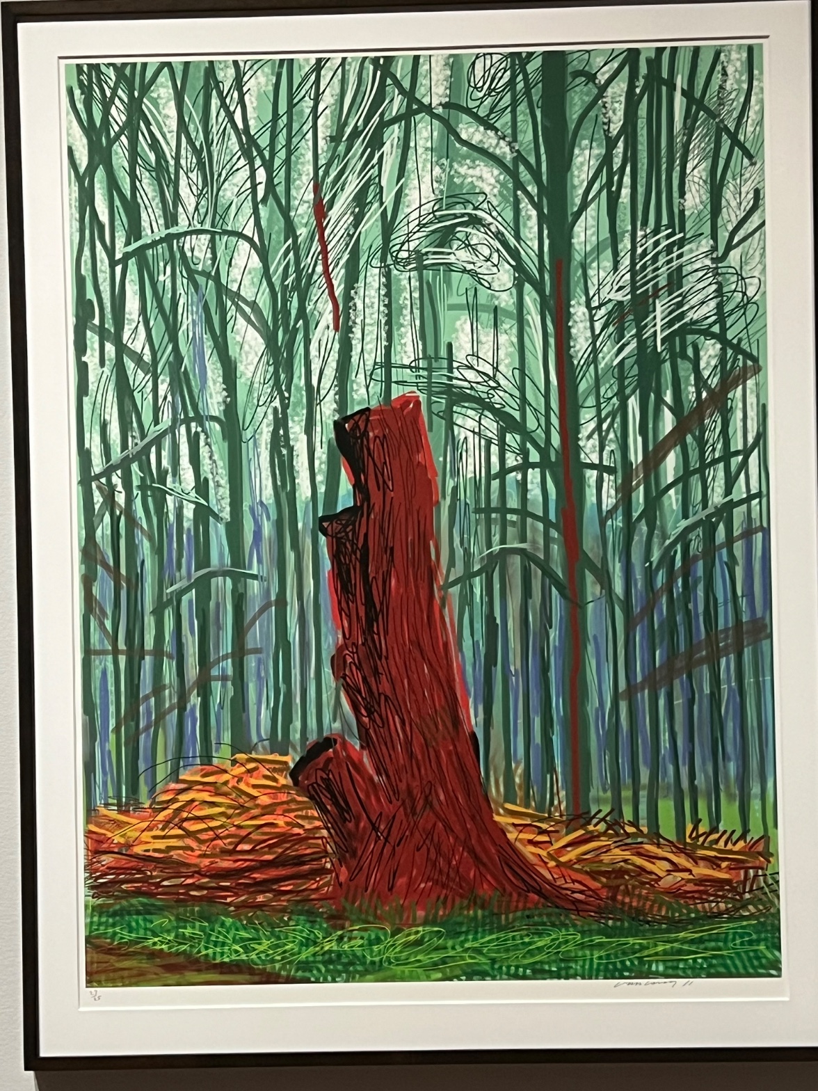
Look at the red trunk in the center. Follow its outline slowly and notice how many separate loops and scribbles make up that one edge.
Scan the upper third of the image, where pale, almost white marks break up the green. Count how many gaps of light you can find up there.
Look at the ground where the red trunk meets the bottom of the picture. Compare the orange and yellow marks there to the thin green lines stacked above them.
Start here: Notice that the red trunk sits in front of everything else and covers the green lines behind it. Once you see what's blocking what, the space of the whole picture opens up.
THE HOOK
Why does that red trunk look like it's glowing, when the color itself is just flat red-brown? Nothing in the pigment is doing that work. The green field surrounding it is doing it, pushing the red to look hotter and brighter than it would sitting on a white page. Cover the green with your hand and the red goes quiet. That's the whole trick of the piece sitting right in front of you.
THE STORY
David Hockney spent decades painting and drawing the same stretch of landscape in East Yorkshire, returning to it across seasons with different tools, including the iPad in his later years. This kind of woodland image, built from repeated line and saturated, non-naturalistic color, belongs to that late period, when Hockney was pushing color and mark-making harder than his earlier, cooler California work. Critics and audiences met these late landscapes with some divide: admirers saw a painter still restlessly inventing in his seventies and eighties, using new tools without losing his hand; skeptics questioned whether digital drawing tools cheapened the labor and authority normally attached to paint. The even, unmodulated color and uniform line in a work like this one are themselves part of that argument, since they read as calculated rather than accidental. That debate over what counts as serious mark-making, digital versus physical, has never fully closed.
THE LIVE QUESTION
Some people look at the flat, even color here and see a artist working confidently with a new tool, translating an old subject into a new language. Others look at that same flatness and feel something is missing, that the color is too uniform to carry the weight of a real place. Where do you land: does the evenness feel controlled, or does it feel thin?
WAYS OF LOOKING
The analysis notices that the red trunk isn't actually glowing, the pigment is flat red-brown, but it looks hot because it's surrounded by green. That's a habit worth stealing: when a color or shape seems to jump out at you, ask what's sitting next to it, not just what it is. Color and value only mean anything in relation to their neighbors. Once you start checking the neighbor, you can build a whole tour stop around one contrast: put your hand over the green, watch the red go dead, take your hand away.
The analysis also spends real time on the trunk's outline, noticing it's not one clean line but a pile of loops and scribbles. That's a habit of slowing down at the edge of a form instead of just naming the form. Most visitors register "tree trunk" and move on. Asking how the edge is built, rough or smooth, single stroke or a hundred, gives you something concrete to point at and a reason to linger there.
Then there's the move of using occlusion, meaning what's in front of what, as the read on space instead of assuming deep perspective. The trunk covers the background lines, the woodpile covers the base of the trees. No blur, no fading. That's a habit of asking "what tells me what's in front of what?" rather than "does this look far away?" It works on any flat or stylized image where atmosphere isn't doing the usual work.
WHAT THIS WORK MAKES VISIBLE
Look at how evenly the color sits in every area, no visible brush drag, no built-up texture, just flat fields of green and red laid next to each other like cut paper. That evenness is unusual to see so clearly. In a painted canvas, texture often hides how color relationships are actually working, because your eye gets caught on the surface. Here there's no surface to get caught on, so the simultaneous contrast, meaning how one color changes your read of the one beside it, sits right on top, unmissable. Next time you're in front of a print, a digital print, or hard-edge painting, check whether the flatness is helping you see color logic more clearly than a textured surface would.
The repeated vertical lines behind the trunk also make rhythm easy to isolate, because the repetition is so regular you can count the beats and then spot exactly where the pattern breaks, at the red accent line, at the trunk itself. Rhythm is harder to catch in more varied, painterly line work. Here it's almost diagrammed for you.
Looking vs. Knowing
These are the analysis's own words, nothing added.
What the Work Shows Us
These are the claims that hold up when you look: each one is rooted in something the image actually puts in front of you, not from what we already knew—or thought we knew—about it.
Readings That Came From Outside
Not wrong, necessarily—but these readings didn't come from looking: they came from biography, cultural context, critical tradition, to complete what the image left open.
Alternative Interpretation
Pulled directly from this analysis's own language — nothing added.
The primary reading treats the flat, uniform color and line as a deliberate, confident translation of Hockney's longtime landscape subject into digital tools, evidence of continued invention late in his career. The competing reading, held in the same analysis without resolution, treats that same evenness as a loss: skeptics see the flatness as a sign that digital drawing lacks the labor and authority of paint, making the color feel calculated rather than earned.
Questions Raised
Whether the uniform, unmodulated color in this piece should be read as controlled mastery of a new tool or as thinness that fails to carry the weight of the actual place, a question the analysis poses directly and leaves open.
Whether digital mark-making of this kind carries the same "authority" as physical paint handling, a dispute the analysis says "has never fully closed" rather than settling one way.
The analysis notes critics and audiences were "divided" on Hockney's late iPad landscapes but doesn't establish which reading, if any, has more support beyond stating both positions existed.
Pass 1 — blind observation used
The red trunk claims the center first, Visual Pop-out driven by saturation: nothing else in the composition reaches that intensity of red against the greens surrounding it.
The trunk's edges are drawn in heavy black scribbled outline, dense and looping, especially at the top where the wood has broken or splintered. That contour quality is rough, repeated pen strokes rather than a single clean line, giving the break at the crown a torn, fibrous look. Lower down the outline relaxes into looser, more open marks where the trunk meets the log pile.
Behind the trunk, the vertical lines of the forest are drawn as thin repeated strokes in dark green, teal, and blue-green, creating a Rhythm and Repetition of trunks that reads as a screen rather than individual trees. Interval Relationships between these verticals are fairly even, reinforcing the sense of a planted or managed stand rather than wild growth. A few of the background lines are rendered in the same red as the main trunk, thin vertical streaks that echo the central color and create Color Opponent Channels against the green field.
Between the trunks, patches of white and pale green suggest light breaking through, with scribbled cloud-like white marks clustered at the upper middle and right, denser and more circular than the straight trunk lines, breaking the vertical rhythm.
At the base, the ground is built from overlapping orange, yellow, and brown scribbles representing cut brush or wood debris, piled unevenly to either side of the trunk. This is the densest area of mark-making in the image, small tight loops layered over each other, contrasting with the longer, sparser strokes used for the background trees. Below that, green cross-hatching indicates grass, flatter and more evenly spaced than the debris above it.
Value Structure is built from the dark trunk and black outlines at one extreme against the near-white gaps in the tree screen at the other, with the mid-range greens and blues carrying most of the picture's area.
Occlusion is minimal: the trunk sits in front of the brush pile, and the brush pile in front of the grass, but the background trees are drawn as a flat overlapping lattice without clear front-to-back layering, keeping the forest compressed rather than deep.
The piece is signed and numbered in pencil at the lower corners, consistent with a limited edition print, and the flat unmodulated color fields point to a printed or digitally generated medium rather than painted layering.
The eye finally settles on the black cavity near the top of the trunk, the darkest and most enclosed shape in the image, where the scribbled contour lines converge and stop.