Artwork #47
August 3, 2026 at 10:37 AM
Model: claude-sonnet-5
These 58 principles are perceptual mechanisms that influence what gets noticed, how forms organize, and how space is inferred - all before conscious interpretation. They do not determine meaning.
what the eye does
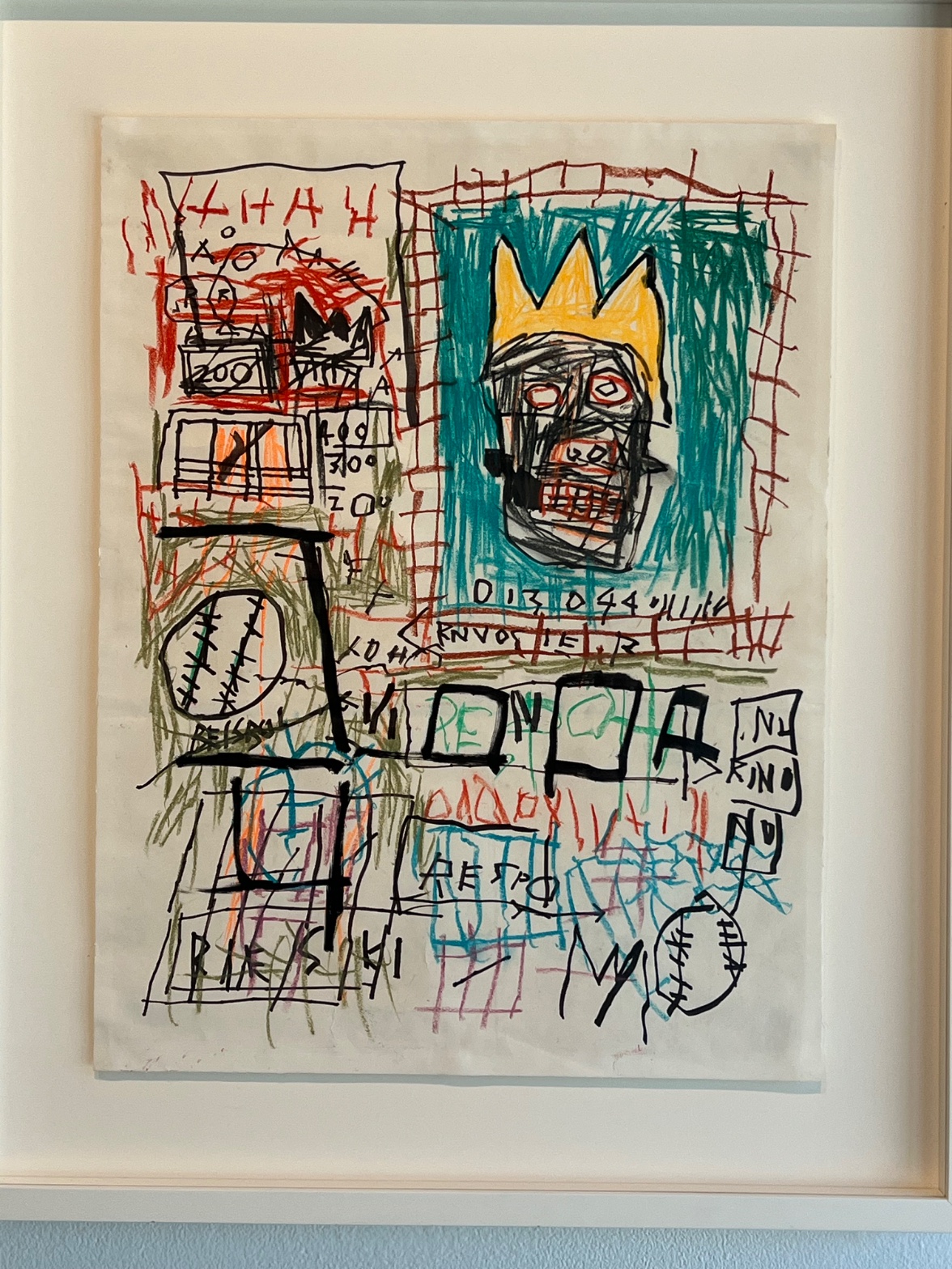
You see the crown first, and there's no getting around it: three jagged yellow points, floating over a head crammed into the upper right corner of the page. It reads as a face almost against your will, two ringed eyes and a mouth barred like a grate, and the crown makes that face feel less like a portrait and more like an announcement. From there the eye doesn't settle. It gets pulled left into a red lattice that keeps almost lining up and never quite does, down into a band of block letters that look legible until you try to actually read them, and further down still into a pair of stitched circles, little baseballs, one bigger and more insistent, one smaller and quieter, echoing each other across the sheet like a rhyme you catch on the second pass. Numbers show up in a boxed compartment, 200 stacked over what might be 300 or 400, and they carry the same weight as everything else here. Nothing in this picture is arranged to lead you gently. It's arranged to keep you moving, the way your eye moves across a subway car plastered with flyers, catching a word, a number, a face, none of it asking to be read in order.
how it's made
This is crayon and oil stick worked hard into paper, dragged and layered until the surface has a waxy, dry buildup you can practically feel from a photograph. The teal field behind the head isn't filled in so much as attacked, fast strokes that leave the white paper showing through at the corners, refusing to cover evenly. The red grid over it looks drawn in a hurry, lines doubling back, stopping short of where they should meet. There's no attempt to blend or soften a transition anywhere in the piece. Marks sit next to marks, crayon over crayon, and the tooth of the paper stays visible under almost everything, so you're always aware this was built by hand and built fast, not composed and revised toward polish. The letter band across the center has the same urgency, thick black outlines around forms that might be letters or might be shapes wearing letters as a disguise.
what it's arguing
You keep expecting the picture to resolve into something you can title, and it keeps declining. The crowned head promises royalty or fame, the numbers promise an inventory or a price, the letters promise a word, the baseball promises a specific object from a specific American childhood, and none of it locks together into a single sentence. That refusal is the argument. This is a mode of drawing that came directly out of graffiti, where a tag, a price tag, a diagram, and a slogan could all occupy the same wall with equal claim on your attention, and the picture keeps that logic intact rather than smoothing it into a single unified scene. The crown recurs across this body of work as a way of claiming stature for figures the culture wasn't in the habit of crowning, and here it does that work again, sitting on a head built from the same rough marks as everything around it, no more finished, no more resolved, just elevated.
where it lives
Stand in front of it and you're standing inside downtown New York in the early 1980s, when work like this was moving straight from the street into gallery rooms that had spent the previous decade cultivating a much cooler, more distant relationship to the hand. The crown, the copyright-style marks, the boxed numerals, the anatomical and comic-book fragments, these belong to a vocabulary built out of graffiti tags, textbook diagrams, and the visual noise of a city, assembled by an artist who was reading Gray's Anatomy and old dictionaries with the same appetite as he was reading the street. The critical reception at the time split hard between people who saw a raw, urgent intelligence working in real time and people who saw a fad dressed up as painting. That argument has mostly resolved in the artist's favor since, and pictures like this one are now read less as chaos and more as a deliberate refusal to let any one part of the image outrank another.
what it holds open
The letters never resolve into a single legible word no matter how long you look, and that's not a failure of the drawing, it's the drawing holding its ground. You can spend real time trying to reconcile the crown, the price tags, the baseball, and never land on the one story that ties them, because the picture was built to keep more than one story alive at once. What stays open is which of these fragments you weight as the key, and that choice says more about you than about the page.
WAYS OF LOOKING
The analysis notices the crown before it notices anything else, then asks why: three yellow points against teal, a shape that pops forward whether or not you want it to. That's a habit worth stealing. Before you interpret a picture, find the thing your eye hits first involuntarily, and treat that as data, not decoration. Composition often tells you where to start looking before it tells you what to think.
Look at how the write-up handles the letters. It tries to read "NURINO," "PE," "KINO," admits other viewers read "RENGA" or "O N O A," and instead of picking a winner, it decides the illegibility itself is the point. That's a different skill: knowing when to stop chasing a single correct reading and start asking what the refusal to resolve is doing. Some pictures want you to solve them. Others want you to notice you can't, and stay there.
Notice too how the analysis keeps returning to the baseball, the small one and the big one, calling it an echo. Spotting a motif that repeats at different sizes across a page, and asking what conversation the repetitions are having with each other, is a habit that works on any picture crowded with objects: find the thing that shows up twice, and ask what changed the second time.
And the piece keeps naming what kind of object this is, a wall, a subway car, a ledger, before it names what the object means. Grounding an image in a real physical experience you already know, then letting the picture's logic follow from that, is a sturdier way to build an argument than starting from symbolism and hoping it lands.
WHAT THIS WORK MAKES VISIBLE
The red grid over the teal field never quite lines up, lines doubling back, stopping short of their own intersections. In a more controlled painting this kind of near-miss geometry would read as a mistake to fix. Here it's visible as intentional friction, proof that hurried, uneven mark-making can carry its own kind of structure. Look for this in any drawing built from fast, repeated gesture: does the imperfection accumulate into a rhythm, or just sit there as noise?
The numbers stacked in their boxed compartment, 200, maybe 300 or 400, sit at the exact same visual weight as the crowned face beside them. That's an unusually clear demonstration of how scale and placement, not subject matter, decide what counts as important on a page. Next time you're in front of a busy image, check whether the "main" figure is actually drawn bigger, or just occupies the spot you were trained to look at first.
Writing guardrail
The house style rules this writing was asked to follow, and where it didn't. Flagged after the fact. Nothing was rewritten.
Pass 2
- Used a banned construction: that's not X, it's Y (bare)
Alternative Interpretation
Pulled directly from this analysis's own language — nothing added.
The analysis reads the crown as an argument, a way of claiming stature for figures the culture wasn't in the habit of crowning, framing the whole image as a deliberate elevation. But it also entertains the possibility that this is graffiti logic left intact rather than composed toward meaning, where tag, price tag, diagram, and slogan sit together with equal claim and no single element is meant to outrank the others. Those two readings pull in different directions: one says the crown is the key that organizes the picture's meaning, the other says the picture is built specifically to prevent any one element, crown included, from becoming the key.
Questions Raised
Whether the letter band contains actual legible words the analysis simply couldn't resolve, or whether the forms were built to resist legibility entirely, is never settled.
The analysis notes the artist was reading Gray's Anatomy and old dictionaries "with the same appetite" as the street, but doesn't establish whether specific fragments in this image trace to those sources or to graffiti vocabulary, leaving the source of individual marks unverified.
Whether the numbers (200 over 300 or 400, itself uncertain) function as price, inventory, or something else is raised and left unanswered, with the analysis admitting it can't confirm even the digits themselves.
Pass 1 — blind observation used
The crowned face pulls my eye first, Face Detection triggered by the two ringed eyes and gapped-tooth mouth even though the features are drawn as loose black shapes rather than anatomy. The yellow crayon crown sits at the top of the composition, its jagged three-point silhouette reading as Visual Pop-out against the dense teal crosshatching that fills the rectangle behind it.
The page divides into two zones by drawing method. The left third is built from thin ballpoint or marker line work, small enclosed rectangles, a grid resembling a ledger or scoreboard, with numbers "200," "400," "300," "20" stacked in a column. The right two-thirds carries the crowned head and is worked in oil stick and crayon, heavier and more saturated. This left/right split creates a Unity vs. Variety Tension: same paper, same hand, two different mark vocabularies sitting side by side without transition.
Edges vary sharply by material. The black marker contours (crown, head outline, the thick vertical bar and thick "T" shapes lower on the page) are hard and decisive, laid down in single confident strokes with visible marker bleed at the corners. The colored crayon fields, the red cross-hatching bordering the head, the teal scribbled ground, the olive scribbles lower left, are soft-edged and built by repeated overlapping strokes, so the boundary between marked and unmarked paper turns ragged and uneven rather than clean.
Value structure is simple: raw paper functions as the lightest ground throughout, black marker provides the darkest notes (the crown outline, the thick strike-through bars, the blocky letters near the bottom), and the crayon colors sit in a narrow middle range, none of them pushed to full saturation. The yellow crown is the only color bright enough to advance forward optically against the surrounding teal, an instance of Color Weight and Advancement, the warm hue sitting on top of the picture plane while the cooler teal recedes as ground.
No consistent light source or spatial recession is established. Instead, depth is implied only through Overlap/Occlusion, the black head shape sits on top of and interrupts the teal crosshatch grid, and the small red-scored rectangle in the upper left overlaps the ledger grid beneath it. Otherwise the whole sheet reads as a flat accumulation of marks with no horizon, no vanishing point, no cast shadow.
Scale jumps abruptly between elements. The crowned head occupies roughly a quarter of the total sheet, dwarfing the tiny numerals and cramped grid boxes to its left, while below it the scale flips again: thick black bars and blocky outlined letters ("PE," "NO," a stack reading "NO," "KINO," "NU") swell up almost as large as the head itself, disrupting any proportional consistency across the page.
Text fragments recur throughout in different scripts and sizes, some cursive-red ("RNVOSIE," "HAH"), some thick block-outline black, some tiny numeral columns, producing a Detail Density Gradient that runs top to bottom: dense and small at the top left, opening into larger, sparser marks toward the bottom of the sheet, where a baseball-stitched circle, a large black "M," and looser blue and pink crosshatched lines are the last things the eye settles on before the frame's white mat cuts the composition off.