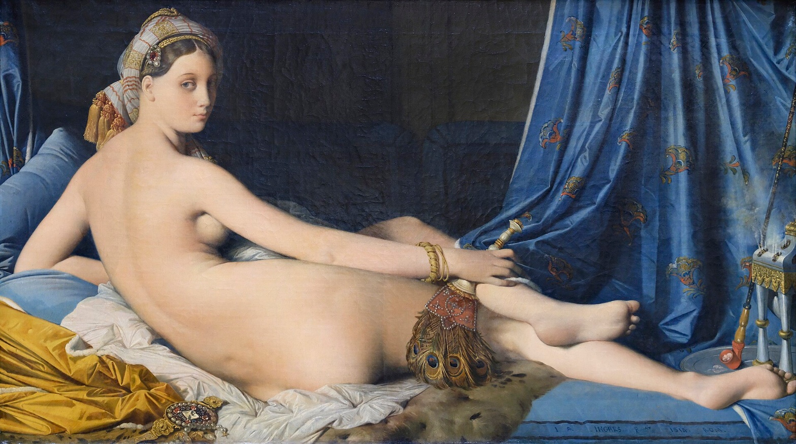
Jean Auguste Dominique Ingres — Grande Odalisque
August 4, 2026 at 9:37 AM
Model: claude-sonnet-5
These 58 principles are perceptual mechanisms that influence what gets noticed, how forms organize, and how space is inferred - all before conscious interpretation. They do not determine meaning.
OVERVIEW
The eye and the anatomy disagree. Perceptual attention moves smoothly, back to front, dark to light, sharp edge to soft edge. The body it's moving across doesn't hold together as a single physical structure. That's the core tension in this work, and it shows up differently in each domain.
Material handling supports the eye's smooth path: the flesh is rendered with almost no visible brushwork, so nothing interrupts the light mass as it reads. But that same smoothness is what lets the elongation slide past on first viewing. The paint doesn't announce the distortion. It absorbs it.
Culturally, the work sits inside a fully legible genre, the reclining odalisque, the Orientalist harem interior, a tradition Ingres's audience at the 1814 Salon would have recognized instantly through the props alone: peacock fan, blue brocade, incense vessel, turban. The anatomical liberty is the disruption inside that legible frame. Critics at the time read the spine as a mistake. A later reading treats it as the argument.
Conceptually, this is where the domains actually converge instead of fighting: the perceptual smoothness, the material erasure of the hand, and the anatomical impossibility all point at the same idea, that this figure is built for a sustained gaze, not for anatomical truth. Peak Shift and Scale Relationships are doing real work here, not just describing an error.
The unresolved tension: does the painting's fluency (the eye's ease, the paint's polish) neutralize the deformation it's built on, or is that fluency the mechanism that makes the deformation acceptable to look at.
PERCEPTUAL
The eye lands on the pale back first. It's the largest continuous light shape in the frame, set hard against a near-black background, and that value jump is the strongest pre-attentive signal in the composition, a clean case of Figure-Ground Relationships and Visual Pop-out. From there the eye has two competing paths. One follows the spine's long curve rightward toward the turned head, pulled by Gaze Direction, since the face looks back at the viewer and Face Detection recruits attention fast. The other gets pulled sideways by the saturated blue curtain and its gold brocade, which compete for weight through Color Weight and Advancement and Saturation.
Edges do specific work here. Where the back meets the dark wall, the contour is hard and exact, a clean line that stops the eye and holds the silhouette. Where flesh meets the white bedding or falls into shadow, the edge softens and dissolves, so the body seems to breathe out into its surroundings at the bottom while staying crisp at the top. That's an edge-quality split, not a lighting inconsistency, and it directs the eye to keep circling the upper body rather than exiting downward.
The peacock fan and the jewelry act as texture interruptions. Both are rendered with tight, specific detail, fine barbs on the feathers, hard specular points on the bracelets, against the otherwise matte, undifferentiated skin. That contrast (Detail Density Gradient) gives the eye small stopping points along its circuit, so attention doesn't fully settle on the body, it keeps making short trips out to the objects and back.
The proportions ask something harder to name cleanly. The back reads as continuously long, and nothing in the image gives a hard perspective check on that length, no floor grid, no architectural line, just overlap and drapery. Overlap/Occlusion carries the depth cues almost entirely (no linear perspective is present), which means the eye has no external ruler to catch the elongation against. The distortion doesn't stop the eye. It just doesn't correct itself either.
MATERIAL AND FORMAL
Oil on canvas, thirty-five inches by sixty-four inches, close to the footprint of a door laid on its side. The paint handling splits sharply by subject. Flesh is built with soft, blended transitions, brushwork suppressed almost to nothing, so the body reads as continuous light rather than as marks. The curtain, the fan, the jewelry get the opposite treatment: distinct, worked passages, individual feather barbs, tight specular hits on metal and gems, visible pattern-work in the brocade.
That split is a formal decision, not an inconsistency. The smooth flesh asks to be seen from a distance, as shape and light mass. The textured objects ask for close inspection. The canvas is doing two different kinds of looking at once, and the size of the work, big enough to hold a life-scale figure, supports both: far enough back, the body reads as pure Value Structure/Massing; close in, the objects reward Edge Detection and surface attention.
The smoothness of the flesh is also what makes the anatomical stretching hard to catch. There's no seam, no visible correction, no place where the paint shows the hand adjusting a joint or a rib. The surface is confident and finished everywhere, which means the elongation isn't a visible edit. It's built into the initial drawing and carried through without the paint ever flagging it. The material is honest about its own construction (blended oil, deliberate contrast in touch across zones) but it is not honest about the body's structure. Those are two separate claims and they don't align.
CULTURAL
This sits inside the reclining nude tradition running through Titian and Giorgione, restaged as an Orientalist harem scene, a genre the 1814 Salon audience would read immediately from the props: peacock fan, hookah-adjacent vessel, brocade curtain, turban. One reading is that Ingres is using an exoticized setting to license a nude that a mythological or classical setting no longer could, sidestepping the moral scrutiny attached to a French female body by relocating her to an imagined Ottoman interior.
The anatomical elongation is the specific point where the work stops being legible to its own moment. Contemporary Salon critics read the extra vertebrae and stretched back as bad drawing, a failure of academic correctness Ingres was otherwise trained to deliver. A later reading, developed well after the fact, treats that same distortion as intentional, as evidence that the painting prioritizes a continuous decorative line over anatomical truth. Both readings depend on the same visual fact, the elongated spine, read through different institutional expectations. This is a case where illegibility to one audience becomes legibility to another: the Salon wanted correct anatomy, later modernist and formalist criticism wanted evidence of pictorial invention over mimetic obligation.
The painting's current position in the Louvre, as a canonical reference point for Ingres and for the odalisque genre generally, is itself a later cultural fact, not something visible in the image. What is visible is a work built entirely out of recognizable genre signals, aimed at a Salon audience that had a fixed vocabulary for reading them.
CONCEPTUAL
The argument, if the elongation is read as deliberate rather than accidental, is that pictorial coherence can override anatomical fact. Ingres trained inside a tradition built on correct drawing as the precondition for painting. This canvas keeps every surface convention of that tradition, hard contour, smooth modeling, precise value structure, while breaking its core rule. That's a specific kind of argument: fidelity to line and surface rhythm matters more than fidelity to the body underneath it.
Hypothesis (insufficient visual evidence): the turned head and returned gaze function as a deliberate strategy to hold the viewer's attention on the face long enough that the spine's length goes unchecked. This would require knowing Ingres's working intent, which the image alone can't confirm; what's observable is only that the gaze pulls attention and the elongation runs along the same visual path.
Where the material and perceptual domains agree, smooth paint handling plus a lack of external depth cues, the conceptual claim gets real support: the picture is built to be taken in as a continuous decorative line first, an anatomical structure second. That puts it in dialogue with a tradition (extending forward to Matisse's odalisques and backward to Mannerist elongation in painters like Parmigianino) where the body becomes a vehicle for line and pattern rather than a record of observed structure. The perceptual thinness, the fact that nothing in the composition forces a viewer to measure the spine against a fixed reference, isn't a failure of the argument. It's the condition that lets the argument work at all.
NOISE: CONSOLIDATED
PERCEPTUAL: The two things competing for the eye, the pale body via Figure-Ground contrast and the saturated blue curtain via Color Weight and Advancement, split attention rather than sequencing it cleanly. There's also no external depth reference (no linear perspective, only Overlap/Occlusion) to check the body's proportions against, so the eye can't confirm or deny the distortion it's moving across.
MATERIAL: The suppression of brushwork in the flesh works against a viewer trying to visually audit the anatomy. Smooth paint reads as confident and correct even where the underlying structure is not. The material choice that makes the body beautiful is the same choice that hides its inconsistency.
CULTURAL: The Orientalist framing was fully legible to its intended Salon audience, but the moral and now the postcolonial reading of that framing were not available to that audience and complicate legibility for a contemporary one. A viewer today reads the harem setting as a historical construct requiring context most casual viewers won't bring.
CONCEPTUAL: If the elongation is the argument (line over anatomy) the work never signals that clearly. Nothing in the image separates "artist's deliberate distortion" from "period Salon audiences were right, this is an error." The painting doesn't argue for its own liberty; it just takes it.
Some of this noise is doing double duty. The smooth paint that hides the anatomical liberty (material) is the same mechanism that lets the perceptual path run uninterrupted and lets the conceptual argument (line over structure) hold together; the cultural ambiguity around intent versus error is likely accidental, a gap in the historical record rather than a built-in device.
WAYS OF LOOKING
The analysis notices that the eye lands on the pale back first, not because that's what the painting is "about," but because it's the largest continuous light shape against the darkest background. That's a specific move: separating what draws attention first from what the work means. A lot of writing about art skips straight to meaning. Here, the value structure gets named before any claim about the harem or the gaze. Look at what's brightest and largest before you decide what's important.
The elongated spine gets read two ways: a Salon critic in 1814 calling it bad drawing, a later critic calling it deliberate. The analysis doesn't pick a winner. It shows both readings depend on the same visible fact, seen through different expectations about what painting is supposed to do. That's the habit worth stealing: when a work seems to make a mistake, ask what standard would have to be in place for it to count as one, and whether that standard is still the one you're using.
The material section makes a claim that could be tested: the smooth, brushless paint on the flesh is the same choice that hides the anatomical stretching from a quick look. Texture and finish aren't just style. They're doing something specific, that here, they're absorbing a distortion that rougher paint would expose. Ask what a technique is hiding, not only what it's showing.
Last, the analysis flags a hypothesis and labels it as such: the idea that the turned head holds your attention long enough that the spine goes unchecked, but admits the painting can't confirm intent. That's a discipline. Say what you can see. Mark what you're guessing.
WHAT THIS WORK MAKES VISIBLE
The spine has no ruler to measure against. There's no floor tile, no doorway, no straight architectural line anywhere in the frame, only overlapping fabric and limbs. That absence is what lets the elongation pass unchallenged on a first look. Most paintings give you at least one fixed reference. Here you can watch, directly, what happens to perception when that reference is removed: distortion stops correcting itself.
The split in surface treatment is unusually stark: flesh smoothed to nothing, jewelry and feathers worked in tight, specific detail. Most paintings blend their handling across the whole surface, so this kind of contrast is harder to isolate. Here it's clean enough to name: one kind of paint for looking from across the room, another for looking up close.
And the gaze doing double duty, pulling your eye toward the face while the body behind it does something structurally impossible, is rarely this exposed. Next time a figure in a painting looks back at you, check what's happening in the parts of the body you're not looking at.
Looking vs. Knowing
These are the analysis's own words, nothing added.
What the Work Shows Us
These are the claims that hold up when you look: each one is rooted in something the image actually puts in front of you, not from what we already knew—or thought we knew—about it.
Readings That Came From Outside
Not wrong, necessarily—but these readings didn't come from looking: they came from biography, cultural context, critical tradition, to complete what the image left open.
Writing guardrail
The house style rules this writing was asked to follow, and where it didn't. Flagged after the fact. Nothing was rewritten.
Pass 3
- Used a banned construction: not just X, but Y
Alternative Interpretation
Pulled directly from this analysis's own language — nothing added.
The primary reading treats the elongated spine as a deliberate formal choice: Ingres subordinates anatomical accuracy to a continuous decorative line, using smooth paint handling and the absence of depth cues to make that substitution work on the eye. The competing reading, held by the 1814 Salon critics, treats the same elongation as simply bad drawing, a technical failure in an artist otherwise trained to render anatomy correctly, and the analysis never resolves which reading the painting itself supports since nothing in the image distinguishes intentional distortion from error.
Questions Raised
Did Ingres intend the elongation as a deliberate override of anatomical truth, or is the "line over structure" reading a later interpretive framework applied retroactively to what was originally a mistake? The analysis flags this explicitly as unresolved.
Does the turned head and returned gaze function as a deliberate device to keep the viewer's attention off the spine's length, or is that connection just a coincidence of composition? The analysis names this as a hypothesis with insufficient visual evidence.
Does the painting's fluency (smooth paint, uninterrupted eye path) neutralize the anatomical deformation it's built on, or is that fluency the very mechanism that makes the deformation acceptable to look at? The analysis states this tension directly and leaves it open.
Pass 1 — blind observation used
The eye lands first on the elongated pale torso stretched horizontally across the canvas — the back and hip form the brightest, most continuous field of light in the composition. Value Structure/Massing is doing the work here: the figure reads as one large lit mass against a dark ground of blue-black drapery, with almost no midtones breaking up the flesh until the shadowed underside of the ribs.
The turned head anchors the composition — Anchoring and Reference Points — the face rotated to look back over the shoulder while the body extends away, creating a torsional axis that runs from skull to trailing foot. This is Directional Force/Implied Movement: the spine's curve pulls the gaze rightward along the body toward the blue curtain, then further right to the small brazier with its curl of smoke.
Edges behave inconsistently. The contour of the back and hip is drawn with a clean, almost hard line — Contour Quality is crisp there, describing an idealized silhouette rather than an observed one. Elsewhere, particularly where the legs recede and overlap each other, the edges soften and the anatomy elongates in a way that doesn't fully resolve — the lower legs feel unmoored from consistent proportion, a Scale Relationships oddity that becomes apparent on close looking rather than at first glance.
Color is divided into distinct zones rather than blended: the flesh is a warm, even ivory; the drapery is a saturated ultramarine with gold brocade patterning; the foreground textiles are mustard-yellow silk and white linen. This is Color Harmony Systems built on a limited triad — blue, gold, flesh-tone — with the blue functioning as the cool anchor that makes the warm body advance (Color Temperature, Color Weight and Advancement).
Texture Density Gradient runs from the smooth, almost matte flesh — brushwork invisible, surface built up in thin glazes with no visible marks — to the heavily worked pattern of the curtain, where paint describes brocade motifs in small repeated strokes, and further to the peacock-feather fan, whose fronds are rendered with fine, separate touches suggesting individual barbs. The turban is its own dense passage: striped fabric, pearls, a jeweled clasp, all resolved in tight, particular detail against the broader simplified planes of the body.
Foreground and background separate by value and focus rather than by strong linear perspective. Overlap/Occlusion does the spatial work: the peacock fan and cloth crumple beneath and behind the legs, the bolster cushions push forward at the left edge, the brazier and its smoke sit at the far right, slightly smaller in scale, implying recession without any drawn vanishing point.
The last thing the eye settles on is the thread of smoke rising from the small silver brazier at the right — a fine, wavering vertical line against the dark curtain, the only implied motion in an otherwise still, static arrangement. It's a small detail, easy to miss initially, but it closes the composition's rightward pull that began at the turned head.