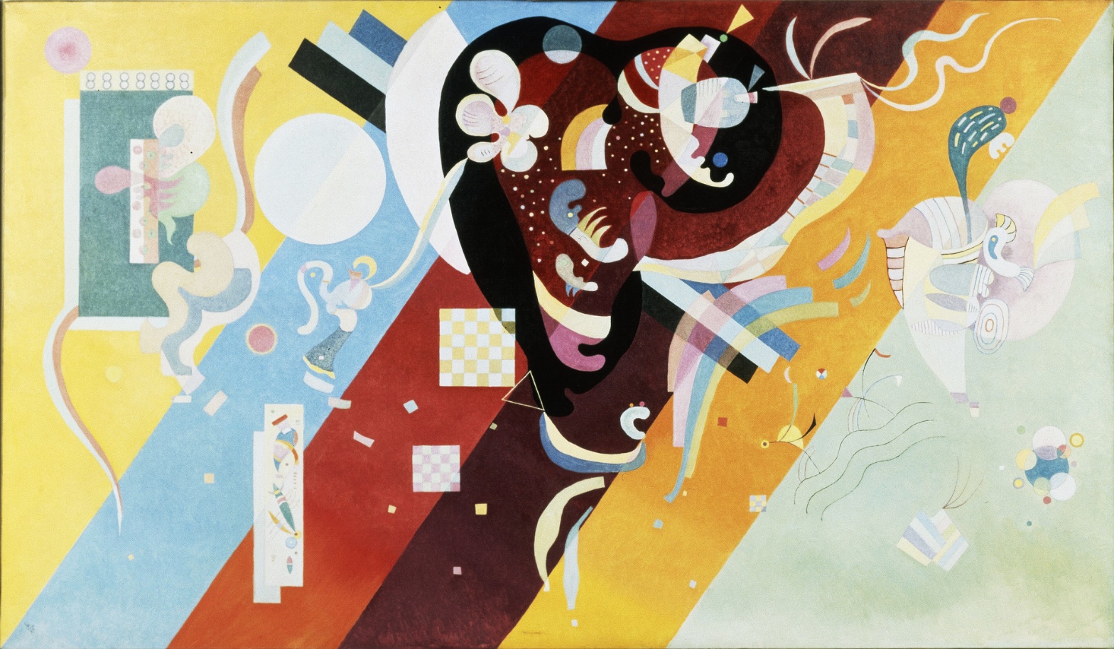
Vassily Kandinsky — Composition IX
July 18, 2026 at 6:43 PM
Model: claude-sonnet-5
These 58 principles are perceptual mechanisms that influence what gets noticed, how forms organize, and how space is inferred - all before conscious interpretation. They do not determine meaning.
OVERVIEW
Four domains agree on one thing: this painting is built from opposites held in tension, not resolved into one. The perceptual pass shows a clean hierarchy — dark mass first, diagonal bands second, small forms third — but that hierarchy fights the Detail Density Gradient, which drags the eye into the center and refuses to let it settle until the lower right. The material domain confirms the perceptual read: flat, matte, edge-driven paint handling with almost no physical texture. Surface and attention move together here. Nothing in the material record contradicts what the eye does.
Cultural and conceptual readings diverge more sharply from the perceptual/material pair. The perceptual experience is playful, dense, almost comic in its scale jumps — checkerboards next to a black continent-shape next to confetti dots. But the cultural position this work occupies (late Kandinsky, Paris, 1936, in dialogue with Miró and Arp) asks it to be read as a serious late-style synthesis of geometric and biomorphic abstraction. The eye's experience of visual play sits oddly against the historical weight the title "Composition IX" carries — Kandinsky reserved "Composition" for his most considered, symphonic works. That's a tension the image itself doesn't resolve.
The conceptual domain adds another friction: if this is an argument about a universal visual language of forms, then the specific, almost anecdotal details (the openai-noted "face-like" or "peacock-like" readings) should not matter. But the perceptual pass shows the eye does look for these things, does try to read the central mass as a body or head. The theory says pure form; the eye keeps hunting for figures.
The most significant unresolved tension: does this painting want to be read as a self-sufficient formal system, or does it quietly depend on the viewer's residual habit of finding bodies and faces in biomorphic shapes to hold the composition together?
PERCEPTUAL
The eye lands on the black mass first. It's the darkest value in the field, it sits center-right, and its irregular edge cuts hard against the flat diagonal bands behind it. That's the anchor. Nothing else in the composition is that dark or that large in one contiguous shape.
From there the eye doesn't move smoothly outward. It gets caught. The central area is dense — dots, checkerboards, small shapes stacked close together — and this density holds attention far longer than the surrounding bands do. The diagonal color fields are calm by comparison: flat, uninterrupted, easy to scan across quickly because there's nothing inside them to stop on. This is Detail Density Gradient doing double duty — it concentrates looking in the middle and empties it at the edges.
The white disk on the left acts as a secondary stop. It's large, pale, and its edge is soft where the black mass's edge is hard — so the eye reads it as a different kind of object, something atmospheric floating over the hard bands rather than cut into them. That contrast in Contour Quality gives the eye two different visual behaviors to perform in one canvas: hard tracking around the black shape, soft drifting around the white disk.
The lower-right pale mint zone is where the eye runs out of things to do. Thin wavy lines, a few scattered dots — sparse enough that scanning slows and stops. This functions as a release valve. After the crowded center, the eye needs somewhere with nothing demanding attention, and this quadrant provides it.
Warm colors (the maroon of the central mass, the ochre and gold bands) read as heavier and closer; the pale blue and mint bands recede. This Color Weight and Advancement reinforces the value hierarchy already set by the black shape — warm and dark items pull forward, cool and pale items fall back, so the compositional structure and the color structure agree rather than compete.
The overall visual request is: enter through the black mass, get held in the dense middle, then exit at lower right where the field goes quiet. That's a directed path. But the small pop-out details — a yellow triangle, a red accent, a bright dot — interrupt this path with Visual Pop-out moments that don't sit inside the main route. The eye keeps getting pulled sideways to these small high-contrast accents before it can complete the main journey. That's the one real perceptual conflict: a clear entry-hold-exit structure, undermined by a scatter of attention-grabbing details that don't respect that structure.
MATERIAL AND FORMAL
The support is canvas, medium is oil, and the paint sits flat and even across almost the entire surface. There's no visible impasto, no dragged brush, no built-up ridges. The diagonal bands look like they were laid down with taped or very controlled edges — the transitions between colors are crisp, not blended. That's consistent with Kandinsky's late Paris period, where he worked with disciplined, almost drafted precision rather than gestural application.
Texture where it exists is optical, not physical. The dot clusters inside the black mass and the checkerboard squares create the sensation of surface incident without any actual paint relief. The hand is present in drawing — the curved contours of the biomorphic shapes show controlled, deliberate linework — but largely absent in facture. This is a painting built by planning and layering thin, flat color, not by working the paint as a substance.
The construction is legible up close and at a distance in different ways. From a distance, the large shapes and bands dominate — the composition reads as bold masses of color and value. Up close, the small dotted and checkered patterns become the point of interest, and the flatness of the larger fields becomes almost invisible because there's no surface variation to look at. The painting asks for two different viewing distances to deliver two different experiences: distance for structure, proximity for incident.
This physical flatness supports the perceptual read directly. Because there's no atmospheric or textural depth, the spatial structure has to come from Overlap/Occlusion — shapes are stacked, not receded — and the paint handling never contradicts that. Nothing about the surface suggests illusionistic space; it stays honest to its own flatness throughout.
CULTURAL
By 1936, Kandinsky is in Paris, at a distance from the Bauhaus vocabulary of his Weimar years and in proximity to Miró, Arp, and the broader biomorphic surrealist current. One reading of this painting's position is that it's Kandinsky absorbing organic surrealist form-language into his own geometric-spiritual system — the hard diagonal bands are the older Bauhaus habit, the soft floating shapes and dotted textures are the newer, softer vocabulary picked up from his Parisian neighbors.
The Pompidou holding is itself a cultural signal — this is a museum-canon object, sitting inside the institutional narrative of abstraction's maturation from Kandinsky's early spiritual abstraction (Munich, "Composition" series begun 1910) through Bauhaus geometry to this late synthesis. A viewer trained in that narrative would recognize this work as a late "return of the organic" within a career otherwise associated with geometric severity.
Whether this reads clearly to a broader, non-specialist audience is a different question. The confetti-like scale jumps, the checkerboards, the almost decorative dot patterns could as easily read as playful or "decorative" to an audience without the Bauhaus-to-Paris narrative in hand. One possible reading: the painting's legibility depends heavily on knowing Kandinsky's trajectory. Without that, it risks being received as pattern-play rather than as a considered late synthesis.
This is not a transgressive illegibility — nothing here suggests deliberate resistance to institutional reading. It reads instead as an artist working comfortably inside an established late-career idiom, made for an audience already fluent in the language of interwar abstraction.
CONCEPTUAL
Kandinsky's larger project, across his career, is an argument that abstract form and color carry expressive and even spiritual content independent of representation — a claim laid out in his own writing (Concerning the Spiritual in Art) decades before this canvas. Composition IX can be read as a late test of that argument: can hard geometric bands and soft biomorphic drift coexist in one visual "language" and still communicate something coherent, without depicting anything?
The tension the perceptual pass surfaces — viewers hunting for face-like or body-like readings in the central mass — cuts against this argument. If the forms are truly non-representational carriers of feeling, the viewer shouldn't need to find a face in them. That some viewers do (per the "thin observations") suggests the biomorphic shapes are working partly through residual figuration, not pure formal abstraction. This is a real friction in the work's own claim: it wants pure visual language, but its curved organic shapes invite exactly the kind of pattern-completion the mind does with bodies and faces.
One possible position: the perceptual thinness in the outer zones (the empty mint-green quadrant, the sparse wavy lines) is not a failure of the argument but its demonstration — Kandinsky shows that meaning and interest can concentrate or dissipate purely through Complexity and Visual Density, independent of any subject. Where the canvas is empty, feeling drops; where it's dense, feeling rises. That is itself the spiritual-abstraction argument made visible, without a single represented object anywhere in the frame.
Historical precedent worth naming: this is late Kandinsky reconciling two things his own career had earlier kept more separate — the hard-edged Bauhaus geometry of the 1920s and the loose biomorphic vocabulary he was absorbing from Miró and Arp in 1930s Paris. Composition IX can be read as the site where those two languages are asked to cohabit in a single canvas, and the work's success is exactly the question of whether they do.
NOISE — CONSOLIDATED
PERCEPTUAL: The main interference is the conflict between the directed entry–hold–exit path (black mass to dense center to quiet lower right) and the scattered high-contrast pop-out details (small yellow triangles, red accents, bright dots) that pull the eye off that path at unpredictable points. A second, smaller interference: the contradiction in the observation record itself over edge quality — some passes see uniformly hard edges everywhere, others see soft, hazy transitions on the white disk and right-side shapes. This is a genuine ambiguity in how the surface reads, not just an observer disagreement.
MATERIAL: No strong internal fight here. The flat, controlled paint handling matches the flat, structured composition. The one soft note: reports of faint canvas grain or subtle tonal modulation within the color fields, which — if present — would be a small departure from the otherwise totally smooth, industrial-looking surface. This is a minor, not a structural, contradiction.
CULTURAL: The work's legibility depends on knowing Kandinsky's biographical arc from Munich through Bauhaus to Paris. Without that context, the biomorphic-geometric synthesis can read as decorative pattern rather than late-career argument. That dependency on prior knowledge is the main obstacle to a clean cultural read for a general audience.
CONCEPTUAL: The work argues for pure non-representational form as a carrier of feeling, but its organic shapes keep inviting figural readings (face-like, body-like) that several observers independently report. This undercuts the purity of the abstraction claim — the painting can't fully escape the viewer's instinct to find bodies in curved dark shapes.
Closing: The figure-hunting instinct and the biographical dependency look like accidental noise — residue of how human perception and art history actually work, not choices Kandinsky controlled — while the density gradient and the flat, edge-driven paint handling look intentional, built to serve the perceptual path and the material argument in tandem.
WAYS OF LOOKING
Three observers looked at the same white disk on the left side of this painting. Two called its edge soft, hazy, almost dissolving into the field behind it. One called every edge in the painting hard, with no blurring anywhere. Rather than pick a winner, the analysis kept the disagreement on the table and asked what it meant — that there's a genuine ambiguity in how the surface reads, not just a difference of opinion. That's a habit worth stealing: when trained eyes contradict each other on a plain factual question, the contradiction is data. It tells you where the work is doing something unstable, and you don't resolve it by voting.
Notice, too, how the analysis handled the moment several viewers spotted a face or a peacock or a flower in the black central mass. It didn't just log that as a fun detail. It set it against Kandinsky's own lifelong claim — that abstract form should carry feeling without depicting anything — and asked whether the painting can actually keep that promise if viewers keep finding bodies in it. That's the move of holding a work's stated intentions up against what it's actually asking your eye to do, and being willing to say the two don't fully match.
And notice the two different distances the analysis kept switching between: from across the room, this reads as bold color masses; up close, the dots and checkerboards take over and the flatness disappears. Good looking often means physically changing your distance from the thing and treating each distance as its own separate observation, not a rough draft of the "real" one.
WHAT THIS WORK MAKES VISIBLE
The empty lower-right corner — a few wavy lines, a scattering of dots against pale mint — makes visible something easy to miss in busier paintings: that attention has a rhythm, and an artist can build in a place for your eye to rest, not just places for it to work. Look for this in any densely packed composition: where does the crowding let up, and does the emptiness feel like relief or like abandonment?
The crisp diagonal color bands sitting under soft, curling organic shapes also make an unusually clean case for how depth gets built without perspective at all — just by stacking flat shapes on top of each other. In a painting with no vanishing point, watch for what overlaps what. That alone tells you what the artist wants read as near and what as far.
Looking vs. Knowing
These are the analysis's own words, nothing added.
What the Work Shows Us
These are the claims that hold up when you look: each one is rooted in something the image actually puts in front of you, not from what we already knew—or thought we knew—about it.
Readings That Came From Outside
Not wrong, necessarily—but these readings didn't come from looking: they came from biography, cultural context, critical tradition, to complete what the image left open.
Writing guardrail
The house style rules this writing was asked to follow, and where it didn't. Flagged after the fact. Nothing was rewritten.
Pass 2
- Used a banned construction: em dash
Pass 3
- Used a banned construction: em dash
Alternative Interpretation
Pulled directly from this analysis's own language — nothing added.
The primary reading treats Composition IX as a self-sufficient formal system, in line with Kandinsky's stated project that abstract form and color carry meaning independent of representation. The competing reading, which the analysis raises but never resolves, is that the painting quietly depends on the viewer's residual instinct to find faces or bodies in the central biomorphic mass — meaning its coherence may rest on exactly the kind of figurative pattern-completion the "pure form" argument claims to transcend.
Questions Raised
Does the central dark mass's power to hold the composition together depend on being read as a face or body, or does it work purely as an abstract value/shape anchor — the analysis flags this as unresolved rather than settling it.
Is the discrepancy in reported edge quality (uniformly hard edges vs. soft, hazy transitions on the white disk and right-side shapes) a real ambiguity in the surface itself, or an artifact of different observers looking differently — the analysis admits it cannot tell which.
Would this painting register as a serious late-career synthesis or as decorative pattern-play to a viewer without knowledge of Kandinsky's Munich–Bauhaus–Paris trajectory — the analysis notes this dependency on outside biographical/historical knowledge but cannot confirm how the work reads without it.
Pass 1 — blind observation used
The eye lands first on the large black form dominating the upper-center-right, its irregular biomorphic contour reading as a distinct figure against the diagonal color bands behind it — Figure-Ground Relationships establishing the central anchor before anything else registers.
Moving outward, the canvas is built from parallel diagonal bands of flat color — pale yellow at far left, light blue, brick red, deep maroon, ochre/gold, and pale green at far right — functioning as Progressive Rhythm across the width, each stripe shifting hue and value in even steps like a spectrum laid on the bias.
Within and against these bands sit clusters of smaller forms: on the left, a teal rectangle with a grid of small circles, layered over pale organic shapes in cream and blush pink; a white checkerboard square lower-left; a large white circle overlapping the blue-to-red seam. These smaller elements show Overlap/Occlusion consistently — the circle overlaps the color bands, the teal panel overlaps a paler shape beneath it, establishing shallow, stacked depth rather than atmospheric recession.
Edges throughout are hard and clean — Edge Detection is easy here, as almost every shape is bounded by a crisp, unmodulated line, whether the diagonal stripes or the biomorphic silhouettes. There is no blurring or softening anywhere; flatness is the rule.
Color relationships lean toward Color Harmony via complementary tension: the yellow-to-orange bands push warm and advance, the blue and pale green bands recede, giving the composition Color Weight and Advancement asymmetry — the warm right-of-center zone (gold, maroon, black) feels heavier and denser than the cooler, sparser left and far-right zones.
The black central mass contains a dense cluster of smaller motifs inside it — a white flower-like form with petals, a red car-like or thumb-shaped protrusion, dotted patterns, small triangles and colored chips — creating a Detail Density Gradient: the middle of the canvas is packed with incident, while the outer thirds (far left yellow field, far right pale green field) are comparatively empty, holding only a few scattered marks — a circle, small stripes, thin curling lines.
On the right side, secondary biomorphic figures in cream, dusty pink, and pale blue echo the shapes on the left, creating a loose Symmetry/Asymmetry balance — similar organic silhouettes appear on both flanks, but their internal patterning, color, and exact placement differ, avoiding mirror repetition.
Thin, wavy black lines near the right edge, unattached to any solid form, sit in the pale green field almost like calligraphic marks — Economy of Means, a few strokes doing the work of suggesting motion or notation in an otherwise empty passage.
The surface throughout is smooth and matte, consistent with flat-applied paint — no visible impasto or brush texture is apparent; the "making" shows only in the precision of the drawn contours and the evenness of the fills, not in gestural marks.
Scale varies deliberately: the large white circle and the black central mass are oversized relative to the small dotted grids, tiny checkered squares, and thin confetti-like rectangles scattered near the bottom — this Scale Relationships contrast keeps the eye moving between anchor-sized shapes and small punctuating details.
The eye finally settles on the lower register of the black form, where it narrows and curls downward like a tail or root, tapering into a thin white ribbon shape against the maroon and gold bands — the last resting point after tracking through the denser upper cluster.