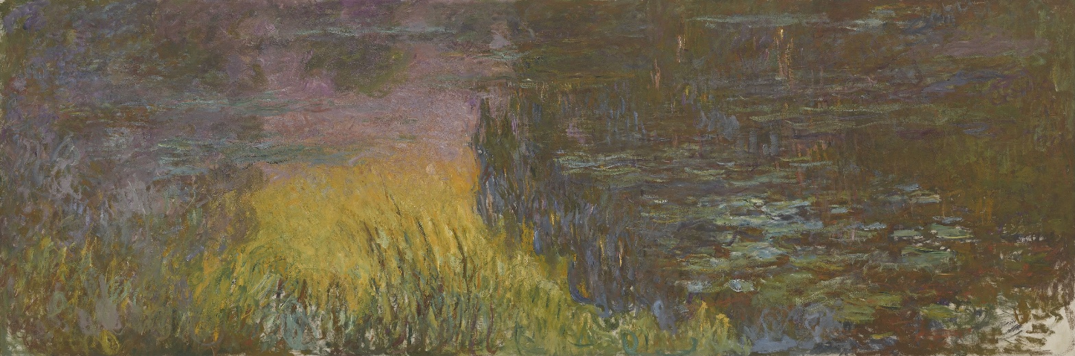
Claude Monet — The Water Lilies - Setting Sun
August 4, 2026 at 5:29 PM
Model: claude-sonnet-5
These 58 principles are perceptual mechanisms that influence what gets noticed, how forms organize, and how space is inferred - all before conscious interpretation. They do not determine meaning.
OVERVIEW
The perceptual and material domains agree with each other almost completely. The eye pops to the yellow mass because of saturation and value contrast; the brushwork underneath that pop-out is loaded, directional, unblended. What the eye does and what the hand did are the same event, described at two different resolutions.
The cultural and conceptual domains introduce friction the other two don't have. A painting nearly twenty feet wide with no horizon line, no vanishing point, and edges that refuse to resolve is not simply a record of a pond. It's also a specific object in a specific room at the Musée de l'Orangerie, built for an oval installation, tied to a public gift after the first World War. That institutional fact sits awkwardly next to the perceptual experience of the canvas alone, on a wall, in reproduction, where none of that site-specific intention is visible. The conceptual argument (dissolving the object into optical event) depends on a viewing condition the perceptual record here can't confirm, because Pass 1 describes a rectangle, not a room.
The sharpest tension: the eye's search for a resting point never gets confirmed. Three independent viewings locate three different "final" zones, one calm and light, one murky and fading, one busier and unresolved. That disagreement isn't a data problem. It may be the actual perceptual content of the painting: a surface built to prevent settling. If so, the conceptual reading (painting as continuous field, not composed scene) and the perceptual noise (contradicted resting point) are the same phenomenon named twice. The unresolved question the work sits inside: is the failure to locate a final anchor a description of how Monet built the canvas, or a limit of describing a nineteen-foot painting from observations that may each be looking at a different part of it.
PERCEPTUAL
The eye goes to the yellow-green mass in the lower left first. It is the highest-saturation, highest-value area against a darker field, a straightforward case of Visual Pop-out / Pre-attentive Features. Nothing else in the composition competes with it for that first half-second.
After the initial catch, the eye doesn't travel smoothly. Edges are soft everywhere: strokes overlap rather than draw contours, so there's no hard boundary to run along. This slows lateral movement and turns looking into a kind of scanning rather than tracking. The eye drifts right, into the dark vertical mass near center, which functions as the Value Structure/Massing anchor of the painting, the heaviest visual weight, pulling attention even though it isn't the pop-out feature. Simultaneous Contrast is doing real work here: the warm yellow reads hotter and the surrounding violet reads cooler because they're adjacent, and that heightened opposition keeps the eye oscillating between the two masses rather than settling on either.
Past that dark mass, the water surface on the right offers horizontal, broken strokes with pale patches, a Specularity/Surface Reflection passage that behaves differently: it invites a slower, side-to-side read rather than a jump. But where the eye finally rests is not settled. Different viewings land in different places, some in a calm lower-right patch, some in a murky upper-right passage that never resolves. That instability is itself a finding: there's no single Anchoring and Reference Point built into the canvas. Instead there's a Directional Force/Implied Movement created by the vertical strokes in the reeds pushing up, the horizontal drags in the water pulling sideways, and no perspective system to reconcile the two. The eye is asked to keep moving because the painting gives it no vanishing point, no horizon, no fixed scale to check itself against, an absence of Linear Perspective that flattens any settled sense of Scale Relationships. This is a picture built to be scanned, not read once and closed.
MATERIAL AND FORMAL
The support is a single canvas, six feet tall and nearly twenty feet wide, wider than a city bus. That scale alone changes what "up close" and "at a distance" mean for this object: standing near it, the canvas exceeds peripheral vision entirely.
The paint handling is frank about its own construction. Strokes stay loaded and separate: vertical, upward marks build the reed mass; horizontal drags build the water; looser, scumbled applications sit in the upper field. Nothing is smoothed over to hide the brush's path. Color arrives through Optical vs. Physical Color Mixing: yellow, green, violet, blue, and brown sit next to each other unblended, and the mixing happens in the eye, not on the palette. This is visible at close range as discrete, directional marks, and only resolves into water, reeds, and reflection at a middle distance. The surface is honest in the specific sense that it doesn't disguise the difference between "mark" and "thing represented." A viewer standing near the canvas sees paint behaving as paint; stepping back activates the illusion.
The absence of any hard-edged drawing under the paint, no visible contour lines, no underdrawing implied by Pass 1's edge descriptions, means the image is constructed entirely through the accumulation of stroke and value, not through outline filled with color. That's a materially significant choice: the painting's form and its paint application are the same operation. There's no separate "drawing stage" the paint sits on top of. The physical scale, six feet by nearly twenty, also means the loaded brushwork required real reach and repositioning across a surface too large to work close-up in one continuous pass, and the consistency of stroke size across that whole surface (noted as a stable observation) suggests the hand didn't shift approach for foreground versus background the way a system with Atmospheric Perspective built through diminishing stroke would.
CULTURAL
A reading of this work's position: it sits inside the late, large-format water lily paintings Monet made for public installation, most associated with the Orangerie's oval rooms built to hold work at this scale. If that context is accurate, the nearly-twenty-foot width isn't a private studio decision. It's a format built for a specific architectural and civic gesture, art as environment rather than easel picture. That's a possible reading, not something confirmable from the canvas alone.
One reading of where this lands institutionally: it belongs to the moment Impressionism converts from a contested, market-resistant style into a state-sanctioned, museum-scaled public offering. The absence of any framing device, any composed "view" with foreground-middle-background staging, could be read as a departure from Salon-era landscape convention, replacing a scene to be looked at with a field to stand inside. Whether that reading is legible to a general museum audience depends on the room; without the oval installation, seen only as a rectangle in reproduction or in a different gallery, that argument softens.
The audience that recognizes this work fully is one already fluent in late Impressionism's move toward abstraction, viewers who read the yellow mass and violet field through Monet's declining eyesight and late style rather than as topographic description. For anyone reading the canvas as a records-accurate garden view, the dissolved edges and absent horizon would register as failure rather than intention. That gap, between "unfinished-looking" and "deliberately dissolved," is the main legibility risk this work carries into a general audience, though within the institutional art-history conversation it's a settled point rather than an open question.
CONCEPTUAL
A possible reading: this painting argues against the object as the subject of a landscape painting, replacing it with optical event. There's no water lily rendered as a discrete, nameable form here, no horizon to orient a viewer's body in space. The argument, if it's an argument, is that perception itself, the flicker of adjacent unmixed color, the overlap of soft-edged strokes, the shifting weight between the yellow mass and the dark mass, is the actual subject. Two anchors support this: the total absence of Linear Perspective and the Optical vs. Physical Color Mixing throughout. Together they suggest a deliberate move away from picture-as-window toward picture-as-field.
This puts the work in dialogue with the Impressionist project's late extreme: not "capturing a moment of light," the earlier Impressionist claim, but dissolving the object entirely into paint behavior. Read this way, it anticipates arguments later made explicit by postwar abstraction, that a painting can function as pure optical surface without representational obligation. Whether Monet intended that lineage or arrived at it through failing eyesight and increasing scale is a separate question the canvas doesn't answer.
Hypothesis (insufficient visual evidence): that the contradictory resting points found across viewings reflect Monet's deliberate refusal of a single reading position, a conceptual argument against the very idea of a "correct" viewing sequence. This is plausible but rests on only one kind of evidence, the disagreement itself, not two independent observational anchors, so it stays a hypothesis rather than a reading.
The perceptual thinness here, no narrative, no legible object, no fixed vantage, may be the conceptual point rather than a deficiency: a painting refusing to resolve into anything nameable enough to stop looking at.
NOISE: CONSOLIDATED
PERCEPTUAL: The clean pop-out-to-resting-point read breaks down because three independent viewings locate the eye's final destination in three incompatible places, one calm and pale, one murky and dark, one diffuse across the margins. There's also disagreement about whether the upper right is busier/denser than the left or simply darker, which changes whether Complexity and Visual Density or Value Structure/Massing is doing the work of holding attention there.
MATERIAL: No real fight here. Stroke direction, looseness, and unblended color all point the same direction, toward a surface that stays honest about its own construction at every distance. The one soft friction: consistent stroke size across the whole six-by-twenty-foot surface works against any Atmospheric Perspective cue that would normally shrink marks with distance, so the material choice actively flattens a spatial reading that the composition might otherwise support.
CULTURAL: The work's full argument depends on an installation context, the oval room, the postwar public gift, that isn't visible in the canvas alone. Read outside that room, as a rectangle in a gallery or a reproduction, the painting can misread as unfinished or indistinct rather than deliberately dissolved. That gap between insider and general-audience legibility is the main obstacle to a clean cultural read.
CONCEPTUAL: The argument that the painting replaces object with optical event is undercut by the presence of clearly identifiable local color zones, yellow reeds, dark thicket, pale water, which still function as legible "things" even without contour lines. Total dissolution into pure field is claimed more than fully delivered; the eye can still name what it's looking at, which limits how far the anti-object argument actually goes.
The contradicted resting-point finding is likely intentional at the perceptual and conceptual level, since a painting built to resist a single anchor supports the argument for optical field over composed scene. The stroke-size consistency undercutting spatial depth reads as accidental, a byproduct of working at extreme scale rather than a chosen effect.
WAYS OF LOOKING
Three separate viewings of this painting sent the eye to three different final resting spots, one calm, one murky, one scattered. Rather than picking the most confident answer or averaging the three, the analysis treated the disagreement itself as the finding: maybe the canvas is built to prevent settling. That's a habit worth stealing. When independent readings of a work contradict each other, the contradiction usually isn't noise to clean up. It's often the most honest data point available, telling you something the work is actually doing.
The analysis also kept catching itself reaching past what the canvas can prove. The Orangerie's oval room, the postwar public gift, the argument that this painting replaces the "object" with pure optical event, all of that got flagged as plausible but unconfirmed by the rectangle of canvas alone. That's a discipline: separate what you can see from what you know from context, and say so out loud when you're leaning on the second kind.
Look, too, at how the material read and the perceptual read were checked against each other rather than left to stand alone. The eye pops to the yellow mass; separately, the brushwork under that mass turns out to be the most loaded and directional in the painting. Two different domains landed on the same spot. When independent observations converge like that, without one being derived from the other, it's a stronger claim than either alone.
WHAT THIS WORK MAKES VISIBLE
There's no line separating the reeds from the water, the water from the reflection, the reflection from the sky. Every boundary here is built from overlapping strokes rather than drawn edges. That makes visible something easy to miss in more conventional paintings: how much of "depth" and "object" in most pictures gets built by contour lines doing quiet work you never notice. Take that scaffold away, as this canvas does, and you can watch depth get rebuilt from nothing but value and warm-versus-cool color instead. Look for this in any painting where you can't find a clean edge anywhere: ask what's substituting for the line.
The size does something too. At nearly twenty feet wide, no single stroke can matter on its own the way a mark might in a small canvas; the picture only resolves at a distance no single viewing position fully occupies. That's worth watching for in any large-format work: the scale itself becomes a formal decision, not just a display fact.
And the color here never gets pre-mixed. Yellow sits next to violet, green next to brown, unblended, letting your eye do the mixing. Stand close and it's just paint; step back and it becomes water and light. That's a good test to run on any loosely handled painting: does the image collapse into abstraction up close, or does it hold its shape at every distance? The answer tells you whether the artist was painting a thing or painting an event.
Looking vs. Knowing
These are the analysis's own words, nothing added.
What the Work Shows Us
These are the claims that hold up when you look: each one is rooted in something the image actually puts in front of you, not from what we already knew—or thought we knew—about it.
Readings That Came From Outside
Not wrong, necessarily—but these readings didn't come from looking: they came from biography, cultural context, critical tradition, to complete what the image left open.
Alternative Interpretation
Pulled directly from this analysis's own language — nothing added.
The analysis reads the contradicted resting point as the painting's central achievement: a surface built to prevent settling, where three viewers land in three different final zones because the canvas refuses a single anchor, making the perceptual noise and the conceptual argument (field over object) the same phenomenon named twice. But it also flags this as a hypothesis resting on one kind of evidence, the disagreement itself, and admits the alternative explanation that three observations of a nineteen-foot canvas may simply each be describing a different physical part of it rather than confirming a unified authorial intention.
Questions Raised
Does the failure to locate a final resting point describe how Monet built the canvas, or is it a limit of describing a nineteen-foot painting from observations that may each be looking at a different section?
Whether the cultural argument about art-as-environment (versus easel picture) holds depends on the oval Orangerie installation; the analysis can't confirm from the canvas alone whether that site-specific intention survives when the work is seen as a rectangle in another room or in reproduction.
Whether Monet intended the anti-object, picture-as-field argument, or arrived at the dissolved edges and absent horizon through failing eyesight and increasing scale, is left as a separate question the canvas doesn't answer.
Pass 1 — blind observation used
The eye lands first on the golden-yellow band of reeds cutting horizontally across the lower third — the only passage of high saturation in the composition, so it functions as an anchoring reference point against which everything else is measured.
Moving outward from that band: to its left, the yellow dissolves into cooler violet-gray strokes that read as a soft reflection of sky on water. The transition between the yellow reeds and this violet field is not a hard line but a broken, feathered edge — individual brushstrokes of ochre and green interlacing with lavender, so the boundary flickers rather than resolves. This is edge detection working against itself: the eye searches for a contour and finds only interval, a zone where two color-masses interpenetrate.
Above and to the right, the surface shifts into a darker, denser field — olive, umber, deep green-black — built from short vertical and diagonal strokes that suggest reflected foliage or a darker sky. This upper-right mass is the densest concentration of value in the piece; it reads as the darkest passage and gives the composition its heaviest visual weight, pulling the eye rightward and upward after the initial stop at the yellow reeds.
Scattered through the dark field are small flashes of warm orange-pink, vertical and staccato, functioning as pre-attentive pop-out marks — they're few and small but their saturation and warmth against the surrounding cool dark makes them register immediately once the eye reaches that zone.
Lower right, the surface changes again: cooler blue-grays and muted greens laid in flatter, more horizontal touches, with pale lozenge-shaped strokes suggesting flat lying forms on or just under a water surface. These strokes have soft, blurred edges — no crisp contour anywhere in the painting — consistent with a focal-blur logic applied uniformly across the whole surface rather than selectively.
There is no linear perspective, no horizon line stated as a hard edge, no single vanishing point. Depth is constructed instead through atmospheric perspective and value massing: the cooler, grayer passages recede, the warmer yellow passage advances due to color weight, and layering of transparent-looking glazes over more opaque underlayers gives a sense of things floating at different depths within a shallow spatial band rather than a deep recession.
The brushwork throughout is loaded, visible, directional — vertical dabs for the reeds, longer horizontal drags for the water, short broken touches for the dark upper mass — so the process of application remains legible as a rhythm across the surface, a repetition of gesture-type by zone rather than a single uniform texture.
The composition has no strong bilateral symmetry; the yellow reed mass sits left-of-center and lower, creating an asymmetrical balance that is offset by the greater density and darkness of the upper-right field — a rough equilibrium between a small saturated area and a larger muted one.
The eye's path, having moved from the yellow band leftward into violet, then rightward and upward into the dark massed field, finally arrives at the lower right corner, where the marks lighten slightly and the water motif becomes most legible as pattern — the last resting point before the eye recognizes the whole as a continuous reflective surface rather than distinct objects.