Henri Matisse — Bathers by a River
July 18, 2026 at 6:29 PM
Model: claude-sonnet-5
These 58 principles are perceptual mechanisms that influence what gets noticed, how forms organize, and how space is inferred - all before conscious interpretation. They do not determine meaning.
what the eye does
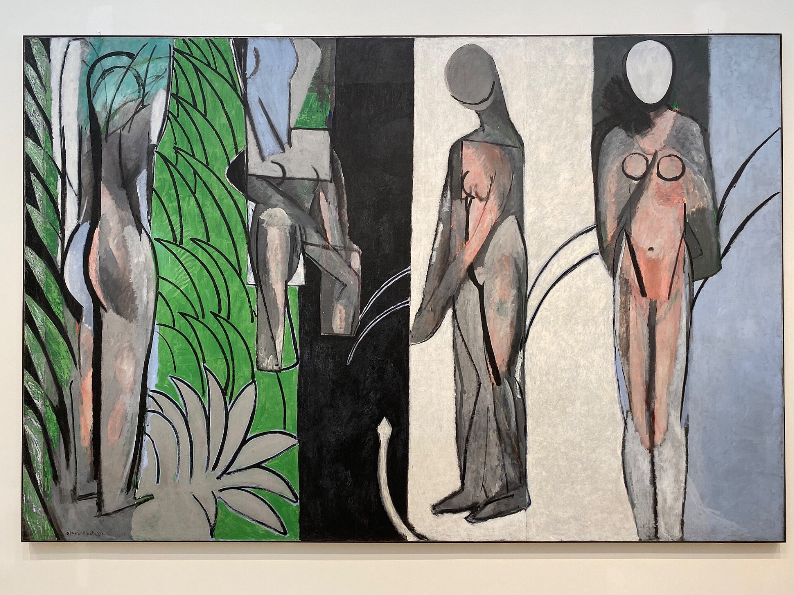
You come around the corner in the gallery and it just about knocks you back — thirteen feet wide, over eight feet tall, four naked bodies stacked up against bands of color that don't behave like a landscape is supposed to. And the first thing that actually happens, before you've processed any of that, is that you look at the faces. Except there are no faces. Just blank ovals, smooth as eggs, no eyes, no mouth. Your brain reads them as heads anyway, tries to find an expression, comes up with nothing, and gets a little stuck there — which is exactly the point. You keep checking back.
From that stuck moment, the eye starts doing something more like reading than looking. The canvas is carved into vertical zones — green on the left, then black, a pale band, a blue-grey one — and the figures each seem to live in their own strip, like the painting is four paintings pushed together. The black band in particular pulls at you. It's the darkest, densest patch of color on the whole canvas, and it sits in the middle like a hole punched in the picture, or a door. Everything else gets measured against it. The pink of the bodies looks warmer, more alive, precisely because it's sitting next to all that cool grey and void black. And down near the bottom, almost as an afterthought, there's a thin curling line — easy to miss on the first pass, and then impossible to unsee once you've caught it.
how it's made
This is oil paint handled almost like a fresco that's lost most of its color — dry, chalky, scumbled thin in places so the canvas or an earlier layer of paint ghosts through. Matisse isn't blending here. He's laying flat shapes next to flat shapes, and where two forms meet he'll sometimes snap a hard black contour around them like a stencil, and sometimes just let the edge dissolve, a leg fading into a background of nearly the same value so you have to hunt for where the body ends. That inconsistency isn't sloppiness. It's a decision repeated across the whole surface: some things get outlined, some things get let go.
The foliage at the left is built from a repeated scallop-shaped black mark, almost like a fingerprint pattern, standing in for leaves without describing a single actual leaf. Nothing here is modeled with light and shadow — no source of light to speak of, no perspective drawing your eye into deep space. Depth happens only because one flat shape sits in front of another. That's it. That's the whole depth system.
where it lives
Matisse started this canvas in 1909, working from an earlier, much gentler picture of bathers among trees, and then kept returning to it across the war years, repainting it as late as 1917. You can feel that duration in the surface — the pentimenti, the reworked contours, the sense of a painting that got fought with rather than finished in one sitting. This is the period when Picasso and Braque had broken form apart into fractured planes, and Matisse, watching that happen, wasn't interested in fracturing form so much as flattening it, stripping his own earlier, more decorative Fauvist manner down to something starker and more architectural. The pretty arcadia of his 1909-era bather paintings gives way here to something closer to a standoff — bodies as blunt vertical facts, color as structure rather than mood.
Matisse himself called it one of the five essential paintings of his career. It sat unsold for years before finding its way to the Art Institute of Chicago, where it lives now, usually cited alongside the Cone sisters' Baltimore holdings and the Barnes Foundation pictures as one of the anchor points for understanding what Matisse was doing to painting in this decade.
what it's arguing
The argument, as far as I can tell, is that a body can be reduced almost to a shadow of itself — no face, no modeled musculature, no naturalistic light — and still read as unmistakably, urgently a body. Matisse is testing how little information a viewer actually needs. He's also arguing, more quietly, that a painting doesn't need to describe a place to hold you in one. The four vertical bands aren't a river and a bank and a forest, not really. They're color intervals that happen to also suggest a river and a bank and a forest. Both things are true at once, and Matisse seems entirely uninterested in choosing between them.
what holds open
The blank heads never resolve into expression, no matter how long you stand there — you keep waiting for a face to arrive, and it doesn't, and that refusal stays alive every time. The scale of the four figures doesn't quite agree with itself either, some reading monumental, others compressed, and it's genuinely unclear whether that's a system or a scar from years of repainting. Either way, the painting keeps its four figures at a slight, permanent distance from being fully readable — and that distance is where it keeps working on you.
WAYS OF LOOKING
Those blank oval heads never resolve, no matter how long you look — your brain keeps hunting for eyes and mouth and coming up empty, and the analysis stays with that discomfort instead of resolving it for you. That's a habit worth stealing: when a work refuses to give you what you're looking for, don't paper over the gap. Report the refusal itself as the finding.
Notice how the black band gets treated — not just described as "dark" but read as a value anchor, the thing everything else in the painting is measured against. That's a habit of establishing a hierarchy in what you're seeing: find the element that organizes the others, and use it as your yardstick for describing everything nearby.
The analysis also catches its own uncertainty and keeps it visible — scale reads as monumental in one pass, compressed in another, and rather than picking a winner, the write-up says so, and lets it stand as an open question about whether that's design or the residue of eight years of repainting. That's a discipline: don't force agreement where the evidence doesn't actually agree. A contradiction, named honestly, is more useful to a viewer than a false resolution.
And notice the move from single detail to whole-canvas system — a scalloped leaf-mark noticed on the left gets connected to the vertical banding that structures the entire composition. That's how you build a stop for a tour: start small and concrete, then show how that small thing is doing the same job everywhere else in the room.
WHAT THIS WORK MAKES VISIBLE
Look at the inconsistent edges here — some contours snapped hard and black like a stencil, others left to dissolve into a background of nearly the same value. Most paintings hide this decision; Matisse leaves the seams showing. Next time you're in front of any figure painting, ask where the artist chose to define an edge and where they let it go soft, and ask what that choice is doing — hiding, emphasizing, or just running out of certainty.
Look too at how flatness alone is made to carry depth — no shadow, no perspective, just one color shape sitting in front of another. That's easiest to see in work like this, stripped of illusion, but once you've learned to spot "depth by overlap" here, you'll notice it lurking underneath even highly modeled paintings that seem to be doing something fancier.
And look at the blank faces working as faces anyway — proof that recognition needs far less information than you'd think. Watch for this in any radically reduced figure: a stick, an oval, two dots. The mind supplies the rest. The painting is just testing how little it has to give you.
Writing guardrail
The house style rules this writing was asked to follow, and where it didn't. Flagged after the fact. Nothing was rewritten.
Pass 2
- Used a banned construction: em dash
Pass 3
- Used a banned construction: not just X, but Y
- Used a banned construction: em dash
Alternative Interpretation
Pulled directly from this analysis's own language — nothing added.
The analysis primarily reads the vertical color bands as a formal system — pure color intervals that Matisse uses to structure the canvas architecturally, independent of subject. But it also flags the competing possibility that these same bands are still doing landscape description (river, bank, forest), and explicitly states that both readings are true simultaneously rather than resolving into one, calling this a deliberate refusal to choose.
Questions Raised
Whether the mismatched scale among the four figures is an intentional compositional system or simply a residue of Matisse's repeated repainting between 1909 and 1917 — the analysis admits this is "genuinely unclear."
Whether the blank, featureless heads are meant to eventually "resolve" into some readable expression that the viewer keeps expecting — the analysis notes this expectation persists but is never answered, without settling what that permanent non-resolution ultimately signifies.
The analysis doesn't determine whether the outlining-versus-dissolving-edges inconsistency across the figures follows any discernible rule, or whether it's simply variable by decision without an underlying logic — it's named as "a decision repeated across the surface" but never explained further.
Pass 1 — blind observation used
The eye lands first on the two right-hand figures — their pale oval heads read as faces before anything else registers, a clear case of Face Detection, even though neither has eyes, nose, or mouth marked in. The heads are blank egg-shapes, one grey, one bone-white, but their placement atop shoulders triggers face recognition anyway.
The canvas divides into five vertical bands, almost like folding screen panels: teal-green foliage at far left, a pale blue-grey strip, a black column at center, then a wide off-white field, then a final grey-blue strip at right. This is Cropping/Framing at work — each figure seems sliced by its panel, bodies continuing past the edges of their colored ground as if seen through slats.
Edges vary sharply in character. The black contour lines around the two right figures are thick, confident, unbroken — hard Edge Detection with total clarity. In contrast, the leftmost standing figure has soft, blended transitions between grey-mauve flesh and the surrounding green pattern; the contour there is felt more than drawn, dissolving into the foliage's black scallop-marks.
Color temperature splits the composition: the left half runs cool (teal, green, blue-grey) while the two central-right figures sit against warm-neutral cream and carry warm pink-orange flesh tones. This creates Simultaneous Contrast — the salmon-pink bodies look more saturated for sitting against the chalky white ground.
Value Structure is stark and massed rather than gradated: large flat fields of near-black, near-white, and mid-grey, with flesh as the only saturated mid-tone. No modeling, no cast shadow — light source logic is absent entirely; forms are built by outline and flat color, not illumination.
The brushwork itself is visible as dry, scumbled paint — a chalky, matte texture especially in the white and grey passages, where the ground shows through in patches. This is Economy of Means: minimal marks (a curved line, a circle for a breast, a triangle for a pubic area) stand in for anatomical detail.
A thin black line snakes across the bottom third of the canvas, connecting the black panel to the cream one — a stray gestural mark that functions as Interval Relationship, linking otherwise disconnected zones.
Scale is inconsistent by design: the two right figures are nearly full-canvas height and frontal, filling their bands, while the left figures are compressed and cropped by the foliage pattern, producing tension between Scale Relationships and the flatness of the picture plane.
The eye finally settles on the rightmost figure's dark applied "cape" or shadow-shape draped over one shoulder and arm — the last passage where black paint interrupts the pink body, closing the sequence on an unresolved note of Figure-Ground ambiguity between body and drapery.