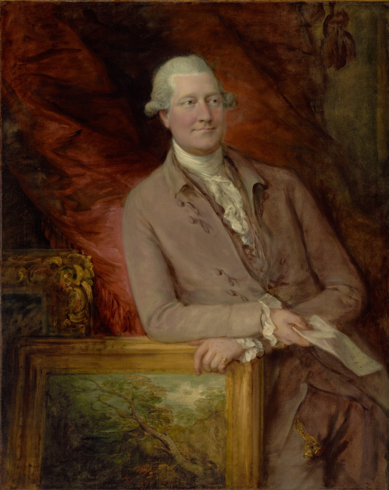
Thomas Gainsborough — Portrait of James Christie
July 18, 2026 at 6:23 PM
Model: claude-sonnet-5
These 58 principles are perceptual mechanisms that influence what gets noticed, how forms organize, and how space is inferred - all before conscious interpretation. They do not determine meaning.
OVERVIEW
Four domains, four different speeds. The eye moves fast: face, cravat, hands, frame, done in seconds. The paint moves slower: it tells you where Gainsborough spent his hours and where he didn't. The cultural domain moves slower still — it asks what kind of man gets this treatment and why. The conceptual domain asks what the painting thinks it's doing by using its own looseness as an argument.
The perceptual and material domains agree completely. The Detail Density Gradient the eye follows — face sharp, coat soft, background dissolved — is the same gradient the brush actually laid down. Nothing fights here. Contour Quality and Edge Detection are not illusions produced by paint; they are the paint.
The cultural and conceptual domains introduce the friction. Christie is an auctioneer, a dealer, a man whose business is the circulation and valuation of paintings. The picture-within-the-picture — a landscape, loosely painted, propped against a gilt frame under his hand — is either a prop of trade or a quiet joke about authorship and taste-making. That reading needs the sitter's identity, which is cultural knowledge, not visual evidence. So there's a live seam: the perceptual structure of the painting (Overlap/Occlusion, Anchoring and Reference Points) supports the reading, but doesn't produce it. The eye alone would never get to "this is a painting about paintings." Identity does that work.
The unresolved tension: the composition performs connoisseurship — hierarchy of finish, controlled Value Structure, a man literally handling a picture — but whether that performance is sincere craft display or self-aware commentary on the art market depends entirely on information the canvas itself cannot supply.
PERCEPTUAL
The eye lands on the face first. Pale skin against the dark red-brown ground gives immediate Figure-Ground Relationships and Visual Pop-out — the palest, highest-contrast shape in the field, and it happens to be a face, so Face Detection locks it in fast. From there the eye drops to the white cravat, another bright vertical, and that pull downward is doing real Directional Force — it's an implied line built from Color Weight and Advancement, pale shapes against dark ground reading as near, planted, important.
The sitter's gaze does not return the look. It goes off to one side. This breaks the loop a viewer expects — Gaze Direction usually recruits Social Attention and holds it, but here the diverted gaze pushes attention outward, off-canvas, and then back in. It doesn't anchor; it deflects and returns.
The hands are the second stopping point. One rests on the gilt frame, one holds a folded paper. Both are Anchoring and Reference Points in the lower half, and the frame's top rail is a hard straight line cutting across the compositon — a rigid horizontal against the otherwise curved, soft masses of drapery and coat. That line stops the eye's downward drift. It's a floor.
Below that floor, the landscape-within-the-painting is loose, gestural, secondary. The eye registers it as a shape, a color mass, but doesn't linger — Detail Density Gradient tells it not to. Everything organizes around a light central cluster (head, wig, cravat) set against dark surrounding mass. That's classic Value Structure/Massing, and it's doing the compositional labor almost by itself. Depth here is not built by recession — it's built by Overlap/Occlusion, layer over layer, figure over frame over landscape over paper. Flat stacking, not deep space.
The eye is asked to do one thing cleanly: focus, drop, anchor, then wander loosely into the dissolved background before circling back to the face. It's a closed loop. Nothing in the perceptual structure resists this.
MATERIAL AND FORMAL
This is oil on canvas, and the canvas is large — over a meter tall. The hand is doing two different jobs in one picture. At the face, the paint is tight: built up in thin, controlled layers, edges resolved, describing bone structure and skin with precision. At the coat, the drapery, the background, the brush opens up — broad, dragged, loaded strokes, edges left soft or unresolved. This isn't inconsistency. It's a deliberate hierarchy of finish, and the hierarchy is legible as intention: hands and face get resolution, fabric and atmosphere get gesture.
The picture-within-the-picture — the landscape under the sitter's hand — is the loosest passage in the whole canvas. Greens and browns, dragged, almost unfinished-looking next to the tightly rendered gilt frame holding it. That contrast in facture (tight frame, loose landscape) is a formal choice that does double duty: it separates the "real" foreground from the "painted" object within it, and it lets Gainsborough show off two registers of his own hand in a single canvas.
Up close, the red drapery is just sweeping strokes — a viewer standing at the canvas sees brushwork, not fabric. At a distance, it resolves into weight and shadow. The painting asks for two different viewing distances and rewards both differently. That's standard studio economy for the period — Economy of Means applied to background and drapery, precision reserved for what the sitter paid to have rendered exactly: his own face.
The surface is honest about its own construction. Nothing is hidden or disguised. The looseness in the lower register isn't a flaw pretending to be something else — it reads as confident, fast paint, applied by someone who didn't need every inch resolved to make the picture work.
CULTURAL
James Christie founded the auction house that carries his name. A portrait of him handling a gilt-framed landscape, positioned as a study in connoisseurship, sits easily inside eighteenth-century English portraiture's central preoccupation: performing status through object and gesture rather than through allegory. Gainsborough and Reynolds were competing for the same clientele, the same social register, the same Royal Academy audience. This painting reads as a Gainsborough entry in that competition — a bravura passage of brushwork (the drapery) set against tight, saleable likeness (the face), which is the exact split the period's portrait market rewarded.
One reading: this portrait belongs to the tradition of portraying men of commerce and taste as if they were men of connoisseurship and land — the landscape under the hand stands in for cultivated eye, for judgment, for the very trade that made Christie's business possible. That reading depends on knowing who Christie was; the canvas alone gives you a man, a frame, a paper, nothing more.
Institutionally, this is the kind of object the Getty collects easily — canonical British portraiture, a named sitter with historical weight, a legible Gainsborough hand. It's legible to museum audiences, to auction houses (with some irony, given the sitter), to art-historical narratives of eighteenth-century English painting. It isn't reaching for a specialist or avant-garde audience. It isn't transgressing anything. It sits comfortably inside the field it was made for.
CONCEPTUAL
The painting is in dialogue with the Grand Manner portrait tradition — a mode built on signaling a sitter's interior qualities (taste, judgment, social standing) through controlled arrangement of external props: drapery, columns, symbolic objects. Here the prop is a painting itself. That's a specific move.
Hypothesis (insufficient visual evidence): the painting-within-the-painting is a self-conscious statement about art as commodity, positioning Christie's hand on the frame as a gesture of ownership over the mechanism of taste-making itself. This claim needs the sitter's biography as an anchor; the visual evidence (Overlap/Occlusion, the hand resting on the frame, the loose brushwork inside the landscape) is suggestive but not sufficient alone. Two observers with no caption would read the hand-on-frame gesture as a generic prop of connoisseurship, common across period portraiture, not a targeted commentary on this particular sitter's profession.
What is visually supportable: the deliberate contrast between tight and loose facture stages a small argument about painting's own hierarchy of attention — some things (a face, an identity) deserve resolution, other things (drapery, background, even a painting inside the painting) are handled as atmosphere. That's a formal argument about what painting chooses to make legible, and it doesn't need Christie's biography to hold.
NOISE — CONSOLIDATED
PERCEPTUAL: The reported gaze direction contradicts across observation runs — left in some, right in others. This is a real ambiguity in the sitter's eyeline, not a resolved fact. It slightly destabilizes the Gaze Direction reading: the eye clearly moves off-axis, but which axis is not settled.
MATERIAL: No real fight here. Tight/loose contrast is consistent and intentional across all observations. The one soft conflict: coat color itself is contested (pink-rose versus mauve-taupe across observers), which suggests the coat sits in a genuinely ambiguous chromatic zone — not a formal problem, but a reading instability worth naming.
CULTURAL: The work's legibility depends entirely on knowing the sitter's identity and profession. Strip that away and this becomes a generic well-painted gentleman's portrait. The cultural reading is fragile outside a caption.
CONCEPTUAL: The self-referential reading (painting-about-art-market) risks overreach. The visual evidence supports a hierarchy-of-finish argument comfortably. It does not, by itself, support a claim about market commentary — that requires imported biography, and the RAP protocol flags it as hypothesis, not conclusion.
The tight/loose facture split is very likely intentional — it serves the material and perceptual domains cleanly. The gaze-direction ambiguity and the dependence on outside biography for the strongest cultural/conceptual readings look more like accidental gaps between what the canvas shows and what the argument wants it to mean.
WAYS OF LOOKING
The analysis notices that the sitter's face is painted tight and precise, while his coat and the background drapery are loose, dragged, almost unfinished. It doesn't stop at describing this — it asks what the gap between the two is doing. That's the habit: when a painting handles two areas differently, the difference is information. A face rendered carefully next to a sleeve rendered loosely isn't sloppiness or an accident of time — it's the painter telling you, silently, what mattered enough to resolve and what didn't. Look for where the hand slows down. That's where the artist is making an argument, whether or not they'd call it that.
Second: the analysis catches itself contradicting itself. Different viewers reported the sitter looking left, others said right. Rather than picking one and moving on, the write-up names the disagreement as real — the gaze direction is genuinely ambiguous, not a fact anyone got wrong. This is a habit worth stealing: when your own evidence disagrees with itself, don't smooth it over. Flag the instability. It usually means you've found an edge of what the image can actually tell you.
Third, and most disciplined: the analysis separates what the canvas shows from what you need outside information to believe. The idea that this portrait is secretly commenting on the art market — clever, tempting — gets labeled a hypothesis, not a conclusion, because it depends on knowing the sitter founded an auction house. Strip that biography away and you're left with a generic well-dressed man touching a painting. The habit is holding two categories apart at all times: what the marks on the surface actually support, and what your outside knowledge is quietly supplying. Good analysis keeps a hand on both, but knows which is which.
WHAT THIS WORK MAKES VISIBLE
Stand close to the red drapery and it's just sweeping, loaded strokes — no fabric, no folds, just paint moving fast. Back up ten feet and it becomes weight, shadow, presence. Most paintings ask for one viewing distance; this one visibly rewards two, and you can watch the switch happen in real time. Next time you're in front of any heavily worked canvas, try stepping back and forth deliberately — you're testing whether the artist built the image to hold up at more than one range.
And watch where the brush gets tight versus where it goes loose within a single canvas — face resolved, coat loose, the painting-within-the-painting loosest of all. Most works blend their finish evenly. Here the hierarchy is almost diagrammed for you, which makes it a good place to train the eye before you go looking for the same, subtler split elsewhere.
Looking vs. Knowing
These are the analysis's own words, nothing added.
What the Work Shows Us
These are the claims that hold up when you look: each one is rooted in something the image actually puts in front of you, not from what we already knew—or thought we knew—about it.
Readings That Came From Outside
Not wrong, necessarily—but these readings didn't come from looking: they came from biography, cultural context, critical tradition, to complete what the image left open.
Writing guardrail
The house style rules this writing was asked to follow, and where it didn't. Flagged after the fact. Nothing was rewritten.
Pass 2
- Used a banned construction: em dash
Pass 3
- Used a banned construction: em dash
Alternative Interpretation
Pulled directly from this analysis's own language — nothing added.
The primary reading treats the composition — the hand resting on the gilt frame, the loose landscape propped beneath it — as a conventional Grand Manner display of connoisseurship, a generic prop signaling taste and judgment common across period portraiture. The competing reading, explicitly flagged as hypothesis rather than conclusion, holds that this same gesture is a self-conscious statement about art as commodity, with Christie's hand asserting ownership over the very mechanism of taste-making — a reading the analysis admits depends on imported biography rather than anything the canvas alone demonstrates.
Questions Raised
Does the sitter's gaze move left or right off-axis? Observation runs contradict each other, and the analysis treats this as a genuinely unsettled fact rather than a resolved detail of Gaze Direction.
Is the picture-within-the-painting a sincere display of craft and connoisseurship, or a quiet, self-aware joke about the art market — and can that question ever be settled by the image itself, given that it hinges entirely on knowing Christie's identity and profession?
Is the coat's color pink-rose or mauve-taupe? The analysis notes this as contested across observers and leaves it as an open chromatic ambiguity rather than a settled material fact.
Pass 1 — blind observation used
The eye finds the face first — Face Detection asserts itself immediately, the pale powdered wig and pink-toned skin isolated against the dark red-brown drape. The man's gaze doesn't meet mine; he looks off to his left, a mild, appraising expression, and Gaze Direction pulls attention out of the frame rather than holding it centrally.
From there the eye travels down to the hands, which are the second area of resolved focus — the right hand loosely holding a folded paper or letter, the left hand resting on the gilt-edged frame of a landscape painting propped below. The ring on the left hand catches a small glint of light, a minor Specularity note amid otherwise matte fabric.
Edges behave unevenly across the canvas. The face has the most resolved contour — jaw, brow, and the soft transitions of the wig curls are legible, if softly blended. Moving outward, edges dissolve: the coat's shoulders and sleeves lose firm boundary against the background, brushwork loosening into scumbled, dragged strokes of ochre and umber. The drapery at left and right is almost abstract, ropes of red-brown pigment worked wet-into-wet, with no single contour holding still. This is Edge Detection doing real work — sharp only at the anchor point of the face, blurred nearly to formlessness at the picture's perimeter.
Value Structure/Massing centers on a bright vertical core: white cravat and ruffled cuffs, pale wig, pinkish coat, running down the middle of the canvas like a spine of light against the dark red curtain and brown-black shadow at the framing edges. The darkest passages sit in the upper corners and lower right, where the drapery folds into near-black. The reddish curtain in the upper background carries Color Temperature warmth that advances slightly, while the greenish-brown foliage at upper right recedes — an Atmospheric Perspective cue, thin and hazy, suggesting outdoor space beyond the room.
The landscape painting propped in the lower left is rendered with looser, more gestural strokes than the sitter — a tree, greenery, a track of brown earth — and its gilt frame provides a hard geometric Anchoring and Reference Point, the only straight lines in an otherwise curvilinear composition. A carved gold object sits at the far left edge, partially cropped, its ornate scrollwork barely legible in the shadow — Cropping/Framing truncates it, implying more space beyond the canvas edge.
Brushwork throughout shows the Economy of Means typical of oil handling built quickly: thin, fluid strokes in the drapery, thicker impasto touches in the ruffles and wig for Texture contrast. The paint surface is uneven in finish — highly resolved at the face and hands, sketch-like at the coat's lower portion and the proper right side of the canvas, where the fabric folds are indicated with broad, unblended strokes.
Last, the eye settles on the small dangling seal or fob at the man's hip, a small gold glint near the lower right, easy to miss, functioning as a final quiet resting point after the more assertive passages of face, hands, and framed landscape.