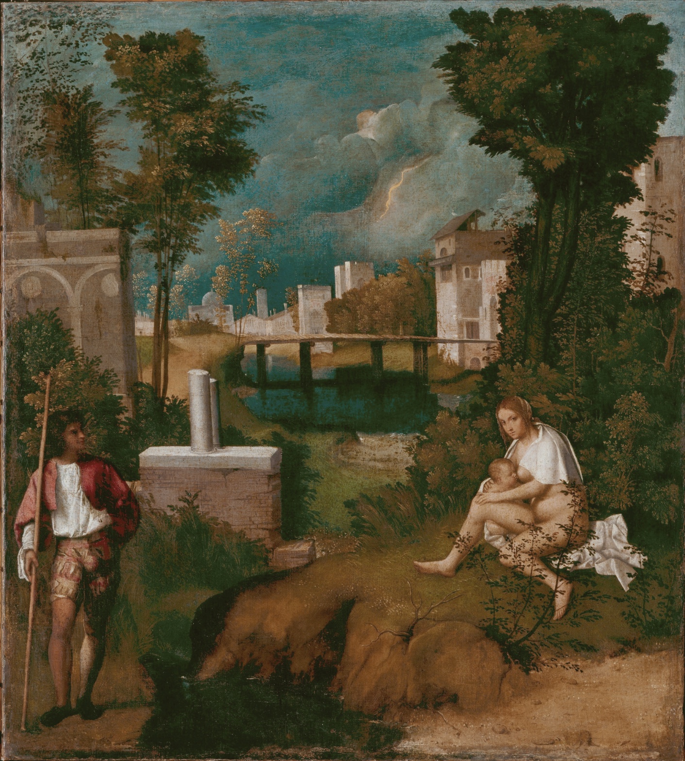
Giorgione — The Tempest
July 18, 2026 at 5:28 PM
Model: claude-sonnet-5
These 58 principles are perceptual mechanisms that influence what gets noticed, how forms organize, and how space is inferred - all before conscious interpretation. They do not determine meaning.
OVERVIEW
Four domains here don't agree on what the work is doing. The perceptual pass finds a fractured, unresolved scan pattern — no consensus on where the eye lands first, no consensus on where it settles. The material pass finds a technique that is unusually integrated for its date, blending forms with a softness that resists hard narrative punctuation. The cultural pass finds a work sitting in a gap between traditions, legible to no single audience of its own moment. The conceptual pass finds a painting that may be arguing against legibility itself.
These domains pull in the same direction on one point: ambiguity is structural, not accidental-seeming. The compositional gap between the two figures (perceptual), the soft edge-blending across the whole surface (material), the absence of a settled textual source (cultural), and the argument for mood over narrative (conceptual) all reinforce each other. That's real alignment.
They conflict on urgency. The lightning bolt is a sharp, high-contrast mark demanding attention (perceptual pop-out). But the man's posture reads as relaxed, unhurried (thin observation, contested). The material handling is calm, blended, unbothered by the storm it depicts. If the conceptual reading is "nature indifferent to human drama," the material calm supports it. If the conceptual reading is "imminent crisis," the postural relaxation undercuts it. The domains don't resolve which argument the painting is making — they show evidence for both.
The unresolved tension: is this a painting about a coming event, or a painting about a suspended, eventless moment mistaken for one because of the lightning bolt's visual loudness.
PERCEPTUAL
Two things compete for first attention: the seated woman's pale skin against dark green foliage, and the lightning bolt's sharp linear mark against soft cloud. Both are Visual Pop-out / Pre-attentive Features — high contrast against a low-contrast field. The record is split on which wins the first fixation. That split is itself a finding: the painting has built two competing entry points rather than one dominant one.
Once the eye is in, it doesn't sit still. The standing man's gaze crosses the composition toward the woman — Gaze Direction / Social Attention pulls the eye laterally, left to right, along the empty middle ground. But that middle ground contains a stone pedestal fragment functioning as an Anchoring and Reference Point, which slows the crossing rather than letting it flow. The gap between the two figures is wider than either figure's own scale — this is a deliberate-reading Interval Relationship, the space itself doing work, resisting the two figures cohering into one grouped unit via Figure-Ground Relationships.
The eye is asked to complete a narrative connection (man looking at woman, both under a storm) while being formally denied a compositional bridge (no shared ground, no touching, a wide interval). That's the core visual tension: Gaze Direction insists on relation; Interval Relationships and Overlap/Occlusion patterns insist on separation.
Where the eye finally rests is contested — dark foreground mass, water under the bridge, or the lightning bolt again. No consensus finding here means the painting doesn't give the eye a stable place to stop. It cycles: woman, gap, man, bridge, sky, back to woman. This circularity is a structural feature, not a failure of the record.
The trees on both flanks act as a framing device, tall dark canopies that box the scene and dwarf the figures by Scale Relationships. This closes the composition at the edges even as the internal gaze/interval relationship keeps it restless in the middle.
MATERIAL AND FORMAL
Oil on canvas, a woven support with visible texture only in thin passages. The brushwork itself carries the whole argument about atmosphere. Flesh, drapery, and sky are smooth and blended — few sharp edges, a soft Contour Quality throughout. Foliage, in contrast, is built from small clustered dabs of variegated green, olive, ochre — a stippled, broken touch that reads as bushy mass at a distance and dissolves into discrete strokes up close.
This is Optical vs. Physical Color Mixing doing real work. The green isn't one mixed pigment; it's a cluster of small strokes of different hues that the eye fuses at viewing distance. Up close the surface breaks into separate marks. At distance it coheres into foliage. That gap between close and far reading is the material's central honesty: it doesn't hide that it's built from discrete strokes, but it also doesn't announce it the way later Impressionist stroke-work will.
Detail Density Gradient runs foreground to background — crisp grass and stone in front, atmospheric blur behind. The lightning bolt breaks this gradient. It's a sharp mark sitting in the softest, most blended part of the whole canvas (the sky). This is a formal irregularity: one hard edge dropped into a field with no other hard edges at that depth. The hand didn't blend the bolt the way it blended the clouds around it. That's a visible decision, not an accident of aging.
The support is canvas, not panel — unusual for Venice at this date, and it allows the blended oil surface that the smooth flesh and drapery require. The physical choices support the atmospheric argument: soft ground and layered glazes over the parts meant to look thick with air, tighter handling over the parts meant to anchor the eye (rocks, masonry, garment folds).
CULTURAL
One reading: this work sits at the edge of the Venetian workshop tradition, made in a period when subject matter is loosening from strict religious or classical narrative into something more atmospheric and privately commissioned. If that's right, it signals a market of private collectors valuing mood and painterly texture over legible istoria — a different kind of literacy than a church fresco demands.
Another reading: the absence of a stable, agreed textual source for the subject (a woman nursing, a soldier, a storm, a broken column) may itself be a cultural position. A viewer trained on Alberti's istoria expects a readable narrative payload. This painting withholds one. That withholding could read as deliberate — a work built for a small, sophisticated audience able to sit with unresolved iconography rather than one built for broad public legibility.
Whether that illegibility was legible-as-sophistication to its own moment, or is only legible that way in retrospect through modern taste for ambiguity, is a separate question this analysis can't settle from the image alone. The formal ambiguity (interval, gaze, no narrative anchor) supports either reading. Which cultural frame actually applied at the moment of making is a claim this documentation can't verify from the image.
Hypothesis (insufficient visual evidence): this work was made to resist iconographic identification as a display of painterly virtuosity over subject.
CONCEPTUAL
One position the image can support: this is an argument for atmosphere and mood as sufficient subject, ahead of a clear narrative payload. The evidence: atmospheric perspective governing the whole background, the color temperature contrast (warm foreground / cool distance), the Detail Density Gradient softening at depth — all working without a legible narrative event tying the two figures together. If nothing narratively definite connects the man and woman, and the storm is the only "event" in the frame, mood may be functioning as the content itself, not as a backdrop to content.
A second position: this is a painting about looking and being looked at without contact — Gaze Direction crossing an Interval that is never closed. The gap between figures, the pedestal that anchors the middle ground without connecting anything, and the absence of any shared prop or touch between them together could support a reading about withheld intimacy or arrested narrative — a moment paused rather than a moment unfolding.
These two arguments are compatible but not identical. The mood argument says the storm is the subject. The withheld-contact argument says the relationship between figures is the subject, with the storm as charged backdrop. The painting's visual structure supports both without forcing a choice — the eye's own indecision about where to land (see Perceptual) mirrors the conceptual indecision about what the painting is actually about.
Historical precedent worth naming: Giorgione is frequently discussed as a hinge figure between quattrocento narrative painting and a mode where subject becomes secondary to sensation. If that lineage is right, this canvas would be an early test case for that argument — the visual evidence (soft edges, unresolved narrative, mood-carrying atmosphere) is consistent with it, though the specific historical claim about Giorgione's intent is a reading, not a fact this image alone proves.
NOISE — CONSOLIDATED
PERCEPTUAL: The clean read is interfered with by two competing pop-out features — the woman's flesh tone and the lightning bolt — with no consensus on which fires first, and no consensus on where the eye finally rests. The scan path is genuinely unresolved across observers, not just difficult.
MATERIAL: The lightning bolt's hard edge fights the material logic of the rest of the sky. Every other form at that depth is soft-blended; the bolt alone is sharp. This is a localized break in the otherwise consistent atmospheric handling.
CULTURAL: The absence of a stable narrative or textual source for the subject prevents this work from being read clearly against any single genre expectation of its moment — devotional, mythological, or portrait convention. That illegibility could be a deliberate move toward mood-based subject matter, or simply the loss of an original context (a specific patron's private reference) that the surviving image can't recover.
CONCEPTUAL: The work may undercut its own mood-argument by including a highly specific, sharply rendered pop-out event (the lightning) that pulls toward "narrative moment" exactly when the rest of the painting is arguing for "sustained atmosphere." The two conceptual positions above are in mild tension with each other inside the same canvas.
Closing line: the lightning bolt's material and perceptual sharpness looks intentional — it serves the conceptual argument about tension without contact — while the unresolved scan path and contested cultural legibility look more like genuine accidents of a fragmentary historical record, not built-in design.
WAYS OF LOOKING
Nine separate viewings couldn't agree on where the eye lands first — the woman's skin or the lightning bolt — or where it finally settles. Instead of picking a winner, the analysis kept both, and asked what it means that a painting can build two entry points instead of one. That's a habit worth stealing: when trained observers genuinely split on something as basic as "where do you look first," the disagreement is data, not noise. It tells you the work engineered a competition rather than a hierarchy.
Notice, too, how the man's relaxed posture got weighed against the lightning's urgency, and the analysis let them stay in tension rather than forcing a verdict — storm coming, or moment suspended. Most people want a painting to mean one thing. The stronger move is naming the two things it could mean and then checking whether the material handling supports one over the other, rather than deciding by preference.
That checking is the third habit. The claim that the lightning bolt is a deliberate hard edge doesn't rest on intuition — it rests on the observation that every other form at that depth is soft-blended, and the bolt alone isn't. A visible decision gets caught by comparing a part to the rule the rest of the painting follows. That's how you tell an intentional break from just a rough patch: find the pattern first, then find where it breaks.
Last: the analysis was honest about its own limits. It floated a reading — that the painting resists iconographic identification on purpose — and then labeled it a hypothesis with insufficient evidence, rather than dressing up a guess as a fact. Knowing which of your claims the image can actually prove, and saying so, is what keeps an interesting reading from curdling into overreach.
WHAT THIS WORK MAKES VISIBLE
Look at the gap between the two figures — wider than either one's own body, filled with water and a stone fragment instead of shared ground. Most paintings close that kind of space with a gesture, a touch, a converging sightline. This one leaves it open on purpose, which makes visible something easy to miss elsewhere: that empty space in a composition is a choice, not an absence.
Look at the foliage up close, then step back. Up close it's discrete dabs of green, olive, ochre; from a few feet away it fuses into leaves. Few paintings let you catch the trick this plainly — the eye assembling color that the brush never actually mixed. Next time you're near any heavily worked canvas, get close enough to lose the image, then back away and watch it reassemble. That's where paint stops being paint and starts being world.
Looking vs. Knowing
These are the analysis's own words, nothing added.
What the Work Shows Us
These are the claims that hold up when you look: each one is rooted in something the image actually puts in front of you, not from what we already knew—or thought we knew—about it.
Readings That Came From Outside
Not wrong, necessarily—but these readings didn't come from looking: they came from biography, cultural context, critical tradition, to complete what the image left open.
Writing guardrail
The house style rules this writing was asked to follow, and where it didn't. Flagged after the fact. Nothing was rewritten.
Pass 2
- Used a banned construction: em dash
Pass 3
- Used a banned construction: em dash
Alternative Interpretation
Pulled directly from this analysis's own language — nothing added.
The primary reading holds that the painting argues for atmosphere and mood as sufficient subject in itself, with the storm functioning as the actual content rather than as backdrop to a legible narrative. The competing reading, held with equal weight in the analysis, is that the painting is about withheld contact between the two figures — gaze crossing an unclosed interval — with the storm serving as charged backdrop to that arrested relationship rather than being the subject itself; the analysis explicitly states these two positions are "compatible but not identical" and that the work's structure "supports both without forcing a choice."
Questions Raised
Whether the painting's illegibility (no stable textual source, no settled iconography) was read as sophistication by its own contemporary audience, or only appears that way now through a modern taste for ambiguity — the analysis flags this as unverifiable from the image alone.
Whether the work was deliberately made to resist iconographic identification as a display of painterly virtuosity — explicitly marked as a hypothesis with "insufficient visual evidence."
Whether the Giorgione-as-hinge-figure lineage actually applies to this specific canvas's intent, or is only a plausible historical frame consistent with the visual evidence without being provable by it.
Pass 1 — blind observation used
The eye lands first on the seated nude woman at right, her white drapery catching more light than anything around her — Visual Pop-out from that pale mass against the dark greenery behind her. She nurses an infant, her head tilted down toward it, gaze not meeting the viewer: Gaze Direction pulling attention downward onto the child rather than outward.
The standing man at left holds the opposite corner, upright, spear or staff vertical, in a red and white slashed costume. His body is turned toward the woman and child across the space — Agency Attribution in his stance, a directed orientation rather than mere presence, though his face and posture stay neutral, almost detached, no urgency in the Postural Affect.
Between them: a gap of dark water, broken masonry with two truncated columns, tall grasses, a fallen dark shape in the foreground shadow. This void is doing real work — Interval Relationships and Closure/Negative Space — the distance between the two figures is wider than either figure's scale, and nothing bridges it directly except the diagonal pull of landscape recession.
Depth builds in stages: sharp architectural fragments and grass blades in the front plane, resolving edges and clear local color (ochre stone, red cloth, green foliage); then a middle zone of a wooden footbridge, houses, a canal, where edges soften slightly and color desaturates toward blue-grey; then a distant town and hills where Atmospheric Perspective takes over fully — forms flatten, contours dissolve, color shifts almost entirely to cool blue-green, indistinguishable from the sky's hue at the horizon.
The sky occupies nearly a third of the canvas and carries the most dramatic Value Structure in the painting — a heavy grey-white cloud mass, darkening at its core, with a jagged bright streak of lightning cutting through it just off-center. This is the only high-contrast, high-energy passage in an otherwise still composition — Directional Force concentrated in that one diagonal flash, contrasting against the static verticals of the two flanking trees.
Those trees are the strongest framing device: one at upper left, one at upper right, both dark-canopied, both taller than any figure or building, establishing Scale Relationships that dwarf the human figures below. Their placement creates a loose bilateral Symmetry/Asymmetry — matched heights, unmatched shapes, holding the outer edges of the scene while the sky-drama occupies the center gap between their crowns.
Brushwork is smooth throughout, blended, with no visible impasto or gestural marks — color transitions handled through thin glazing rather than texture, consistent with the overall hazy, blended atmospheric handling. Foliage is built from small clustered dabs of variegated green and ochre, denser and darker at the tree masses, thinner and more scattered in the middle-distance shrubs — a clear Detail Density Gradient from foreground crispness to background dissolution.
Last, the eye settles on the darkened foreground mass just beneath the woman and child — an ambiguous brown-black shape, possibly rock or fallen log, whose edges are the least resolved in the entire painting, sitting in shadow, anchoring the bottom of the frame without offering a clear reading.