Artwork #31
July 17, 2026 at 9:39 AM
Model: claude-sonnet-5
These 58 principles are perceptual mechanisms that influence what gets noticed, how forms organize, and how space is inferred - all before conscious interpretation. They do not determine meaning.
OVERVIEW
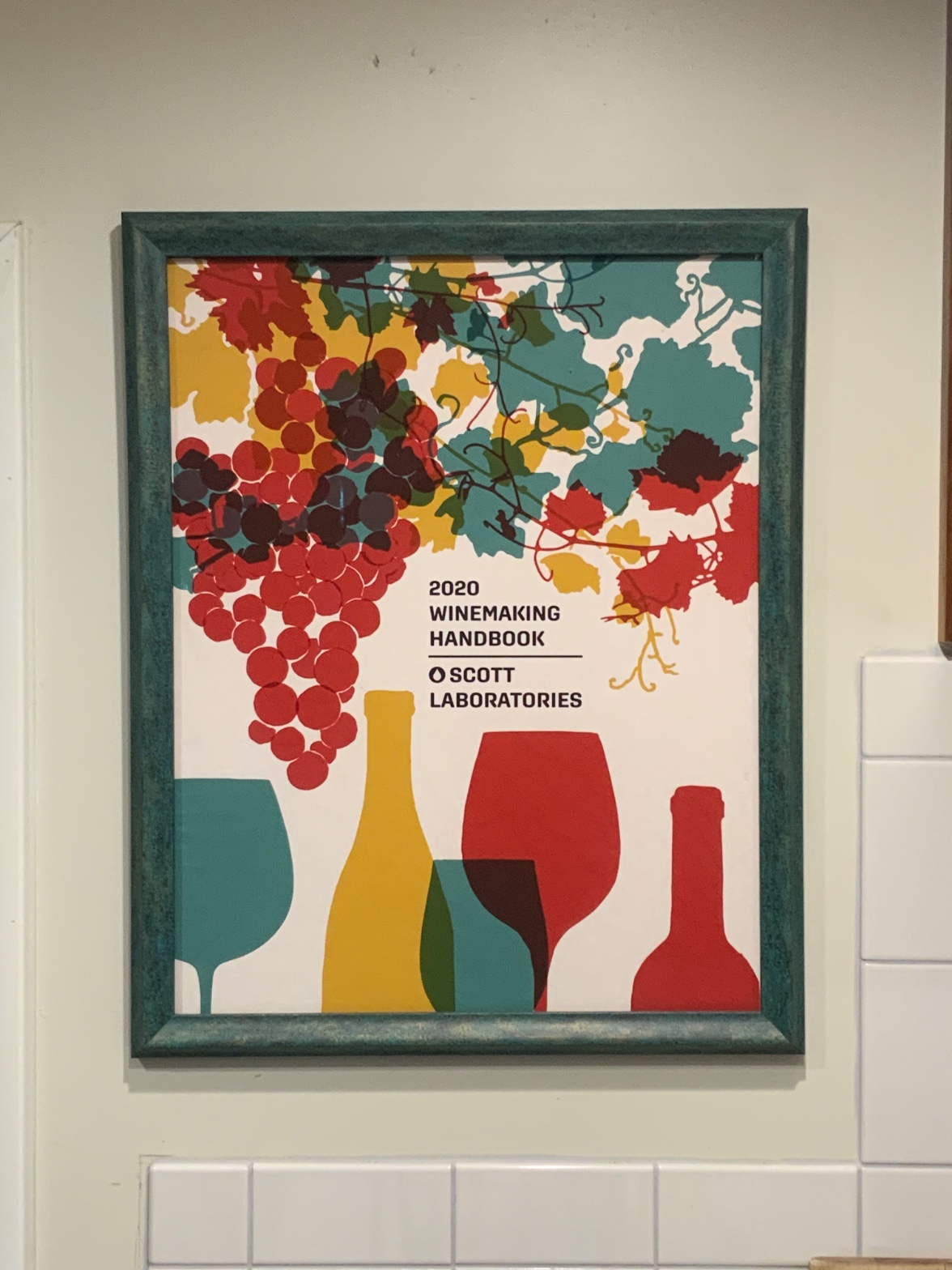
Four domains, one object: a framed trade poster for a winemaking supply catalog, photographed on a wall. The perceptual and material domains agree completely. The eye moves from grapes to leaves to text to vessels because the flat color blocks and hard edges are built for exactly that scan path. The frame's worn teal paint and the glare on the glazing confirm this is a physical object in a real room, not a digital file. Nothing in the making contradicts what the eye is doing.
The cultural and conceptual domains introduce friction the other two don't have. Perceptually this is a clean, confident, well-organized commercial graphic. Conceptually, that same cleanliness is what keeps it out of any fine-art conversation — the flatness that reads as "efficient design" in the perceptual domain reads as "generic trade ephemera" in the cultural domain. The object hasn't changed. The question of what room it belongs in has.
There's one live tension worth naming directly: the framing act (wood frame, wall, glazing, photograph of the whole scene) asks the viewer to consider this as an art object or exhibit, while every formal decision inside the poster itself was made for a catalog rack, not a gallery wall. The domains don't resolve that gap. They just keep showing it from different angles.
The unresolved question the work sits inside: is the frame elevating a commercial object, or is the photograph just documenting an ordinary object in an ordinary kitchen — and does the difference matter if the eye can't tell?
PERCEPTUAL
The eye lands first on the cluster of red/maroon circles in the upper left. This is straightforward Visual Pop-out — saturated warm color against a white ground, tight grouping, circular repetition. Nothing else in the frame competes with that combination of hue and density in the first instant.
From there the eye slides right and down along the vine and leaf shapes. The teal, mustard, and olive fills are flat and unshaded, so there's no internal modeling to stop the eye — it just tracks the tendril lines like a path. This is Directional Force doing quiet work: thin dark lines lead the gaze rather than stopping it.
The black sans-serif text block ("2020 WINEMAKING HANDBOOK / SCOTT LABORATORIES") functions as an Anchoring point. It's the one area of the composition with no color competition — pure black on white — so after the color chaos above, the eye rests here. This is where the composition tells the viewer what they're looking at.
The bottom row of vessel silhouettes operates as a second visual band, organized by Rhythm and Repetition — glass, bottle, glass, glass, bottle, alternating teal and maroon. Where two vessels overlap, Overlap/Occlusion produces a darker secondary color, read by the eye as depth even though it's flat paint logic, not real transparency. This is the work's only depth cue. There's no shading, no perspective, no atmospheric fade — Figure-Ground stays flat throughout because the white background never modulates.
Visual weight is unevenly distributed. The red elements — the grape cluster, the red glass, the red bottle at far right — carry more Color Weight and Advancement than the teal and olive shapes. Warm saturated color simply sits closer to the eye than cool desaturated color. So even though the composition might be intended as balanced, the eye keeps returning to red first and longest.
What the composition asks of the eye is simple: scan top to bottom, land on text, confirm with vessels. There's no real conflict in that request. The only mild tension is between the pop-out grapes at top-left and the anchoring text at center — two competing claims on first attention — but the size and placement give text the second position, not the first, and the eye accepts that order without confusion.
MATERIAL AND FORMAL
This is a printed poster — vector-style, silkscreen or offset-printed graphic — inside a wooden frame, itself inside a room with white subway tile. Three physical layers: print, frame, wall.
The print surface is flat and hard-edged throughout. No gradients, no visible brush marks, no texture variation within a shape. This is consistent with commercial printing — CMYK or spot-color separations, not hand-painted color. The Optical vs. Physical Color Mixing that a painter would use to build the intersection colors (the dark brown or maroon where vessels overlap) is absent here. Instead each overlap is a separate flat printed shape — a solid third color laid down where two silhouettes cross. The making is honest about being mechanical reproduction. Nothing pretends to be a painting.
The frame is the one handmade or hand-finished element. Its surface is mottled and distressed, teal paint over a darker underlayer, worn enough to show the layer beneath. This is Texture doing real work — the only textured surface in the whole image. It contradicts, gently, the machine-flatness of the print it holds. The frame has a history of wear; the print has none.
A faint reflection sits on the glazing over the print. This is Specularity/Surface Reflection — physical evidence of glass, confirming this object is behind protective material, hung and lit in an ordinary room, not photographed as a flat scan. It's a small but real material fact: this poster was framed and displayed like something worth protecting, even though its content is a product catalog cover.
Up close, the viewer would see print dot structure or vector-clean edges, depending on print method — the description gives no evidence either way. At a distance, the whole thing reads as a unified graphic. The material doesn't ask for close inspection. It asks to be read fast, like signage, which is what it was made to do.
The physical choices — frame, glazing, wall-mounting — don't fight the graphic content. They just recontextualize a printed catalog cover as a displayed object. Whether that recontextualization is deliberate elevation or incidental (someone just liked the image and framed it) can't be settled from the material evidence alone.
CULTURAL
This reads first as commercial packaging design — a supply catalog cover for a wine industry laboratory. The visual language belongs to mid-century-revival or contemporary craft-beverage branding: flat vector illustration, muted-but-warm palette, folk-adjacent grape iconography. This aesthetic is widely used right now in wine, coffee, and small-batch food branding. One reading: this poster sits inside a design lineage that borrows from WPA-era poster art and European wine-label tradition, filtered through current flat-illustration trends common in Etsy-adjacent and boutique branding studios.
The act of framing it and hanging it near subway tile — a common kitchen material — suggests domestic display rather than gallery display. One possible reading: someone treated a trade item (a handbook cover, likely a promotional giveaway) as decor, the way people frame vintage advertising or fruit-crate labels. This is a recognizable collecting behavior — kitchen-as-gallery for food and beverage ephemera. If that's the context, the work is legible to a very specific but common audience: people who decorate kitchens with agricultural/beverage nostalgia graphics, not people looking for contemporary art.
It is not clearly aimed at a fine-art audience. No painterly gesture, no material rarity, no artist signature or authorship claim is visible. If this were presented in a gallery context, it would need supporting framing (title wall text, artist statement) to be legible as art rather than as furniture. Its current presentation — frame plus domestic wall plus tile — doesn't provide that scaffolding. That absence could be read as the work simply not intending to enter that conversation at all, rather than failing to.
CONCEPTUAL
If there's an argument here, it's a modest one: commercial illustration deserves the same wall-space treatment as fine art. Hanging a laboratory supply catalog cover in a frame, behind glass, performs a small leveling gesture — ephemera treated with the display conventions normally reserved for paintings or prints of higher cultural standing.
This connects to a much larger, long-running conversation about the boundary between design and art — Pop Art's appropriation of advertising imagery, the readymade tradition's insistence that context and display can confer status independent of making. But this object doesn't do the appropriation work itself. Nobody altered the poster, recontexted its scale, or juxtaposed it against anything that comments on its commercial origin. It's just framed and hung, the way anyone frames a favorite print.
Hypothesis (insufficient visual evidence): that the framing is a deliberate conceptual gesture about the status of commercial/agricultural graphic design as folk art. The visual evidence — plain frame, ordinary domestic wall, no other art displayed nearby for comparison, no textual or curatorial signal — doesn't support this as an active argument. It's equally, maybe more, consistent with someone simply liking the graphic and framing it, no different than framing a favorite album cover or postcard.
If there is perceptual thinness here — and there is, the poster asks for no sustained looking, resolves in a single scan — that thinness might be the honest point. Trade illustration is built for fast recognition, not contemplation. Framing it doesn't change that design intent. The conceptual tension, if the work has one, is between the elevating gesture of the frame and the resolutely un-elevated, single-glance content inside it.
NOISE — CONSOLIDATED
PERCEPTUAL: The main interference is the competition between the grape cluster's pop-out and the text block's anchoring function — two different claims on first attention, resolved only by position and size, not by any hierarchy built into color or contrast alone. Minor secondary noise: the contradictory readings of overlap color (olive vs. brown vs. maroon) suggest the intersection hues may not read consistently to all viewers, meaning the Transparency/Opacity illusion is not perfectly stable across the composition.
MATERIAL: The frame's worn, distressed texture sits against the print's clean mechanical flatness. One surface has history; the other has none. This isn't a fight exactly, but it is a mismatch — a handmade or aged object holding an image with zero material age.
CULTURAL: The domestic display context (subway tile, kitchen framing) works against any fine-art reading, while the frame-and-glazing treatment works against a purely decorative/ephemera reading. The object sends mixed signals about what shelf it wants to sit on — collector's kitchen decor or something more deliberately curated. Nothing in the image resolves which.
CONCEPTUAL: The work's biggest self-undercutting move is the absence of any authorial or curatorial gesture beyond framing itself. Simply putting glass and wood around commercial ephemera is a weak claim next to the tradition it gestures toward (Pop appropriation, readymade recontextualization). The argument is implied by display convention alone, with no supporting material evidence that the choice was deliberate rather than casual.
Some of this noise likely serves a single purpose — the plain domestic framing keeps the object legible as "a nice thing on a kitchen wall" rather than demanding gallery-level scrutiny it can't survive. Other noise, especially the unresolved overlap-color and logo-shape contradictions, look accidental: artifacts of low-resolution observation rather than intended ambiguity.
WAYS OF LOOKING
Take the moment where the analysis notices the frame's worn teal paint against the print's flat, unshaded surface. Nobody asked "is this a good poster." The analysis asked what each material is doing — one surface has a history of wear, the other has none — and let that mismatch sit there, unresolved, as information. That's a habit worth stealing: read the object as layers of separate decisions (print, frame, glass, wall) rather than one seamless thing, and notice where those layers agree or disagree with each other.
Then there's the treatment of the "hexagon vs. circle" logo disagreement across observers. Instead of picking a winner, the analysis names the contradiction and asks what it reveals — in this case, that the logo mark is small and ambiguous enough that even careful lookers can't agree on its shape. Contradiction isn't a failure of looking. It's data about where a work is actually underspecified.
Notice, too, how the piece separates "what the eye does" from "what the culture does with it." The perceptual read says: pop-out grapes, then anchoring text, clean scan path, no conflict. The cultural read says: this is trade ephemera, domestically displayed, sending mixed signals about what shelf it belongs on. Same object, two different questions. Keeping those questions apart — instead of collapsing "it looks good" into "it means something" — is what lets the analysis find the real tension: a plain frame performing a small gesture of elevation that nothing else in the room actually supports.
WHAT THIS WORK MAKES VISIBLE
Look at where the vessel silhouettes overlap — teal glass crossing a maroon one, producing a dark brown sliver. In a painting, that darker patch would usually come from optical mixing: layered pigment, visible brushwork, color built up in passes. Here it's a separate flat shape, printed once, no blending at all. That contrast is unusually easy to see in this piece because the medium is so clean — commercial illustration doesn't hide its methods the way paint does. Next time you're in front of any hard-edged, flat-color work — screen prints, cut-paper collage, vector art — check whether an "overlap" color is actually mixed or just a third flat shape doing the job of mixing. It's a quick way to tell whether depth is being built optically or just implied by layout.
The other thing this piece makes plain: display context can outrun content. A trade catalog cover, behind glass, in a real kitchen, next to subway tile — the frame asks you to look longer than the image was built to reward. Most works blend their content and their presentation until you can't separate the two. This one keeps them visibly apart, so you can watch the elevating gesture (frame, glazing, wall) fail to change what's actually inside it. Worth checking in any framed object: is the frame arguing for something the image itself doesn't back up?
Looking vs. Knowing
These are the analysis's own words, nothing added.
What the Work Shows Us
These are the claims that hold up when you look: each one is rooted in something the image actually puts in front of you, not from what we already knew—or thought we knew—about it.
Readings That Came From Outside
Not wrong, necessarily—but these readings didn't come from looking: they came from biography, cultural context, critical tradition, to complete what the image left open.
Writing guardrail
The house style rules this writing was asked to follow, and where it didn't. Flagged after the fact. Nothing was rewritten.
Pass 2
- Used a banned construction: em dash
Pass 3
- Used a banned construction: em dash
Alternative Interpretation
Pulled directly from this analysis's own language — nothing added.
The primary reading treats the frame, glazing, and wall-mounting as a deliberate elevating gesture—commercial ephemera given the display conventions normally reserved for fine art, echoing Pop Art/readymade traditions of conferring status through context. The competing reading, which the analysis explicitly flags as an unsupported hypothesis, is that this is simply domestic decor: someone framed a catalog cover they liked, the way people frame album covers or fruit-crate labels, with no conceptual claim intended at all — and the visual evidence (plain frame, ordinary kitchen wall, no curatorial signal) actually favors this second reading over the first.
Questions Raised
Is the framing act a deliberate conceptual gesture about the status of commercial/agricultural graphic design, or an incidental act of personal decorating taste? The analysis states this cannot be settled from material evidence alone.
Does the mismatch between the frame's worn history and the print's mechanical flatness carry intended meaning, or is it just the unremarkable byproduct of using a secondhand or pre-owned frame?
Do the overlap colors in the vessel row (read variably as olive, brown, or maroon) represent a stable intended illusion of transparency, or is this inconsistency an artifact of low-resolution observation rather than genuine ambiguity in the design itself?
Pass 1 — blind observation used
This is a framed poster hanging on a pale wall above white subway tile, viewed at a slight angle so the wall itself recedes to the right.
The frame is a weathered teal-green wood, textured with visible grain and worn patches that let lighter wood show through at the corners — a distressed, hand-painted quality.
Inside, the composition is flat-color graphic design: a cluster of grapes rendered as overlapping circles in dark burgundy, red, and maroon occupies the upper left, with individual circles reading as discrete forms through Grouping — clustered dots the eye assembles into a single grape bunch via Pattern Completion/Closure. Vines and leaves in teal, mustard-yellow, and olive-green spread across the upper portion, their shapes cut with hard, clean edges typical of silkscreen or vector illustration — no gradients, no blending, only flat Optical vs. Physical Color Mixing through adjacent hues rather than blended pigment.
Text sits center-left in bold black sans-serif: "2020 WINEMAKING HANDBOOK," a thin rule, then "SCOTT LABORATORIES" with a small circular logo mark. The text anchors the composition — an Anchoring and Reference Point that the eye returns to after scanning the organic shapes above.
Below, a row of silhouetted objects in flat color blocks: a teal wine glass, a mustard bottle, overlapping teal-and-maroon glasses, a red wine glass, and a red bottle on the far right. These shapes overlap each other in shallow layering (Overlap/Occlusion) but sit on a single white ground with no cast shadow, keeping the whole image spatially flat.
Color relationships repeat throughout — teal, red, mustard, maroon, olive — creating Color Harmony Systems that unify the grape cluster, vine leaves, and bottle/glass silhouettes despite their different subject matter. Saturation is uniform and high across all shapes, giving equal Visual Weight to grapes, leaves, and glassware rather than pushing any one element into dominance.
The white background functions as unmodulated negative space, a Figure-Ground Relationship where the flat white reads clearly as "behind" the colored silhouettes with no atmospheric depth cues at all.
The eye finally settles on the red bottle at the lower right — the last element in the reading path, isolated slightly from the overlapping cluster to its left, closing the composition.