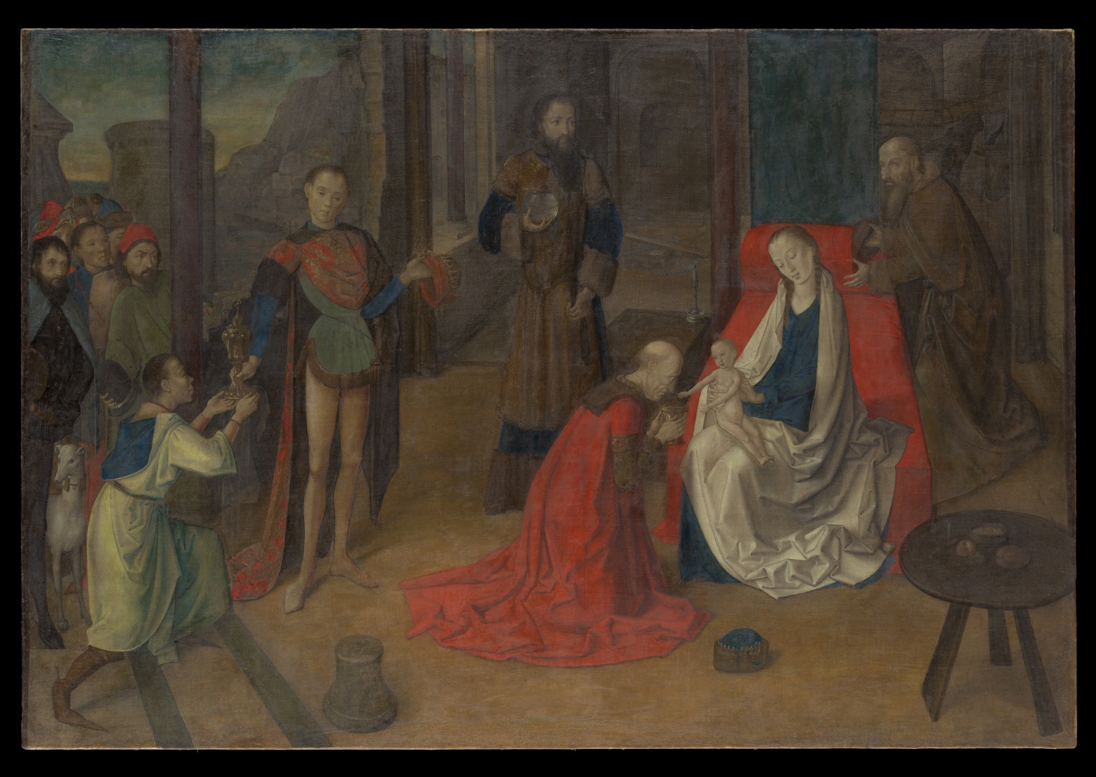
Joos van Wassenhove — The Adoration of the Magi
July 17, 2026 at 7:04 AM
Model: claude-sonnet-5
These 58 principles are perceptual mechanisms that influence what gets noticed, how forms organize, and how space is inferred - all before conscious interpretation. They do not determine meaning.
LOOKING PROMPTS
Follow the red robe on the kneeling figure — where else in the painting do you find another color that pulls your eye as hard as that red does?
Look closely at the faces and hands in the front of the painting, then let your eye drift back to the buildings and hills in the upper left — how does the sharpness of the lines change as you move from front to back?
Trace the path your eye takes from the standing figures on the left, through the crowd, to the pale child on the woman's lap — what leads you there, and what stops your eye along the way?
Start here: Notice how the palest thing in the painting — the child — sits surrounded by the darkest values in the painting. Once you see that contrast, watch how many heads, hands, and gazes are aimed at that same small point.
THE HOOK
Where does the light in this painting actually come from? Look at the shadows on the kneeling man's robe, then look at the shadows in the architecture behind him — they don't fully agree with each other. This isn't a flaw to catch the painter in; it's a seam in how the space was built, likely panel by panel, figure by figure, rather than observed all at once from a single moment in a single room. Once you notice it, the painting stops feeling like a snapshot and starts feeling like something assembled.
THE STORY
Joos van Wassenhove — better known in Italy as Justus of Ghent — trained in the Netherlands, in the tradition of oil painting, minute detail, and closely observed faces, before moving south to Italy in the early 1470s. This painting, made in distemper on canvas rather than the wood-panel oil technique typical of his Flemish training, shows him working in a medium and support common to Italian workshops of the period. He arrived in Italy at a moment when Netherlandish naturalism — sharp faces, careful hands, believable fabric — was prized and imitated by Italian patrons and painters alike, and his work became one of the channels through which that northern eye for detail entered Italian court circles. The painting sits at a crossroads: Flemish observation of individual faces and surfaces, delivered in an Italian material and format. Today it's held up less as a singular masterpiece and more as documented evidence of exactly this cross-cultural exchange — a working record of a Flemish painter adapting to Italian conditions, rather than a settled canonical showpiece.
THE LIVE QUESTION
Some people look at the crisp faces and hands up front against the soft, hazy hills in the back and read it as a deliberate choice — the painter guiding your eye toward what matters. Others see it as simply the limits of the medium, distemper on canvas not holding fine detail the way oil on panel does. What do you think — intention, or material?
WAYS OF LOOKING
Notice how the tour doesn't start with the artist's name or the date — it starts with a red robe pulling your eye across the canvas. That's a habit worth stealing: begin a stop by pointing at the thing a visitor's eye already found on its own, then build outward from there. You're not teaching them to see; you're catching them in the act of seeing and giving it a name.
Notice, too, how the light-and-shadow contradiction — the kneeling man's robe lit one way, the architecture behind him lit another — isn't smoothed over or treated as a mistake to forgive. It's handed to the visitor as a seam, something to look for and puzzle over. A good stop doesn't require the guide to resolve every inconsistency; it can hand the visitor the inconsistency itself as the interesting part.
Notice how the gaze-lines of every figure — the seated woman, the kneeling man, the standing attendants — get traced back to a single point, the child. That's the habit of finding the painting's center of gravity not by what's biggest or brightest, but by where all the internal attention is pointed. Once a visitor sees that convergence, they don't need you to tell them the child matters. They've located it themselves.
WHAT THIS WORK MAKES VISIBLE
Look at how sharp the faces and hands are in the front of this painting, and how quickly that sharpness dissolves into haze by the time you reach the hills in the background. That gradient — crisp up close, soft and pale far away — is called atmospheric perspective, the trick of making things feel distant by making them less distinct, the way real haze softens a far mountain. Most paintings use it, but here it's almost a demonstration piece: stand at the crowd on the left and watch it happen in real time as your eye moves back.
Look, too, at the small table in the lower right, with its few round pale objects — a detail that reads as an afterthought, something added late to frame the foreground rather than something built into the painting's first plan. Not every painting lets you feel a difference in "layers of decision," but this one does: some details feel structural, others feel like they arrived after the composition was already settled. Next time you're in front of any layered, populated scene, ask which details feel load-bearing and which feel like they were added to fill a gap. That question opens rooms other questions don't.
Looking vs. Knowing
These are the analysis's own words, nothing added.
What the Work Shows Us
These are the claims that hold up when you look: each one is rooted in something the image actually puts in front of you, not from what we already knew—or thought we knew—about it.
Readings That Came From Outside
Not wrong, necessarily—but these readings didn't come from looking: they came from biography, cultural context, critical tradition, to complete what the image left open.
Writing guardrail
The house style rules this writing was asked to follow, and where it didn't. Flagged after the fact. Nothing was rewritten.
Pass 2
- Used a banned construction: em dash
- Used banned word: masterpiece
Pass 3
- Used a banned construction: em dash
Alternative Interpretation
Pulled directly from this analysis's own language — nothing added.
The primary reading treats the crisp foreground faces against the hazy background hills as a deliberate compositional choice by the painter to direct the viewer's eye toward what matters. The competing reading, held equally in the text, attributes this same effect simply to the material limits of distemper on canvas, which doesn't hold fine detail the way oil on panel does — the analysis explicitly leaves this open as "The Live Question" rather than resolving it.
Questions Raised
Is the sharpness gradient from foreground to background an intentional artistic device or an inherent constraint of the distemper-on-canvas medium?
Does the painting's inconsistent light source (kneeling man's robe vs. the architecture) reflect a genuine seam in how the space was assembled panel-by-panel/figure-by-figure, or could it stem from some other cause not addressed by the analysis?
The analysis frames the work as "documented evidence" of Flemish-Italian cross-cultural exchange rather than a "settled canonical showpiece" — but it doesn't specify what evidence or consensus determines this status, leaving open how firmly that historical judgment is established.
Pass 1 — blind observation used
My eye lands first on the seated woman in blue and white, her pale face tilted downward, positioned right of center against a slab of dark green cloth of honor and a red cushioned bench — that red is the single most saturated note in the panel and pulls everything toward it (Color Weight and Advancement).
From her the gaze moves to the kneeling figure in the sweeping red robe, whose garment pools across the floor in heavy folds. The robe's red is echoed in the seated woman's bench, creating a chromatic bridge across the middle of the composition (Interval Relationships) that ropes the two central figures together despite the gap between them.
The child on her lap is the palest, smallest form in the picture — bare skin against dark drapery — and functions as a focal anchor (Anchoring and Reference Points) toward which the kneeling man's hands and lowered head are directed, along with the standing figure's turned attention behind him (Agency Attribution, in the way postures orient toward the child rather than simply look at it).
Moving left, the standing young man in the parti-colored tunic (green, red, blue) stands rigidly frontal, his contour crisp and his skin pale and smooth-edged against the dark colonnade behind him (Edge Detection) — his outline is the hardest in the painting, almost cut out from the ground. Behind him the cluster of onlookers' faces are more loosely brushed, their edges softening (Detail Density Gradient) as they recede into the crowd at the left margin.
The architecture — dark red columns receding at intervals — sets up the deep space (Linear Perspective), while the pale sky and distant rocky forms at the far left corner are cooler and grayer, sitting behind the columns as the furthest visible depth (Atmospheric Perspective).
Darkest values pool in the background arches and the standing bearded man's brown-black robe at center-right; these near-black passages give the mid-tones — ochres, browns, dull greens — their weight (Value Structure/Massing). The lightest values are concentrated in the seated woman's white mantle, the child's flesh, and small bright accents: the gilt vessel held by the kneeling boy at lower left, and the metal vessel held by the standing man in the background.
Surface handling is smooth, thinly built, with soft transitions in flesh and drapery suggesting an oil technique with minimal visible brushwork; texture registers mainly in the nap of velvet reds and the flatter matte quality of the stone architecture.
The round table at the lower right, with its small dish, sits low and close to the picture plane, acting as a foreground marker (Cropping/Framing) that stabilizes the right edge before the eye is released outward, having moved from the central seated pair, through the kneeling and standing figures, back to the crowd, and finally out to the framing furniture and architectural recession.