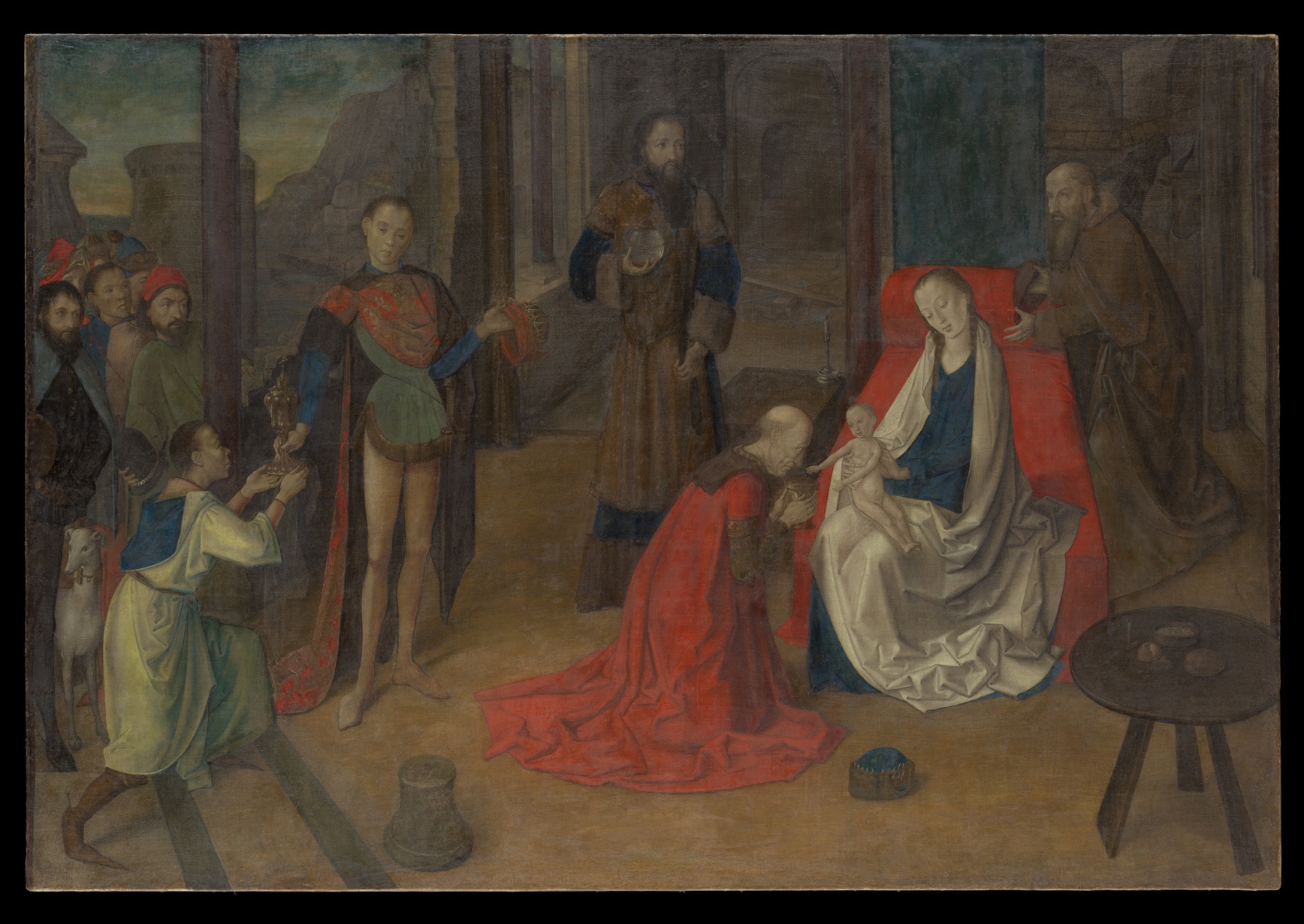
Joos van Wassenhove — The Adoration of the Magi
July 17, 2026 at 7:02 AM
Model: claude-sonnet-5
These 58 principles are perceptual mechanisms that influence what gets noticed, how forms organize, and how space is inferred - all before conscious interpretation. They do not determine meaning.
what the eye does
The red stops you first. Before you've registered that this is a Nativity, before you've counted the kings or found the child, there's this one hot, saturated patch of drapery on a kneeling figure that just refuses to let your eye pass over it. Everything else in the painting is working in a lower key — browns, grays, the dull gleam of architecture — and then there's this red, and it pulls rank on all of it.
From there the eye does something almost against its will: it goes looking for a reason for the red. And it finds one. The kneeling figure is bent forward, offering something small and gold toward a pale child sitting on a woman's lap, right of center. The child is the lightest thing in the whole picture — paler than the woman's white mantle, paler than the sky visible through the gap in the architecture at upper left — and once you notice that, you start noticing that everyone else's head and hands are pointed the same direction. The standing elder half-swallowed by the dark background, the man in the green tunic, even the crowd pressed in at the far left with their half-cropped dog — they're all quietly aimed at the same point. The composition isn't subtle about this. It sets up a bright small target and surrounds it with a room full of people looking at it, and your eye, being a fairly obedient piece of biological equipment, does what they're doing.
how it's made
This is distemper on canvas — pigment bound in glue rather than oil — which is an unusual choice for a Netherlandish painter of this period, and it shows. The paint sits thin. In places you can feel the weave of the canvas underneath it, not as a flaw but as a kind of texture the image is built on top of rather than over. There's almost no visible brushwork in the way you'd find in an oil painting from the same decades — no ridges, no drag marks. Van Wassenhove builds form the older way, through gradation of tone, dark to light, the way you'd model something in a drawing rather than push it around with a loaded brush.
The faces and hands are handled with a sharp, almost carved precision — crisp edges, careful contour — while the architecture behind them and the crowd at the far left get softer, less defined, as if the painter's attention itself was running out toward the edges of the scene. That's not incompetence. That's a working method: put your certainty where the story needs it, let the rest go a little vague.
where it lives
Stand in front of it and you notice something odd for a Nativity: it's staged like a formal audience, almost like a court reception, more than a stable scene. That's not an accident of this particular painting — it's the moment. Van Wassenhove was working in the years just before he left the Low Countries for Urbino, where he'd spend the rest of his career as Giusto da Guanto, painting for Federico da Montefeltro's court. The record on his early years is thin — we don't have the density of documentation we'd want — but this painting sits right at the hinge, absorbing the northern habit of exhaustive, particular detail — the specific weave of drapery, the individual faces in the crowd — while already reaching toward something more composed, more theatrical, more suited to an Italian audience trained on figures arranged like actors making an argument. It's in the Metropolitan Museum now, filed under Northern Renaissance, but it was made by a painter about to become someone else.
what it's arguing
The painting is making a case for looking as a form of devotion. Everyone in the scene is doing exactly what the painting wants you to do — looking at the child — and the picture doesn't trust you to get there on your own, so it builds a room full of models. This is an old argument, dressed as a Nativity: attention itself is the holy act. Where the painting gets more interesting is in how it handles the cost of that attention — the crowd at the edges going soft, underlit, unfinished, because focus has to come from somewhere. You can't light the whole room evenly and still make someone look at one point in it.
what it holds open
The light in this painting doesn't behave consistently — soft from one angle here, hard and raking there — and nobody's fully settled why. Maybe it's an artist working out a new material, distemper being less forgiving than oil for staging light logically across a whole composition. Maybe the inconsistency doesn't matter, because the eye was never going to check. Either way, the painting keeps a small unresolved argument going between what it shows you and how carefully it wants you to look for the seams.
WAYS OF LOOKING
The analysis starts with the red drapery — not with "this is a Nativity," not with iconography, but with the one patch of color that physically grabs the eye before the brain has done any work. Only after admitting that does it go looking for why the red is there, and find the child. That's a habit worth stealing: describe what your eye does, in order, before you explain what the picture means. Meaning comes second. If you start with meaning, you skip the evidence.
Then there's the moment where the analysis notices that faces and hands are crisp while the crowd and architecture go soft, and reads that not as failure but as a decision — put your certainty where the story needs it, let the rest go vague. That's a habit: when something in a painting seems unfinished or uneven, ask what work the unevenness is doing before assuming it's a limitation.
The unresolved question about light — soft in one account, raking and hard in another — could have been smoothed over. Instead it's left open, with a guess attached (maybe the medium, maybe it just doesn't matter) rather than a false resolution. That's a habit too: naming what you can't settle is more useful than forcing an answer, especially when you're building a case for someone else to check.
WHAT THIS WORK MAKES VISIBLE
Every figure in this room is looking at the same small pale child — the elders, the standing man in green, even the half-cropped dog's owners in the crowd. That's a composition using gaze as a directional arrow, and it's unusually easy to trace here because the cast is large and their attention is so uniform. Next time you're in front of a crowded scene, follow the eyes in the painting before you follow your own — they were placed to lead you somewhere.
The paint itself is thin enough that the canvas weave shows through in places — you can feel the material under the image, not hidden by it. That's rare to catch this plainly; oil paintings usually bury their support. Look for where a painting lets its foundation show, and ask what that tells you about how fast, how cheap, or how experimental the making was.
And the edges: sharp in front, dissolving toward the back and the margins. That gradient — call it focus, or attention spent unevenly — is often invisible unless a painting is crowded enough to need it. Here, with dozens of figures competing for space, the fade is obvious. Once you've seen it named, you'll start finding it everywhere: the place where an artist's hand got surer, and the place where it let go.
Writing guardrail
The house style rules this writing was asked to follow, and where it didn't. Flagged after the fact. Nothing was rewritten.
Pass 2
- Used a banned construction: em dash
Pass 3
- Used a banned construction: em dash
Alternative Interpretation
Pulled directly from this analysis's own language — nothing added.
The primary reading treats the painting's inconsistent lighting as a deliberate device serving its argument about focused devotional attention — light logically subordinated to the goal of directing the eye. The competing reading, which the analysis raises but doesn't resolve, is that the inconsistency may simply be a technical byproduct of Van Wassenhove working in the less forgiving medium of distemper, with no intended meaning at all — the analysis explicitly says "nobody's fully settled" which reading is correct.
Questions Raised
Is the inconsistent handling of light across the composition an intentional compositional/devotional strategy, or an artifact of the artist's inexperience with distemper as a medium?
The analysis notes "the record on his early years is thin" — how much of the reading of this painting as a transitional, Italy-bound work rests on documented biography versus inference from the image itself?
Does the softness/vagueness at the painting's edges (crowd, architecture) reflect a deliberate hierarchy of attention, or simply where the painter's effort or finish ran out — a question the analysis raises ("that's not incompetence... or is it") without fully closing?
Pass 1 — blind observation used
My eye lands first on the seated woman in blue and white, her pale face tilted downward, positioned right of center against a slab of dark green cloth of honor and a red cushioned bench — that red is the single most saturated note in the panel and pulls everything toward it (Color Weight and Advancement).
From her the gaze moves to the kneeling figure in the sweeping red robe, whose garment pools across the floor in heavy folds. The robe's red is echoed in the seated woman's bench, creating a chromatic bridge across the middle of the composition (Interval Relationships) that ropes the two central figures together despite the gap between them.
The child on her lap is the palest, smallest form in the picture — bare skin against dark drapery — and functions as a focal anchor (Anchoring and Reference Points) toward which the kneeling man's hands and lowered head are directed, along with the standing figure's turned attention behind him (Agency Attribution, in the way postures orient toward the child rather than simply look at it).
Moving left, the standing young man in the parti-colored tunic (green, red, blue) stands rigidly frontal, his contour crisp and his skin pale and smooth-edged against the dark colonnade behind him (Edge Detection) — his outline is the hardest in the painting, almost cut out from the ground. Behind him the cluster of onlookers' faces are more loosely brushed, their edges softening (Detail Density Gradient) as they recede into the crowd at the left margin.
The architecture — dark red columns receding at intervals — sets up the deep space (Linear Perspective), while the pale sky and distant rocky forms at the far left corner are cooler and grayer, sitting behind the columns as the furthest visible depth (Atmospheric Perspective).
Darkest values pool in the background arches and the standing bearded man's brown-black robe at center-right; these near-black passages give the mid-tones — ochres, browns, dull greens — their weight (Value Structure/Massing). The lightest values are concentrated in the seated woman's white mantle, the child's flesh, and small bright accents: the gilt vessel held by the kneeling boy at lower left, and the metal vessel held by the standing man in the background.
Surface handling is smooth, thinly built, with soft transitions in flesh and drapery suggesting an oil technique with minimal visible brushwork; texture registers mainly in the nap of velvet reds and the flatter matte quality of the stone architecture.
The round table at the lower right, with its small dish, sits low and close to the picture plane, acting as a foreground marker (Cropping/Framing) that stabilizes the right edge before the eye is released outward, having moved from the central seated pair, through the kneeling and standing figures, back to the crowd, and finally out to the framing furniture and architectural recession.