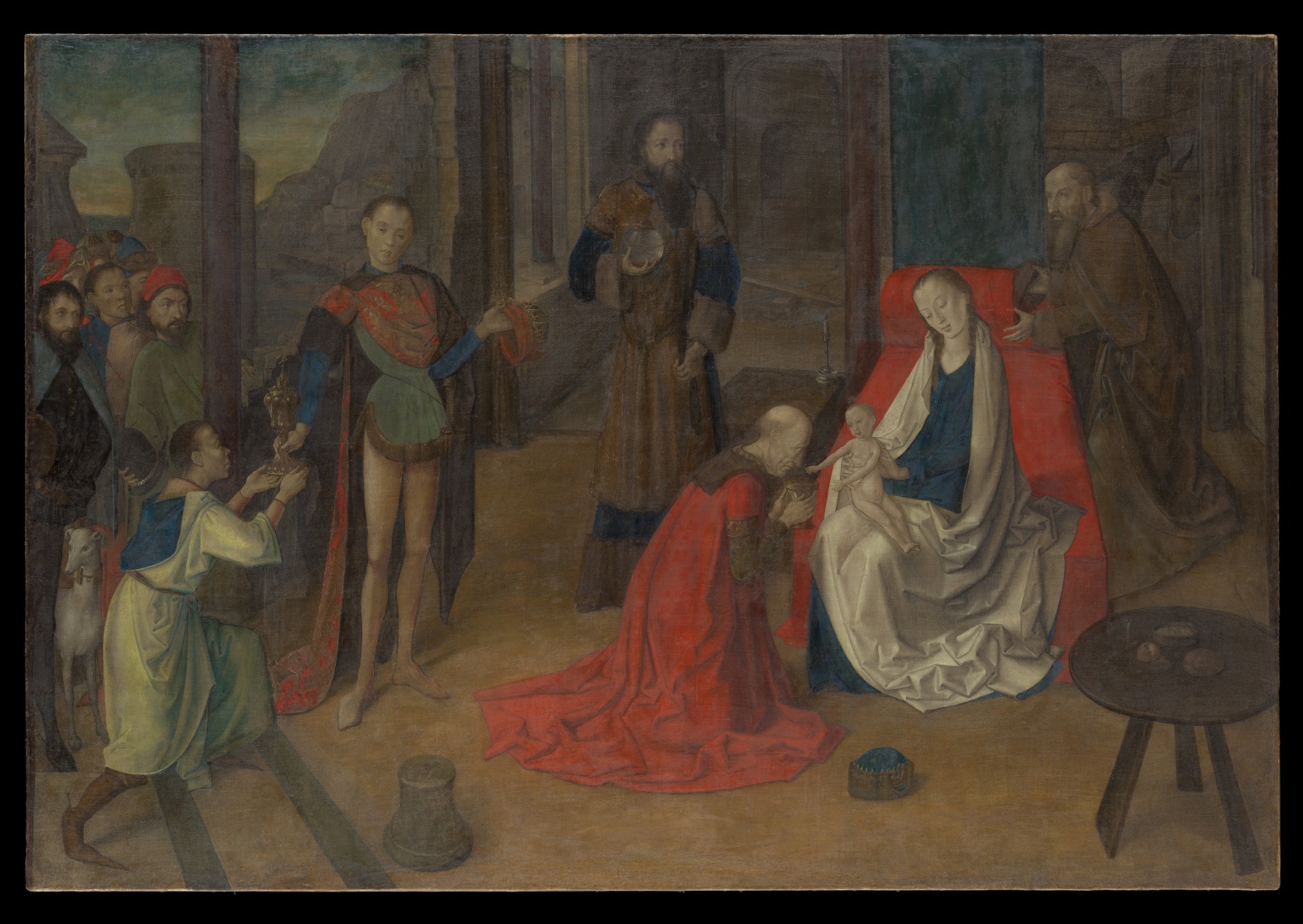
Joos van Wassenhove — The Adoration of the Magi
July 17, 2026 at 7:01 AM
Model: claude-sonnet-5
These 58 principles are perceptual mechanisms that influence what gets noticed, how forms organize, and how space is inferred - all before conscious interpretation. They do not determine meaning.
OVERVIEW
The eye moves fast in this picture. Red robe, pale child, white mantle — the circuit closes in under a second. The paint handling doesn't slow that circuit down. It's smooth, thin, built for legibility, not for resistance. Perceptual pop and material technique agree with each other. Both point at the child.
The cultural and conceptual domains complicate that agreement without breaking it. This is a devotional object first. Its job is to organize attention around a theological event, not to reward optical dwelling. Read that way, the perceptual clarity isn't decoration — it's function. The eye goes where the doctrine needs it to go.
The tension shows up at the edges of the record, not the center. Contradicted light-source readings and disputed proportions (gemini's elongation claims vs. anthropic/openai's naturalism) suggest the image doesn't fully commit to one internal logic — hard raking light in one passage, softer front-lighting in another. That's a real formal seam, not just observer disagreement. It sits underneath the confident central read without disturbing it.
The live question: whether this is a single unified pictorial system aimed at one convergence point, or several locally-resolved passages (a lit face here, a raking edge there, a naturalistic figure next to a slightly stretched one) stitched into a compositional whole that reads as unified only because the subject demands it to.
PERCEPTUAL
The red robe hits first. It's the largest saturated shape in the field, and saturation wins before anything else gets processed — pure Visual Pop-out / Pre-attentive Features. The eye doesn't reason its way there. It just lands.
From the red, the eye is handed off. The kneeling figure's head and offered vessel point toward the child — Directional Force/Implied Movement, reinforced by Gaze Direction / Social Attention from the seated woman and the standing onlookers. The child is the palest value in the composition, so Value Structure/Massing pulls the eye there independently of the directional cues. Two separate mechanisms — color pop and value contrast — both terminate at the same point. That's why the convergence feels inevitable rather than staged.
Once there, the eye doesn't stay locked. Crisp edges on the foreground faces and hands (Edge Detection / Contour Quality) give the eye a place to rest and then release, moving along the receding floor bands and columns (Linear Perspective) into the crowd at left, where edges soften and dissolve (Detail Density Gradient, Atmospheric Perspective). The cropped white dog at the frame edge is a stopping point that isn't a resolution — Cropping/Framing cuts the narrative off rather than closing it, which keeps the eye circling back toward center rather than exiting.
The one friction point: reported light direction isn't stable across the image. If raking light hits some passages and soft frontal light governs others, the eye gets inconsistent cues about where the "true" source sits — a small but real disruption in Light Source Logic under an otherwise clean compositional read.
MATERIAL AND FORMAL
Distemper on canvas. That's a fast, thin, water-based medium — no build, no impasto, no drag. The paint sits in the weave rather than on top of it; canvas texture shows through in thin passages. That's consistent with distemper's physical behavior: it doesn't allow heavy reworking, so the surface stays close to the support.
This flatness is honest about process. Nothing here fakes volume through thick paint. Volume is built entirely through tonal gradation — the "smooth, thinly built" surface noted across all runs is the direct result of the medium, not a stylistic overlay on top of a different material logic. The hand worked fast, in washes, committing early.
This creates a real material-perceptual alignment: because there's no surface incident (no visible brushwork, no impasto ridges) to catch light or attention, the eye isn't distracted by texture at any viewing distance. Up close, you get thin, matte, weave-revealing paint. At distance, you get the same tonal massing that organizes the composition. The material doesn't perform differently depending on how close you stand — which is unusual, and which supports the perceptual clarity rather than fighting it.
Where the material logic gets tested: distemper doesn't sustain contradictory light logics well, because it can't hide reworking. If two passages carry different implied light sources, that's not concealed by surface — it's sitting right there in the thin paint, visible as an actual construction inconsistency, not just an interpretive disagreement between viewers.
CULTURAL
This is a 1470s devotional narrative panel-turned-canvas, working inside the workshop-and-altarpiece economy of Northern/Netherlandish-adjacent production. One reading: the Metropolitan's institutional framing places it as an example of Netherlandish naturalism moving into Italian or transitional visual territory — distemper on canvas is itself an unusual, somewhat provincial choice relative to panel painting, which was the higher-status support at this date.
The audience this work needs to reach isn't primarily an optical audience — it's a devotional and liturgical one. Legibility of narrative (who kneels, who watches, where the vessel goes, where the child's attention pulls the room) matters more than painterly virtuosity for that audience. The composition's clarity — red robe, pale child, converging gazes — is legible to exactly that community: clergy, patrons, congregants trained to read Adoration iconography quickly.
For a modern museum-going public, the cultural signal is different. It reads as "early Renaissance devotional object," valued now for historical position and material rarity (distemper on canvas survives poorly; this is part of why the object has institutional weight) rather than for painterly innovation per se. One possible reading: its market and scholarly value rests more on rarity of support and technique than on the pictorial ambition itself. That's a position, not a settled fact — it would require reception history the image alone can't supply.
CONCEPTUAL
The work sits inside the Northern devotional tradition of organizing a sacred narrative through legible spatial and gestural logic — this is the same conceptual project as most quattrocento Adorations: make the theological event readable as physical event. Kneeling, offering, gazing, holding — these are all Postural Affect and Gaze Direction doing doctrinal work, not just compositional work.
The argument the picture makes: sacred significance is legible through ordinary perceptual mechanisms — color, gaze, gesture — without needing symbolic distortion of scale or space to signal holiness. That's a specific position relative to earlier medieval conventions, where hierarchy of scale (bigger = holier) was a live device. If this picture largely avoids that (as anthropic/openai suggest, against gemini's elongation reading), it's taking the naturalizing position: sanctity shown through composition and attention, not through size distortion.
The unresolved proportion dispute matters conceptually. If the child really is subtly elongated, that's a residue of older symbolic-scale thinking surviving inside an otherwise naturalistic system — the picture arguing two things at once without fully choosing. If it's naturalistic throughout, the picture is more conceptually unified: full commitment to attention-based sacred signaling.
Hypothesis (insufficient visual evidence): the picture is using naturalistic register precisely to make the miraculous event feel historically real rather than symbolically remote — this would require textual/doctrinal context the image alone doesn't supply.
NOISE — CONSOLIDATED
PERCEPTUAL: Light source direction is reported inconsistently — raking hard light in some accounts, soft frontal light in others. This is a real conflict in Light Source Logic, not just an observer disagreement, since it affects how edges and volumes are read across the same figures.
MATERIAL: Distemper's thinness means any inconsistency in the underlying drawing or light logic is visible, not buried. The surface can't cover a construction seam. If two lighting logics exist, the material has no capacity to reconcile them.
CULTURAL: Distemper-on-canvas is a lower-status/lower-durability material choice relative to panel painting at this date. This may make the work harder to place confidently within the "major altarpiece" category that its subject and scale suggest — a mismatch between ambition of subject and modesty of support.
CONCEPTUAL: The proportion dispute (naturalistic vs. elongated child/figures) means the work may be arguing for full perceptual naturalism while still carrying a residual symbolic-scale device. That would undercut the very naturalizing argument the composition otherwise seems to make.
Most of this noise looks accidental — a function of condition, attribution uncertainty, and viewer disagreement — rather than a deliberate device serving a second domain; the one possible exception is the cropped dog and compressed left-edge crowd, where Cropping/Framing may be a genuine compositional choice to keep the eye from exiting the scene.
WAYS OF LOOKING
The red robe gets noticed first, and the analysis doesn't stop there — it asks why. Saturation wins before reasoning starts; that's a fact about how eyes work, not about this painting specifically. But then it checks whether the value structure (the palest patch, which is the child) sends the eye to the same place. Two separate mechanisms, one destination — that's the habit: when a composition feels inevitable, look for more than one system agreeing, not just one loud cue.
The light-source contradiction is the more instructive move. Instead of picking a side — raking light versus soft frontal light — the analysis lets both readings stand and then asks what kind of problem that is. Is it sloppy looking, or is it sitting in the actual paint? It traces the disagreement down into the material (distemper can't hide a construction seam) rather than resolving it by authority. The habit: treat unresolved disagreement as data about the object, not a mistake to smooth over.
The cultural section does something easy to skip — it separates the audience the work was built for from the audience looking at it now. A 1470s congregant reading gesture and gaze as doctrine is a different viewer than a museum visitor valuing the object for rarity of technique. Naming both, without letting one collapse into the other, is what keeps a formal observation from turning into an anachronistic claim.
WHAT THIS WORK MAKES VISIBLE
Watch how the eye is handed off, not just where it lands. Red robe to kneeling gesture to gaze to pale child, then out along the floor bands into a softening crowd, stopped short by a half-cropped dog. Because the paint is thin and unusually legible — smooth, distemper on canvas, no impasto to snag attention at any distance — you can trace that circuit without the surface fighting you. In a heavily worked oil painting, brushwork itself becomes a stopping point; here, nothing competes with the compositional logic, so the logic itself is easy to see and name.
The other thing this painting exposes is how proportion disputes carry real stakes. Whether the child is naturalistically scaled or subtly enlarged isn't just an accuracy question — it's the seam between two different ways of signaling holiness, hierarchy-of-scale versus attention-based composition. Most paintings hide that seam. This one, because the observers split on it, lets you watch the seam happen in real time. Next time a figure looks "almost right" in size, ask whether an older symbolic convention is still doing quiet work underneath a newer naturalistic one.
Looking vs. Knowing
These are the analysis's own words, nothing added.
What the Work Shows Us
These are the claims that hold up when you look: each one is rooted in something the image actually puts in front of you, not from what we already knew—or thought we knew—about it.
Readings That Came From Outside
Not wrong, necessarily—but these readings didn't come from looking: they came from biography, cultural context, critical tradition, to complete what the image left open.
Writing guardrail
The house style rules this writing was asked to follow, and where it didn't. Flagged after the fact. Nothing was rewritten.
Pass 2
- Used a banned construction: em dash
Pass 3
- Used a banned construction: em dash
Alternative Interpretation
Pulled directly from this analysis's own language — nothing added.
The primary reading holds that the picture is a naturalistic devotional system in which sanctity is signaled through composition, gaze, and gesture alone, with no need for symbolic scale distortion. The competing reading, left unresolved in the analysis itself, is that the child may be subtly elongated in the older hierarchy-of-scale tradition — meaning the picture could be arguing two incompatible things at once (full naturalism vs. residual symbolic distortion) rather than committing to one.
Questions Raised
Is the inconsistent light-source logic (raking light in some passages, soft frontal light in others) a genuine construction seam in the painting, or an artifact of disagreement between observers/records — the analysis flags this as unresolved and says distemper's thinness makes it "visible, not buried" but doesn't settle whether it's real.
Is the child's proportion actually elongated (residual symbolic-scale device) or naturalistic throughout — the analysis explicitly notes this is disputed (gemini vs. anthropic/openai) and that it changes whether the work is conceptually unified or self-contradictory.
Does the work's value and institutional placement rest more on rarity of support/technique than on pictorial ambition — flagged explicitly as "a position, not a settled fact" requiring reception history the image alone can't supply.
Pass 1 — blind observation used
My eye lands first on the seated woman in blue and white, her pale face tilted downward, positioned right of center against a slab of dark green cloth of honor and a red cushioned bench — that red is the single most saturated note in the panel and pulls everything toward it (Color Weight and Advancement).
From her the gaze moves to the kneeling figure in the sweeping red robe, whose garment pools across the floor in heavy folds. The robe's red is echoed in the seated woman's bench, creating a chromatic bridge across the middle of the composition (Interval Relationships) that ropes the two central figures together despite the gap between them.
The child on her lap is the palest, smallest form in the picture — bare skin against dark drapery — and functions as a focal anchor (Anchoring and Reference Points) toward which the kneeling man's hands and lowered head are directed, along with the standing figure's turned attention behind him (Agency Attribution, in the way postures orient toward the child rather than simply look at it).
Moving left, the standing young man in the parti-colored tunic (green, red, blue) stands rigidly frontal, his contour crisp and his skin pale and smooth-edged against the dark colonnade behind him (Edge Detection) — his outline is the hardest in the painting, almost cut out from the ground. Behind him the cluster of onlookers' faces are more loosely brushed, their edges softening (Detail Density Gradient) as they recede into the crowd at the left margin.
The architecture — dark red columns receding at intervals — sets up the deep space (Linear Perspective), while the pale sky and distant rocky forms at the far left corner are cooler and grayer, sitting behind the columns as the furthest visible depth (Atmospheric Perspective).
Darkest values pool in the background arches and the standing bearded man's brown-black robe at center-right; these near-black passages give the mid-tones — ochres, browns, dull greens — their weight (Value Structure/Massing). The lightest values are concentrated in the seated woman's white mantle, the child's flesh, and small bright accents: the gilt vessel held by the kneeling boy at lower left, and the metal vessel held by the standing man in the background.
Surface handling is smooth, thinly built, with soft transitions in flesh and drapery suggesting an oil technique with minimal visible brushwork; texture registers mainly in the nap of velvet reds and the flatter matte quality of the stone architecture.
The round table at the lower right, with its small dish, sits low and close to the picture plane, acting as a foreground marker (Cropping/Framing) that stabilizes the right edge before the eye is released outward, having moved from the central seated pair, through the kneeling and standing figures, back to the crowd, and finally out to the framing furniture and architectural recession.