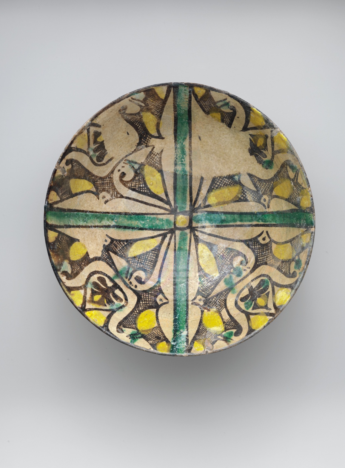
Buff Ware Bowl with Geometric Patterns
July 17, 2026 at 7:14 AM
Model: claude-sonnet-5
These 58 principles are perceptual mechanisms that influence what gets noticed, how forms organize, and how space is inferred - all before conscious interpretation. They do not determine meaning.
LOOKING PROMPTS
Follow the green cross from the center out to the rim — where does your eye land first, and where does it go next?
Look closely at the yellow shapes scattered around the bowl — how many can you find, and do they all seem to catch the light the same way?
Move your eyes along the black outlines in each quarter of the bowl — find a spot where the line is crisp and confident, then find a spot where it goes thin, wavers, or breaks.
Start here: Notice the small element at the very center where the green cross meets itself — everything in the bowl radiates from or answers back to that one point.
THE HOOK
Look at the four quarters of this bowl — are they really the same pattern repeated, or does something feel off? They're meant to match, and at a glance they do: same curling motif, same black outline, same basic layout, four times around. But look closer and no two quadrants are quite identical — the curls tighten or loosen, the hatching gets denser or sparser, a yellow shape shifts position. A human hand was working freehand, fast, four separate times, and never quite repeated itself. The symmetry you feel is really an illusion your brain is completing — the object is more variable than it looks.
THE STORY
This bowl comes from the 9th century, a period when potters across the Islamic world were producing what's now called buff ware — earthenware built on a light, sandy-colored clay body, then decorated with a limited palette of mineral colors and sealed under a clear glaze. The green-cross-and-quadrant layout, the cross-hatched fills, and the punchy yellow accents are part of a broader visual language that shows up on ceramics, textiles, and architectural decoration of the era — a shared decorative vocabulary rather than one artist's invention. Bowls like this were made for everyday use and display alike; they weren't precious objects in their own moment the way we treat them now, sitting under museum light. Scholars still debate exactly where within the region specific buff ware workshops operated, since these wares traveled and were traded, and clear regional attribution is often difficult (verify before using). Today the piece sits in an encyclopedic collection, valued less as a masterpiece by a named hand and more as evidence of a widespread, confident design system practiced across many hands and generations.
THE LIVE QUESTION
Some people look at this bowl and see pure abstract pattern — leaves, curls, geometry, nothing more. Others start to see faces or creatures hiding in the curling shapes, almost like the pattern is watching back. There's no settled answer here — what do you see when you look at the motif in each quadrant?
WAYS OF LOOKING
Start at the center where the green cross meets itself, then follow the arms out to the rim. That's not just a nice place to begin — it's the single point the whole design radiates from, so anchoring your eye there before scanning the quadrants gives every tour stop a spine. Any object with a strong central axis — a rose window, a mandala, a formal portrait — rewards this: find the anchor first, then let the audience discover the rest as departures from it.
Notice how the analysis doesn't stop at "four matching quadrants" — it goes back and checks whether they actually match. They don't, quite. The curls tighten in one, the hatching thins in another, a yellow shape drifts. That's the habit of testing your first impression against the details instead of resting on it. A pattern that reads as symmetrical from six feet away almost always breaks down at six inches, and that gap between glance and scrutiny is where you can bring a group in close.
Watch how confident the black outline is in one passage and how it thins, wavers, or vanishes a few inches away. Rather than reading this as a flaw, treat it as evidence: variation in line quality tells you about the hand that made the object, the speed it was made at, even the tool. Any handmade surface — a ceramic, a fresco, a woodblock print — carries this kind of information if you look at execution, not just composition.
And notice how the write-up holds two unresolved readings side by side — pure abstract pattern versus hidden bird faces — without forcing a winner. Naming a genuine ambiguity, and inviting the group to argue it, is often more useful for a tour than settling it yourself.
WHAT THIS WORK MAKES VISIBLE
The yellow patches sitting inside black cross-hatching, glossy where the glaze catches light — that contrast makes color saturation and surface reflection unusually easy to see and explain together, since the glaze physically sits on top of the pigment. Look for this pairing on any glazed or varnished surface: where does the shiniest area also happen to be the most intense color?
The rim's chips and worn glaze, right up against a design still fully legible in the center, make condition and content sit side by side without competing. That's rarer than it sounds — usually damage either destroys the image or hides in a corner. Here you can point to both in one glance and talk about what four-cornered symmetry, and time, each do to an object.
Looking vs. Knowing
These are the analysis's own words, nothing added.
What the Work Shows Us
These are the claims that hold up when you look: each one is rooted in something the image actually puts in front of you, not from what we already knew—or thought we knew—about it.
Readings That Came From Outside
Not wrong, necessarily—but these readings didn't come from looking: they came from biography, cultural context, critical tradition, to complete what the image left open.
Writing guardrail
The house style rules this writing was asked to follow, and where it didn't. Flagged after the fact. Nothing was rewritten.
Pass 2
- Used a banned construction: em dash
- Used banned word: masterpiece
Pass 3
- Used a banned construction: not just X, but Y
- Used a banned construction: em dash
Alternative Interpretation
Pulled directly from this analysis's own language — nothing added.
The primary reading treats the quadrant motifs as pure abstract pattern — curling leaves, geometry, decorative fill with no representational content. The competing reading, raised in "The Live Question," is that the curling shapes may hide faces or creatures, as if the pattern is watching back — and the analysis explicitly declines to settle between these two ways of seeing.
Questions Raised
Where exactly within the Islamic world this bowl's buff ware workshop operated — the analysis flags regional attribution as difficult and unresolved due to the trade and travel of these wares, and marks it as something to "verify before using."
Whether the curling quadrant motifs are meant (or perceived) as purely abstract pattern or as concealed faces/creatures — the analysis presents both readings as live and unresolved.
Whether the quadrant variations (tightened curls, denser hatching, shifted yellow shapes) reflect intentional freehand variation or simple execution error — the analysis notes the discrepancy but doesn't resolve what it signifies beyond "a human hand was working fast."
Pass 1 — blind observation used
The eye lands first on the green cross that bisects the plate into four quadrants, its saturated, even band of color reading as the dominant Anchoring and Reference Point around which everything else organizes. This cross has straight, hard-drawn edges, outlined in thin dark brown, and it terminates in a small circular hub at the exact center of the bowl.
Within each of the four quadrants, the same design repeats with slight hand-drawn variation — this is Rhythm and Repetition through near-identical motifs rotated around the center, producing an overall four-fold Symmetry / Asymmetry tension: symmetrical in layout but asymmetrical in the small irregularities of brushwork from quadrant to quadrant.
The motifs themselves are dense: curling, leaf-like or wing-like cream-colored shapes outlined in dark brown/black, filled in places with a cross-hatched lattice pattern. This hatching creates a strong Detail Density Gradient — busy, textured passages sit next to plain, unpainted cream ground, so the eye moves between areas of Complexity and Visual Density and areas of open Negative Space.
Color-wise, three hues dominate: the ochre/cream base, black-brown linework, mustard-yellow fills, and the green of the cross and small accents scattered through the quadrants. The yellow patches act as Visual Pop-out elements — small, saturated, irregularly shaped, they catch the eye first within each quadrant before the surrounding linework is read. Green appears again in small dabs within the quadrant designs, echoing the central cross and creating Color Harmony through repetition of that single hue across the composition.
Edges vary in quality: the outer rim of the plate is a hard, continuous Contour Quality boundary, dark and consistent. Inside, the brush-drawn outlines of the leaf/wing shapes are more irregular, sometimes thick and confident, sometimes thinning or breaking slightly — visible evidence of a hand-applied slip or glaze pigment rather than a mechanically repeated pattern.
The surface itself shows the Specularity/Surface Reflection of a glazed ceramic — a glassy sheen catches light unevenly, with brighter highlights toward the upper right quadrant and a softer, more matte quality in some cream passages, suggesting glaze pooling or wear.
Value structure is relatively narrow: mid-tone cream ground, dark brown/black linework for contrast, and mustard yellow sitting at a similar mid-value to the ground, which keeps the overall Value Structure fairly flat and pattern-like rather than volumetric — this is a flat picture plane, decorative rather than illusionistic, so there's no real Atmospheric Perspective or depth cue beyond simple Overlap where lines cross the yellow fills.
Scale is consistent with the plate's function: the motifs are proportioned to fill the circular field evenly, respecting the round Cropping/Framing of the object itself, with no motif breaking past the rim's dark boundary line.
The eye finally settles on small idiosyncrasies — a slightly uneven yellow blob, a place where the black outline doubles back on itself, a faint crack or glaze flaw near the rim — these final small details give the object its handmade, individual character after the overall symmetrical pattern has been absorbed.