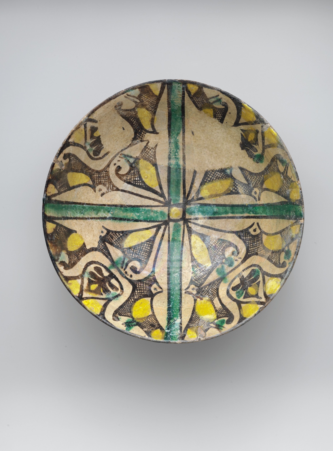
Buff Ware Bowl with Geometric Patterns
July 17, 2026 at 7:12 AM
Model: claude-sonnet-5
These 58 principles are perceptual mechanisms that influence what gets noticed, how forms organize, and how space is inferred - all before conscious interpretation. They do not determine meaning.
what the eye does
Your eye lands on the cross first — thick, green, dead center, holding the whole bowl together like a plus sign someone pressed into the surface before anything else was decided. From there it splits, the way a cross always does, into four rooms. And in each room, roughly the same thing happens: a dark curling shape, hatched over in tight black lines, with a patch of yellow set into it like a hot coal. You look at one quadrant, then you check it against the next, the way you'd check a rhyme scheme — does it match? It almost does. Never exactly. The yellow shifts a little in placement, the hatching gets denser here, thinner there, and that almost-matching is what keeps you circling the bowl instead of settling. There's no single point of maximum detail to rest on. The busyness is evenly rationed out into four servings, and your eye keeps taking seconds.
how it's made
This is earthenware — ordinary clay, not the fine white-bodied stuff — covered in a slip the color of dried cream, then painted in black, yellow, and green pigments, then glazed clear and fired. The buff-colored body is doing a job here: it's the field everything else sits on, the calm ground against which the black hatching reads as busy and the yellow reads as loud. You can see the hand in it if you look at the linework — some of the black outlines are crisp and confident, drawn like someone who'd done this a thousand times, and others thin out, waver, or bleed slightly where the pigment ran under the glaze during firing. That inconsistency isn't a flaw exactly. It's the fingerprint. A stamped or molded pattern would have given you four identical quadrants; this gives you four cousins. The glaze itself catches light unevenly across the surface, so depending on where you stand, parts of the pattern go glassy and bright and other parts go quiet — the glaze has its own weather, separate from the painting underneath.
where it lives
Turn the bowl slightly and you notice the rim is chipped in places, the glaze gone thin or lost entirely, exposing the rougher body beneath — a reminder this thing was used, not just admired. It comes out of the ninth century, from the world of Islamic ceramic production where potters working in earthenware were solving a specific problem: how to get color and pattern onto a cheap clay body when you don't have access to the fine white kaolin clays used further east in Chinese porcelain, which Islamic potters at this moment were deeply aware of and responding to. Buff ware and its slip-painted relatives were part of that response — using colored slips and glazes to get a comparable visual richness out of humbler material. The result sits in a lineage that runs toward the more famous splashed and slip-painted wares of the same centuries, all of them working the same basic bet: that pattern, repeated and controlled, could make ordinary clay carry real visual weight. It lives now in the Metropolitan Museum's collection, catalogued as tableware, though nothing about looking at it feels like looking at something merely functional.
what it's arguing
The bowl is making a quiet case for pattern over illusion — it isn't trying to convince you there's a bird or a garden here, even though the curling shapes gesture toward leaves or wings. It's arguing that geometry, repeated with just enough human variation, can hold your attention as long as a picture of something would. The cross-and-four-quadrant structure gives the whole thing a kind of fairness — no quadrant wins, no single motif dominates — and then the hand-painted looseness undercuts that fairness just enough to keep it from feeling mechanical. That tension, between a rigid organizing structure and the wobble of a human hand working fast inside it, is the real subject. It's not decoration in the sense of filler. It's decoration as an argument that symmetry and variation can coexist without canceling each other out.
what it holds open
I keep going back to the fact that the four quadrants never fully agree with each other, and the bowl never tells you whether that's a mistake or the point. A potter working this fast, this many times, across this many bowls, wasn't necessarily chasing perfect symmetry — but nothing here confirms that the near-matching wasn't deliberate either. Stand close enough and the hatching starts to separate from the shapes it's supposed to be filling, and you're left deciding for yourself where the pattern ends and the picture begins.
WAYS OF LOOKING
The analysis starts with the green cross and follows it outward into four quadrants, checking each one against the others like a reader checking rhymes. It doesn't just note that the quadrants are symmetrical — it notices where the symmetry breaks, where the yellow shifts position or the hatching thickens. That's a habit worth stealing: find the repeating unit first, then hunt for the deviation. Perfect repetition is boring to describe. The gap between "supposed to match" and "doesn't quite" is where the actual observation lives.
Notice, too, how the analysis reads the linework itself — crisp in places, thinning or bleeding in others — and uses that as evidence of a hand, not a stamp. It's not describing what the pattern shows; it's describing how the pattern was physically made, and treating inconsistency as information rather than error. That's a way of looking that asks material questions before it asks meaning questions: what tool, what pressure, what moment of hesitation left this mark?
And when the piece turns to the chipped rim, it doesn't just log damage — it uses the damage to argue the object was used, handled, lived with. Wear becomes evidence of a life, not just a flaw to mentally correct. That's the habit of reading condition as content: the scratches and losses on an object are part of its story, not noise to filter out before the "real" analysis begins.
WHAT THIS WORK MAKES VISIBLE
Look at how evenly the detail is spread across the four quadrants — no single hot spot, no quiet corner. Because the density gradient repeats four times instead of building toward one climax, you can actually watch your own eye refuse to settle, circling instead of resting. Most paintings pull your attention to one place; this bowl distributes it, and that makes the mechanism of visual pacing unusually easy to catch in the act. Look for this in any object with rotational rather than pyramidal composition — mandalas, tiled floors, plates.
Look also at the glaze catching light unevenly across the surface. Because the surface is curved and reflective, you can see, almost like a diagram, how gloss and matte areas compete with the painted pattern for your attention — sometimes overriding it entirely. That's usually invisible in flat, matte painting. Next time you're in front of glazed ceramics, lacquerware, or varnished panels, tilt your head and watch the picture plane fight the reflection plane for dominance.
Writing guardrail
The house style rules this writing was asked to follow, and where it didn't. Flagged after the fact. Nothing was rewritten.
Pass 2
- Used a banned construction: em dash
Pass 3
- Used a banned construction: em dash
Alternative Interpretation
Pulled directly from this analysis's own language — nothing added.
The primary reading treats the near-matching quadrants as the fingerprint of a fast-working hand — natural variation arising from repetition rather than precision. The competing reading, which the analysis raises but refuses to settle, is that this near-symmetry could be deliberate: a calculated "argument" that controlled variation, not accident, is what keeps the pattern alive against mechanical perfection. The text explicitly declines to choose between these two, stating the bowl "never tells you whether that's a mistake or the point."
Questions Raised
Was the imprecision across the four quadrants intentional artistic variation or simply the byproduct of working quickly across many similar pieces? The analysis admits it cannot determine this from the object alone.
Where exactly does the pattern stop being abstract geometry and start being representational (leaf, wing, bird)? The analysis notes this boundary dissolves on close viewing but doesn't resolve where it lies.
How much of the surface's visual effect (crisp vs. wavering lines, pigment bleeding, glaze's uneven "weather") reflects deliberate technique versus firing accidents and material limitations? The analysis describes both possibilities without confirming which dominates.
Pass 1 — blind observation used
The eye lands first on the green cross that bisects the plate into four quadrants, its saturated, even band of color reading as the dominant Anchoring and Reference Point around which everything else organizes. This cross has straight, hard-drawn edges, outlined in thin dark brown, and it terminates in a small circular hub at the exact center of the bowl.
Within each of the four quadrants, the same design repeats with slight hand-drawn variation — this is Rhythm and Repetition through near-identical motifs rotated around the center, producing an overall four-fold Symmetry / Asymmetry tension: symmetrical in layout but asymmetrical in the small irregularities of brushwork from quadrant to quadrant.
The motifs themselves are dense: curling, leaf-like or wing-like cream-colored shapes outlined in dark brown/black, filled in places with a cross-hatched lattice pattern. This hatching creates a strong Detail Density Gradient — busy, textured passages sit next to plain, unpainted cream ground, so the eye moves between areas of Complexity and Visual Density and areas of open Negative Space.
Color-wise, three hues dominate: the ochre/cream base, black-brown linework, mustard-yellow fills, and the green of the cross and small accents scattered through the quadrants. The yellow patches act as Visual Pop-out elements — small, saturated, irregularly shaped, they catch the eye first within each quadrant before the surrounding linework is read. Green appears again in small dabs within the quadrant designs, echoing the central cross and creating Color Harmony through repetition of that single hue across the composition.
Edges vary in quality: the outer rim of the plate is a hard, continuous Contour Quality boundary, dark and consistent. Inside, the brush-drawn outlines of the leaf/wing shapes are more irregular, sometimes thick and confident, sometimes thinning or breaking slightly — visible evidence of a hand-applied slip or glaze pigment rather than a mechanically repeated pattern.
The surface itself shows the Specularity/Surface Reflection of a glazed ceramic — a glassy sheen catches light unevenly, with brighter highlights toward the upper right quadrant and a softer, more matte quality in some cream passages, suggesting glaze pooling or wear.
Value structure is relatively narrow: mid-tone cream ground, dark brown/black linework for contrast, and mustard yellow sitting at a similar mid-value to the ground, which keeps the overall Value Structure fairly flat and pattern-like rather than volumetric — this is a flat picture plane, decorative rather than illusionistic, so there's no real Atmospheric Perspective or depth cue beyond simple Overlap where lines cross the yellow fills.
Scale is consistent with the plate's function: the motifs are proportioned to fill the circular field evenly, respecting the round Cropping/Framing of the object itself, with no motif breaking past the rim's dark boundary line.
The eye finally settles on small idiosyncrasies — a slightly uneven yellow blob, a place where the black outline doubles back on itself, a faint crack or glaze flaw near the rim — these final small details give the object its handmade, individual character after the overall symmetrical pattern has been absorbed.