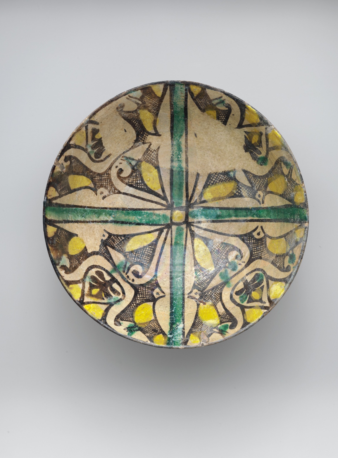
Buff Ware Bowl with Geometric Patterns
July 17, 2026 at 7:11 AM
Model: claude-sonnet-5
These 58 principles are perceptual mechanisms that influence what gets noticed, how forms organize, and how space is inferred - all before conscious interpretation. They do not determine meaning.
OVERVIEW
Four domains agree on one thing: a hand made this, and the hand shows. Perceptual, material, and cultural readings converge around the cross-and-quadrant structure — the eye finds it first, the glaze sits on it physically, the design vocabulary places it in a known ceramic tradition. That's alignment.
The tension sits elsewhere. Perceptual analysis finds a calm, legible order — anchor point, four repeats, done in seconds. Material analysis complicates that calm: chipping, crackle, uneven glaze pooling mean the object doesn't look the same twice, not in different light, not at different distances. The conceptual domain asks whether the "imperfection" the eye registers as charming hand-variation is actually evidence of a system (workshop production, repeatable motifs) rather than a gesture of individual expression. Cultural framing pulls against a purely aesthetic reading too: this bowl entered the Met's collection through frameworks built for painting and sculpture, and functional Islamic-world ceramics get read there partly as design, partly as ethnography, rarely as both at once with equal weight.
The eye wants unity. The material record shows wear and asymmetry. The cultural record shows a category (bowl, tableware, "decorative art") historically valued differently than a "great work." None of these resolve. The live question: does this object ask to be read as a composition first and an artifact second, or does that ordering itself belong to the museum wall label and not to the object.
PERCEPTUAL
The eye lands on the center first. The green cross is the strongest linear feature on the surface, and it meets a small yellow element at the middle — that intersection functions as the Anchoring and Reference Point for everything else. From there the eye follows the cross outward into four repeating quadrants.
The yellow patches act as Visual Pop-out elements — they're the most saturated note in an otherwise cream-brown-black field, so they catch the eye before the linework does, even though they're smaller in area than the cross or the hatched fill.
Once in a quadrant, the eye slows down. Dense black cross-hatching sits right next to open cream ground — a Detail Density Gradient that reads as busier near the edges and calmer near the center. That gradient does a specific job: it pulls the eye toward the rim, then the rim's dark circular boundary (Cropping/Framing) stops it and pushes it back in. The result is a loop — center to edge to center — rather than a single directional sweep.
Rhythm and Repetition across the four quadrants sets up an expectation of exact Symmetry, but the linework is hand-painted: contours thin out, bleed, or go crisp inconsistently from one quadrant to the next. The eye notices the mismatch on a second pass, not the first. First pass: order. Second pass: variation. The two requests — read this as a unified radial pattern, and notice that no two quadrants match — don't fully conflict, but they do compete for the same few seconds of attention.
Glaze reflections (Specularity/Surface Reflection) scatter unevenly across the surface, which occasionally competes with the cross for structural attention — a glare patch can momentarily out-pull the yellow pop-outs depending on the light in the photograph.
MATERIAL AND FORMAL
This is earthenware — a low-fired clay body, buff-colored, covered in polychrome slip or pigment and sealed under a transparent glaze. That's the plain material fact. The hand's presence is visible in the linework: black-brown outlines vary in thickness and confidence quadrant to quadrant, consistent with brush-applied decoration rather than stencil or mold-transferred pattern.
The glaze sits as a single transparent layer over the painted design, which is why the surface reads as glossy and uneven in its reflections — glaze pools slightly differently over raised or thicker paint areas, which is why some passages catch more light than others. That unevenness is a firing/glazing condition, not a decorative choice as such, though it participates in how the pattern reads at a distance.
The surface shows wear: chips, abrasion, crackle. That wear exposes the buff earthenware body beneath the glaze in places, which is a different material — coarser, matte, lighter or rougher than the glazed surface around it. This means the object's current visual condition is partly the original 9th-century decoration and partly nine-plus centuries of handling and burial or storage. A viewer up close sees both layers simultaneously: intact design intention and accumulated damage. At a distance, the damage recedes and the radial pattern dominates.
The physical choices — thin earthenware wall, wide rim, shallow bowl form — support a functional object: something meant to hold food or be used at a table, not simply displayed. The decorative program (cross, quadrants, hatching) works within that constraint: it reads clearly from above, which is the eating/serving vantage point, not a framed-wall vantage point. The material logic and the decorative logic agree with each other. What doesn't agree is the museum presentation, which asks this functional round object to behave like a flat framed picture — a tension addressed more fully in cultural.
CULTURAL
One reading: this bowl belongs to a broad family of glazed earthenware produced across the medieval Islamic world, where geometric and vegetal ornament on tableware was a dominant, highly developed visual language — not a marginal craft tradition but a primary site of aesthetic ambition. Radial quadrant division, hatched fill, and restrained four-color palettes (cream, black, yellow, green) appear across a wide range of 9th-10th century production centers. If that's the correct family, the object is legible to specialists in Islamic ceramics, to institutions like the Met that hold comparative pieces, and to collectors of medieval decorative arts — a well-established, well-valued field.
To a general museum visitor, though, the signals may not land the same way. Functional ceramic objects in Western museum contexts often get filed mentally under "craft" or "decorative art," a category historically valued below painting and sculpture in market and critical hierarchies — even when the object's design sophistication rivals anything in those categories. That's a possible tension: the object may be doing formally ambitious work (the radial anchoring, the density gradient, the color restraint) that the label "bowl" undersells to an audience trained to look for easel-painting-style composition.
Whether this bowl is "ignoring" contemporary cultural conditions or simply predates the categories now used to sort it is a matter of framing, not fact. It isn't transgressive — it's pre-categorical relative to the modern art/craft split.
CONCEPTUAL
One reading: this object sits inside a broader argument — visible across much medieval decorative production — that ornament is not secondary to representation but is itself a complete visual system. The cross-and-quadrant structure, the repeating motif, the hatching density: these don't refer to anything outside themselves. They organize attention through Rhythm and Repetition and Anchoring and Reference Points alone. If that's right, the "argument" of the object is that pattern can carry the full weight of visual interest without figuration — Pattern vs. Figure resolved entirely on the side of pattern (with the caveat that Gemini's bird-face reading, if valid, would complicate this; but that reading isn't corroborated across observers, so it stays a hypothesis).
Hypothesis (insufficient visual evidence): the imperfect symmetry between quadrants is a deliberate assertion of hand over mechanism — a conceptual stance about individual variation within a repeating system. Only two anchors are available (contour inconsistency, hand-painted execution noted across observers), and both describe execution, not intent. This can't be separated from ordinary workshop variation without more context.
A more supportable conceptual claim: functional and decorative ambition are not opposed in the object's own logic, whatever the modern art/craft hierarchy assumes. The bowl is not undecorated because it's useful, and not less considered because it's round and shallow rather than flat and framed. The historical precedent worth naming is the whole tradition of Islamic ceramic ornament treating the vessel surface as primary pictorial ground, not a lesser surface waiting for "real" art to happen elsewhere.
NOISE — CONSOLIDATED
PERCEPTUAL: The clean radial read (center-out-back) competes with the disorder discovered on a second look — quadrants don't actually match. Glaze glare adds a second, unstable bright zone that sometimes pulls attention away from the yellow pop-outs and the cross alike.
MATERIAL: Wear and chipping expose the raw earthenware body under the glaze, so the object's surface is legible as two different material states (intact glaze vs. bare clay) simultaneously — this fights the "single unified surface" the design pattern implies.
CULTURAL: Modern art/craft hierarchies and museum display conventions (frontal photography, wall-adjacent presentation) can flatten a functional tabletop object into a static image, obscuring the fact that its design logic was built for a hand holding it and an eye looking down into it, not for a frame on a wall.
CONCEPTUAL: The "hand-painted variation as individual expression" reading is not well anchored — it could just as easily be routine workshop inconsistency, and the record doesn't have enough independent evidence to separate the two.
The glaze/wear noise (material) plausibly serves no one — it's accidental, historical accident layered onto intentional design. The frontal-display noise (cultural) is more likely an institutional artifact, not something the object itself produces. The quadrant-mismatch noise (perceptual) may be intentional — hand execution as a mode of production, not a flaw — but this can't be confirmed from the image alone.
WAYS OF LOOKING
Start with the green cross. The analysis doesn't just note it's there — it tracks what the eye does with it: lands, then loops out to the quadrants, then gets stopped by the dark rim and pulled back in. That's not describing a pattern, that's describing a path. The habit worth stealing: don't just name what's on the surface, trace the order in which a viewer actually encounters it. First pass, second pass — these are different experiences of the same object, and naming both is more honest than settling for one.
Then there's the moment the analysis catches its own first impression correcting itself: the quadrants look symmetrical, until you notice the linework doesn't actually match from one to the next. That correction — order first, variation second — only surfaces because the analysis went back for a second look instead of trusting the first. Good looking includes doubting your first read on purpose.
Notice, too, how the material argument gets built from a small physical fact: glaze sits unevenly over paint, so some areas catch more light than others. That's not a metaphor about "texture" — it's a specific claim about how glaze pools during firing, and it's checked against what's actually visible (chips exposing the clay body underneath). The habit: ground every formal claim in something the material is actually doing, not just something it evokes.
Last, the analysis is willing to say when it doesn't know. The bird-face reading, the "hand variation as deliberate expression" idea — both get flagged as under-supported rather than smoothed into confident narrative. Knowing the difference between what the object shows and what you're guessing is its own skill, and it's the one that keeps an argument honest.
WHAT THIS WORK MAKES VISIBLE
Look at the center of this bowl again — the small yellow mark where the green cross meets itself. In a busier, more figurative painting, your eye has to hunt for its anchor among competing subjects. Here, the anchor is engineered: one point, four repeats fanning out from it. That's easier to see on a radially symmetric object than almost anywhere else, and once you've spotted it here, you'll notice it faster in any composition built from a center — a rose window, a mandala, a dinner plate.
Look too at the rim, where age has chipped through the glaze to the raw clay beneath. That's two material histories sitting side by side in one glance: the artist's intention and time's interference, with nothing hiding the seam. Paintings usually blend their damage in — craquelure spreads evenly, varnish yellows all at once. Here the wear is patchy and legible, which makes it a good training ground for learning to separate "what was made" from "what happened to it since."
Looking vs. Knowing
These are the analysis's own words, nothing added.
What the Work Shows Us
These are the claims that hold up when you look: each one is rooted in something the image actually puts in front of you, not from what we already knew—or thought we knew—about it.
Readings That Came From Outside
Not wrong, necessarily—but these readings didn't come from looking: they came from biography, cultural context, critical tradition, to complete what the image left open.
Writing guardrail
The house style rules this writing was asked to follow, and where it didn't. Flagged after the fact. Nothing was rewritten.
Pass 2
- Used a banned construction: em dash
Pass 3
- Used a banned construction: em dash
Alternative Interpretation
Pulled directly from this analysis's own language — nothing added.
The primary reading treats the quadrants' hand-painted inconsistency as charming individual expression — a human touch visible against the machine-like regularity of the radial design. The competing reading, flagged explicitly as an unconfirmed hypothesis, holds that this same variation is simply routine workshop production inconsistency with no intended statement about individuality at all, and the analysis admits it cannot separate these two without evidence beyond the image.
Questions Raised
Is the imperfect symmetry between quadrants a deliberate assertion of hand over mechanism, or ordinary workshop variation with no conceptual weight — the analysis states this cannot be resolved from the image alone.
Does Gemini's "bird-face" reading in the quadrant pattern hold any validity, or is it noise? It's raised only as an uncorroborated hypothesis and left unresolved.
Should this object be read as composition first and artifact second, or does that ordering belong only to the museum's display conventions rather than to the object itself? The analysis poses this as the live, unresolved question and does not answer it.
Pass 1 — blind observation used
The eye lands first on the green cross that bisects the plate into four quadrants, its saturated, even band of color reading as the dominant Anchoring and Reference Point around which everything else organizes. This cross has straight, hard-drawn edges, outlined in thin dark brown, and it terminates in a small circular hub at the exact center of the bowl.
Within each of the four quadrants, the same design repeats with slight hand-drawn variation — this is Rhythm and Repetition through near-identical motifs rotated around the center, producing an overall four-fold Symmetry / Asymmetry tension: symmetrical in layout but asymmetrical in the small irregularities of brushwork from quadrant to quadrant.
The motifs themselves are dense: curling, leaf-like or wing-like cream-colored shapes outlined in dark brown/black, filled in places with a cross-hatched lattice pattern. This hatching creates a strong Detail Density Gradient — busy, textured passages sit next to plain, unpainted cream ground, so the eye moves between areas of Complexity and Visual Density and areas of open Negative Space.
Color-wise, three hues dominate: the ochre/cream base, black-brown linework, mustard-yellow fills, and the green of the cross and small accents scattered through the quadrants. The yellow patches act as Visual Pop-out elements — small, saturated, irregularly shaped, they catch the eye first within each quadrant before the surrounding linework is read. Green appears again in small dabs within the quadrant designs, echoing the central cross and creating Color Harmony through repetition of that single hue across the composition.
Edges vary in quality: the outer rim of the plate is a hard, continuous Contour Quality boundary, dark and consistent. Inside, the brush-drawn outlines of the leaf/wing shapes are more irregular, sometimes thick and confident, sometimes thinning or breaking slightly — visible evidence of a hand-applied slip or glaze pigment rather than a mechanically repeated pattern.
The surface itself shows the Specularity/Surface Reflection of a glazed ceramic — a glassy sheen catches light unevenly, with brighter highlights toward the upper right quadrant and a softer, more matte quality in some cream passages, suggesting glaze pooling or wear.
Value structure is relatively narrow: mid-tone cream ground, dark brown/black linework for contrast, and mustard yellow sitting at a similar mid-value to the ground, which keeps the overall Value Structure fairly flat and pattern-like rather than volumetric — this is a flat picture plane, decorative rather than illusionistic, so there's no real Atmospheric Perspective or depth cue beyond simple Overlap where lines cross the yellow fills.
Scale is consistent with the plate's function: the motifs are proportioned to fill the circular field evenly, respecting the round Cropping/Framing of the object itself, with no motif breaking past the rim's dark boundary line.
The eye finally settles on small idiosyncrasies — a slightly uneven yellow blob, a place where the black outline doubles back on itself, a faint crack or glaze flaw near the rim — these final small details give the object its handmade, individual character after the overall symmetrical pattern has been absorbed.