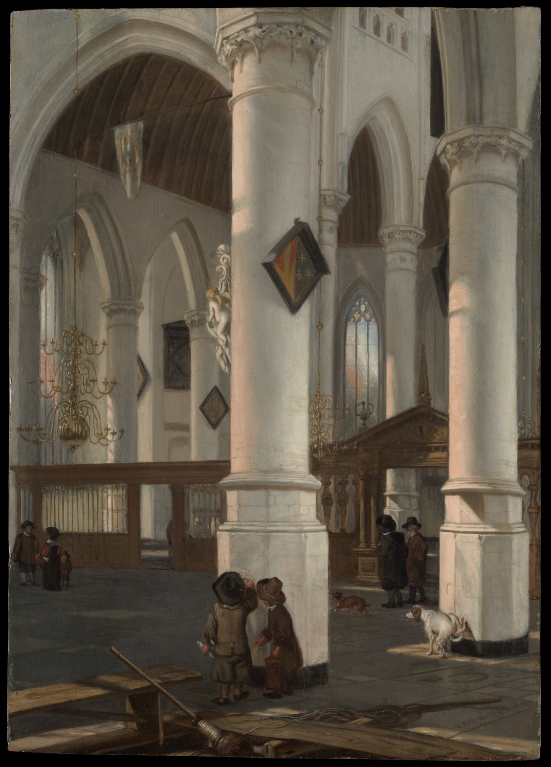
Emanuel de Witte — Interior of the Oude Kerk, Delft
July 17, 2026 at 7:34 AM
Model: claude-sonnet-5
These 58 principles are perceptual mechanisms that influence what gets noticed, how forms organize, and how space is inferred - all before conscious interpretation. They do not determine meaning.
LOOKING PROMPTS
Look at the huge pale column just right of center — follow it from the floor up as far as the frame lets you, and notice how much of the painting it takes up.
Find the small colored shield hanging on that column, and notice how your eye catches it before almost anything else in the painting.
Trace the floor tiles and the row of arches back into the distance, and find the point where the lines seem to disappear.
Start here: Notice how the massive pale stone shapes and the dark wooden ceiling and shadows divide the painting into two totally different weights — let that division guide where your eye travels next.
THE HOOK
Where are the people in this painting? Look again — there are at least six figures and two dogs scattered across the floor, but you probably scanned right past them at first. That's not an accident of looking; the artist has made the architecture so overwhelming, and the figures so small and dim, that the humans read almost as an afterthought. Once you spot them — a boy at the column base, a family near the left, two cloaked men by the screen — the whole painting recalibrates: this is a church built to make people feel small.
THE STORY
Emanuel de Witte painted this around 1650, in Delft, at a moment when Dutch artists were becoming obsessed with painting real, specific church interiors rather than imagined or symbolic ones. The Reformation had stripped Dutch churches like the Oude Kerk of altarpieces, statues, and stained-glass saints, leaving bare stone, whitewash, and wood — and painters like de Witte found in that emptiness a new subject: light, space, and structure themselves, with ordinary people (and their dogs) going about daily business inside a sacred building. This wasn't devotional art in the old sense; it was almost documentary, but also quietly inventive — de Witte was known for rearranging real architectural elements to build a more satisfying composition than the actual church allowed (verify before using specific liberties taken with the Oude Kerk's true layout). These church interior paintings sold well to a Protestant merchant class that wanted art about their own civic and religious spaces, not saints and miracles. Today the painting sits comfortably in the canon of Dutch Golden Age architectural painting — admired more for its handling of space and light than debated over any controversy.
THE STORY
THE LIVE QUESTION
Is this painting really about the church — or about the people and dogs wandering through it? Some viewers see the architecture as the true subject, with the figures included only for scale. Others think the casualness of daily life inside this vast sacred space is exactly the point. What do you think de Witte wants you looking at first — the building, or the people in it?
WAYS OF LOOKING
Notice how the tour stops before it explains: "follow it from the floor up," "find the small colored shield," "trace the floor tiles back into the distance." Only after the eye has done that work does the analysis say what it means. That's a habit worth stealing for any tour — give people a physical task for their eyes before you give them a fact. A group that has just found the vanishing point themselves will actually care where it leads.
Look at how the shield gets singled out — "notice how your eye catches it before almost anything else." That's not guessing; that's naming a specific point where color and value break a pattern (a pop of red against acres of pale stone) and using that break as a stop on the tour. The general habit: find the one thing in the composition that's fighting the dominant pattern, and build your talking point there. Contrast is where attention already wants to go — you're just meeting it.
The hook does something sneakier: it makes the viewer notice their own blind spot ("Where are the people? You probably scanned right past them"). Rather than pointing at a detail, it points at a failure of looking, then explains why the failure happened — the architecture is built to swallow the figures. That's a technique for any docent: don't just show what's there, show what got missed, and use the miss itself as the lesson.
WHAT THIS WORK MAKES VISIBLE
This painting makes scale-as-argument unmistakable. The column isn't just big — it's positioned so the human figures are dwarfed by it in the same glance, no separate look required. In a lot of art you have to hunt for how size is being used rhetorically; here it's staged for you. Next time you're in front of any architecture-heavy painting, ask: are the people incidental, or is their smallness the whole point being made?
It also makes value structure (the light-versus-dark masses, independent of color) visible without needing color at all — pale stone against dark timber and shadow does the compositional work almost by itself. That's a good painting to train your eye on before tackling something more chromatically busy, where the same structural logic is harder to isolate.
And notice the live disagreement baked into the piece: is it a building painting with people in it, or a people painting that happens to be indoors? That tension is unusually exposed here because the artist gave equal craft to both — the architecture is precise, the daily-life details (dogs, a broom, boys marking a column) are specific, not filler. Most paintings settle that question quietly. This one leaves it open, which is exactly what makes it worth arguing about out loud.
Looking vs. Knowing
These are the analysis's own words, nothing added.
What the Work Shows Us
These are the claims that hold up when you look: each one is rooted in something the image actually puts in front of you, not from what we already knew—or thought we knew—about it.
Readings That Came From Outside
Not wrong, necessarily—but these readings didn't come from looking: they came from biography, cultural context, critical tradition, to complete what the image left open.
Writing guardrail
The house style rules this writing was asked to follow, and where it didn't. Flagged after the fact. Nothing was rewritten.
Pass 2
- Used a banned construction: em dash
Pass 3
- Used a banned construction: em dash
Alternative Interpretation
Pulled directly from this analysis's own language — nothing added.
The primary reading treats the church architecture — its scale, light, and structure — as the true subject, with the small dim figures included mainly to establish scale and reinforce human smallness. The competing reading, raised explicitly in the "Live Question," holds that the casual presence of people and dogs going about daily life within this sacred space is itself the point, making the human activity, not the building, the real subject.
Questions Raised
Whether de Witte actually rearranged or invented architectural elements of the Oude Kerk rather than depicting it faithfully — the analysis flags this as something to "verify before using," meaning it's unconfirmed.
Whether the painting's meaning centers on the building or on the people/dogs within it — the analysis raises this explicitly as unresolved ("What do you think de Witte wants you looking at first?").
The analysis asserts the painting is "not debated over any controversy" today, but doesn't establish how it knows this or what critical consensus this claim rests on.
Pass 1 — blind observation used
The first thing I find is the massive foreground column, cropped at its base and rising the full height of the panel — an immediate Anchoring and Reference Point that fixes the eye level low and close, forcing an Embodied Perspective effect where I feel I'm standing within the nave rather than viewing it from outside.
Linear Perspective governs the whole structure: the ribbed arches recede in diminishing scale toward the vaulted ceiling at upper left, and the receding arcade on the right pulls the eye toward the small pointed window filled with pale colored glass. Overlap/Occlusion reinforces this — the near columns cut across the arches behind them, and the arches in turn overlap each other in receding pairs, stacking depth without any single continuous line.
Value Structure/Massing is stark: the stone columns and walls hold the lightest values, catching a raking light from the upper right that models their cylindrical surfaces in soft gradients from bright to shadowed. Against this, the vaulted wooden ceiling at left reads as a warm dark mass, and the small clustered figures are rendered in near-black and umber tones that read as Visual Pop-out / Pre-attentive Features against the pale stone floor and walls — small dark accents scattered across a light field.
Color is restrained: grays, buff stone tones, and warm browns dominate, with small interruptions of color — the red-and-gold coat of arms hanging from the column, a hint of blue and amber in the stained glass, the ochre wood of the choir screen at right. These act as Simultaneous Contrast points, since their saturation is slight but reads strongly against the desaturated stone.
Scale Relationships are deliberately exaggerated — the columns dwarf the figures below, who are rendered at a fraction of the column's implied girth, reinforcing the cavernous size of the interior.
Texture is handled smoothly: the stone surfaces are painted with soft blended strokes describing smooth curvature, while architectural carving at the capitals and the hanging escutcheon show tighter, more detailed brushwork — a Detail Density Gradient that concentrates incident toward the lower-middle picture, where two boys stand close together in conversation, dogs sniff nearby, and a broom and plank lie in the immediate foreground.
Grouping organizes the figures into three separate clusters — a family at far left, two boys with dogs at center, two men in dark coats at right near the screen — each isolated by empty floor space, creating Interval Relationships that keep the eye moving in a triangular path across the lower third of the composition.
The eye finally arrives at the small dog in the lower right, caught mid-motion sniffing the ground — a small Biological Motion Detection cue that anchors the human presence within the otherwise static, monumental architecture, before settling on the darkened doorway and brass chandelier at left, which close the depth of the space like a final punctuation.