Allen Smith — 49B
July 17, 2026 at 6:56 AM
Model: claude-sonnet-5
These 58 principles are perceptual mechanisms that influence what gets noticed, how forms organize, and how space is inferred - all before conscious interpretation. They do not determine meaning.
what the eye does
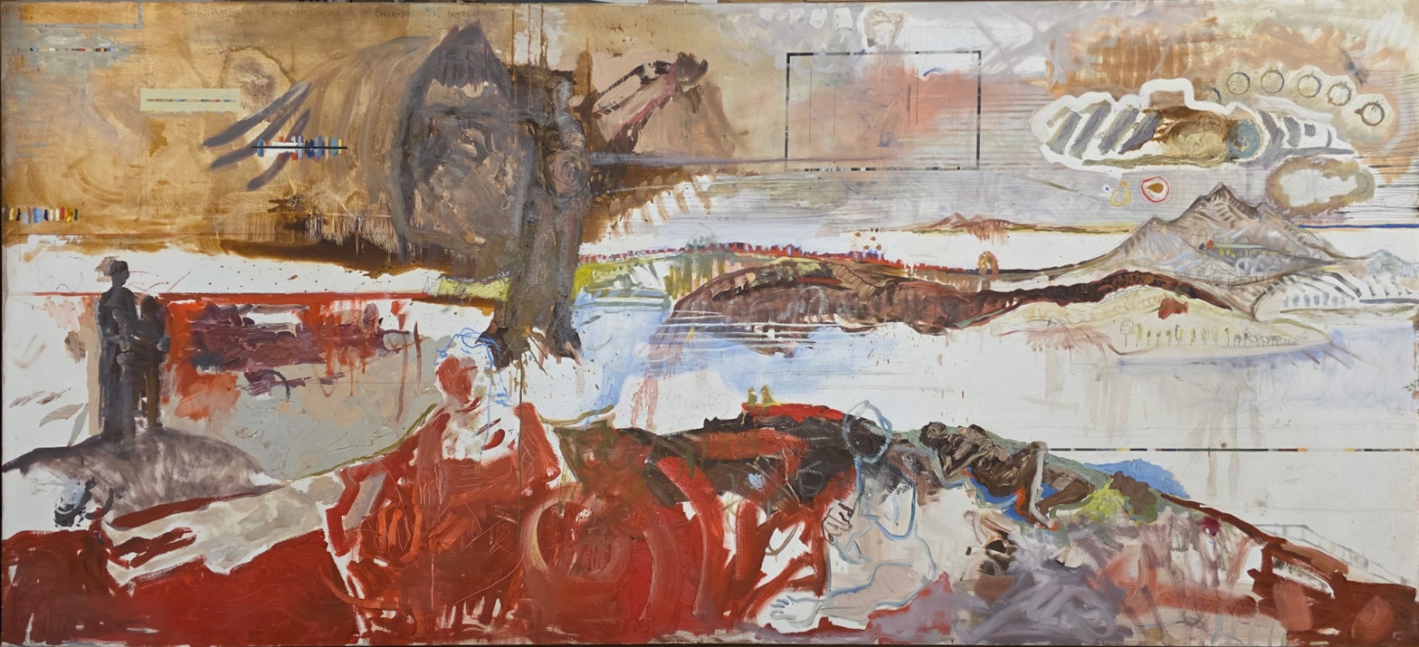
The first thing that grabs you isn't a shape, it's a temperature drop. You're moving across a field of warm, dusty browns and ochres, nothing alarming about it, and then you hit that pale horizontal band cutting through the middle and the whole canvas exhales. Cold air right through the center of a hot painting. That's the move that gets you back for a second look.
Once you're in, the eye does something almost involuntary at the bottom: it goes to the red. Not because the red is loudest in the literal sense — the dark mass up top is heavier, denser — but because red paint dragged thick across a canvas has a way of coming toward you whether you invite it or not. It sits closer than everything else in the room. So you're pulled down and forward, into a zone of loose, scumbled brushwork where a body might be lying, might just be paint pretending to be a body. Then something tugs you back up and left, to two small dark figures standing on a gray mound, dwarfed by that huge hanging form above them like they're standing under a coat someone forgot they were wearing. The scale gap between those tiny figures and that enormous dark shape is doing real work — it's the difference between a person and whatever a person is afraid of.
There's a thin black rectangle floating up near the top, doing nothing narrative at all, just holding still while everything around it moves. Your eye keeps returning to it out of relief.
how it's made
This is oil paint behaving like it has weather in it. The dark mass at the top isn't just painted, it's allowed to run — you can see the drips, the rivulets, actual gravity recorded in real time as the paint was wet enough to fail to stay where it was put. That's not an accident dressed up as intention; dripped paint reads as time passing, as something still settling, and the painter clearly wanted that.
Down in the red zone the handling changes completely — this is brush-drag, scumbling, loops laid on thick enough to hold their own ridges. You're looking at paint that was pushed around with some force, not floated on. Compare that to the mountains on the right, which are thin, linear, almost drawn rather than painted, paler and cooler, receding the way distant things do when the air between you and them thins the color out. Three different physical actions — dripping, dragging, thinning — sit on one seventy-two-inch-wide canvas, and the painting uses that difference in touch the way another painting might use difference in color: to tell you what's near and what's far, what's solid and what's dissolving.
There's writing along the top edge, right at the point where you can't quite read it. Whether that's genuinely legible up close or stays a tease forever, I'd have to stand in front of the actual canvas to tell you — from here it functions as texture that wants to be language, which is its own kind of instruction to lean in.
where it lives
Standing in front of a twelve-foot canvas like this, the scale itself is an argument before content enters into it — this wants to be encountered bodily, at a size where the red zone can genuinely feel like it's approaching you, where the standing figures are legitimately human-sized against a mound that towers past them.
Made in 2026, this sits at a moment when a lot of painting has circled back toward the figure without fully trusting it — figures that dissolve into their own ground, contours that give up on holding a line, narrative gestures (a shroud, a mountain, a reclining body) offered and then partially withdrawn. That's a live argument right now, not a settled one: how much image can you put in front of a viewer before you owe them a story, and how much can you withhold before the painting becomes a puzzle instead of an experience. This painting is placing a bet on withholding — on letting shapes gesture toward figure and landscape and shroud without committing to any of them fully.
what it's arguing
I think this painting is arguing that dread doesn't need a face. The hanging dark mass reads as coat, shroud, or looming presence depending on how long you look, and it never resolves into one of those — and that refusal is the point. Meaning here comes from relationship, not identification: the size gap between the tiny figures and the huge dark form, the temperature gap between the cold pale band and the hot red beneath it, the touch gap between dripping paint and dragged paint. The painting trusts that those relationships alone can carry feeling, without ever telling you what happened or to whom.
what it holds open
Whether that red zone holds a body or just the memory of one is never settled, and I don't think it's meant to be. The dark mass keeps shifting between object and threat depending on how you tilt your attention toward it. What's left open is the question of scale — whether you're looking at two small people beneath something enormous, or one enormous feeling shrinking two people down to size.
WAYS OF LOOKING
Notice how the analysis never treats the red zone in isolation — it's read against the pale band above it, the drips coming off the dark mass, the tiny figures across the canvas. The size of those figures only means something once you've clocked what's looming over them. Nothing in this painting was assessed alone; everything was assessed as a ratio to something else. That's a habit worth stealing: stop asking "what is this shape," start asking "what is this shape doing in relation to the shape next to it." Meaning lives in the gap, not in the object.
Look at how much weight got put on paint handling itself — the difference between dripping (wet, gravity-driven, uncontrolled) and dragging (forceful, thick, deliberate) and thinning (linear, almost drawn). None of that requires knowing the subject. You can read a painting's emotional temperature off how the paint was physically moved, before you've decided what it depicts. Next time you're in front of a painting, try covering the subject matter mentally and just ask: was this paint pushed, dripped, scraped, or floated? That alone tells you where the energy is.
Notice, too, that the analysis doesn't force the dark mass to be a coat or a shroud or a figure — it lets the ambiguity stand and treats the not-knowing as the content. That's a discipline: resisting the urge to resolve every form into a noun. The strongest readings often come from naming exactly what stays unresolved, rather than manufacturing a decision the painting itself refuses to make.
WHAT THIS WORK MAKES VISIBLE
The mountain range on the right is rendered thin, pale, and linear compared to the thick red foreground — that's atmospheric perspective (the way distant things lose color and detail because of the air between you and them) working almost like a textbook diagram. Most paintings hide this effect inside subtlety; here it's blunt enough to actually point to and teach from. Look for this contrast — dense near, thin far — in any landscape, and you'll start seeing depth as a paint decision, not just an optical fact.
The size gap between the standing figures and the hanging dark mass makes scale-as-emotion unusually legible — you don't need training to feel that smallness is doing something to you. Most paintings bury this relationship more subtly; here it's almost diagrammatic, which makes it a good place to first learn how scale creates feeling before hunting for it elsewhere.
And the drips off the dark mass let you watch gravity as it happened — wet paint recording its own falling. That's usually invisible once a painting is finished and dry; here the record was left showing on purpose.
Writing guardrail
The house style rules this writing was asked to follow, and where it didn't. Flagged after the fact. Nothing was rewritten.
Pass 2
- Used a banned construction: em dash
Pass 3
- Used a banned construction: em dash
Alternative Interpretation
Pulled directly from this analysis's own language — nothing added.
The primary reading treats the red zone at the bottom as possibly containing a reclining body, rendered through loose, scumbled brushwork that reads as figuration under pressure. The competing reading, held open without resolution, is that this is simply "paint pretending to be a body" — a purely material event of dragged red pigment that never actually commits to representing a figure at all.
Questions Raised
Whether the red zone depicts a body or only "the memory of one" — the analysis explicitly states this "is never settled, and I don't think it's meant to be."
Whether the writing along the top edge is genuinely legible up close or remains permanently illegible texture — the analysis admits "I'd have to stand in front of the actual canvas to tell you," flagging this as unresolved from reproduction alone.
Whether the scale relationship is "two small people beneath something enormous, or one enormous feeling shrinking two people down to size" — explicitly named as a question the painting leaves open rather than answers.
Pass 1 — blind observation used
The eye lands first on the dark mass at the upper center — a heavy, brown-black shape that reads like a coat or draped form with a hint of a standing figure inside it, hanging down as if suspended, thinned drips trailing below it toward the mid-register. This is the densest concentration of value in the piece, and it functions as an Anchoring and Reference Point against which everything else in the composition gets measured.
Below and to either side, the picture separates into distinct bands. A pale horizontal field of near-white and bone color runs through the middle, broken by a distant mountain range rendered in thin, almost linear strokes on the right — schematic peaks, small trees, a suggestion of buildings, all handled with delicate, sketchy lines that sit far back in Atmospheric Perspective. Color desaturates and cools here relative to the warmer, thicker paint elsewhere, pushing that whole right-hand passage into deep space even though it occupies the same horizontal strip as nearer elements.
The lower third of the canvas is dominated by raw, unmixed red — thick, gestural, scraped and dragged strokes that pool and streak across the bottom edge. This red has strong Color Weight and Advancement; it pushes forward against the pale mid-ground and reads as nearest to the viewer, almost spilling past the frame. Within this red field, dark contour lines suggest reclining or crouched bodies, their forms dissolving into the surrounding pigment — edges here refuse full resolution, sitting between figure and abstraction.
On the left, two small dark silhouetted figures stand on a gray mound, rendered with hard, simple contours — a rare instance of Figure-Ground clarity in a painting otherwise built from bleeding, ambiguous boundaries. Their scale is small against the vast horizontal expanse, which exaggerates the Scale Relationships across the work and makes the space feel enormous.
Upper right holds a cluster of small circular marks and a cloud-like white outline enclosing striped and looping linear marks — a passage of Pattern vs. Figure that reads almost diagrammatic, faint stenciled text visible along the top edge reinforcing a sense of inscription or notation layered over the image.
Throughout, the surface shows visible drips, scumbled passes, staining, and dry brush drags — the physical evidence of built-up washes over which more opaque strokes were later applied, some areas thinned to transparency, others opaque and chalky. The eye, after moving through the warm ochre upper-left field, the suspended dark form, the pale distant mountains, and the two small standing figures, finally settles into the red lower band, where the marks are thickest, the strokes most urgent, and the paint least resolved into legible form.