Allen Smith — 49B
July 17, 2026 at 6:51 AM
Model: claude-sonnet-5
These 58 principles are perceptual mechanisms that influence what gets noticed, how forms organize, and how space is inferred - all before conscious interpretation. They do not determine meaning.
LOOKING PROMPTS
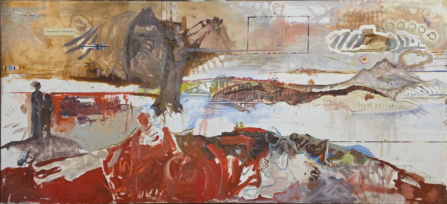
Look at the wide pale band that cuts across the middle of the canvas — what does that empty, light-filled space do to the areas above and below it?
Move your eyes into the thick red passage at the bottom of the painting — follow one loop of paint and notice where the brush dragged, piled up, or scraped thin.
Find the two small dark figures standing on the gray mound at the far left, then look up at the large dark hanging shape above them — how does their size change the way that shape feels?
Start here: Notice how the pale horizontal band splits the painting into an upper zone and a lower zone — once you see that division, everything else in the painting seems to sort itself into "above the line" or "below the line."
THE HOOK
Where does this painting actually want your eye to land first — the red at the bottom, or the dark shape at the top? Most people say the red. It's the thickest paint, the most saturated color, the most physically worked surface in the whole canvas, and warm, advancing colors like this naturally pull the eye toward them and make that space feel closest to us. But the dark hanging mass above sits higher in the frame, is larger in total area, and has a softer, sink-down edge that keeps dripping toward the red zone, almost like it's feeding it. So the painting sets up two competing claims on your attention — weight of color at the bottom, weight of position at the top — and doesn't resolve which one wins.
THE STORY
This is a new work — dated 2026 — so there's no settled critical record to draw on yet, no reviews, no exhibition history, no controversy to report. What can be said is where the painting sits formally: it belongs to a lineage of large-scale figurative-abstract painting that puts raw, physical paint handling (the dragged red) next to quieter, more ghostly passages (the dark hanging form, the faint text at the top edge), asking the viewer to hold both registers — bodily and specter-like — at once. The small standing figures against the big pale ground, and the schematic mountains fading in cooler tone on the right, suggest a landscape tradition being pulled into something more psychological or dreamlike. Any claim about the artist's specific intentions, biography, or the work's reception beyond this remains untested — there simply isn't a public record yet. Where this work sits "now" is exactly here: freshly made, unreviewed, and open.
THE LIVE QUESTION
Some people look at the dark mass at the top and see a coat or a shroud — something hung up, empty, past use. Others see it as a figure or presence still watching over the two small people below it. What do you see when you look at it — an object, or someone?
WAYS OF LOOKING
Notice how the analysis doesn't just say "there's a red section" — it says the red is thick, dragged, scumbled, and looping, and that this handling makes it advance toward the viewer, sit closer than the rest of the painting. That's the habit: naming what the paint physically does before naming what it means. On a tour, this is the difference between telling people "this part feels close" and showing them why — pointing at the drag marks, the built-up ridges, the place where the brush ran dry. Once your group can see the handling, they'll find the meaning themselves.
Look at how the two small dark figures on the left only become interesting once they're placed next to the massive hanging shape above them. Alone, they're just two gray marks. Next to something twenty times their size, they become vulnerable, small, watched-over, or dwarfed. The habit here is relational looking — nothing in a painting has a fixed meaning by itself; everything is being measured against its neighbor. When you build a stop, don't isolate a detail. Pair it with something.
Notice, too, that the write-up admits where the observers disagreed — one saw a face in the pale patch inside the dark mass, others saw nothing there at all. Rather than papering over that, the analysis keeps the disagreement visible and turns it into a question for the viewer. That's a teaching move: uncertainty isn't a gap to fill before the tour, it's a doorway to open during it. "What do you see here — an object or someone?" does more work than a confident answer would.
WHAT THIS WORK MAKES VISIBLE
This painting makes the tug-of-war between color and position unusually easy to feel. The red at the bottom is closer to us because warm, saturated color naturally advances — that's just how the eye works. But the dark mass at the top is larger and higher, which normally would win our attention too. Here the two pulls are almost perfectly balanced, so you can actually feel your eye bounce between them. In most paintings one factor wins outright; here, standing in front of it, you get to watch the competition happen in real time.
It also makes "unfinished" reading visible — the faint text along the top edge, right at the border of legibility. Look for that in any painting with inscriptions, stencils, or ghost-writing: the artist is choosing to give you a fragment, not a sentence, and that choice itself is worth noticing before you try to decode it.
Looking vs. Knowing
These are the analysis's own words, nothing added.
What the Work Shows Us
These are the claims that hold up when you look: each one is rooted in something the image actually puts in front of you, not from what we already knew—or thought we knew—about it.
Readings That Came From Outside
Not wrong, necessarily—but these readings didn't come from looking: they came from biography, cultural context, critical tradition, to complete what the image left open.
Writing guardrail
The house style rules this writing was asked to follow, and where it didn't. Flagged after the fact. Nothing was rewritten.
Pass 2
- Used a banned construction: em dash
Pass 3
- Used a banned construction: em dash
Alternative Interpretation
Pulled directly from this analysis's own language — nothing added.
The analysis holds that the red passage at the bottom (thickest paint, warmest color, most worked surface) draws the eye first by weight of color, while the dark hanging mass above claims attention by weight of position (larger area, higher placement, dripping toward the red as if feeding it). It explicitly declines to resolve which of these two competing pulls wins, leaving the painting's primary focal point undecided.
Questions Raised
Does the dark hanging shape read as an object (a coat, a shroud — something emptied of use) or as a presence/figure still watching over the two small people below? The analysis raises both readings and doesn't settle on one.
Because the work is dated 2026 with no reviews or exhibition history, any claim about the artist's intentions or biographical context remains untested — what, if anything, would ground such claims is unknown.
Is the drip connecting the dark upper mass to the red lower zone a formal/compositional device only, or does it imply a narrative or symbolic transfer (the upper "feeding" the lower)? The analysis suggests the latter as a possibility ("almost like it's feeding it") without confirming it.
Pass 1 — blind observation used
The eye lands first on the dark mass at the upper center — a heavy, brown-black shape that reads like a coat or draped form with a hint of a standing figure inside it, hanging down as if suspended, thinned drips trailing below it toward the mid-register. This is the densest concentration of value in the piece, and it functions as an Anchoring and Reference Point against which everything else in the composition gets measured.
Below and to either side, the picture separates into distinct bands. A pale horizontal field of near-white and bone color runs through the middle, broken by a distant mountain range rendered in thin, almost linear strokes on the right — schematic peaks, small trees, a suggestion of buildings, all handled with delicate, sketchy lines that sit far back in Atmospheric Perspective. Color desaturates and cools here relative to the warmer, thicker paint elsewhere, pushing that whole right-hand passage into deep space even though it occupies the same horizontal strip as nearer elements.
The lower third of the canvas is dominated by raw, unmixed red — thick, gestural, scraped and dragged strokes that pool and streak across the bottom edge. This red has strong Color Weight and Advancement; it pushes forward against the pale mid-ground and reads as nearest to the viewer, almost spilling past the frame. Within this red field, dark contour lines suggest reclining or crouched bodies, their forms dissolving into the surrounding pigment — edges here refuse full resolution, sitting between figure and abstraction.
On the left, two small dark silhouetted figures stand on a gray mound, rendered with hard, simple contours — a rare instance of Figure-Ground clarity in a painting otherwise built from bleeding, ambiguous boundaries. Their scale is small against the vast horizontal expanse, which exaggerates the Scale Relationships across the work and makes the space feel enormous.
Upper right holds a cluster of small circular marks and a cloud-like white outline enclosing striped and looping linear marks — a passage of Pattern vs. Figure that reads almost diagrammatic, faint stenciled text visible along the top edge reinforcing a sense of inscription or notation layered over the image.
Throughout, the surface shows visible drips, scumbled passes, staining, and dry brush drags — the physical evidence of built-up washes over which more opaque strokes were later applied, some areas thinned to transparency, others opaque and chalky. The eye, after moving through the warm ochre upper-left field, the suspended dark form, the pale distant mountains, and the two small standing figures, finally settles into the red lower band, where the marks are thickest, the strokes most urgent, and the paint least resolved into legible form.