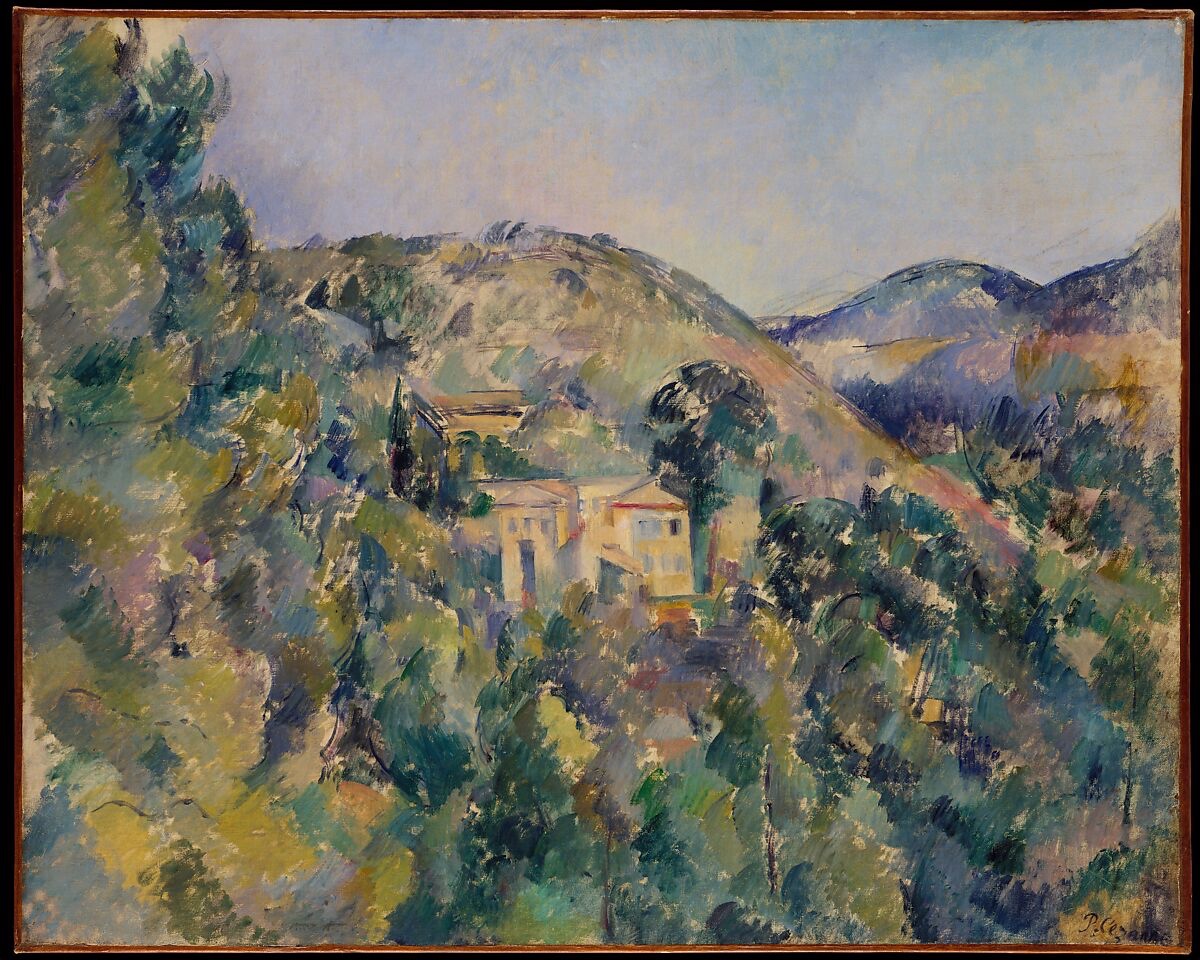
Paul Cézanne — View of the Domaine Saint-Joseph
August 4, 2026 at 5:11 PM
Model: claude-sonnet-5
These 58 principles are perceptual mechanisms that influence what gets noticed, how forms organize, and how space is inferred - all before conscious interpretation. They do not determine meaning.
OVERVIEW
The perceptual pull and the material handling agree with each other. The eye moves toward the pale buildings because they carry the sharpest edges and the strongest value contrast, and the brushwork that builds those edges is the same short, hatched stroke used everywhere else in the canvas. Nothing in the paint application is asking to be looked at differently in the buildings than in the foliage. That consistency is the work's real spine.
The cultural and conceptual domains sit less comfortably together. A reading of this work as a document of Cézanne's late working method (the Aix countryside, the Saint-Joseph property, the run of Provençal motifs he returned to across the 1880s) asks the viewer to see it as a modest, almost private study. A reading of it inside the larger argument about post-Impressionist structure asks the viewer to see it as evidence in a bigger claim about how paint can build form without dissolving into either Impressionist atmosphere or academic modeling. Both readings can be true at once, but they pull the object in different directions: one toward the local and occasional, one toward the exemplary and art-historical.
The conflict worth naming: the perceptual system in the painting resolves cleanly (buildings anchor, foliage activates, sky releases), but the two contradicted observations from Pass 1, on where the eye lands first and where it settles last, mean that resolution isn't as stable as the value structure suggests. The domains don't fight each other so much as disagree on how settled the picture actually feels once looking is done.
The unresolved question the work sits inside: is this a picture that resolves into a stable house-in-landscape image, or one that keeps the eye in low-grade motion indefinitely, never quite letting attention rest.
PERCEPTUAL
The pale rectilinear buildings pull the eye first. They sit slightly below and left of center, and they carry the firmest edges in the painting against a field of broken, dissolving foliage edges. This is a straightforward case of Visual Pop-out: rectilinear, light-value shapes against organic, mid-to-dark value texture read as figure against ground almost instantly.
But the surrounding foliage doesn't let the eye stay there. The dense, choppy brushwork on the left and in the foreground is high in Complexity and Visual Density, and its directional, hatch-like strokes create small local vectors that keep pulling the gaze sideways and down before it settles on the buildings. Whether the eye enters through that foliage first or lands on the buildings immediately is not settled here (the observation record itself splits on this), but either way the foliage acts as a holding pattern the eye passes through repeatedly.
Once on the buildings, the eye has an anchor: the pale mass functions as an Anchoring and Reference Point for the whole composition, since the value bands (dark foreground, mid-value hillside and structures, light sky) are organized so obviously around it. Depth is built through simple, legible means: Overlap/Occlusion (foliage over buildings, buildings over hillside) and Atmospheric Perspective (the cooler, flatter, bluer distant ridge on the right) both push the eye back in space without requiring any single vanishing point.
Where the eye finally rests is the one place looking doesn't converge. Some routes end at the distant blue ridge, pulled there by Color Temperature and Atmospheric Perspective doing their job of receding. Some routes end in the lower right, caught by the density of paint and the signature. There's no single exit. The visual system offers a strong entry and a strong middle, and a soft, ambiguous close.
MATERIAL AND FORMAL
Oil on canvas, a little under two feet by two and a half feet, roughly the size of a large cafeteria tray held up on a wall. The paint is applied in short, discrete, directional strokes throughout, not just in the foliage. Nothing here is blended wet-into-wet in the way a Barbizon landscape would be; the marks stay separate and legible up close, an example of Optical vs. Physical Color Mixing where the eye, not the brush, does the blending at a distance.
The surface is honest about its own construction. Up close it reads as a field of discrete touches, none of them individually describing a leaf or a roof tile; step back and the touches cohere into buildings, hillside, sky. That gap between close and far reading is not a trick played on the viewer. It is the actual mechanism of the picture, visible at both distances simultaneously if you know to look for it.
The firmer edges on the buildings are still, per the observation record, "broken/discontinuous." Cézanne doesn't switch technique to render architecture; he just tightens the interval between strokes and increases the value jump. That's an economical solution: the same brush vocabulary produces both the solid-looking house and the dissolving tree by adjusting stroke density and contrast, not by adjusting method. The material logic supports what the eye is doing: form emerges from accumulation, not from outline.
CULTURAL
A reading of this work as part of Cézanne's Aix-en-Provence campaign places it among the working studies he made repeatedly of the land around his family property and neighboring estates in the 1880s. Read this way, the picture belongs to a body of work valued less as individual masterworks and more as a sustained investigation, the kind of series that matters cumulatively rather than as single objects competing for attention. That framing would explain the picture's modesty of subject: a cluster of farm buildings, not a monument or a portrait sitter.
A different reading places this work inside the market and institutional narrative of Cézanne as the hinge figure between Impressionism and twentieth-century structural painting, the artist Matisse and Picasso are both recorded as citing. In that reading, the Metropolitan's acquisition and display of a work like this signals its value as evidence in an argument about modern painting's development, not as a spectacular object in its own right. Museum visitors who know that argument will read the choppy brushwork as historically consequential; visitors who don't may just see an unfinished-looking landscape.
Those two readings aren't fully compatible. One asks the viewer to see a private, local record. The other asks the viewer to see a canonical proof-of-concept for structural post-Impressionism. Both readings are available to a Metropolitan Museum audience, but they require different prior knowledge, and the painting itself gives no signal for which one to prefer.
CONCEPTUAL
A reading of this work as an argument against Impressionist dissolution is well supported by the material evidence: the value banding, the retained edges on the buildings, and the consistent stroke vocabulary across the canvas all suggest a painter building solid, legible masses rather than chasing momentary light. Where Monet's contemporaneous haystacks argue for the primacy of atmospheric flicker over object, this canvas keeps the house recognizably a house even while using an Impressionist-derived brush unit.
A second reading, compatible with the first, treats the picture as an argument that structure and optical color-mixing aren't opposed. The Value Structure/Massing and the Optical vs. Physical Color Mixing observed here work together rather than against each other: the same discrete touches that create atmospheric shimmer in the foliage also, through value contrast and directional consistency, produce the solidity of the buildings. That's the position Cézanne's late work is often read as taking, that form can be reconstructed from color relationships rather than from drawn contour.
Hypothesis (insufficient visual evidence): the ambiguity in where the eye settles at the end of looking (mountain versus foreground versus signature) might be read as the painting's own argument that landscape has no single privileged terminus, that attention in nature is inherently recursive. This claim isn't well anchored by the Pass 1 record; the settling-point disagreement is at least partly an artifact of different viewers describing the same painting differently, not a demonstrated feature of the composition itself.
NOISE: CONSOLIDATED
PERCEPTUAL: The record disagrees on entry point (foliage first versus buildings first) and disagrees on exit point (mountain, sky, or signature). That means the "clean" reading of buildings-as-anchor is real but incomplete: the picture doesn't resolve into one settled scan path across observers.
MATERIAL: No real fighting here. The stroke method used for foliage and for architecture is the same vocabulary at different densities. The material choices are consistent with each other.
CULTURAL: The work can be read either as a private, serial working document or as canonical evidence in the story of Cézanne's structural break from Impressionism. A general museum viewer without art-historical training may see neither, just a somewhat unresolved-looking landscape, which limits how legible either cultural position is without wall-text scaffolding.
CONCEPTUAL: The strongest conceptual claim (structure built from color relation rather than contour) is well supported. The weaker claim about the ambiguous resting point as intentional statement about recursive attention is not supported by two independent anchors and stays flagged as hypothesis.
The buildings-as-anchor consistency across perceptual and material domains looks deliberate, serving the reading of structure-through-accumulation; the disagreement over where the eye finally lands looks accidental, a byproduct of the painting's genuinely open composition rather than a designed effect.
WAYS OF LOOKING
Three separate viewers all landed on the pale buildings as the strongest point of contrast in the painting, but they disagreed on whether the eye gets there first or wanders through the foliage on the way. Rather than picking the "correct" answer, the analysis kept both and used the disagreement itself as information: it meant the composition holds a strong middle but a genuinely open entry and exit. Noticing that a contested detail can be more useful than a confirmed one is its own skill. When multiple careful observers split, the split is data about how the work behaves, not a problem to be resolved by finding the tiebreaker.
The analysis also caught something easy to miss: the brushwork on the buildings isn't actually a different technique from the brushwork on the trees. It's the same short, hatched stroke, just packed tighter and pushed to a bigger value jump. That's a habit worth stealing: before assuming an artist switched methods to render something more "important" (a face, a building, a focal point), check whether they just adjusted the dial, density, contrast, size, on a method they were using everywhere else. Consistency of technique across different subjects tells you something continuity of subject alone won't.
And when the analysis brought in Cézanne's biography and reputation, it didn't let that history quietly decide what the painting looks like. It named two competing frames, a modest private study versus a canonical proof-of-concept, and then said plainly that the canvas doesn't tip its hand toward either one without help from a museum label. That's the discipline of keeping the object and its story in separate hands until you're sure which one is doing the talking.
WHAT THIS WORK MAKES VISIBLE
Stand close to this canvas and you see nothing but disconnected dabs of color. Step back and a house appears. That gap, between what the marks are and what they add up to, is unusually easy to catch here because Cézanne never blends his strokes wet into wet; each touch stays a separate, visible unit even in the finished image. Look for this in any painting where the paint stays "chunky" up close: it tells you the image is being built by your eye at a distance, not handed to you by the brush.
The picture also makes it easy to see how little difference is needed between "solid object" and "dissolving texture." Compare the edge of the roofline to the edge of a treetop and you'll find both are broken, made of the same short strokes. What differs is spacing and contrast, not method. That's worth checking in any picture where some things read as solid and others as atmospheric: often it's not a change in technique, just a change in density.
Looking vs. Knowing
These are the analysis's own words, nothing added.
What the Work Shows Us
These are the claims that hold up when you look: each one is rooted in something the image actually puts in front of you, not from what we already knew—or thought we knew—about it.
Readings That Came From Outside
Not wrong, necessarily—but these readings didn't come from looking: they came from biography, cultural context, critical tradition, to complete what the image left open.
Alternative Interpretation
Pulled directly from this analysis's own language — nothing added.
The primary reading treats the painting as a coherent perceptual system: buildings anchor the composition through value contrast, foliage activates the surrounding field, and the same stroke vocabulary produces both solidity and dissolution through density and contrast alone. The competing reading, which the analysis raises but doesn't resolve, treats the ambiguous resting point (mountain, foreground, or signature) as possibly meaningful, a deliberate refusal of a single terminus that would argue for landscape attention as inherently recursive, but the analysis itself flags this as a hypothesis without sufficient anchoring, more likely an artifact of viewers disagreeing than a demonstrated feature of the composition.
Questions Raised
Does the eye enter the painting through the foliage first or land on the buildings immediately? The observation record splits on this and the analysis doesn't resolve which is the more common or "correct" scan path.
Where does looking actually end, at the blue ridge, the lower-right density and signature, or nowhere fixed at all? The analysis records three different exit points without determining whether this is a real feature of the composition or a byproduct of differing viewers.
Is the unresolved resting point an intentional compositional argument about recursive attention in landscape, or simply an accident of an open composition described inconsistently across observers? The analysis explicitly labels this "insufficient visual evidence" and cannot settle it from the image alone.
Pass 1 — blind observation used
My eye enters through the dense screen of foliage in the left foreground, where dark green and olive strokes mass together before opening onto the pale cluster of buildings at the center. That is where the looking settles first — a low white and cream house with a darker red-toned roof, sitting slightly below center, flanked by taller cypress-like green verticals.
Edge Detection varies considerably across the canvas: the architecture holds relatively firm geometric edges — the corners of the house, the line of the roof, a rectangular window opening — while everything surrounding it, the trees and hillsides, dissolves into broken patches of color with no continuous contour.
Value Structure/Massing organizes the composition into three bands: a dark, densely worked foreground of greens and blue-greens; a middle value zone holding the pale buildings and the ochre-green hillside behind them; and a light, thinly painted sky at top, closest in value to the pale hill on the right.
Atmospheric Perspective is at work in the hills — the nearer green slope is more saturated and textured, while the farther mountain on the right edge goes cooler and bluer, flattening into a hazier violet-grey mass.
Color Temperature shifts support the depth: warm ochre and ivory in the buildings and sunlit hill pull forward, while cool blues and violets recede toward the horizon and sky.
Directional Force/Implied Movement runs diagonally — a band of warm rose-tan color cuts across the hillside from lower right to upper middle, functioning almost like a path or seam, pulling the eye across the slope.
Brushwork is consistent throughout — short, choppy, directional strokes, none blended, laid in patches rather than continuous fields, visible as discrete marks of paint even in the sky.
Cropping/Framing places the true horizon high, with the top fifth given to open sky, while the bulk of the canvas is filled with layered, overlapping vegetation and hill forms.
The eye ultimately settles last on the far blue mountain at the right edge, the coolest, most desaturated element, where the terrain trails off the edge of the canvas.