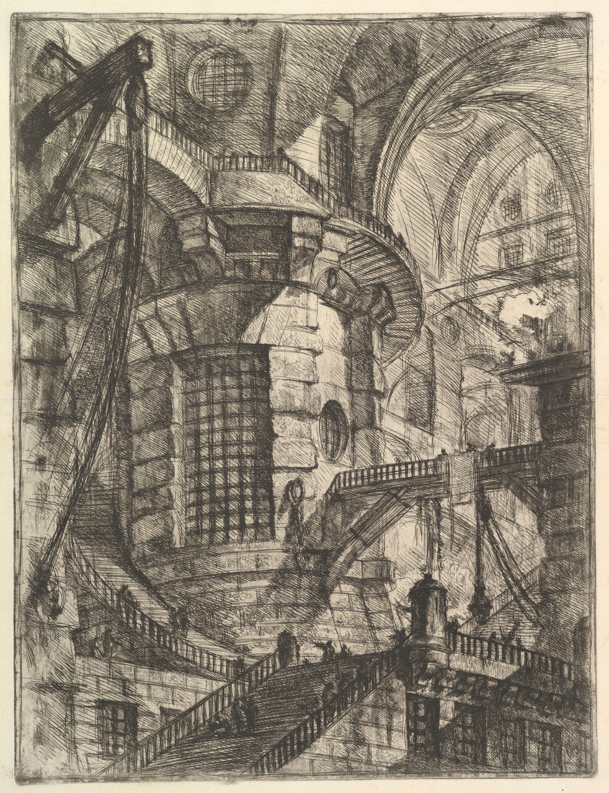
Giovanni Battista Piranesi — The Round Tower, from "Carceri d'invenzione" (Imaginary Prisons)
July 17, 2026 at 7:47 AM
Model: claude-sonnet-5
These 58 principles are perceptual mechanisms that influence what gets noticed, how forms organize, and how space is inferred - all before conscious interpretation. They do not determine meaning.
what the eye does
You look for the way out before you look at anything else. That's the trap. There's a pale arch up in the right corner, sparser, lighter, almost breathing compared to everything around it, and your eye goes there like it's a door — but it's not a door, it's just the place Piranesi decided to stop drawing so hard. Before you get there, though, you're dragged through a whole machine of stairs, bridges, ropes, a round tower with a black barred slot in it like an eye socket. Tiny figures stand on the walkways, so small they barely register as people, and they do the job of telling you how big everything else is. The staircases don't connect the way staircases should. You keep trying to trace a path from the bottom of the print to the top, the way you would with a real building, and the print keeps almost letting you, then doesn't. That "almost" is the whole experience. It's not confusion exactly — it's more like being led somewhere by someone who knows the way and isn't telling you.
how it's made
This is etching and engraving, black ink cut into a plate and pulled onto paper, and Piranesi is using something rougher too — sulphur tint, open bite — techniques that let ink pool and bite unevenly rather than sit in clean controlled lines. You can see it: some of the deep shadow doesn't look drawn so much as corroded into being, grainy and atmospheric, while the architectural edges — railings, the curve of the tower, the ruled lines of the stonework — stay crisp and confident. That contrast is doing real work. The dark comes from hatching and crosshatching piled up in layers, no wash, no gray poured in — every value in this print is built out of quantity of line. Look closely at where the tone goes soft, dissolving toward the edges of the sheet, and you're looking at where Piranesi let the plate do something less controllable. He's not hiding the seams between control and accident. He's using both.
where it lives
Piranesi made this around 1750, one plate in a set of fourteen he kept revising and re-biting for years afterward — the Carceri went through at least two states, the later ones darker, more claustrophobic, more insistent. He was trained as an architect and never really stopped thinking like one, even when the buildings he was drawing couldn't be built by anyone. Rome in the mid-eighteenth century was obsessed with its own ruins, with excavation, with the idea that antiquity was a thing you could measure and recover. Piranesi's other major work was exactly that — meticulous documentary views of Roman monuments. The Carceri are the opposite move: invented structures, no real referent, prisons that exist only on the plate. That's what makes this print an argument rather than a record. It's held now at places like the Met alongside his more straightforward architectural views, and standing between the two bodies of work you feel the deliberate refusal in the Carceri — refusal to resolve, to measure, to let the building make sense.
what it's arguing
The thing this print is after is the feeling of architecture without the logic of architecture — scale, weight, structure, all present and convincing, while the actual geometry underneath refuses to add up into one coherent space. That's not sloppiness. Piranesi knew perspective construction better than almost anyone working at the time; the inconsistency is deliberate. The argument, if you want to call it that, is that a building can be emotionally and physically true — heavy stone, real shadow, real distance — without being spatially possible. It's an argument for atmosphere over blueprint. For dread as a structural material. You feel imprisoned not because you can trace the walls closing in, but because you can't trace them at all.
what it holds open
The pale arch never resolves into an exit — it just stays lighter, an invitation the print never honors. Nobody has settled whether Piranesi wanted you to read that space as freedom, as another chamber of the same trap, or as nothing at all, a place he simply stopped drawing. The staircases still don't connect if you try to walk them, and that failure doesn't go away with familiarity — it's built to survive repeated looking. Every time you return to it, you're back at the start, trying to find the way through a building that was never going to let you.
WAYS OF LOOKING
The analysis noticed that three separate viewers each entered this print at a different point — one through the diagonal ropes upper left, one through the central tower, one through the spiral stair — and instead of picking a winner, it treated the disagreement as data. That's a habit worth stealing: when close observers genuinely diverge on something as basic as "where do you look first," the divergence itself is the finding. It usually means the artist built multiple entry points on purpose, not that someone looked wrong.
Notice, too, how the piece separates what's stable from what's thin from what's contradicted before it says anything interpretive. The gridded window, the tiny figures, the crisscrossing stairs — all confirmed across lookers, so they become load-bearing evidence. A hanging rope or a background façade shows up once or twice — interesting, but held loosely. That's the discipline of not letting a vivid but unconfirmed detail run the argument.
The essay also keeps asking what a technique is for, not just naming it. Sulphur tint and open bite get mentioned, but only alongside what they let Piranesi do — pool ink unevenly, let shadow feel corroded rather than drawn. A technique named without its purpose is trivia. A technique named with its purpose is evidence.
And notice the ending doesn't resolve the pale arch. It says plainly: nobody knows if that's an exit, another cell, or just unfinished shading — and that unresolve is treated as the work's actual achievement, not a gap in the analysis. Naming what a piece refuses to settle is often the most honest thing you can say about it.
WHAT THIS WORK MAKES VISIBLE
Look at how tone here is built entirely from line density — no wash, no flat gray, just more or fewer strokes crosshatched over each other. Because there's no color and no wash to hide behind, you can watch value get constructed stroke by stroke, which is much harder to see in a painting where shadow can just be mixed on a palette.
Look too at how the perspective almost works and then doesn't — stairs that seem to connect until you try to walk them. Most pictures either commit to one coherent space or abandon it entirely; this one holds both at once, which makes visible how much "believable space" depends on you not checking the math.
And look at the tiny figures on the walkways. They're doing pure scale-work — nothing else, no story, no faces — a function figures rarely get to perform this nakedly, since most paintings ask you to also read them as people.
Writing guardrail
The house style rules this writing was asked to follow, and where it didn't. Flagged after the fact. Nothing was rewritten.
Pass 2
- Used a banned construction: em dash
Pass 3
- Used a banned construction: em dash
Alternative Interpretation
Pulled directly from this analysis's own language — nothing added.
The analysis reads the pale arch as functioning like a doorway that draws the eye, suggesting an implied promise of exit or escape. But it simultaneously insists this reading is a trap — that the arch is "not a door," merely the place Piranesi stopped rendering, and it explicitly states "nobody has settled" whether the space signifies freedom, another chamber of the same trap, or nothing at all.
Questions Raised
Does the pale arch represent freedom, a continuation of the prison, or simply an area Piranesi abandoned mid-execution — the analysis names all three possibilities without adjudicating between them.
Is the perceived "confusion" of the staircases actually confusion, or a deliberate rhetorical strategy ("being led somewhere by someone who knows the way and isn't telling you")? The analysis raises this distinction but doesn't fully resolve which experience is intended.
The analysis asserts the disjointed spatial logic is "deliberate" given Piranesi's mastery of perspective — but it doesn't cite evidence beyond inference from his skill, leaving open whether intentionality itself is established or assumed.
Pass 1 — blind observation used
The eye enters at upper left, where a huge diagonal beam and taut rigging lines cut across the picture plane, and is pulled immediately down and right into a circular drum-shaped structure that dominates the center of the composition.
First impressions and movement: The composition is built on a strong diagonal thrust — Directional Force/Implied Movement is unmistakable in the crossed timbers, ropes, and cantilevered bridges that slice through the space at odd angles, none of them horizontal or vertical, all pulling the eye downward toward the lower right corner where a staircase descends out of frame.
Space and structure: Linear Perspective is present but deliberately confounded — the arches recede in the upper right into what reads as distant vaulted space, while the central cylindrical tower sits close and looms large, creating contradictory depth cues. Overlap/Occlusion does the heavy lifting for spatial order: the drum-tower overlaps the bridges, the bridges overlap the stair railings, the stair railings overlap tiny figures, building a legible front-to-back stack even where perspective lines don't fully agree.
Edges: Edge Detection reveals a huge range — the architectural masonry has crisp, ruled contours (drawn with a straightedge, evident in the tower's coursed blocks and the circular oculus at top left), while the cross-hatched shadow zones dissolve into soft, vibrating darkness with no distinct boundary, especially in the upper left corner and the deep recesses behind the central pier.
Value structure: Value Structure/Massing is stark and almost binary in places — the paper is left nearly bare white in the upper right arch and the small patch of cloud-like scribble to the right, while the left third of the sheet is built up into near-black density through repeated crosshatching. The mid-tones are handled through the gradation of hatching density rather than through tonal wash, visible in the cylindrical tower where curved parallel lines thin out toward the lit face.
Texture and mark-making: This is an etching, and the process shows everywhere — parallel engraved lines built into crosshatch meshes of varying density, the burin/needle strokes visible as individual scratches especially in the architectural stonework's grid pattern on the tower's lower drum. Some lines are looser, sketchier, almost gestural (the rigging ropes at top left), contrasting with the tighter, more controlled hatching of the architecture.
Scale: Scale Relationships are exaggerated for effect — the tiny human figures scattered on the staircases and bridges are dwarfed by the masonry, several barely more than a few strokes of the pen, establishing the massive scale of the structure by contrast.
Where the eye settles last: After circling the stairs, bridges, and tower, the eye comes to rest on the small dark doorways and window openings at the bottom edge — compact rectangles of solid black that anchor the composition's lower register and stop the descending motion of the staircase.