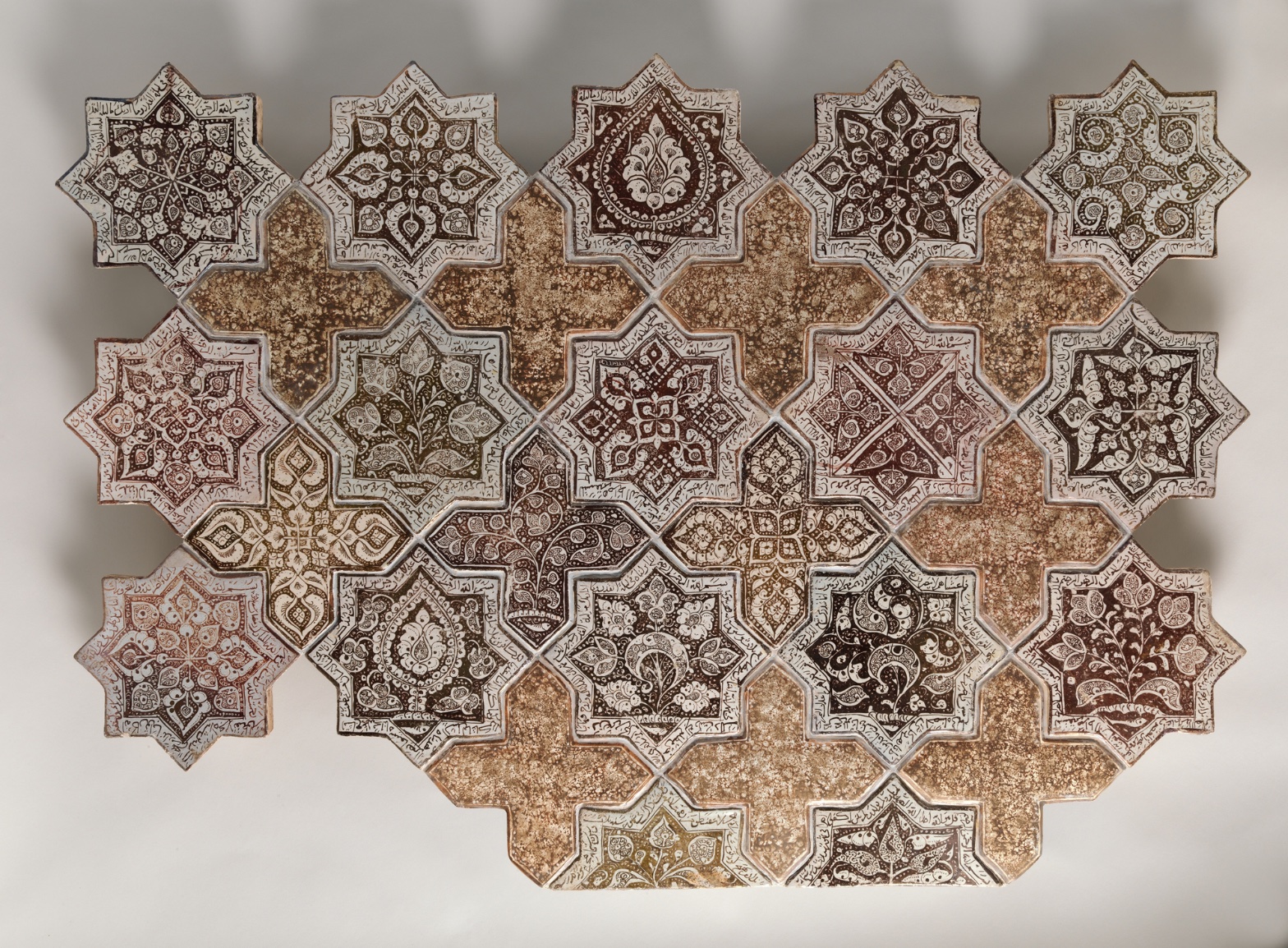
Panel Composed with Tiles in Shape of Eight-pointed Stars and Crosses
July 17, 2026 at 7:53 AM
Model: claude-sonnet-5
These 58 principles are perceptual mechanisms that influence what gets noticed, how forms organize, and how space is inferred - all before conscious interpretation. They do not determine meaning.
LOOKING PROMPTS
Look closely at one star tile and trace the dark brown pattern inside it — follow the lines from the center outward until you lose them.
Move your eyes to a cross-shaped tile and study its surface — notice the speckled, grainy texture compared to the smoother star next to it.
Step back and let your eyes drift across the whole panel without settling on any one tile — notice whether you start seeing the crosses as the main shape instead of the stars.
Start here: Notice where each tile is cut off at the panel's edge — let that tell you this pattern isn't complete, it's a fragment of something larger.
THE HOOK
Look at the crosses between the stars — are they background, or are they their own shape? Most people's eyes lock onto the star tiles first, because they're darker and busier. But the cross tiles aren't empty filler — they're doing exactly as much work holding the pattern together, just more quietly. Once you notice you can switch which one reads as "the pattern" and which reads as "the gap," the whole surface starts to flicker between the two.
THE STORY
This panel dates to the 1260s–70s, a period when luster-painted ceramic tilework was one of the most technically demanding luxury crafts in the Islamic world, requiring a second firing just to fix the metallic sheen onto the glaze. Tiles like these were made to sheet entire interior walls — palaces, shrines, mosques — turning architecture into continuous ornament rather than isolated pictures. The star-and-cross module seen here was a standard and widely reused system across the region (verify before using specific origin/workshop), which is part of why this panel reads as a fragment: it was never meant to be looked at as a single self-contained composition, but as one repeatable unit in an endless field. Museums have had to make a design decision in framing works like this — do you present it as one complete "artwork," or make the incompleteness visible? The Met keeps the cropped, fragmentary edges visible rather than smoothing them into a tidy rectangle, which is itself a curatorial argument about honesty to the object's original function. Today the piece sits in the collection less as a singular masterpiece and more as a case study in how pattern, repetition, and modular design functioned as a total environment rather than a discrete image.
THE LIVE QUESTION
Some people look at this panel and see decoration — pure pattern, meant to please the eye and cover a wall. Others see it as dense with meaning: script, floral forms, and geometry doing symbolic work that rewards close reading. Standing here, does this feel like something to glance across, or something to read tile by tile — and does the panel itself give you a clue about which one it wants?
WAYS OF LOOKING
Notice how the analysis keeps flipping between star and cross — first the stars as the "figure" (the shape your eye reads as subject), then the crosses. That's not indecision. That's a deliberate move: when you're building a stop for a group, you don't just point at the obvious thing. You show people there's a second reading hiding in the same object, and you let them find it themselves by asking a question instead of handing them the answer.
Look at how the cropped edges got treated — not as a flaw to apologize for, but as information. The tiles cut off at the frame tell you this pattern was never meant to be a single, complete picture; it was meant to keep going, wall to wall. The habit here: read what's missing or unfinished as evidence, not as a gap to smooth over. A ragged edge is often the clearest clue to how a thing was actually used.
Watch how "matte versus glossy" and "actual ceramic versus image of ceramic" got flagged as open disagreements rather than settled facts. That's a habit worth stealing for any tour: say what you're sure of, then say plainly what you're not, and let the group look for themselves rather than pretending certainty you don't have. It builds trust, and it turns your group into observers instead of just listeners.
Notice, too, how the historical fact (the second firing, the luxury of luster) got introduced only after the eye had already done work — after people had looked, flipped figure and ground, noticed the crop. History here answers a question the looking already raised. That order matters: context lands harder when it explains something you just noticed, rather than something you were told to notice.
WHAT THIS WORK MAKES VISIBLE
Stand back from this panel and the star tiles pull your eye first — they're darker, busier. But because the crosses are so plain by comparison, you can actually watch your own attention move, tile to tile, dense to bare, dense to bare. That rhythm — call it a detail density gradient, meaning the busy parts and rest parts trade off in a regular beat — is usually much harder to catch in a painting, where detail is scattered unevenly. Here it's built into the grid itself, so you can point to it directly.
The repeating module also makes visible something abstract paintings rarely show so plainly: that a single tile can be both a complete symmetrical shape and part of something incomplete and ongoing. Next time you're in front of any patterned surface — a mosaic floor, a printed textile, a screen — ask whether the unit is meant to be whole or meant to be endless. This panel answers that question just by being cut off at its own edges.
Looking vs. Knowing
These are the analysis's own words, nothing added.
Readings That Came From Outside
Not wrong, necessarily—but these readings didn't come from looking: they came from biography, cultural context, critical tradition, to complete what the image left open.
Writing guardrail
The house style rules this writing was asked to follow, and where it didn't. Flagged after the fact. Nothing was rewritten.
Pass 2
- Used a banned construction: em dash
- Used banned word: masterpiece
Pass 3
- Used a banned construction: em dash
Alternative Interpretation
Pulled directly from this analysis's own language — nothing added.
The primary reading treats the panel as pure decoration — a repeatable pattern-unit meant to sheet a wall and please the eye through modular design. The competing reading, held equally in the "Live Question" section, treats the same surface as dense with symbolic content — script, floral forms, and geometry meant to be read tile by tile — and the analysis explicitly declines to choose between these two, asking instead whether the panel itself gives a clue.
Questions Raised
The analysis flags the star-and-cross module's origin/workshop attribution as needing verification ("verify before using specific origin/workshop") — so the specific place and maker of this system remain unconfirmed.
It's unresolved whether the panel is best understood as decoration to glance across or as symbolic content to read closely — the analysis poses this as the "live question" without resolving it.
Whether the Met's curatorial choice to leave the fragment's edges visible is the "right" or only honest way to present it is raised as a design decision but not settled as definitively correct versus an alternative (e.g., reconstructing a fuller pattern).
Pass 1 — blind observation used
Looking at this tile assemblage, my eye first catches the alternating eight-pointed star tiles arranged in diagonal rows, interlocked with cross-shaped filler tiles — a clear instance of Pattern Completion/Closure, where the mind registers the full grid even though several stars are missing at the edges, particularly at lower left and bottom.
Grouping organizes my reading immediately: the star tiles cluster visually by their dense, dark calligraphic borders, while the plainer cross tiles read as a separate visual class, creating Figure-Ground Relationships that shift depending on whether I focus on stars-as-figure or crosses-as-ground.
Edges are precise where the ceramic tiles meet — hard physical seams with visible grout lines and slight chips at several star points (upper left, lower left corner). Within each tile, however, the painted linework dissolves into softer transitions where pigment has worn or the glaze has pooled, especially in the mottled crackled surfaces of the cross tiles.
Value structure runs from near-black brown script and central medallions to the pale cream-white ground of each star, with the cross tiles occupying a middle tan-ochre value that unifies the composition — a clear Value Structure/Massing where the crosses recede slightly and the stars advance.
Color is a narrow, warm-earth harmony: brown, ochre, cream, rust, with only slight shifts toward olive-green in a few star centers (upper right, mid-left). This is Color Harmony Systems built on analogous warm tones with almost no chromatic departure.
Detail Density Gradient is strong: the star tiles carry tight, small-scale interlacing script and floral arabesques near their points, while the crosses are comparatively bare, their surface texture reading as aged, speckled glaze rather than pattern — a deliberate Complexity and Visual Density contrast that keeps the eye moving between ornament and rest.
Rhythm and Repetition governs the overall structure — the same star module repeats at consistent intervals, with Interval Relationships kept tight and regular except where tiles are missing, breaking the grid's continuity at the perimeter.
Surface Texture is tactile throughout: crackled glaze, small pits, uneven firing spots visible especially on the cross tiles, giving a sense of ceramic materiality and age.
Scale Relationships stay constant tile to tile, reinforcing the modular, near-flat picture plane; there's no depth cue beyond slight Overlap/Occlusion where tile edges cast thin shadows against the neutral backdrop, and soft diagonal shadow bands across the whole photographed surface suggest a raking light source.
My eye finally settles on the lower right star tile, where a dense brown botanical motif sits inside crisp white framing — the most saturated, complete, and legible single unit in the whole arrangement.