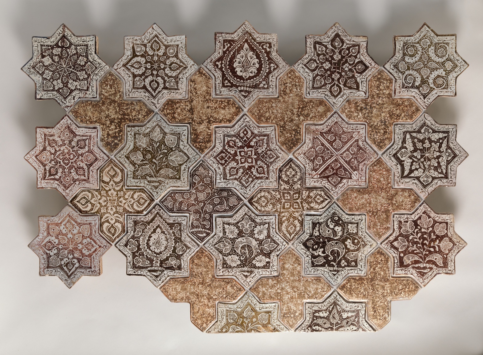
Panel Composed with Tiles in Shape of Eight-pointed Stars and Crosses
July 17, 2026 at 7:51 AM
Model: claude-sonnet-5
These 58 principles are perceptual mechanisms that influence what gets noticed, how forms organize, and how space is inferred - all before conscious interpretation. They do not determine meaning.
OVERVIEW
Four domains agree on one thing: this panel repeats a module and cuts it off at the edges. That much is stable across perceptual, material, and cultural readings. Where they split is on what the repetition means.
Perceptually, the eye bounces between star and cross, finds no single anchor, and settles into rhythm instead of focus. Materially, the crispness of tile seams against the softness of painted line tells a story about two different hands — the cutter and the painter — working at different registers of control. Culturally, the panel enters a conversation about architectural ornament, and the fragment format works against that conversation: this thing was never meant to be looked at as a discrete "panel" in a room. Conceptually, the work argues for pattern over image, field over focal point — but the museum's framing act (mounting it as 32 elements, giving it dimensions, calling it a "panel") pulls against that argument by making a fragment behave like a self-contained artwork.
The tension: the object's own logic is anti-compositional — it wants to be endless, cropped, part of a wall that continues past any frame. The presentation logic (mounting, titling, measuring) is compositional — it asks the panel to resolve as a bounded thing. That's not a contradiction the tiles created. It's one imposed after the fact. The work doesn't resolve it. Neither will this analysis.
The live question: is this a fragment of a larger field pretending to be a complete work, or a complete work that happens to look like a fragment?
PERCEPTUAL
The eye lands on the star tiles first. Their dark brown and black ornament against pale cream ground creates the highest local contrast in the piece — a straightforward case of Visual Pop-out against the quieter, mottled cross tiles. That contrast does the initial sorting: stars read as figure, crosses read as ground, at least at first glance.
But the sorting doesn't hold. Because the stars are also symmetrical and repeat at even intervals, the eye can't stay locked on any single one — Rhythm and Repetition takes over almost immediately, and attention starts moving laterally across the grid rather than resting. This is Figure-Ground Relationships doing something unstable: at a glance the pattern flips, and the crosses start to read as the shape and the stars as the interlocking gaps around them. The eye toggles between these two readings without settling into either. That flip is not a flaw in looking. It's what an interlocking tessellation does to perception by design — Pattern vs. Figure never resolves into one winner.
The Detail Density Gradient reinforces the rhythm rather than fighting it: eyes move from dense (star interiors: script, arabesque, floral motifs) to sparse (cross tiles) in a steady pulse, like a visual heartbeat. This gradient gives the surface a scanning rhythm — dense, rest, dense, rest — instead of a hierarchy. Nothing commands sustained attention over anything else.
Cropping/Framing at the edges kills any impulse to read this as a bounded composition. Tiles cut off mid-star at the border signal that the pattern is a slice of something larger. The eye tries to complete the missing stars — Pattern Completion/Closure — and fails, because the frame stops the information cold. That incompleteness keeps the eye moving outward, toward the edges, rather than inward toward a center. There is no compositional center to find. The panel asks the viewer to accept a fragment as a whole field, and the eye resists that for a moment before giving in to the rhythm.
Depth is minimal. There's no recession, no depth cue competing with the surface pattern, so the eye stays locked to the picture plane the whole time. All movement is lateral, not into space.
MATERIAL AND FORMAL
Physically, this is stonepaste ceramic, luster-painted over an opaque white glaze, sealed under a transparent glaze. Two glaze layers plus a painted layer means the surface is doing three jobs: color, protection, and light behavior, all stacked. The stonepaste body is a specific technology — a quartz-frit composite developed to imitate the whiteness and hardness of Chinese porcelain, fired at lower temperature than true porcelain, more workable for the tile-cutter.
The star and cross shapes are cut, not painted-in-outline — this is a tessellating tile system, individually fired pieces assembled into a modular field. That's visible in the crisp grout lines and seams: the physical boundary between one tile and the next is a hard architectural fact, not an illusion. Against that hardness, the internal painted linework — the script, the florals, the arabesques — is soft, sometimes blurred or dissolved at the edges. This is a real material contrast, not a metaphor: cutting is precise, brushwork is fluid. The maker's hand shows up differently at each register. The cutter's hand is exact. The painter's hand moves.
The cross tiles carry a mottled, granular, speckled surface — likely evidence of glaze pooling or firing variation — while the star tiles carry the dense calligraphic and floral programs. This division of labor across two tile types suggests the maker planned a hierarchy of attention at the level of tile design, before assembly: crosses as rest, stars as content.
There's a live disagreement in the underlying descriptions about whether the surface reads as glossy (active Specularity/Surface Reflection, glassy sheen, crackle) or matte. Both are plausible outcomes of lustre-glaze technique depending on lighting and wear — lustre glazes can go dull with age or read brilliantly under raking light. This is a documentation problem, not a resolved material fact, and it matters: if the surface is glossy, the panel throws light back at the viewer and behaves differently from across a room than up close. Up close, the calligraphy and florals demand slow reading. At a distance, the whole thing flattens into a rhythmic textile-like field. The medium supports both modes of viewing without contradiction — that's what tessellated ornament is built to do.
CULTURAL
This reads as architectural ornament — tilework meant for a wall, likely from a religious or courtly building in the greater Persian/Islamicate world, given the lustre technique and the 1260–70 date, which places it in the Ilkhanid period following the Mongol conquest of Iran. One reading: this panel belonged to a larger decorative program — a mihrab, a shrine facade, an interior dado — where pattern was never meant to terminate at any edge. The cropping visible in the panel supports this reading: real architectural tilework is site-specific and continuous; a museum panel is a forced excerpt.
The institution that now holds it — the Met — validates this object through the frame of "Islamic art," a category itself shaped by 19th- and 20th-century Western collecting practices, world's fair displays, and orientalist taste for pattern and lustre-ware. One possible reading: the museum's act of mounting 32 tile-elements as a single "panel" with fixed dimensions (28 x 40 in.) converts an architectural fragment into a portable, salable, exhibitable art object — a category shift the original maker never intended.
The community that would recognize this work most fluently isn't a contemporary art audience. It's specialists in medieval Islamic ceramics, historians of Ilkhanid patronage, and audiences familiar with the calligraphic and geometric traditions of tilework across Iran, Central Asia, and Anatolia. To a general museum visitor, the deep cultural content — the specific Qur'anic or poetic inscriptions, if present in the script bands — is largely illegible without translation and expertise. That illegibility isn't transgression; it's a gap created by geographic and temporal distance, and by the object's removal from its architectural context.
Hypothesis (insufficient visual evidence): the calligraphic bands carry specific devotional or courtly text with symbolic weight beyond decoration. The formal observations note "calligraphic script" as a motif category but no content is legible from the documentation, so any claim about what the text says or means is unsupported by the evidence base here.
CONCEPTUAL
The strongest argument this panel makes, formally, is a stand against the primacy of the single image. Western easel painting trains a viewer to look for a focal point, a hierarchy, a center of gravity. This panel refuses that. The Rhythm and Repetition, the toggling Figure-Ground Relationships, the even Detail Density Gradient across a grid — all argue for a field logic instead of a figure logic. Pattern here is not decoration subordinate to image. Pattern is the whole proposition.
This puts the work in dialogue with a long tradition — arabesque and geometric ornament in Islamicate visual culture — that treats infinite extensibility as a conceptual position, not just a decorative habit. The interlocking star-and-cross module is mathematically generative: it could theoretically extend in any direction without a natural stopping point. One reading: the theological or philosophical undercurrent in this ornamental tradition treats potentially infinite pattern as an analog for the boundlessness of the divine, with the eye's inability to find a final resting point as the point itself, not a design failure. That's a well-established scholarly reading of geometric Islamic ornament broadly; whether it applies specifically to this panel's intent is a hypothesis, since no textual or programmatic evidence about this object's original context appears in the observation base.
The cropped edges support this non-terminating argument perceptually. But the museum's act of framing it as a bounded "panel" — with a title, dimensions, and an element count — works against the argument the object's own pattern logic makes. The conceptual position is anti-closure. The presentation format is closure. That's a real tension, not a resolved one.
Historical precedent worth naming: this sits alongside other Ilkhanid and earlier Seljuk lustreware tile programs where geometric star-and-cross (or star-and-hexagon) tessellations were standard architectural vocabulary. The precedent matters because it tells us the "argument" here is not original to this object — it's a shared visual language of the period, executed with high technical skill in this instance, but not a singular authorial statement in the way a modern artwork claims originality.
NOISE — CONSOLIDATED
PERCEPTUAL: The Figure-Ground Relationships never resolve — stars and crosses trade places as figure and ground depending on scanning distance. This is a genuine perceptual instability, not a reading error, and it keeps the eye from settling anywhere. Compounding this, the Cropping/Framing prevents Pattern Completion/Closure at the edges, so the eye is denied its natural impulse to finish the pattern.
MATERIAL: Direct contradiction in the surface-finish record: some evidence indicates glossy, specular lustre-glaze reflection with crackle and highlights; other evidence describes the surface as matte with minimal reflection. This can't both be true under one consistent lighting condition, and it changes how the work behaves at a distance versus up close. Additionally, one source hedges on whether this is real fired ceramic tilework at all versus an image made to resemble ceramic — a base-level material uncertainty that undercuts confident material claims.
CULTURAL: The panel's original architectural site and function are absent from the documentation. Without knowing what building this came from, any claim about its original devotional, courtly, or civic role is speculative. The museum's decontextualized "panel" framing further obscures the object's original relationship to a continuous decorative program, making it harder to read this piece as it was meant to be encountered — as one part of an unbroken wall.
CONCEPTUAL: The work's implicit anti-closure, field-based argument is undercut by its current bounded, titled, dimensioned presentation as a discrete art object. A pattern designed to resist termination is being shown as a terminated thing.
Some of this noise is likely intentional at the level of original design — the perceptual figure-ground instability probably serves the conceptual anti-closure argument on purpose. But the material contradiction over glossiness and the cultural loss of architectural context are accidental noise, introduced by documentation inconsistency and by the institutional act of collecting and mounting, not by the maker.
WAYS OF LOOKING
Notice what happened when the analysis hit the question of glossy versus matte surface. Instead of picking a winner, it said: this is a documentation problem, and here's why it matters — a glossy surface throws light across a room, a matte one only rewards close reading. The habit here is treating disagreement in the evidence as information, not noise to smooth over. When two credible readings conflict, the move isn't to average them or silently choose one. It's to ask what each version would mean for how the thing works, then hold both open.
Notice, too, how the eye's first landing point — the dark star tiles, high contrast against pale ground — got named, then immediately complicated: the same tessellation that pulls you to the stars also flips, so the crosses become the shape and the stars the gaps. That's the habit of tracking a perception through time rather than freezing it at first glance. A pattern doesn't have one true reading; it has a sequence of readings, and the interesting part is often the flip, not the first impression.
Notice the moment the analysis separated the object's own logic (anti-closure, endlessly extensible) from the museum's framing of it (bounded, titled, measured, called a "panel"). That's the habit of asking who authored which feature. Not everything visible in front of you was decided by the maker. Some of it was decided by whoever mounted, cropped, and displayed it afterward — and naming that split keeps you from crediting or blaming the wrong hand.
WHAT THIS WORK MAKES VISIBLE
Look at where the tiles are cut off at the panel's edges — a star sliced mid-motif, a cross truncated at the border. Most paintings resolve at their frame; this one doesn't, and because it doesn't, you can watch your own eye try and fail to complete the missing shapes. That failed completion is usually invisible, absorbed instantly by a bounded composition. Here, the seam is left showing. Look for this in any tiled, modular, or repeating work — wallpaper, a grid of Warhol portraits, a brick wall — anywhere the frame cuts into a pattern that clearly continues past it.
Look also at the difference between the crisp grout lines and the soft, sometimes-blurred brushwork inside each tile. Two hands, two kinds of control, sitting on the same surface. That contrast is usually buried in a single continuous material. Here, cutting and painting are literally separate acts, so you can see precision and looseness coexist without one correcting the other.
Looking vs. Knowing
These are the analysis's own words, nothing added.
What the Work Shows Us
These are the claims that hold up when you look: each one is rooted in something the image actually puts in front of you, not from what we already knew—or thought we knew—about it.
Readings That Came From Outside
Not wrong, necessarily—but these readings didn't come from looking: they came from biography, cultural context, critical tradition, to complete what the image left open.
Writing guardrail
The house style rules this writing was asked to follow, and where it didn't. Flagged after the fact. Nothing was rewritten.
Pass 2
- Used a banned construction: em dash
Pass 3
- Used a banned construction: em dash
Alternative Interpretation
Pulled directly from this analysis's own language — nothing added.
The primary reading treats this panel as a fragment of a once-continuous architectural field whose anti-closure logic (cropped edges, non-resolving figure-ground, infinite tessellation) is the object's authentic conceptual argument, with the museum's bounded "panel" presentation working against that logic after the fact. The competing reading, never resolved, is that the panel's current bounded, mounted, titled form is simply what the object now is — making the analysis's own framing of "fragment vs. complete work" undecidable rather than a case where one side is clearly the imposed distortion.
Questions Raised
Is the surface actually glossy/specular or matte — the documentation contradicts itself, and this materially changes how the panel behaves at different viewing distances, yet remains unresolved.
What building or program did this panel originally belong to (mihrab, shrine facade, dado)? Without that context, any claim about its devotional, courtly, or civic function is explicitly flagged as speculative.
Does the calligraphic band carry specific devotional or courtly text with symbolic weight, or is it purely decorative script? The analysis names this as an unsupported hypothesis, since no content is legible from the documentation.
Pass 1 — blind observation used
Looking at this tile assemblage, my eye first catches the alternating eight-pointed star tiles arranged in diagonal rows, interlocked with cross-shaped filler tiles — a clear instance of Pattern Completion/Closure, where the mind registers the full grid even though several stars are missing at the edges, particularly at lower left and bottom.
Grouping organizes my reading immediately: the star tiles cluster visually by their dense, dark calligraphic borders, while the plainer cross tiles read as a separate visual class, creating Figure-Ground Relationships that shift depending on whether I focus on stars-as-figure or crosses-as-ground.
Edges are precise where the ceramic tiles meet — hard physical seams with visible grout lines and slight chips at several star points (upper left, lower left corner). Within each tile, however, the painted linework dissolves into softer transitions where pigment has worn or the glaze has pooled, especially in the mottled crackled surfaces of the cross tiles.
Value structure runs from near-black brown script and central medallions to the pale cream-white ground of each star, with the cross tiles occupying a middle tan-ochre value that unifies the composition — a clear Value Structure/Massing where the crosses recede slightly and the stars advance.
Color is a narrow, warm-earth harmony: brown, ochre, cream, rust, with only slight shifts toward olive-green in a few star centers (upper right, mid-left). This is Color Harmony Systems built on analogous warm tones with almost no chromatic departure.
Detail Density Gradient is strong: the star tiles carry tight, small-scale interlacing script and floral arabesques near their points, while the crosses are comparatively bare, their surface texture reading as aged, speckled glaze rather than pattern — a deliberate Complexity and Visual Density contrast that keeps the eye moving between ornament and rest.
Rhythm and Repetition governs the overall structure — the same star module repeats at consistent intervals, with Interval Relationships kept tight and regular except where tiles are missing, breaking the grid's continuity at the perimeter.
Surface Texture is tactile throughout: crackled glaze, small pits, uneven firing spots visible especially on the cross tiles, giving a sense of ceramic materiality and age.
Scale Relationships stay constant tile to tile, reinforcing the modular, near-flat picture plane; there's no depth cue beyond slight Overlap/Occlusion where tile edges cast thin shadows against the neutral backdrop, and soft diagonal shadow bands across the whole photographed surface suggest a raking light source.
My eye finally settles on the lower right star tile, where a dense brown botanical motif sits inside crisp white framing — the most saturated, complete, and legible single unit in the whole arrangement.