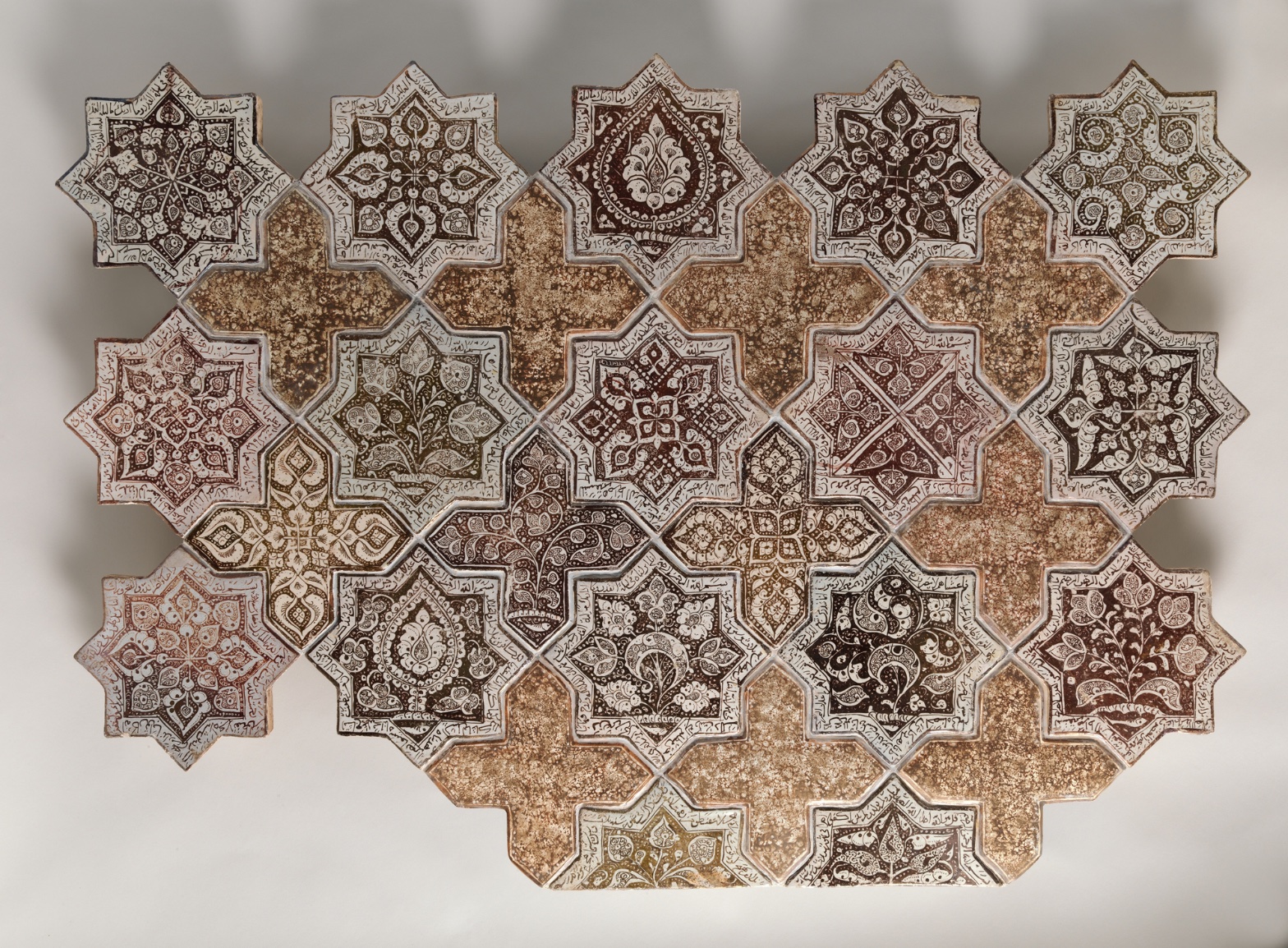
Panel Composed with Tiles in Shape of Eight-pointed Stars and Crosses
July 28, 2026 at 2:19 PM
Model: claude-sonnet-5
These 58 principles are perceptual mechanisms that influence what gets noticed, how forms organize, and how space is inferred - all before conscious interpretation. They do not determine meaning.
OVERVIEW
Perceptual and material findings agree closely here. The eye's rhythm follows the physical grid. Grout lines are physical facts; they also set the pace of scanning. Cultural and conceptual readings extend outward from that same grid, into questions about where this fragment sits institutionally and what argument a repeating, crop-truncated pattern makes about wholeness. The tension isn't between domains contradicting each other. It's between what's visible (a fragment) and what's implied (a total pattern that exceeds the frame). Perceptual closure wants to complete the star-and-cross field beyond the edges. Material fact stops at 32 tiles, 28 by 40 inches, no more. Cultural and conceptual domains both have to work with that gap: a full architectural scheme reduced to a museum panel. The live question the work sits inside: does this panel ask to be read as a complete aesthetic object, or as a deliberately partial witness to something larger it can no longer be part of.
PERCEPTUAL
The eye lands on the star tiles first. Reason: Detail Density Gradient. Dark brown and black ornament against pale cream ground creates high local contrast, and contrast wins the first look. The cross tiles function as rest stops, their mottled tan surface offering the eye a place to release tension before the next star pulls it back in. This alternation sets up Rhythm and Repetition: scan, rest, scan, rest, moving through the grid at a steady pace.
At a middle viewing distance, Figure-Ground Relationships flip. Seen close, each star is a figure against the cross ground. Pull back, and the crosses start to read as a figure of their own, a secondary lattice sitting on top of the star field. This is Figure-Ground Reversal doing real work: the same tiles support two different readings depending on scanning distance, and the eye doesn't settle on one.
The cropped edges interrupt Pattern Completion/Closure. Tiles cut off at top, bottom, and sides tell the eye this pattern continues past what's shown. The mind fills in more grid than is physically present. That's Cropping/Framing forcing an active viewer response rather than a passive one.
Depth stays flat throughout. No occlusion, no atmospheric recession, nothing pulling the eye into illusionary space. All visual movement happens in the picture plane itself, through contrast and repetition, not through depth cues.
MATERIAL AND FORMAL
The medium is stonepaste with luster-painted decoration under a transparent glaze. That's a specific ceramic technology: a fritware body, an opaque white glaze layer, metallic luster pigment painted on top, then fired again at lower temperature to fuse the luster. The result is visible in the surface: crisp tile boundaries where individual fired units meet the grout, and softer, sometimes-blurred internal linework where the luster pigment migrated or fired unevenly during the second firing. That contrast between hard physical edge and soft painted edge is a direct record of two separate manufacturing stages: shaping/glazing the tile, then luster-painting it.
The cross tiles' granular, speckled texture reads as under-decoration, or as a plainer glaze recipe used deliberately to contrast with the ornamented stars. The tan/ochre mottling is consistent with variable firing or a different glaze mixture on those units.
Surface reflectivity is a genuinely contested read across observers: some see active glassy specular highlights consistent with a fired luster glaze; others see a mostly matte surface. Given the medium record (opaque white glaze under transparent glaze, luster-painted), a glossy, light-catching surface is the more materially consistent expectation. A flatter photographic reproduction could suppress that.
Up close, the viewer confronts brushwork: individual calligraphic and arabesque strokes, pooling of luster pigment, pitting in the glaze. At distance, those individual marks disappear into the grid's overall rhythm. The object asks for both kinds of looking and rewards each differently, which is consistent with tilework meant for architectural installation, viewed at multiple distances by people moving through a space.
CULTURAL
One reading: this panel sits within the Persian/Ilkhanid ceramic tradition of luster-painted tilework, made for architectural revetment. Institutions like the Met display such panels as reassembled or excerpted fragments of larger schemes, originally set into a wall, mihrab, or dado. If that reading holds, the object now functions doubly: as an art-historical witness to 13th-century Kashan production technique, and as a museum object valued for its formal pattern and craftsmanship independent of its lost architectural context.
The audience most equipped to recognize this work is one fluent in Islamic art history: scholars, collectors, and museum-goers who read luster ware as a marker of technical sophistication (a difficult, resource-intensive glazing/firing process) and who understand tile panels as fragments of dismantled buildings, common in the market history of Islamic architectural ceramics from the 19th and 20th centuries onward.
To a general museum audience unfamiliar with that history, the panel may read primarily as ornamental pattern, its calligraphic and arabesque content illegible as content rather than decoration. That illegibility isn't transgression here; it's a consequence of the object's removal from its original reading context. Hypothesis (insufficient visual evidence): the star tiles' script bands carry specific devotional or poetic text, which would be legible to a period viewer and is largely inaccessible to a modern general viewer without translation.
CONCEPTUAL
This object sits inside a design tradition that treats geometric modularity, unity through repeated form, and variety through individualized ornament as compatible rather than opposed. The star's outer form stays constant tile to tile; the internal motifs vary (Unity vs. Variety Tension, observed directly in the star/cross alternation and internal motif variation). This is consistent with an argument common in Islamic geometric ornament: infinite, non-hierarchical pattern as a formal analog to a non-representational, non-narrative visual order. No single tile is a focal point in a Western compositional sense; Rhythm and Repetition replaces a singular climax with distributed emphasis.
The cropping supports that argument rather than working against it. A pattern that implies continuation beyond its physical edges argues, visually, for a field that exceeds any single frame. That's consistent with a tiling logic built to cover a wall of any size, not a bounded picture built to be complete in itself. Hypothesis (insufficient visual evidence): the specific selection of eight-pointed stars and crosses references cosmological or mathematical symbolism beyond decorative function; the visible tile record alone doesn't establish that reading with two independent anchors.
Read this way, the panel is less an "artwork" in the Western individual-authorship sense and more a fragment of an ongoing design system. The conceptual position: pattern itself, not any single tile, carries the meaning.
NOISE — CONSOLIDATED
PERCEPTUAL: Figure-ground reads competitively. Star-as-figure and cross-as-figure alternate depending on viewing distance, and the eye doesn't get a stable resolution. Cropped edges also work against closure by forcing an active, unresolved sense of "more pattern exists," which can read as either an open invitation or an incompleteness depending on viewer expectation.
MATERIAL: The record itself is split on whether the glaze is glossy or matte. That's not a fight within the object; it's a fight in how the object has been photographed or lit across different documentation passes. It matters because Specularity/Surface Reflection changes how "finished" or "precious" the object appears at first glance.
CULTURAL: The panel's script and iconographic content are likely illegible to most viewers without specialist knowledge, and the object's fragmentary, reassembled museum status (32 elements reconstituted into a "panel") can obscure its original architectural function, making it easy to misread as a self-contained decorative composition rather than a rescued piece of a larger structure.
CONCEPTUAL: The argument for infinite, non-hierarchical pattern sits in tension with the museum's framing of the object as a bounded, titled, dimensioned "panel." Presenting a fragment of an endless system as a discrete work with fixed dimensions works against the pattern's own logic of continuation.
The cropping and figure-ground instability look intentional, in service of the conceptual argument for pattern without a fixed center. The glaze-reflectivity discrepancy and the panel's institutional framing as a bounded, titled object look more like accidents of display and documentation, cutting against the same argument the tilework itself makes.
WAYS OF LOOKING
Notice how the analysis catches itself flipping between two readings of the same tiles: up close, the stars are the figure and the crosses recede as ground; pull back, and the crosses start to organize themselves into their own lattice. Rather than pick one and move on, the analysis holds both and asks what triggers the switch (distance, mainly). That's a habit worth stealing: when a composition seems to contain two competing readings, don't resolve the tension, locate the condition that produces it. The answer is often more interesting than either reading alone.
Watch what happens with the cropped edges. Instead of treating the truncated tiles at the border as a photographic accident, the analysis treats them as information: the pattern implies continuation, and that implication becomes evidence for an argument about what kind of object this is (a fragment of an endless system, not a bounded picture). This is the habit of reading absence as content. What's cut off, missing, or implied can carry as much argument as what's fully rendered.
Look at how the glossy-versus-matte disagreement about the glaze gets handled. Rather than average the two claims or pick a winner, the analysis traces it back to a likely cause (photographic lighting) and then asks what's at stake in the disagreement (how "finished" the object reads). That's the discipline of treating contradictions in your own perception as diagnostic rather than as noise to be smoothed over. A disagreement between viewers is data about the object's instability, not a flaw in the viewers.
WHAT THIS WORK MAKES VISIBLE
The seam between star and cross tiles is a literal, physical line, grout, a manufacturing boundary, and yet it's also doing compositional work: setting the rhythm, splitting dense ornament from plain rest. Few paintings give you a boundary that is simultaneously a material fact and a formal device this cleanly. Look for this in any tiled, modular, or paneled work: places where the object's construction seams double as its visual pacing.
The stars keep one constant outer shape while varying their internal motifs tile to tile. That's unity and variety sitting inside the same unit rather than distributed across a whole composition. It's easier to see here than in, say, a landscape, because the module repeats enough times that you can compare it directly against itself. Look for this in any repeating-unit design (textiles, architectural friezes, printmaking series): does the container stay fixed while the content shifts, and what does that ratio argue about the system as a whole.
Looking vs. Knowing
These are the analysis's own words, nothing added.
What the Work Shows Us
These are the claims that hold up when you look: each one is rooted in something the image actually puts in front of you, not from what we already knew—or thought we knew—about it.
Readings That Came From Outside
Not wrong, necessarily—but these readings didn't come from looking: they came from biography, cultural context, critical tradition, to complete what the image left open.
Writing guardrail
The house style rules this writing was asked to follow, and where it didn't. Flagged after the fact. Nothing was rewritten.
Pass 2
- Used a banned construction: em dash
Alternative Interpretation
Pulled directly from this analysis's own language — nothing added.
The primary reading treats this panel as an art-historical witness valued for its formal pattern and technical craftsmanship, functioning coherently as a museum object in its own right. The competing reading, held alongside it without resolution, treats the same panel as a fragment whose bounded, titled, dimensioned museum presentation actively works against the tiling system's own logic of infinite, non-hierarchical continuation, making its display arguably a misrepresentation of what the pattern is designed to argue.
Questions Raised
Whether the script bands on the star tiles carry specific devotional or poetic text legible to a period viewer is flagged as a hypothesis with insufficient visual evidence, so the panel's textual content and meaning remain unknown.
Whether the choice of eight-pointed stars and crosses carries cosmological or mathematical symbolism beyond decoration is likewise marked as unresolved, lacking two independent anchors in the visible tile record.
Whether the surface is genuinely glossy or matte is unsettled, and the analysis cannot determine whether this is a property of the object itself or an artifact of inconsistent photographic documentation.
Pass 1 — blind observation used
Looking at this tile assemblage, my eye first catches the alternating eight-pointed star tiles arranged in diagonal rows, interlocked with cross-shaped filler tiles — a clear instance of Pattern Completion/Closure, where the mind registers the full grid even though several stars are missing at the edges, particularly at lower left and bottom.
Grouping organizes my reading immediately: the star tiles cluster visually by their dense, dark calligraphic borders, while the plainer cross tiles read as a separate visual class, creating Figure-Ground Relationships that shift depending on whether I focus on stars-as-figure or crosses-as-ground.
Edges are precise where the ceramic tiles meet — hard physical seams with visible grout lines and slight chips at several star points (upper left, lower left corner). Within each tile, however, the painted linework dissolves into softer transitions where pigment has worn or the glaze has pooled, especially in the mottled crackled surfaces of the cross tiles.
Value structure runs from near-black brown script and central medallions to the pale cream-white ground of each star, with the cross tiles occupying a middle tan-ochre value that unifies the composition — a clear Value Structure/Massing where the crosses recede slightly and the stars advance.
Color is a narrow, warm-earth harmony: brown, ochre, cream, rust, with only slight shifts toward olive-green in a few star centers (upper right, mid-left). This is Color Harmony Systems built on analogous warm tones with almost no chromatic departure.
Detail Density Gradient is strong: the star tiles carry tight, small-scale interlacing script and floral arabesques near their points, while the crosses are comparatively bare, their surface texture reading as aged, speckled glaze rather than pattern — a deliberate Complexity and Visual Density contrast that keeps the eye moving between ornament and rest.
Rhythm and Repetition governs the overall structure — the same star module repeats at consistent intervals, with Interval Relationships kept tight and regular except where tiles are missing, breaking the grid's continuity at the perimeter.
Surface Texture is tactile throughout: crackled glaze, small pits, uneven firing spots visible especially on the cross tiles, giving a sense of ceramic materiality and age.
Scale Relationships stay constant tile to tile, reinforcing the modular, near-flat picture plane; there's no depth cue beyond slight Overlap/Occlusion where tile edges cast thin shadows against the neutral backdrop, and soft diagonal shadow bands across the whole photographed surface suggest a raking light source.
My eye finally settles on the lower right star tile, where a dense brown botanical motif sits inside crisp white framing — the most saturated, complete, and legible single unit in the whole arrangement.