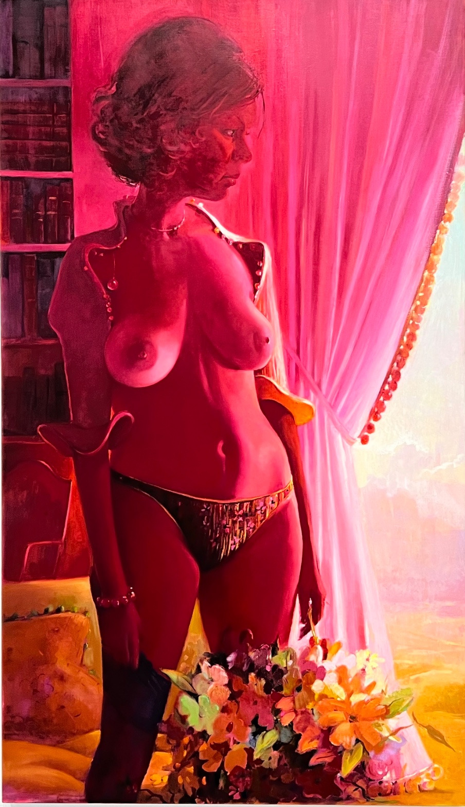
Lisa Yuskavage — Northview (Impressionist Jacket)
August 3, 2026 at 4:36 PM
Model: claude-sonnet-5
These 58 principles are perceptual mechanisms that influence what gets noticed, how forms organize, and how space is inferred - all before conscious interpretation. They do not determine meaning.
OVERVIEW
The perceptual and material domains agree on where the intensity sits: chest, curtain edge, that blown-out opening at the right. Color does the work. Brushwork stays mostly out of the way except at the flowers.
The cultural and conceptual domains complicate that agreement. The subject, a nude or near-nude woman lit like a devotional object, sits inside a history of painting that has used the female body as surface for male-authored desire. Yuskavage paints it anyway, in a palette that refuses to let the viewer look at skin without also looking at color as color. The perceptual pop-out (torso, saturation) and the conceptual argument (is this critique or complicity) pull in the same direction and then split: the eye is told to enjoy the surface; the concept asks whether enjoyment is the trap or the point.
Material handling doesn't resolve this. The smooth, blended skin sits next to the thick, almost aggressive flower impasto. That inconsistency in touch matches the inconsistency in argument. Nothing here stabilizes into a single reading.
The live question: does the saturation function as critique of the gaze it invites, or does it just deliver the gaze more efficiently?
PERCEPTUAL
The eye lands on the torso first. Every account but one confirms it. The chest is the brightest, most saturated passage in the painting, and Visual Pop-out/Pre-attentive Features explains why: high saturation against a warm but comparatively duller surround reads as figure before it reads as body.
From there the eye has two paths. One goes right, following the woman's own gaze toward the blown-out opening past the curtain. That's Gaze Direction/Social Attention doing double duty: her look pulls the viewer's look, and it points toward the single area of true value contrast in the painting, the pale yellow-white light behind the pink curtain. Directional Force pushes the whole right half of the canvas outward, toward that light, in a way the left half (dark shelf, stacked books) doesn't fight back against. Figure-Ground Relationships stay simple because of it: dark vertical mass on the left, the body in the middle, brightness escalating to the right.
The other path drops down to the flowers. Their impasto changes the Detail Density Gradient abruptly; a viewer moving down the body hits a patch of thicker paint and slower reading. The green leaf accents are the only real Simultaneous Contrast break in a field that's otherwise all one hue family. The eye rests there because it has nowhere else in the painting to cool down.
Edges do contradictory work depending on which side of the torso you track (the accounts disagree on left versus right), but the underlying mechanism is stable: one side of the body dissolves into a dark ground, the other holds a hard Edge Detection line against the curtain. That asymmetry keeps the torso from reading as a stable volume. It flattens under Color Weight and Advancement instead of rounding under modeling.
Overall the visual request is: get pulled to the chest, then get pulled sideways by the gaze and the light, then get stopped by the flowers before you exit the bottom of the frame. Those requests don't conflict so much as sequence. The painting has an itinerary.
MATERIAL AND FORMAL
Oil on linen, four feet by nearly eight feet, wider than a doorway laid on its side. The scale matters at the body: at 48 inches tall, the figure is close to or beyond life-size, so a viewer standing in front of it meets flesh at roughly its own scale.
The hand behaves differently in different zones. Skin and curtain get long, blended passages, Optical Color Mixing built through soft transitions rather than discrete strokes staying separate on the retina. The flowers get built up in isolated, thicker touches, closer to Texture as a physical fact than as an illusion. That's a real material split, not just a compositional one: the paint sits differently on the surface in the two zones, and that difference is visible from three feet back before any subject matter registers.
The magenta cast is not a glaze effect described by the observations; it reads as color mixed into the local hue itself, so skin, hair, and curtain share the same base chroma rather than a red light passing over separately-colored objects. That's a choice about Local vs. Atmospheric Color: the atmosphere has been absorbed into the local palette rather than layered on top of it.
Up close the flowers likely show ridges and directional loading a viewer can track stroke by stroke. At a distance those same flowers flatten into a color mass that reads as incident, not as intricately painted incident. The skin does the opposite: closer inspection reveals soft, structureless gradation, while at a distance it reads as a single glowing volume. The painting asks for two different viewing distances and rewards different things at each.
The surface is honest about the labor in the flowers and coy about it in the skin. That asymmetry in the handling is the material's own version of the ambiguity running through the other domains.
CULTURAL
The subject, a solitary woman in a private, dimly furnished room lit by strong warm light, sits inside a tradition running from Boucher and Ingres through Bonnard and Balthus: interior, undress, controlled illumination. A reading of this work could place it as continuing that tradition rather than rejecting it. Yuskavage has been positioned by critics and galleries as working in dialogue with, and against, exactly that lineage, painting bodies that recall pin-up and pornographic conventions while insisting on oil paint's full historical weight.
The saturated monochrome cast is a choice unlikely to appear in a strictly commercial pin-up image; it belongs to a painterly vocabulary (closer to Bonnard's interiors or to color-field logic) that signals "serious painting" to a gallery audience even as the pose and cropping signal something closer to soft pornography. That double signal is probably legible to the contemporary art audience she needs to reach: collectors and critics trained to read Cecily Brown, John Currin, and Yuskavage herself as a cohort revisiting figuration's uncomfortable pleasures in the late 1990s and 2000s.
One reading: the painting is aimed at an art-world audience already primed to debate the ethics of the returned gaze in figurative painting, and the discomfort is the entry ticket, not a barrier. A different reading: the extreme prettiness of the color risks being absorbed as decoration, especially in a domestic or corporate collecting context where the discomfort gets aestheticized away. Both readings are available; the work doesn't resolve which audience wins.
CONCEPTUAL
The argument in play is an old one restaged: can a painting depict a sexualized female body without simply repeating the terms of that sexualization. Yuskavage's move, going by what's visible here, is to make the color itself the site of pleasure rather than letting anatomy alone carry it. The magenta cast overriding local color (skin, curtain, hair all pulled into one hue family) shifts some of the viewer's visual appetite from the body's contours onto the chromatic field. Hypothesis (insufficient visual evidence): this shift is a deliberate strategy to implicate the viewer's looking in the mechanics of color perception rather than let it rest purely on figure.
The compositional structure, gaze pulling toward a lit opening past a curtain, recalls a long history of framing the female body as something glimpsed, half-concealed, offered through an aperture. Repeating that structure so plainly is either homage or indictment; the painting doesn't visually distinguish between the two. That's consistent with a reading in which ambiguity is the position: neither endorsing nor refusing the viewing structures inherited from earlier painting, but re-presenting them at full chromatic volume so the viewer has to notice they're operating.
The impasto flowers complicate any purely ironic reading. They introduce a register of direct sensuous pleasure in paint-as-paint that doesn't obviously serve critique; it just is what oil paint does. If the conceptual position depends on keeping viewer pleasure and viewer discomfort simultaneously active, the flowers are doing pleasure's work almost too well, unbalanced by anything as materially assertive on the figure's side.
Historical precedent worth naming: Bonnard's saturated, artificial-light interiors, and Currin's and Brown's contemporaneous return to painterly female-body subjects loaded with historical baggage. Yuskavage's version differs by pushing saturation further than either, past naturalism entirely, which supports a reading that the color is the argument's main instrument, not an accent to it.
NOISE: CONSOLIDATED
PERCEPTUAL: The observations disagree on which side of the torso is sharp-edged and which breast is brightest. That's a real ambiguity in the image, not a data error to resolve; the torso doesn't present a single stable read of its own volume, and a viewer's eye will legitimately land differently depending on entry point.
MATERIAL: The impasto flowers fight the smooth, blended skin handling. Two different material logics sit in the same painting without a transition zone to reconcile them. That's a formal collision, not just a stylistic variety.
CULTURAL: The painting's dual signal, painterly seriousness plus pin-up staging, risks being read entirely as one or the other depending on the venue. A collector's living room and a museum survey of feminist figuration will extract opposite readings from the same canvas.
CONCEPTUAL: The flowers' unambiguous sensuous pleasure undercuts an argument that depends on keeping the viewer uneasy about pleasure. If critique needs friction, the flowers offer none.
The torso's contradictory edges and the flower/skin material split look like the same choice serving two domains at once: an unresolved body is the conceptual position, not an accident. The cultural legibility gap looks more like risk the work runs than risk it stages on purpose.
WAYS OF LOOKING
The three research passes couldn't agree on which side of the woman's torso holds the sharp edge, or which breast catches the brightest light. Instead of picking a winner, the analysis kept the disagreement and asked what it meant that the body itself wouldn't resolve into one stable shape. That's a habit worth stealing: when multiple careful viewers see the same passage differently, the split is often information about the painting, not a failure of looking. An artist deciding how to render a volume can leave it deliberately unfixed; a critic reviewing that choice should notice the wobble before rushing to correct it.
Notice how the analysis separated the flowers from the skin: one built in thick, isolated touches you could probably read stroke by stroke up close, the other blended so smoothly it dissolves at three feet. That's tracking where the hand's behavior actually changes across a single canvas, rather than describing the painting's "brushwork" as one uniform quality. Two different material logics can sit in the same picture without a bridge between them, and spotting the seam tells you where the artist stopped smoothing things over.
The cultural section placed this painting next to Bonnard, Currin, and Brown, not to prove influence but to test what the extreme saturation adds that a naturalistic interior wouldn't. That's putting a work inside a lineage in order to isolate what it's doing differently from that lineage, which is more useful than either praising it as original or filing it under "similar to."
WHAT THIS WORK MAKES VISIBLE
The magenta cast sits over everything, skin, curtain, hair, at the exact same intensity, so you can watch, in real time, how color overriding local hue flattens a scene into one chromatic family. Most paintings hide this seam; here it's the whole surface, so it's a good place to first learn to see when "atmosphere" has actually been mixed into the paint itself rather than glazed on top.
The flowers sit right next to the skin, thick paint against smooth paint, with no transition passage between them. Go find a painting where a single object is handled in a completely different manner than everything surrounding it: that's usually the artist telling you where they wanted your eye to slow down.
And the gaze: the woman looks toward the one blown-out bright spot in the room, and your eye follows hers there before you've decided to. Watching a painted figure's sightline pull your own attention is easiest to catch in a picture this uncluttered, where there's only one place to look.
Looking vs. Knowing
These are the analysis's own words, nothing added.
What the Work Shows Us
These are the claims that hold up when you look: each one is rooted in something the image actually puts in front of you, not from what we already knew—or thought we knew—about it.
Readings That Came From Outside
Not wrong, necessarily—but these readings didn't come from looking: they came from biography, cultural context, critical tradition, to complete what the image left open.
Alternative Interpretation
Pulled directly from this analysis's own language — nothing added.
The analysis reads the painting's saturated, non-naturalistic color as a deliberate strategy that shifts the viewer's pleasure from anatomy onto the chromatic field itself, implicating the viewer's looking rather than simply feeding it. But it flags this as a hypothesis with insufficient visual evidence, and offers an equally live competing reading: the color's extreme prettiness could just as easily be absorbed as decoration, letting the discomfort of the pose and lighting get aestheticized away rather than confronted.
Questions Raised
Does the saturated palette actually implicate the viewer's gaze, or does it just make the gaze more pleasurable to sustain? The analysis names this as its own live question and doesn't settle it.
Is the mismatch between the impasto flowers' unguarded sensuous pleasure and the smooth-skin handling's coyness a deliberate strategy to keep the body unresolved, or an imbalance that undercuts the critique by letting pleasure win without friction? The analysis calls this both "the conceptual position" and a possible failure of the argument's own terms, without choosing.
Which audience determines the painting's meaning: the gallery-trained viewer who reads the color as "serious painting" signaling critical distance, or the viewer (domestic/corporate collecting context) who reads the same canvas as decorative pin-up? The analysis states both are available and explicitly leaves the question of which wins unresolved.
Pass 1 — blind observation used
The eye lands first on the figure's torso — the bare chest reads as the brightest, most saturated passage in the composition, and Visual Pop-out/Pre-attentive Features pulls attention there before anything else registers, including the face.
Working outward from that point: the whole scene is bathed in a single dominant hue. Color Temperature here is uniformly hot — magenta-red light washes across skin, hair, curtain, and bookshelf alike, so that Local vs. Atmospheric Color has been overridden by the colored light source. The skin, which would presumably read as a different tone in neutral light, is pushed into deep rose and crimson. This is Optical Color Mixing at work — the red cast doesn't sit as a filter on top but seems to blend into the pigment structure of the figure itself, unifying flesh, hair, and background into overlapping value bands.
Value Structure/Massing: the darkest passages cluster in the upper left (bookshelf, hair) and lower left (boots, shadowed drapery fold near the hip), while the lightest area breaks through on the right side, where the curtain parts to reveal a pale sky or wall beyond. This creates a strong diagonal Visual Tension between the dense red mass on the left and the airy light passage on the right.
Edges behave inconsistently across the painting. The contour of the shoulder, breast, and hip are handled with soft, blended transitions — Edge Detection barely registers a hard boundary between flesh and background in the mid-torso. But the curtain's folds carry crisper linear strokes, and the beaded trim along its edge is rendered with small, distinct dabs, giving that passage more Texture and Detail Density than the body.
Figure-Ground Relationships: the body is placed against the vertical drape of the curtain, and the curtain's pale interior acts as a secondary "window" or Figure-Ground reversal point — for a moment the eye reads the gap in the curtain as its own bright rectangle floating in the red field.
At the base, a mass of flowers in yellow, orange, and green breaks the red-dominant Color Harmony System, introducing complementary contrast (green against red) that is the only Simultaneous Contrast in the piece strong enough to make those flowers advance despite their placement in the lower, shadowed zone.
Scale: the figure is cropped at the ankles, Cropping/Framing pushing her close to the picture plane, oversized relative to the room's furniture (chair, bookshelf) behind her, reinforcing her closeness to the viewer.
The eye arrives last at the face — turned in profile, partially shadowed, offering no direct Gaze Direction back to the viewer, so attention that started at the chest eventually settles on the averted, quieter passage of the face before drifting back down toward the curtain's light.