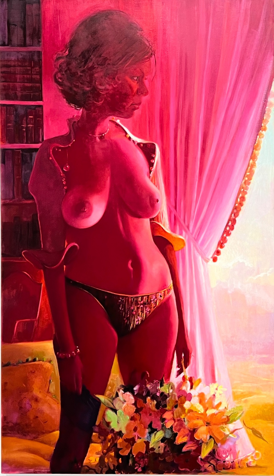
Lisa Yuskavage — Northview (Impressionist Jacket)
July 28, 2026 at 2:11 PM
Model: claude-sonnet-5
These 58 principles are perceptual mechanisms that influence what gets noticed, how forms organize, and how space is inferred - all before conscious interpretation. They do not determine meaning.
what stops you
Everything in this painting is the same color. That's the thing before the thing. Skin, hair, curtain, shadow, wall: one saturated magenta-crimson wash, as if the whole room got dipped in it. Your eye doesn't know what to do with that at first, because color is supposed to tell you where one object ends and another starts, and here it refuses. So the eye does what it does when color fails it: it hunts for brightness instead. It finds the torso. Chest and shoulder sit at the highest saturation in the canvas, and that's where you land, before you've registered a face, a room, a shelf of books. Only after does the head arrive, turned in profile toward a blown-out pale opening at the far right, past a curtain rendered in thick vertical drags. The face is looking at the light. You were looking at the body. The painting knows that split happens and doesn't apologize for it.
Then the flowers pull you down. Thick, buttery, impasto against all that smooth blended flesh, they sit at the bottom like a second, denser painting stapled onto the first. Green leaves cut through the red field, the one cool note in a canvas that otherwise won't let you cool off. You keep circling: torso, face, light, flowers, back to torso. The painting doesn't resolve into a single path. It keeps you moving.
how it was made
Oil on linen, four feet by nearly eight, so the figure is close to life-size and then some, filling the vertical field shoulder to hip with room to spare. The color didn't sit as a filter over the top of the image, laid on like a glaze after the fact. It's built into the paint itself: skin passages carry pink through the modeling, not just on top of it, so the flesh reads as continuous with the crimson curtain rather than lit by it. That's an optical decision, not a lighting effect. It means she couldn't correct it later without repainting the body.
The brushwork changes register by object. The curtain is dragged in long vertical strokes that read as gravity, fabric falling. The flowers are worked wet-into-wet, loaded, distinct from the softer transitions across the chest and stomach, where edges dissolve into each other with almost no visible stroke at all. Jewelry, curtain trim, the small round beads along the fabric edge: these get hard, defined contours, pinpoint highlights, something close to a jeweler's attention. So within one painting there are at least three different kinds of touch: dissolved, dragged, and precise. The hand shows most where the eye is meant to rest longest, and least where it's meant to keep moving.
The composition is cropped at the lower body, no floor, no full figure, so she's pushed up against the picture plane with nowhere to recede to. Depth comes from things overlapping other things: flowers over legs, figure over shelf, curtain over light, not from any vanishing point. The space is shallow because she wanted it shallow.
what it was entering
By 2000, Yuskavage had already spent a decade making women who looked like they'd been lit by a bad motel and modeled after a centerfold's grandmother. The art world of the 1990s and 2000s was arguing, loudly, about the female nude and who got to paint it and why: after two decades of feminist critique treating the nude as a site of instruction, of correction, a painter making figures this frankly hyperbolic, this sweetly and grotesquely sexualized, was read either as complicit or as staging the whole problem on purpose. She wasn't quiet about which. Her women are built from the vocabulary of pinup and soft-core, exaggerated until the exaggeration itself becomes the subject, then dropped into color fields borrowed from Bonnard and Vuillard, from a domestic, decorative, distinctly non-pornographic tradition. Northview sits right in that collision: a body handled like a pinup, a room lit and colored like an Intimist interior. It arrived as a rebuttal to the idea that a painting of a sexualized woman has to choose a side. It doesn't apologize and it doesn't wink. Both readings sit in the same canvas without resolving.
what demonstrates
Watch what the single color cast does to the reading of the body: it makes the torso pop forward not because it's drawn with more anatomical incident but because it's the brightest, most saturated patch in a canvas that has removed almost every other differentiating cue. That's the eye's own wiring doing the work, not the drawing. Once you've seen that here, you start noticing it everywhere color gets used to direct attention rather than describe an object: a single warm note in an otherwise cool painting, a patch of white in a dark field. Color can carry the whole job of composition. Drawing doesn't have to.
The other thing this painting makes legible: edges are information, and inconsistency of edge is a kind of instruction. Where the paint dissolves, she's telling you to look past, to keep moving. Where it hardens, at a bead, a trim, a shoulder line against the curtain, she's telling you to stop. Most paintings hold edge quality fairly constant across a surface. This one plays it like a volume knob, turning attention up and down across a single unbroken field of color. You leave able to see, in other paintings, where an artist has done the same thing quietly, without calling attention to the mechanism.
why it holds
The painting still works because it never settles the argument it's having with itself. Is this a woman turned into wallpaper, absorbed into a decorative field the way Vuillard absorbed his sitters into pattern? Or is she the one point of heat in a room built to serve her? The color says one thing, the crop and scale say another, the flowers underneath say a third. Nothing in Northview resolves that tension, and it isn't supposed to. You stand in front of it now and you're still doing the work the painting assigned in 2000: deciding, moment to moment, whether you're looking at a body or a light source, and finding you can't hold both readings in the eye at once, only in memory, one after the other. That flicker, unresolved, is the reason to keep looking.
WAYS OF LOOKING
The analysis notices that the torso is the brightest passage in the canvas before it notices anything else, and it treats that as data, not accident. It then asks what's doing the pointing when color has been flattened into one hue across the whole surface: not drawing, not anatomy, just saturation. That's a habit worth stealing. When a painting removes one of the usual cues you rely on (here, local color, the thing that tells you skin is not curtain is not shadow), watch for what cue takes over instead. Something always steps in to direct the eye. Find it and you've found the real structure of the composition, underneath whatever the subject matter seems to be doing.
Then there's the move of tracking touch itself as a kind of speech: dissolved brushwork on the torso, dragged strokes on the curtain, thick impasto on the flowers, sharp precision on the beads and jewelry. The analysis doesn't just catalog these differences, it reads them as instructions, a volume knob for attention. Once you clock that an artist is using edge quality (hard versus soft, defined versus dissolved) to tell you where to linger and where to pass through, you can find that same volume knob in almost any painting, even ones that seem to have a single uniform surface.
The analysis also refuses to resolve the contradiction it finds: is she absorbed into the room, or is she the one hot point demanding attention against it? Rather than picking a side, it holds both readings open and asks why the painting won't let them collapse into one. That's a discipline, not indecision. When a work sets up two competing ways of seeing it and never picks between them, don't force a verdict. Describe the tension precisely instead. The tension is usually the point.
WHAT THIS WORK MAKES VISIBLE
Northview makes visible something you can only see clearly when color has been pushed this far: that saturation alone, stripped of local color, can perform the entire job of composition. Because everything here (skin, hair, curtain, wall) shares one crimson family, you can watch your own eye get steered by brightness alone, with no help from drawing or contrast of hue. Look for this in any painting where a single dominant cast has swallowed the local color: ask what's left to organize your looking once hue stops differentiating objects. Usually it's value, saturation, or edge, doing quiet work you'd otherwise credit to the drawing.
It also makes visible how brushwork changes register within one canvas, because the differences are so extreme here you can't miss them: buttery flowers, dragged fabric, dissolved flesh, jeweled precision. Most paintings vary touch more subtly. Once you've seen it this obviously, you can find the same variation, turned down low, in quieter work, and use it to locate where an artist wants you to stop.
Looking vs. Knowing
These are the analysis's own words, nothing added.
Readings That Came From Outside
Not wrong, necessarily—but these readings didn't come from looking: they came from biography, cultural context, critical tradition, to complete what the image left open.
Alternative Interpretation
Pulled directly from this analysis's own language — nothing added.
The analysis holds that Northview can be read as a woman dissolved into a decorative field, absorbed into pattern the way Vuillard's sitters merge with wallpaper and upholstery. Against that, it also reads her as the single point of heat and saturation in a room otherwise built around her brightness, meaning the same color scheme that could erase her instead concentrates all attention on her body. The analysis explicitly declines to pick between these, stating that "nothing in Northview resolves that tension, and it isn't supposed to."
Questions Raised
Whether the monochrome cast should be read as a deliberate optical strategy to direct the eye or as a citation of an Intimist palette tradition (Bonnard, Vuillard) — the analysis asserts both origins without settling which is primary.
Whether the painting functions as feminist critique-by-exaggeration or as complicit indulgence in pinup/soft-core imagery — the analysis says both readings "sit in the same canvas without resolving" and does not adjudicate.
The analysis infers from the paint handling that "she couldn't correct it later without repainting the body," but this is a claim about process and intent inferred from the finished surface, not confirmed by any outside evidence about how the work was actually made.
Pass 1 — blind observation used
The eye lands first on the figure's torso — the bare chest reads as the brightest, most saturated passage in the composition, and Visual Pop-out/Pre-attentive Features pulls attention there before anything else registers, including the face.
Working outward from that point: the whole scene is bathed in a single dominant hue. Color Temperature here is uniformly hot — magenta-red light washes across skin, hair, curtain, and bookshelf alike, so that Local vs. Atmospheric Color has been overridden by the colored light source. The skin, which would presumably read as a different tone in neutral light, is pushed into deep rose and crimson. This is Optical Color Mixing at work — the red cast doesn't sit as a filter on top but seems to blend into the pigment structure of the figure itself, unifying flesh, hair, and background into overlapping value bands.
Value Structure/Massing: the darkest passages cluster in the upper left (bookshelf, hair) and lower left (boots, shadowed drapery fold near the hip), while the lightest area breaks through on the right side, where the curtain parts to reveal a pale sky or wall beyond. This creates a strong diagonal Visual Tension between the dense red mass on the left and the airy light passage on the right.
Edges behave inconsistently across the painting. The contour of the shoulder, breast, and hip are handled with soft, blended transitions — Edge Detection barely registers a hard boundary between flesh and background in the mid-torso. But the curtain's folds carry crisper linear strokes, and the beaded trim along its edge is rendered with small, distinct dabs, giving that passage more Texture and Detail Density than the body.
Figure-Ground Relationships: the body is placed against the vertical drape of the curtain, and the curtain's pale interior acts as a secondary "window" or Figure-Ground reversal point — for a moment the eye reads the gap in the curtain as its own bright rectangle floating in the red field.
At the base, a mass of flowers in yellow, orange, and green breaks the red-dominant Color Harmony System, introducing complementary contrast (green against red) that is the only Simultaneous Contrast in the piece strong enough to make those flowers advance despite their placement in the lower, shadowed zone.
Scale: the figure is cropped at the ankles, Cropping/Framing pushing her close to the picture plane, oversized relative to the room's furniture (chair, bookshelf) behind her, reinforcing her closeness to the viewer.
The eye arrives last at the face — turned in profile, partially shadowed, offering no direct Gaze Direction back to the viewer, so attention that started at the chest eventually settles on the averted, quieter passage of the face before drifting back down toward the curtain's light.