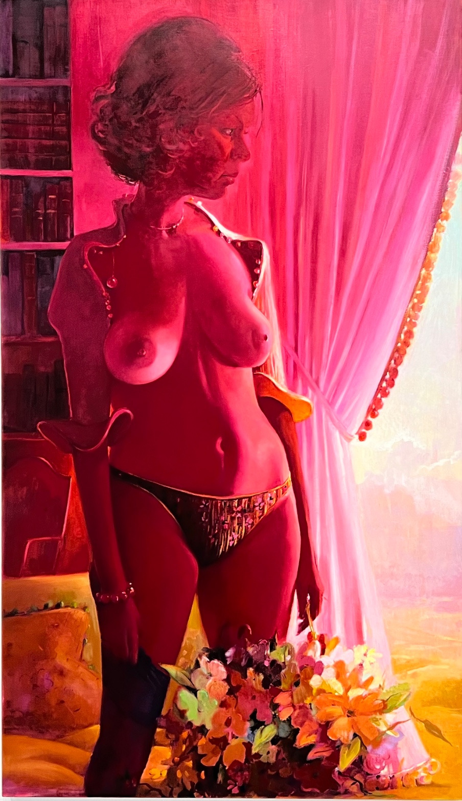
Lisa Yuskavage — Northview (Impressionist Jacket)
July 28, 2026 at 2:10 PM
Model: claude-sonnet-5
These 58 principles are perceptual mechanisms that influence what gets noticed, how forms organize, and how space is inferred - all before conscious interpretation. They do not determine meaning.
what the eye does
You walk up and the whole room seems to have caught a fever. Everything, the skin, the hair, the curtain, the bookshelf, is soaked in the same hot pink-magenta light, like someone put a red gel over the sun and forgot to take it off. That's the thing that stops you before you've registered a single object: the color isn't sitting on top of the painting, it's inside everything in it.
Once you're in, your eye does what it's told. It goes straight for the torso, the brightest, most lit-up patch of paint in the whole canvas, glowing like it's been polished. From there it's supposed to travel up to her face, which is turned in profile, looking off toward a blown-out pale opening at the far right, like she's watching something happen outside the frame that we're not shown. But the trip isn't smooth. Coming down from her face, you snag on a little run of gold dots trimming the curtain, then on the thick, almost frosted texture of a flower arrangement at the bottom, painted so much rougher than everything around it that it stops your eye like a speed bump. The whole painting keeps doing this: pulling you toward the light, then distracting you with some small hard glinting detail along the way.
how it's made
This is oil on linen, and the paint handling is doing two completely different jobs depending on where you look. The skin is smooth, blended, almost licked into place, edges melting into the dark shelf on one side and into the pale curtain on the other so you can't always tell where body ends and room begins. Then you hit the flowers, and suddenly the brush is loaded, dragged, built up in ridges, nothing blended about it. The curtain is somewhere in between: long vertical strokes that read as fabric folds, decisive but not fussy, with small precise dabs marking the beaded trim.
The color itself isn't local color with a filter over it. Yuskavage builds the red into the paint structure itself, so the shadows of the hair and the highlights of the skin are made of the same family of pigment, just pushed to different values. That's why it reads as atmosphere rather than tint. It doesn't sit on the surface. It's baked into how everything was mixed.
where it lives
Stand in front of this and you notice how it refuses the two obvious categories waiting for it. It's a female nude in an interior, so your mind reaches for either the history of odalisques and reclining Venuses, or for the cool, deadpan detachment that a lot of figurative painting used to distance itself from that history. Yuskavage gives you neither. The color is too lurid, too candy-colored and cheap-looking to sit comfortably in the grand tradition, and the handling is too loving, too worked-over and sensuous, to read as ironic critique.
Painted in 2000, this comes out of a body of work where Yuskavage had already spent the nineties taking heat and praise in roughly equal measure for painting women who looked like they'd stepped out of a soft-porn illustration crossed with a Renaissance devotional panel. The bookshelf, the curtain, the domestic clutter, these root the figure in something ordinary, even middlebrow, while the lighting turns it operatic. That gap between the modesty of the setting and the theatrical color is exactly where her reputation was built.
what it's arguing
The painting is making a case that beauty and vulgarity aren't opposites you have to choose between, they're the same material handled two ways. The saturated pink could read as a cheap velvet curtain in a bad motel or as a sunset over a Renaissance altarpiece, and Yuskavage isn't going to help you decide which. She wants you to feel both possibilities sitting on top of each other without collapsing.
There's also an argument happening in the brushwork itself, about where attention deserves to go. The flowers, technically the least important thing in the painting, get the most aggressive, textured paint handling. The face, which you'd expect to be the emotional center, gets folded into softness and shadow. That's a deliberate redistribution of where the painting wants your care to land.
what it holds open
You never quite settle on whether the woman is a person having a private moment or a construction built entirely for looking at, and the painting won't resolve that for you. The bright opening past the curtain stays empty, a promise of somewhere else that never gets filled in. Whatever she's looking at, we don't get to see it, and neither, maybe, does she.
WAYS OF LOOKING
The analysis notices that the torso is the brightest patch in the painting, and only afterward does it get to the face. That order matters. Instead of assuming the "point" of a figure painting is the face, because that's usually where meaning is supposed to sit, the analysis follows where the paint is actually loudest first. The habit here is letting the eye's real path through a work, not the assumed hierarchy of importance, tell you what the painting is doing.
There's a moment where the analysis catches the flowers being painted with thick, ridged, almost rough brushwork while the skin around them stays smooth and blended. Nobody would expect the least important object in the scene to get the most aggressive paint handling. Naming that mismatch, and then asking why, is a way of using inconsistency in technique as evidence rather than treating it as a flaw. Wherever the hand behaves differently, something is being argued.
The analysis also refuses to file this painting neatly into "history of the nude" or "ironic critique of the nude." It holds both readings up at once and says the painting won't choose. That's a discipline: resisting the first available category long enough to notice the painting is actually sitting between two categories, and that the tension between them is the content, not a problem to be resolved.
WHAT THIS WORK MAKES VISIBLE
The color here doesn't sit on the surface like a filter or a spotlight, it's built into the paint itself, so skin and hair and curtain and shadow are all made from the same reddish family, just pushed lighter or darker. Because Yuskavage pushes this so far, past the point of naturalism entirely, you can actually watch the difference between light as an effect glazed on top and color as something structural, mixed into the pigment from the start. Most paintings hide this distinction. Here it's impossible to miss, so it's a good painting to train your eye on before you go looking for the same trick, done more quietly, in a Rembrandt or a Vermeer.
The gap between where your eye is supposed to go and where it actually snags, on the gold beads, the flower texture, the boots, is unusually easy to track here because the setting is so plain and the lighting so theatrical. That contrast between ordinary furniture and operatic color makes the painting's redirection of attention visible in a way a more evenly rendered scene would hide. Next time, look for where a painter mismatches the emotional weight of a subject with the physical weight of the paint. That gap is often where the real argument lives.
Alternative Interpretation
Pulled directly from this analysis's own language — nothing added.
The analysis treats the painting's saturated pink and worked-over paint handling as arguing that beauty and vulgarity are the same material rather than opposites, suggesting the color could be read as a cheap motel curtain or a Renaissance altarpiece sunset. It explicitly refuses to pick between these readings, stating Yuskavage "isn't going to help you decide which" and wants both possibilities held at once without collapsing into one.
Questions Raised
Whether the woman is a person caught in a private moment or a figure built purely to be looked at is left unresolved, with the analysis stating outright that "the painting won't resolve that for you."
What lies beyond the blown-out pale opening at the right, the thing the woman appears to be watching, is never shown, and the analysis admits it doesn't know if she herself sees it either ("neither, maybe, does she").
Whether the painting's redistribution of attention (rough paint on flowers, soft paint on the face) is a deliberate argument about where care should land, or simply a byproduct of technique, is asserted as "deliberate" but not otherwise proven within the analysis itself.
Pass 1 — blind observation used
The eye lands first on the figure's torso — the bare chest reads as the brightest, most saturated passage in the composition, and Visual Pop-out/Pre-attentive Features pulls attention there before anything else registers, including the face.
Working outward from that point: the whole scene is bathed in a single dominant hue. Color Temperature here is uniformly hot — magenta-red light washes across skin, hair, curtain, and bookshelf alike, so that Local vs. Atmospheric Color has been overridden by the colored light source. The skin, which would presumably read as a different tone in neutral light, is pushed into deep rose and crimson. This is Optical Color Mixing at work — the red cast doesn't sit as a filter on top but seems to blend into the pigment structure of the figure itself, unifying flesh, hair, and background into overlapping value bands.
Value Structure/Massing: the darkest passages cluster in the upper left (bookshelf, hair) and lower left (boots, shadowed drapery fold near the hip), while the lightest area breaks through on the right side, where the curtain parts to reveal a pale sky or wall beyond. This creates a strong diagonal Visual Tension between the dense red mass on the left and the airy light passage on the right.
Edges behave inconsistently across the painting. The contour of the shoulder, breast, and hip are handled with soft, blended transitions — Edge Detection barely registers a hard boundary between flesh and background in the mid-torso. But the curtain's folds carry crisper linear strokes, and the beaded trim along its edge is rendered with small, distinct dabs, giving that passage more Texture and Detail Density than the body.
Figure-Ground Relationships: the body is placed against the vertical drape of the curtain, and the curtain's pale interior acts as a secondary "window" or Figure-Ground reversal point — for a moment the eye reads the gap in the curtain as its own bright rectangle floating in the red field.
At the base, a mass of flowers in yellow, orange, and green breaks the red-dominant Color Harmony System, introducing complementary contrast (green against red) that is the only Simultaneous Contrast in the piece strong enough to make those flowers advance despite their placement in the lower, shadowed zone.
Scale: the figure is cropped at the ankles, Cropping/Framing pushing her close to the picture plane, oversized relative to the room's furniture (chair, bookshelf) behind her, reinforcing her closeness to the viewer.
The eye arrives last at the face — turned in profile, partially shadowed, offering no direct Gaze Direction back to the viewer, so attention that started at the chest eventually settles on the averted, quieter passage of the face before drifting back down toward the curtain's light.