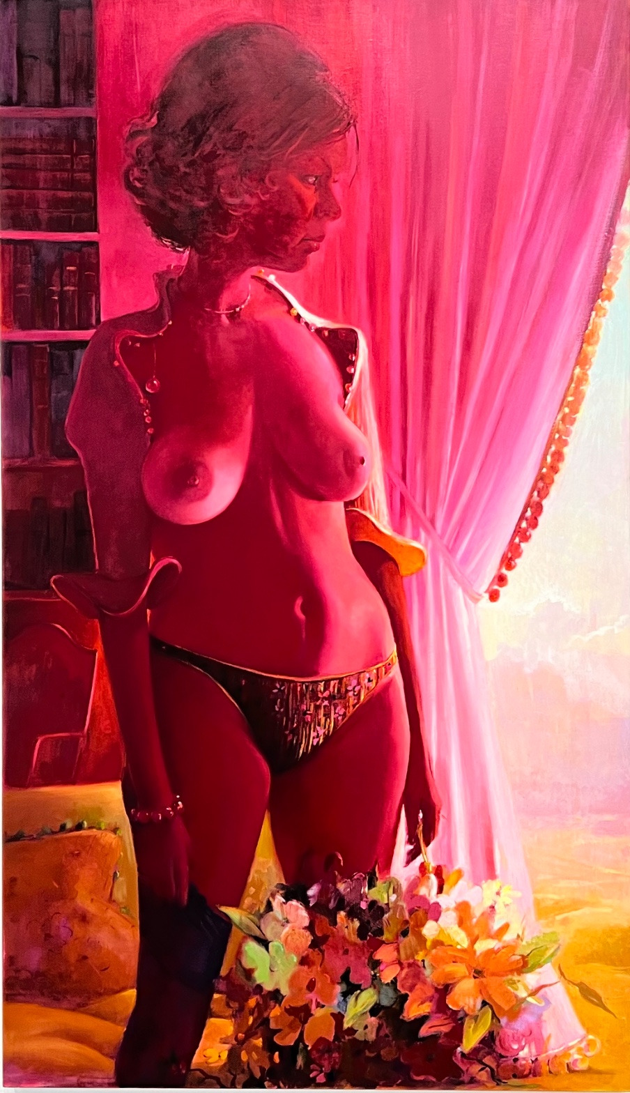
Lisa Yuskavage — Northview (Impressionist Jacket)
July 28, 2026 at 2:08 PM
Model: claude-sonnet-5
These 58 principles are perceptual mechanisms that influence what gets noticed, how forms organize, and how space is inferred - all before conscious interpretation. They do not determine meaning.
LOOKING PROMPTS
Look at the woman's chest and torso, then notice how the color there seems brighter and more saturated than anywhere else in the painting. Move your eyes to the flowers at the bottom of the canvas, and compare the thickness of that paint to the smooth, blended paint of the skin above it. Follow the edge of the curtain on the right, from its soft dragged folds down to the small round beads trimming its border, and notice where that border meets the blown-out pale light behind it.
Start here: Notice that the entire canvas, skin, hair, shelf, curtain, is washed in the same hot pink-red, and then ask yourself where the "real" colors of this room would be if that cast were removed.
THE HOOK
Where does your eye land first, and how long does it take you to notice her face? Most people go straight to the chest, the brightest, most saturated passage in the painting, and only afterward travel up to find the head turned in profile toward the light at right. That's a built sequence: the body is positioned to be seen before the person is. Once you notice the order your eye took, it's hard to unsee that the painting made you do it.
THE STORY
Lisa Yuskavage painted "Northview (Impressionist Jacket)" in 2000, at a point in her career when she'd already built a reputation, and some notoriety, for paintings of women with cartoonishly exaggerated bodies bathed in candy-colored light. She trained in a rigorous, old-master-adjacent tradition of figure painting, and then aimed that skill at imagery closer to pin-up illustration and soft-core photography than to any academic nude. Critics in the 1990s and 2000s split hard: some read her women as complicit in their own objectification, painted by a woman in on the joke, while others saw straightforward titillation dressed up in painterly bravado. The title's nod to Impressionism (verify before using) suggests she's needling art history directly, borrowing the language of dappled, atmospheric light and putting it in service of a scene that reads more like a boudoir than a garden. The argument hasn't closed. Yuskavage is now a fixture in major collections, but the discomfort her work provokes, the sense that you might be enjoying something you're not sure you should, remains part of how people talk about her.
THE LIVE QUESTION
Some people see this as a critique, a woman artist exposing exactly how the male gaze constructs and lights a body, using color and paint handling to make the mechanism visible. Others see it as reproducing that same gaze without much distance, dressed up in confident brushwork. Look at how the chest is lit and how the face is turned away from you, toward the light instead of toward you: does that choice feel like exposure of a system, or participation in it?
WAYS OF LOOKING
Nine separate viewings of this painting all agreed the eye lands on the torso first, before the face. That's not a guess about what the painting means, it's a track of what actually happens when a person looks. When you're building a stop for a tour, you can do the same thing before you say a word of interpretation: ask people where their eyes went first, then ask them to time how long it took to find the face. The sequence itself becomes the evidence.
The analysis also caught a contradiction, different observers disagreed about which breast carries the brightest highlight, and left it standing instead of forcing an answer. That's useful for a guide because groups will argue about details too. You don't need consensus to make a stop work. You need the disagreement to point somewhere, in this case toward how ambiguous the lighting actually is, which is itself worth saying out loud.
Notice how the flowers get called out for having thicker, more textured paint than the smooth skin above them. That's a habit worth stealing: compare how the paint is handled in two different zones of the same canvas, not just what those zones depict. A group can see brushwork even if they've never studied it, once you point at two spots and ask which one looks more built-up.
WHAT THIS WORK MAKES VISIBLE
The whole canvas is soaked in one hot pink-red, skin, hair, bookshelf, curtain, all pushed into the same color family. That uniformity makes something easy to see here that's much harder to spot in a normally-lit painting: the difference between color that describes an object and color that describes light falling on all objects equally. Ask a group what color the curtain "really" is, and they'll have to mentally subtract the red wash to answer. That's a skill, subtracting the light source from the local color, that most paintings hide by not pushing the light this far.
The cropping also does something legible: the figure fills almost the entire vertical frame, cut off at the ankle, so she reads as too close, pressed toward the viewer rather than arranged in a room. In a painting with more breathing room around the figure, that effect of forced proximity gets diluted. Here, because there's nowhere else for the eye to go, you can actually feel the crop working on you, which is a good thing to name the first time someone stands in front of a canvas that does this.
Looking vs. Knowing
These are the analysis's own words, nothing added.
What the Work Shows Us
These are the claims that hold up when you look: each one is rooted in something the image actually puts in front of you, not from what we already knew—or thought we knew—about it.
Readings That Came From Outside
Not wrong, necessarily—but these readings didn't come from looking: they came from biography, cultural context, critical tradition, to complete what the image left open.
Alternative Interpretation
Pulled directly from this analysis's own language — nothing added.
The primary reading holds that Yuskavage is a woman artist exposing the mechanism of the male gaze, using exaggerated lighting and body emphasis to make that construction visible and available for critique. The competing reading, held with equal weight in the analysis, is that the painting simply reproduces that gaze under cover of painterly skill, offering titillation dressed as commentary without securing any real critical distance.
Questions Raised
The analysis flags the title's Impressionist reference as needing verification before it can be used as evidence of art-historical needling, so it's unresolved whether that connection is intentional or just a suggestive coincidence of naming.
The analysis never settles whether the sequencing of the eye (chest first, face second) is a deliberate critical device or simply how the composition happens to fall, and it says outright that the critical argument "hasn't closed."
It's unresolved whether the viewer's own uncertainty ("enjoying something you're not sure you should") is evidence of the painting's critique working, or evidence that the critique isn't distinct enough from the thing it supposedly critiques.
Pass 1 — blind observation used
The eye lands first on the figure's torso — the bare chest reads as the brightest, most saturated passage in the composition, and Visual Pop-out/Pre-attentive Features pulls attention there before anything else registers, including the face.
Working outward from that point: the whole scene is bathed in a single dominant hue. Color Temperature here is uniformly hot — magenta-red light washes across skin, hair, curtain, and bookshelf alike, so that Local vs. Atmospheric Color has been overridden by the colored light source. The skin, which would presumably read as a different tone in neutral light, is pushed into deep rose and crimson. This is Optical Color Mixing at work — the red cast doesn't sit as a filter on top but seems to blend into the pigment structure of the figure itself, unifying flesh, hair, and background into overlapping value bands.
Value Structure/Massing: the darkest passages cluster in the upper left (bookshelf, hair) and lower left (boots, shadowed drapery fold near the hip), while the lightest area breaks through on the right side, where the curtain parts to reveal a pale sky or wall beyond. This creates a strong diagonal Visual Tension between the dense red mass on the left and the airy light passage on the right.
Edges behave inconsistently across the painting. The contour of the shoulder, breast, and hip are handled with soft, blended transitions — Edge Detection barely registers a hard boundary between flesh and background in the mid-torso. But the curtain's folds carry crisper linear strokes, and the beaded trim along its edge is rendered with small, distinct dabs, giving that passage more Texture and Detail Density than the body.
Figure-Ground Relationships: the body is placed against the vertical drape of the curtain, and the curtain's pale interior acts as a secondary "window" or Figure-Ground reversal point — for a moment the eye reads the gap in the curtain as its own bright rectangle floating in the red field.
At the base, a mass of flowers in yellow, orange, and green breaks the red-dominant Color Harmony System, introducing complementary contrast (green against red) that is the only Simultaneous Contrast in the piece strong enough to make those flowers advance despite their placement in the lower, shadowed zone.
Scale: the figure is cropped at the ankles, Cropping/Framing pushing her close to the picture plane, oversized relative to the room's furniture (chair, bookshelf) behind her, reinforcing her closeness to the viewer.
The eye arrives last at the face — turned in profile, partially shadowed, offering no direct Gaze Direction back to the viewer, so attention that started at the chest eventually settles on the averted, quieter passage of the face before drifting back down toward the curtain's light.